Zygomorph
Member
There are tons of comments online that dump on Ektar, so I thought I'd write up a little something to keep people from being unreasonably discouraged from using it. I too was initially worried that it was too unwieldy in the color/exposure department for my tastes. But the last few frames I've worked with have given me superb results... such that I've taken to exclaiming "F--- Yeah, Ektar!" which I think is the best way to describe the nature of this film.
NB I scan my negs as positives and do all reversals and balancing manually in Photoshop.
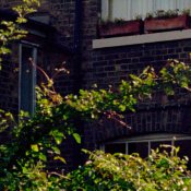
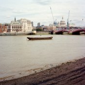
I think the most important thing to realize is that it's not Portra. The colors are naturally much bolder and it looks its best and most natural with quite a steep contrast curve. Therefore, the choice of a neutral tone in a given scene is that much more important, especially when there is a mixture of elements in direct sunlight (yellowish) and open shade (bluish). In these cases, I have had a better time neutralizing for the shaded areas as a starting point, and subsequently working with the resulting (BOLD) colors in the midtones and highlights. Obviously, this is not an issue for scenes that are flatly lit.
I have included an example of each scenario. Each has been printed at 11 inches across with outrageous detail and sharpness with little to no visible grain at handheld distances. Both photos are with a Mamiya 6, 75mm lens, handheld, scanned with a calibrated (important!) Artixscan 120tf and edited in the ProPhotoRGB colorspace.


NB I scan my negs as positives and do all reversals and balancing manually in Photoshop.
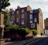
I think the most important thing to realize is that it's not Portra. The colors are naturally much bolder and it looks its best and most natural with quite a steep contrast curve. Therefore, the choice of a neutral tone in a given scene is that much more important, especially when there is a mixture of elements in direct sunlight (yellowish) and open shade (bluish). In these cases, I have had a better time neutralizing for the shaded areas as a starting point, and subsequently working with the resulting (BOLD) colors in the midtones and highlights. Obviously, this is not an issue for scenes that are flatly lit.
I have included an example of each scenario. Each has been printed at 11 inches across with outrageous detail and sharpness with little to no visible grain at handheld distances. Both photos are with a Mamiya 6, 75mm lens, handheld, scanned with a calibrated (important!) Artixscan 120tf and edited in the ProPhotoRGB colorspace.