• Welcome to Photrio!
    Registration is fast and free. Join today to unlock search, see fewer ads, and access all forum features.
    Click here to sign up

Ilford MGIV & Warmtone (MGWT), a discussion...

Sprung

H
Sprung

  • 2
  • 1
  • 18
Hensol woods

A
Hensol woods

  • 2
  • 0
  • 29

Recent Classifieds

Forum statistics

Threads
202,962
Messages
2,848,154
Members
101,555
Latest member
drzf
Recent bookmarks
0
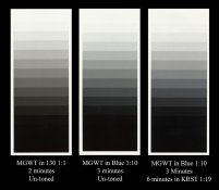
That's interesting. I have recently decided to use some MGWT for a project. I bought some, and found that I already had bought a box to try some time previously. I use ID-78 which is to some degree a warm tone developer. (Actually I use potassium carbonate instead of the sodium carbonate, adjusted for MW) which should make it a bit warmer.

I found the warm tone very subtle indeed. Warm enough for me, but I was surprised that it wasn't anything like the old Agfa Record Rapid (I'm showing my age) of the 1960s, or like a toned print.

One explanation might be that here, almost the end of the Earth (only New Zealand is further away) the age of stock is often problematical.

ID-78 is a very good warm-tone developer, it gives me identical results to Agfa Neutol WA. I substitute Potassium Carbonate and a little Sodium Hydroxide for the Sodium Carbonate and make up a much more concentrated stock solution.

Unfortunately no modern Warmtone papers get remotely close to the older Record Rapid with cadmium in it, that disappeared in the late 1980's.

I found that Ilford MG Warmtone did give me very warm tones when reasonably fresh, but later cooled off very significantly. My Forte Polywarmtone from the last production run before closure has cooled off slightly but over a longer time and not as significantly.

At some point later this year I have to decide what to use once my Polywarmtone runs out, at the moment that could be Ilford Warmtone, Adox MCC or Fomatone MG.

Ian
 
Thomas my pm functon is off , but could you please send me an email.
I tried you earlier but it bounced back

That's an interesting observation. I can't remember exactly now, since it's been a few years since I printed on Agfa MCC, but I can't really remember having problems reaching maximum contrast with it.
Would you say that is a correct observation? If so, the MCC emulsion that ADOX uses is not the same as the old Agfa.

Anyway, I also agree with your notion that larger prints on MGWT can take a ridiculously long time, entering reciprocity failure territory. My new (to me) Leitz Focomat V35 enlarger only has a 75W bulb in it. Making a 16x20" print the other day I had a main exposure of 120 seconds at f/2.8 on the Focotar lens, and the burning exercises were several minutes long. Fortunately the Focotar is a good lens, which holds up well at f/2.8 even at 16x magnification, but it was definitely a test of my patience.
 
Thomas my pm functon is off , but could you please send me an email.
I tried you earlier but it bounced back

Email sent, Bob. (I have shut down one or two of my email addresses, so that might be why).
 
If you didn't like LPD at 1+4 - the developer changes as you alter dilution. Try LPD at 1+1 or replenished for something completely different. Both color wise as well as contrast. It gets colder as you decrease dilution and contrast increases. It's why I love LPD so much - it's easy to adjust to get what you want. Although I mostly use it replenished, I also usually have a gallon of fresh stock to mix single shot from if I need something different.

- Thomas

I've been using LPD 1:1 with MGWT lately. Also, have used 130 1:1 with it and both combinations are wonderful...
 
I've used a fair amount of both these papers, but I prefer the regular MGIV to its warmtone brother. The Ilford warmtone product is not particularly warm toned, but MGIV is a very good cool - neutral color. I don't usually tone my prints, and that may be the difference that causes my preference. I recently compared the results using these Ilford products to a number of other currently available papers, and the Ilford product is consistently and decidedly better.
 
Cooling MGWT, a test

Well I told you I'd get to testing and I did. Today I got some Clayton's Ultra Cold developer and also again used some Moersch SE6 Blue that I had in stock. I was printing step wedges.

To be honest I was extremely disappointed in the Clayton Ultra-Cold. It produced a rather unpleasant greenish tone, not far from what most other developers would produce. I added 10ml/L of 1% benzotrazole solution to it.. Nothing. I added another 10ml/L of 1% benzotriazole, and again, Nothing. I'm not giving up on it yet, I'm going to selenium tone some of the wedges and also split sepia-selenium some as well to see how it tones.

On to the Moersch SE6 Blue... WOW!!! As soon as I turned the lights on I knew that was the developer for neutralizing MGWT. A wonderful neutral bluish color. Very cold, similar to a mild gold toning of MGWT. Some of the color is lost through washing, though not much. I also got around to selenium toning one of my wedges of MGWT in Blue. I was amazed. I toned for 6 minutes in Kodak Selenium at the 1:19 dilution. The paper acted much like MGIV, not turning a brownish-purple in the shadows, but rather simply cooling off even more and losing the slight tinge of green from it's blue. The blacks stayed cold! I was very impressed! Next I'm going to try the 1:9 dilution and see if it cools off even more, or gives a cold purple to the shadows. Overall I would have to say that Moersch Blue is the cold-tone developer that will cool off MGWT.

I have attached scans of MGWT in Blue un-toned, as well as MGWT in Blue & selenium toned. I have also included a scan of a wedge of MGWT in PF130 1:1 for comparison in tone.
 

Attachments

  • MGWT wedges.jpg
    MGWT wedges.jpg
    186.3 KB · Views: 247
Last edited by a moderator:
Great results, Brian. I also have some of that MT6 blue toner too.
Have you any idea of how archival it is? I'm a bit worried about that, to be honest, as I think it's dye based.

Also, for cold tone developer - have you tried Edwal Ultra Black? I used that for a while, and it gives amazing blacks and cold tones.

- Thomas
 
I'm sorry Thomas, I should have specified. The paper developer I used is also known as Moersch SE6 Blue. It is not a toner. I know the toner you're speaking of, and I wouldn't imagine it being archival. No blue toners are. I also have a PF blue toning kit. I bought it a few months ago planning on trying it eventually, but the research I've done and the bad results I've heard from Bob Carnie along with the fact that it is not archival has led to me to not try it yet.

No I haven't tried Edwal Ultra Black. I was on my short list though. I don't think B&H will ship that, that's why I haven't tried it yet. I may order some from Freestyle though, as that's where I get the Moersch Blue as well.
 
You may wish to tap Suzanne Revy's shoulder about the Edwal Ultra Black. I think she used to use it with MGWT, but I'm not sure.

I see about the developer... I'll have to look into that... Sorry for the mix-up.
 
This has been a wonderful thread to follow and have found it quite interesting.

For me, when I break down what has been shared by what appears to be knowledgeable printers there are several layers to this discussion.

It's obvious to me there are different factors dictating ones first choice of enlarging paper.

In no order of preference, COST, COLOR, MICOR CONTRAST, SPEED and AVAILABILITY, there maybe other concerns but these are the ones which come to mind.

I am not familiar with how to structure this as a "poll" but I would be most interested in those responding in this thread as to what is their number ONE preference. No explanation just a one word answer from those capitalized above.

Cheers!
 
Steve, that's funny cause I was actually thinking of making this a poll thread when I started it, but decided not to, rather chose to gather information from those instead of them just selecting one paper or another from a poll. I'm not sure if I can add a poll to this thread now. Maybe a moderator can step in and help. I would be interested as well.

I've enjoyed this thread too and I hope it continues to grow. From what I have gathered so far it seems that most are in favor MGWT as a preference. I honestly don't think I could choose. I enjoy having the choice of each paper for different printing situations. If I HAD to choose I guess I would probably go with MGWT.

Your determining factors of choosing a paper are correct, though I would add Dmax in there as well.
 
In no order of preference, COST, COLOR, MICOR CONTRAST, SPEED and AVAILABILITY, there maybe other concerns but these are the ones which come to mind.

While you have image colour there's also two other missing factors - base colour and also emulsion surface.

These other two factors played an important part when I switched to Forte Poltwarmtone a few years ago when Agfa ceased production.

At that point Ilford MG Warmtone was on a sickly creamy base which some of us didn't like, the base has since been discontinued and now it's on a nice white base. My other option was the Kentmeere WT paper but I didn't like the surface.

Another issue is the subtle way some papers handle shadows or highlights often being better at one than the other. Talking nuances here but Ilford Galerie is superb for stretching out highlight details, but it's not warm toned. MCC was/is superb for rich shadow details, Polywarmtone seemed to have the best overall balance, I think this is what you're referring to as micro contrasts.

An ideal warm tone paper has great flexibility, can be bent tonally & in image colour through development controls.

Ian
 
Brian
I have decided to abandon the blue chemically , in my toner sequence.
This is my crazy solution*****FOR SENSITIVE READERS DO NOT FOLLOW THIS POST AS IT MAY CONTAIN DIGITAL DIALOQUE WHICH COULD HARM YOU****

Once I have selected an image from my series that I really believe is worthy of printing and selling. I will high resolution scan the entire image,.
Then I will make my enlarged solarization prints with all steps that I have been working on for the last few years minus the blue toner. (I will include the black rebate for measurment sakes.)
I will then mount the print to aluminum and measure the print .
Then I will in PS separate out the shadows and make a shadow only negative with anything above 1/4 tone blocked out black on the negative and only the shadows showing through.{ the negative will be sized to the print) right now I am planning on 18x28 inch prints , once I get the larger film I will make them to any mural size.
Final steps will be to coat the paper with some sizing to accept a hit of Carbon, or Gum that has been made with blue pigment.
This layer will create the elusive blue shadows I have been pinning for the last 6 years.

Crazy yes, Only in Canada you say?:munch:


I'm sorry Thomas, I should have specified. The paper developer I used is also known as Moersch SE6 Blue. It is not a toner. I know the toner you're speaking of, and I wouldn't imagine it being archival. No blue toners are. I also have a PF blue toning kit. I bought it a few months ago planning on trying it eventually, but the research I've done and the bad results I've heard from Bob Carnie along with the fact that it is not archival has led to me to not try it yet.

No I haven't tried Edwal Ultra Black. I was on my short list though. I don't think B&H will ship that, that's why I haven't tried it yet. I may order some from Freestyle though, as that's where I get the Moersch Blue as well.
 

Attachments

  • stilllifeNo Blue.jpg
    stilllifeNo Blue.jpg
    177.3 KB · Views: 170
  • stilllifeBlue added.jpg
    stilllifeBlue added.jpg
    166.7 KB · Views: 165
You may wish to tap Suzanne Revy's shoulder about the Edwal Ultra Black. I think she used to use it with MGWT, but I'm not sure.

I see about the developer... I'll have to look into that... Sorry for the mix-up.

I've used Edwal Platinum II developer with this paper, and loved the results, but it's a warm tone I'm after, not a cool tone. I'd use it more, but it's a little hard to get it shipped, though I think Freestyle will ship it. I've been using Ilford WT developer lately, and the results are quite similar.
 
Brian
I have decided to abandon the blue chemically , in my toner sequence.

What is your problem with the blue toner? Assuming you are using a non-dye based blue toner with a combined bleach / toning solution, that creates the Prussian Blue pigment as the end result, do you pre-acidify your papers before attempting to blue tone by soaking them in for example a citric acid bath?

The Prussian Blue pigment, which is the same pigment that forms cyanotypes, prefers slightly acidic environments, and will be destroyed in highly alkaline environments. This is also the reason why it should be the last toner in the sequence of toners, as for example the highly alkaline thiourea redevelop bath of a sepia toner will likely destroy it.
 
Impossible to work with as the last step, clearing out is a real pain, and I am not willing to work with it if the results are not what I want. I am using the iron blue direct tone formuala and it really works well sometimes, other times it is a huge mess.

I mainly asked to possibly learn from your experiences. I only used iron blue toner once, and so have little real data or experience to share.

However, the reason I also asked is that I seem to remember you once showing and sharing some very beautiful and successful results with a combination toning including iron blue shadows. Am I right? Anyway, the results I saw, whether or not they were yours, were very beautiful, and this is still on my list to explore once, hence my interested in the details of your problems.

Do I understand you mainly have difficulty in reproducing results from one print to another? Is there any extra info from your side to share on what attempts were more or less successful, and which not? Any ideas you may have to factors influencing success or failure?

One other thing my limited experience thought me, is that the iron blue toner one bath bleach/tone solution I used really is almost a "one shot" toner. You can maybe keep it one day, but after that, it becomes useless. This is contrary to my two bath sepia toner and selenium toner, that I have kept for months without issues.
 
This is great stuff guys. Brian, those wedges look interesting and would give me an option to get cool side of neutral images off MGWT and to be able to tone them without the dangers of typical aubergine/plum hues appearing where I dont want them!

I have not yet used Dektol (tho I have Robin Bell prints made with this) and it is very neutral (looks cool next to those from multigrade or PQ universal). Eukobrom might be worth trying for some of you. I am finding it working quite well. no nasty greenness to my eyes.
 
Impossible to work with as the last step, clearing out is a real pain

Bob,

Moersch's MT7 Iron Blue toner contains an additional optional acidic clearing bath in the toning kit for removing yellow staining, and Fotospeeds toner manual recommends using a quick pass through a weak plain salt solution (1 tablespoon per litre) to help clearing the ferricyanide yellow stain for their blue toner.

Have you tried either of these options?

Also the questions in my previous post...

Marco
 
Additionally, Moersch's website lists here:

"With a number of papers some combinations can result in an unpleasant yellow dyeing of the highlights. In such cases after-treatment in diluted sulphuric, citric or hydrochloric acid can be the remedy. The gelatine is decolorized but the image colour is preserved. Using 2-5 ml of a 15-20% solution of acid on 100ml of water, the highlights will clear after 2 to 3 minutes. If you want to change the green-blue tone to a pure blue or delft-blue, give the print an after-treatment in a weak alkaline bath (borax, sodium carbonate, ammonia)."

This is officially instruction for a indirect two bath blue toner, see the linked webpage, but I guess it is similar to the described clearing bath for the direct, one bath toner.

I can also highly recommend reading this section on Moersch's website, it seems full of useful tips and warnings regarding iron blue toning:

Basics of Iron Blue toning: http://www.moersch-photochemie.de/content/artikel/anleitungen/120/lang:en

Marco
 
Last edited by a moderator:
Hi Marco
Yes
I posted some solarizations with iron blue as the final hit over top gold and sepia. in my first testing I was using 11x14 and 16x20 papers, the control of the blue was ok , though I was unhappy with the fact the blue would wash off and be unpredictable as well not as archival.
When I moved up to 30 x40 and now 40 x50 the problems become too much for any sane man/woman to want.
With the alt overhit, I believe that it is quite predictable and the washing mechanics are not so labour intensive and un - predictable. As well the pigment overcoat is as permanent as the sepia and gold and it makes me warm and fuzzy to say I am doing.. two dev, solarizations with duo tone toners with a gum or carbon pigment over coat.


The sepia and gold is very predictable and easy to do in murals but once one starts iron blue toning 30 x40 's a whole world of whoopass starts.
I do not want to spoil days of printing with a sketchy end toner process.
bob
 
The sepia and gold is very predictable and easy to do in murals but once one starts iron blue toning 30 x40 's a whole world of whoopass starts.
I do not want to spoil days of printing with a sketchy end toner process.
bob

Amen, I can understand that fully. Still, I do think I will give it a try myself once. The Moersch MT7 kit with all the tips and instructions, seem worth a try and Moersch definitely seems to have made an attempt with his kit and instructions to overcome some of the issues.

Still, I do not see myself doing 30x40 inch mural with it, but than my darkroom isn't big enough anyway. Doing 20x24 in trays recently for the first time already almost broke my back... :confused: Yet the results were worth the labour :D, fortunately... :blink:
 
Bob, if you're going to do an alt hit overcoat on top of a gelatin silver print, are you going to be contacting the overcoat? Is the original gel-silver print, a contact print?
 
Contacting the overcoat, the original will be a solarized enlarger print mounted to aluminum.
yes overcoat contact
no orig print enlarger
Bob, if you're going to do an alt hit overcoat on top of a gelatin silver print, are you going to be contacting the overcoat? Is the original gel-silver print, a contact print?
 
Photrio.com contains affiliate links to products. We may receive a commission for purchases made through these links.
To read our full affiliate disclosure statement please click Here.

PHOTRIO PARTNERS EQUALLY FUNDING OUR COMMUNITY:


Ilford ADOX Freestyle Photographic Stearman Press Weldon Color Lab Blue Moon Camera & Machine
Top Bottom