I can't get the right color filtration.

River Eucalyptus

H
River Eucalyptus

  • 0
  • 0
  • 11
Musician

A
Musician

  • 1
  • 0
  • 42
Your face (in it)

H
Your face (in it)

  • 0
  • 0
  • 53
A window to art

D
A window to art

  • 3
  • 0
  • 53

Recent Classifieds

Forum statistics

Threads
199,251
Messages
2,788,569
Members
99,843
Latest member
nemo6168
Recent bookmarks
0
Joined
Mar 11, 2020
Messages
42
Location
Rome
Format
Medium Format
Hello everyone,

I'm having an issue with the correct filter :errm: 
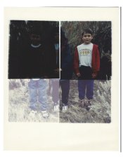
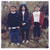
I did two test strip. One it's too green and the other it's too blue.
The blue one has M100 Y150 and the green one has M140 Y120
49ba3b2b-1e3e-4035-aa20-7d906ea6bc3e.jpg
. I did other test but I had cyan and I didn't get good results. What combination can I try to have the correct result?

Thank you so much :heart:
 

pentaxuser

Member
Joined
May 9, 2005
Messages
20,024
Location
Daventry, No
Format
35mm
Flavia, if I may suggest the following: 1. Tell us what make of RA4 paper you are using and 2. Show us test strips using a negative. Correct colour filtration is to there to eliminate colour cast on the print overall and these two pieces of paper cannot tell us anything about what is the correct filtration for your prints

You do not need to use cyan at all Y and M are all that are required for correct colour balance

Thanks

pentaxuser
 

pentaxuser

Member
Joined
May 9, 2005
Messages
20,024
Location
Daventry, No
Format
35mm
Hi,

I'm using fuji crystal archive paper. What do you mean here?
Thanks for the reply. Fuji Crystal paper makes a print that has no colour cast at a different combination of Y and M that does Kodak paper

Try Martin's combination for a negative that you wish to print and then show us the print. My guess is that his suggested filtration will get you close to the correct colours. I think you need to tell us what you already know about how to correct any colour casts you have on a print. It is worth reading about colour printing or getting a book on the subject as well

Unless we know how much you know about RA4 printing we can waste your time telling you what you already know or not telling you things you need to know

pentaxuser
 
OP
OP
Joined
Mar 11, 2020
Messages
42
Location
Rome
Format
Medium Format
Thank you so much to you two guys!

@pentaxuser actually, even if this is an obvious tips, this means a lot to me because I have an hint for starting. My first print was just some days ago so I still have to understand how to get the right combinations.
 

MattKing

Moderator
Moderator
Joined
Apr 24, 2005
Messages
53,277
Location
Delta, BC Canada
Format
Medium Format
I think the OP is using a negative - at least I see what looks like a part of an image.
The density looks reasonably close.
Try to make a test strip with different colour settings at different spots on the same strip.
 

MattKing

Moderator
Moderator
Joined
Apr 24, 2005
Messages
53,277
Location
Delta, BC Canada
Format
Medium Format
As for the test strip, I would suggest starting with Martin's suggestion, and then varying the Magenta and yellow 10 points each way for each step.
Something like the following, with each step occupying a different segment on your strip.
50M 40Y
60M 40Y
70M 40Y
60M 30Y
60M 50Y
Essentially, what you are trying for is a version of a colour "ring-around".
 
OP
OP
Joined
Mar 11, 2020
Messages
42
Location
Rome
Format
Medium Format
As for the test strip, I would suggest starting with Martin's suggestion, and then varying the Magenta and yellow 10 points each way for each step.
Something like the following, with each step occupying a different segment on your strip.
50M 40Y
60M 40Y
70M 40Y
60M 30Y
60M 50Y
Essentially, what you are trying for is a version of a colour "ring-around".

PERFECT!! I'll try this combination for sure ! Thank you so much!
 

gdavis

Member
Joined
Feb 4, 2020
Messages
63
Location
San Diego
Format
Multi Format
Frustrating isn't it. I finished up my box of Fuji Crystal Archive Type C (actually, ruined the last 20 or so sheets forgetting to close the box before turning the lights on :pinch:) which I thought I had fairly well dialed in. Bought a box of Type II and I'm almost half way through it and still haven't figured it out. :cry:

Everything I read basically says "identify the color cast and adjust it out". My adjustments never seem to work out quite like I expect.
 

Vaughn

Subscriber
Joined
Dec 13, 2006
Messages
10,125
Location
Humboldt Co.
Format
Large Format
Once you get close to proper color balance, if those are white plates, it will be easy to tell.
I used mostly Kodak paper and it has been a decade or so, but if you use the same film and the same paper, then you'll be able to start the same filter pack pretty close for every print.
Once your starting filter pack is found, I was taught to make 'test strips'" quite differently than with B&W printing. Pick a good time (10 sec?) and make 4 different exposures of 10 seconds but with different apertures. Color balance will shift if one changes the exposure time significantly...makes burning in skies a drag.

One of my boys, many years ago, 120 Portra VC, RA4 print
 

Attachments

  • BryceSC.jpg
    BryceSC.jpg
    365.1 KB · Views: 111

Sirius Glass

Subscriber
Joined
Jan 18, 2007
Messages
50,411
Location
Southern California
Format
Multi Format
It has been a few years, but papers used to include starting values for Y and M.
 

Vaughn

Subscriber
Joined
Dec 13, 2006
Messages
10,125
Location
Humboldt Co.
Format
Large Format
Those M and Y values on the pkgs were helpful going from emulsion batch to emulsion batch, rather than starting values. But with Kodak Portra VC, Kodak Supra RA4+, Omega D5 color head, my color pack was around 60M-40Y maybe 70M-50Y. around it that range -- depending on your factors, it could be much different.

A couple things I have noticed...I assume it is still the same...do not judge the color until the print is dry (color changes as it dries), and view the dry print under similar display lighting (color temperature) that the print will most like be illuminated with before deciding any changes to your filter pack. Otherwise the color will be off.

I have attached a test print like I described above.
 

Attachments

  • Test.jpg
    Test.jpg
    697.9 KB · Views: 103
  • BoysColumbiaRiver.jpg
    BoysColumbiaRiver.jpg
    407.6 KB · Views: 84
Last edited:

Mr Bill

Member
Joined
Aug 22, 2006
Messages
1,484
Format
Multi Format
Hi, you can start anywhere you like, but personally, I'd say you already HAVE a start. I'd go on from there. For the folks that say to go back to a "standard" starting point, fine. Either way, pick one and then go on from there.

From your test that is too blue, here's how I'd approach it: a rule I've used for color correcting since circa 1970s is, "always do the wrong thing." Ok, since the print is too blue the "wrong thing" seems to be to add even more blue (to the filter pack). But following the rule, it IS what you want to do. So... since you're gonna do all your adjustments using only yellow and magenta filtration you've got to convert from blue to these.

Ok, yellow and blue are "complementary" colors, essentially opposites in photographic color. You know you want to add blue, which you don't have, to the filter pack. But since yellow is the "opposite" of blue, then removing yellow from the films pack is equivalent to adding blue. So... you wanna remove some yellow filtration. How much, I have no idea - this is so far off. But if you make several jumps of 30cc it shouldn't take long to zero in. So from your starting point of: 100M, 150Y, I might pull out 60Y, giving pack = 100M, 90Y. If this overshoots, giving a yellowish print, then you could estimate a correction somewhere between the original 150Y and the test value of 90 Y. If it was not far enough, and the print is still too blue, you could try removing another 30Y from the filter pack. Etc., etc.

Alternatively you could use the green print as a starting point. Using the rule, "always do the wrong thing," you would want to add green to the filter pack. As before, you don't have any green filters to work with. But... green is the complementary color to magenta, which means that adding green is equivalent to removing magenta. For the amount to remove, I dunno, but the green doesn't look as "strong" as the bluish print, so it's probably a smaller correction. I'd probably try pulling one or two sets of 30cc magenta. So instead of 140M, 120Y, I might try going to 110M or 80M with the 120Y.

When you reach the point where another color predominates then you can start working on that color.

I should probably describe how to deal with the third primary color, red. If you have a reddish print, you want to "do the wrong thing," and add red to the filter pack. The complement of red is cyan, so adding red is equivalent to removing cyan. But... traditionally we don't adjust cyan filtration. So, the question is, "is there another way to add red filtration?" The answer is yes, if we add equal amounts of both magenta and yellowish, this is equivalent to adding red filtration.

Now, I'm guessing that you don't have the color relationships memorized. A conventional way to work with them is to sketch three overlapping colors; label them as red, green, and blue. Where red and green overlap label it yellow. Where red and blue overlap, label it magenta. And where green and blue overlap, label it cyan. Once you have this diagram its easy to see which colors are opposite (these are complementary), and the result of combining colors. With this you should be able to work out all the colors. Once you are able to recognize them, that is. Most people, when starting out with this, will identify a magenta color as red, and a cyan color as blue. So keep this in mind if it's hard to fine-tune colors.

Once you get a print dialed in, more or less, then it may be worth making a so-called color ringaround. Basically this is a set of color variations in 6 directions. You'd have both plus and minus red (minus red = cyan), plus and minus green (minus green = magenta), and plus and minus yellow (minus yellow = blue). If you do this ringaround in two or three different color strength levels, this would be very useful in learning how to recognize colors.

Best of luck in your endeavors.
 
Last edited:
Joined
Dec 24, 2016
Messages
390
Location
Asturias, Spain
Format
35mm
I remember seeing, but can't remember where, that Fuji papers require less filtration than Kodak, so my values of 60M 40Y as a starting point may still be a little high. When you achieve the correct colours, That value will be fairly standard for each negative processed under similar conditions as there is little variation nowadays from paper batch to paper batch. Different film types do require different filtration values, however.
As a matter of interest, what RA4 chemistry are you using? I'm guessing from your location that it could be Bellini.
 
Last edited:

koraks

Moderator
Moderator
Joined
Nov 29, 2018
Messages
23,512
Location
Europe
Format
Multi Format
I'd recommend starting with a negative taken in daylight, preferably with clouds in the sky ir an overcast sky, and some range of "natural" colors (eg foliage, rocks, maybe some colorful clothing, skintones). Your average outdoor snapshot of a friend during a hiking trip would be great, to give just one example. Reasons for this approach are:
* natural light means that the light matches what most color negative films are optimized for, so the chances of an easy to print negative are the highest
* clouds and overcast skies, at least in the late morning or early afternoon tend to be fairly neutral grey, giving you a reference point to focus on. Once you get the clouds to print in a natural way, the other colors should fall nicely into place
* man-made objects an artificial lighting (and certainlt the combination of both) can be a bit harder to nail down due to a variety of factors.
* skin tones are often a decent secondary reference point as humans are generally very sensitive to correct rendition of skin tones; probably has a lot to do with how our brains are wired.

Once you get the sample image to print well, keep the filter settings and try a different negative. You'll find that as long as the lighting is still natural, filter settings only need to be changed a little (if at all) to get a decent print.
 
OP
OP
Joined
Mar 11, 2020
Messages
42
Location
Rome
Format
Medium Format
Frustrating isn't it. I finished up my box of Fuji Crystal Archive Type C (actually, ruined the last 20 or so sheets forgetting to close the box before turning the lights on :pinch:) which I thought I had fairly well dialed in. Bought a box of Type II and I'm almost half way through it and still haven't figured it out. :cry:

Everything I read basically says "identify the color cast and adjust it out". My adjustments never seem to work out quite like I expect.
It's very hard... I wonder if exists a method to check color quickly...
 
OP
OP
Joined
Mar 11, 2020
Messages
42
Location
Rome
Format
Medium Format
Once you get close to proper color balance, if those are white plates, it will be easy to tell.
I used mostly Kodak paper and it has been a decade or so, but if you use the same film and the same paper, then you'll be able to start the same filter pack pretty close for every print.
Once your starting filter pack is found, I was taught to make 'test strips'" quite differently than with B&W printing. Pick a good time (10 sec?) and make 4 different exposures of 10 seconds but with different apertures. Color balance will shift if one changes the exposure time significantly...makes burning in skies a drag.

One of my boys, many years ago, 120 Portra VC, RA4 print


I use fuji paper because in Italy it's easier to find it but I really want to try the Kodak paper. I saw that some shops in USA sell Kodak Paper in roll.. how do you cut it accurately in complete darkness:wondering:?
 
OP
OP
Joined
Mar 11, 2020
Messages
42
Location
Rome
Format
Medium Format
I'd recommend starting with a negative taken in daylight, preferably with clouds in the sky ir an overcast sky, and some range of "natural" colors (eg foliage, rocks, maybe some colorful clothing, skintones). Your average outdoor snapshot of a friend during a hiking trip would be great, to give just one example. Reasons for this approach are:
* natural light means that the light matches what most color negative films are optimized for, so the chances of an easy to print negative are the highest
* clouds and overcast skies, at least in the late morning or early afternoon tend to be fairly neutral grey, giving you a reference point to focus on. Once you get the clouds to print in a natural way, the other colors should fall nicely into place
* man-made objects an artificial lighting (and certainlt the combination of both) can be a bit harder to nail down due to a variety of factors.
* skin tones are often a decent secondary reference point as humans are generally very sensitive to correct rendition of skin tones; probably has a lot to do with how our brains are wired.

Once you get the sample image to print well, keep the filter settings and try a different negative. You'll find that as long as the lighting is still natural, filter settings only need to be changed a little (if at all) to get a decent print.
Perfect, I'll try to print one of the pic of the same film roll that seems have natural light and colors.
 
Joined
Dec 24, 2016
Messages
390
Location
Asturias, Spain
Format
35mm
It's very hard... I wonder if exists a method to check color quickly...
Kodak, in the past produced a publication about home printing in colour. I have the Spanish edition, "Tecnicas de Positivado en Color", which is full of useful hints. They also had a set of colour viewing filters through which you could view the finished print to see what the correction should be (they were listed as "Kodak Publication R-25").https://www.amazon.es/KODAK-Color-Print-Viewing-Filter/dp/0879857919
By the way,, I also use a Meopta Opemus with the colour head.:wink:

Edit.https://camera-house.co.uk/product/kodak-color-print-viewing-filter-kit.html
 
Last edited:
OP
OP
Joined
Mar 11, 2020
Messages
42
Location
Rome
Format
Medium Format
Kodak, in the past produced a publication about home printing in colour. I have the Spanish edition, "Tecnicas de Positivado en Color", which is full of useful hints. They also had a set of colour viewing filters through which you could view the finished print to see what the correction should be (they were listed as "Kodak Publication R-25").https://www.amazon.es/KODAK-Color-Print-Viewing-Filter/dp/0879857919
By the way,, I also use a Meopta Opemus with the colour head.:wink:

Edit.https://camera-house.co.uk/product/kodak-color-print-viewing-filter-kit.html
I really want to buy those filters but it seems hard to fin them in italy :cry: I tried to check on ebay and a lot of people don't ship here. Only one seller ship here but a kit would cost me like the enlarger LOL
 
OP
OP
Joined
Mar 11, 2020
Messages
42
Location
Rome
Format
Medium Format
Hi, you can start anywhere you like, but personally, I'd say you already HAVE a start. I'd go on from there. For the folks that say to go back to a "standard" starting point, fine. Either way, pick one and then go on from there.

From your test that is too blue, here's how I'd approach it: a rule I've used for color correcting since circa 1970s is, "always do the wrong thing." Ok, since the print is too blue the "wrong thing" seems to be to add even more blue (to the filter pack). But following the rule, it IS what you want to do. So... since you're gonna do all your adjustments using only yellow and magenta filtration you've got to convert from blue to these.

Ok, yellow and blue are "complementary" colors, essentially opposites in photographic color. You know you want to add blue, which you don't have, to the filter pack. But since yellow is the "opposite" of blue, then removing yellow from the films pack is equivalent to adding blue. So... you wanna remove some yellow filtration. How much, I have no idea - this is so far off. But if you make several jumps of 30cc it shouldn't take long to zero in. So from your starting point of: 100M, 150Y, I might pull out 60Y, giving pack = 100M, 90Y. If this overshoots, giving a yellowish print, then you could estimate a correction somewhere between the original 150Y and the test value of 90 Y. If it was not far enough, and the print is still too blue, you could try removing another 30Y from the filter pack. Etc., etc.

Alternatively you could use the green print as a starting point. Using the rule, "always do the wrong thing," you would want to add green to the filter pack. As before, you don't have any green filters to work with. But... green is the complementary color to magenta, which means that adding green is equivalent to removing magenta. For the amount to remove, I dunno, but the green doesn't look as "strong" as the bluish print, so it's probably a smaller correction. I'd probably try pulling one or two sets of 30cc magenta. So instead of 140M, 120Y, I might try going to 110M or 80M with the 120Y.

When you reach the point where another color predominates then you can start working on that color.

I should probably describe how to deal with the third primary color, red. If you have a reddish print, you want to "do the wrong thing," and add red to the filter pack. The complement of red is cyan, so adding red is equivalent to removing cyan. But... traditionally we don't adjust cyan filtration. So, the question is, "is there another way to add red filtration?" The answer is yes, if we add equal amounts of both magenta and yellowish, this is equivalent to adding red filtration.

Now, I'm guessing that you don't have the color relationships memorized. A conventional way to work with them is to sketch three overlapping colors; label them as red, green, and blue. Where red and green overlap label it yellow. Where red and blue overlap, label it magenta. And where green and blue overlap, label it cyan. Once you have this diagram its easy to see which colors are opposite (these are complementary), and the result of combining colors. With this you should be able to work out all the colors. Once you are able to recognize them, that is. Most people, when starting out with this, will identify a magenta color as red, and a cyan color as blue. So keep this in mind if it's hard to fine-tune colors.

Once you get a print dialed in, more or less, then it may be worth making a so-called color ringaround. Basically this is a set of color variations in 6 directions. You'd have both plus and minus red (minus red = cyan), plus and minus green (minus green = magenta), and plus and minus yellow (minus yellow = blue). If you do this ringaround in two or three different color strength levels, this would be very useful in learning how to recognize colors.

Best of luck in your endeavors.
I was actually trying to do like you said but I was a bit confused by add or substract colors and I had to ask a sort of opinion to figure out the correct combination. Anyway I'll try your suggest too. Thank you !!
 
Photrio.com contains affiliate links to products. We may receive a commission for purchases made through these links.
To read our full affiliate disclosure statement please click Here.

PHOTRIO PARTNERS EQUALLY FUNDING OUR COMMUNITY:


Ilford ADOX Freestyle Photographic Stearman Press Weldon Color Lab Blue Moon Camera & Machine
Top Bottom