Brian Stater
Member
Hello Photrio
You have helped me a lot in the past and I hope you won’t mind me picking your brains again….
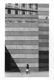
I have attached two prints of the same image. The first is the work of a darkroom professional, the second is my attempt to match his quality and detail. And I need help to improve it!
Here’s the story: I used HP5 Plus film in an Olympus OM2N SLR camera.
I took the neg along to a top-class darkroom in London and Nick, their printer, did a wonderful job, especially in bringing out the detail of the frieze in the upper section of the picture.
I have a small darkroom at home and have tried to replicate his print.
I am happy with the tone and texture of the stonework, but I cannot get the figures in the frieze, or the pedestrian and his bag, quite as sharp as I’d like.
I am printing on Ilford MGFB Classic paper, with a glossy finish, the same as Nick.
Nick told me that he used split grade printing, with filters 1.5 and 5, so I have done the same. I tried various combinations but the most successful (shown here) was 9 secs at f11 for the 1.5, plus 6 secs at f11 with the 5 filter.
I have burnt in the lower section (pavement and pedestrian below the waist) at 4 secs, f11, grade 2.5, then an additional 5 secs, f8, grade 2.5 for the triangular void on the left.
My print was developed for 60 secs, though I have used shorter and longer times too.
My enlarger is fairly basic — a Kaiser VP350 System V — with below the lens filters.
I am focussing with an old EPL Focus Scope.
Does anyone have any suggestions, please? I feel I’m about 90 per cent there in matching Nick’s effort, but need your help over the final hurdle…
Many thanks
Brian
You have helped me a lot in the past and I hope you won’t mind me picking your brains again….
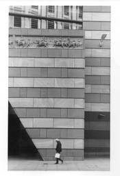
I have attached two prints of the same image. The first is the work of a darkroom professional, the second is my attempt to match his quality and detail. And I need help to improve it!
Here’s the story: I used HP5 Plus film in an Olympus OM2N SLR camera.
I took the neg along to a top-class darkroom in London and Nick, their printer, did a wonderful job, especially in bringing out the detail of the frieze in the upper section of the picture.
I have a small darkroom at home and have tried to replicate his print.
I am happy with the tone and texture of the stonework, but I cannot get the figures in the frieze, or the pedestrian and his bag, quite as sharp as I’d like.
I am printing on Ilford MGFB Classic paper, with a glossy finish, the same as Nick.
Nick told me that he used split grade printing, with filters 1.5 and 5, so I have done the same. I tried various combinations but the most successful (shown here) was 9 secs at f11 for the 1.5, plus 6 secs at f11 with the 5 filter.
I have burnt in the lower section (pavement and pedestrian below the waist) at 4 secs, f11, grade 2.5, then an additional 5 secs, f8, grade 2.5 for the triangular void on the left.
My print was developed for 60 secs, though I have used shorter and longer times too.
My enlarger is fairly basic — a Kaiser VP350 System V — with below the lens filters.
I am focussing with an old EPL Focus Scope.
Does anyone have any suggestions, please? I feel I’m about 90 per cent there in matching Nick’s effort, but need your help over the final hurdle…
Many thanks
Brian