• Welcome to Photrio!
    Registration is fast and free. Join today to unlock search, see fewer ads, and access all forum features.
    Click here to sign up

Help with PVA chiba over cyanotype

Recent Classifieds

Forum statistics

Threads
202,092
Messages
2,835,003
Members
101,111
Latest member
gil9002
Recent bookmarks
0

imgprojts

Member
Allowing Ads
Joined
May 24, 2024
Messages
186
Location
Seattle WA
Format
Multi Format
Has anyone noticed how the cyanotype layer is still active or photosensitive after the cyanotype is made?

Maybe thats not the question, im sure its noticeable, that's why people recommend the print to be stored in a dark room to recover it. Or maybe I misread that.

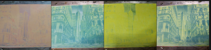
After watching some Analogue Andy videos on gum over cyanotype I thought to give it a try with PVA chiba. It works but has a weird side effect and I don't know to to expand the dynamic range. Each time you expose the new layer over the cyanotype, the cyanotype layer bleaches out and then comes back during development. Its both neat and annoying. But I didn't see that happening with Andy's gum prints. The dynamic range is too small using mica powder as pigment. I use mica because its what I have but also it florecess under UV for easy manual registration.

You can see the images below starting right to left after I applied the yellow layer, exposed it, then applied magenta and exposed that. I got very little to zero experience. I'm trying the calibrate the process at the same time. At this particular size and full aperture a square grid of linearly increasing gray shades produces a generally solid yellow that only shows shades from 0 to square 25. I'll post those images tomorrow.

Questions: what, why? do I add more pigment to block the light? Less pigment to increase dynamic range? Do I close down the aperture to reduce exposure? Decrease exposure time? Increase sensitizer amount to prevent light passing layers?

As a reference, the light source is a projected image at 850nm that can take Mike Ware's New Cyanotype to prussian white in 5 minutes with added citric acid, 15 minutes without.

I need to stick to making grid exposures until I can figureout how to extend the dynamic range. Once this system can make an acceptable image, I want to summarize it.
 

Attachments

  • Screenshot_20260115-083432.png
    Screenshot_20260115-083432.png
    590.9 KB · Views: 21

koraks

Moderator
Moderator
Joined
Nov 29, 2018
Messages
27,326
Location
Europe
Format
Multi Format
I'm not sure if your question is about the cyanotype image or the pigment-in-PVA layers that you're placing on top. I assume you're trying to solve the pigment part, right? What happens if you test that part separately; do you get better contrast?

At this particular size and full aperture a square grid of linearly increasing gray shades produces a generally solid yellow that only shows shades from 0 to square 25.
I don't know what kind of test chart you're using; it might help to see an example.

Generally with pigment processes: more pigment = higher density = higher contrast, but evidently exposure does something, too. Then there's the issue of potential self-masking depending on the sensitizer you use. In your case that would be ferric ammonium citrate (FAC), yes?

Must be a typo; 350nm? Or 450nm? Neither sounds very plausible; IIRC you're working at 385nm, yes?
 
OP
OP

imgprojts

Member
Allowing Ads
Joined
May 24, 2024
Messages
186
Location
Seattle WA
Format
Multi Format
Oops on the wavelength, my dislexia. Its 385nm. I am using Ferric Ammomium oxalate, but I have Ferric Ammonium Citrate available to try/experiment with. I'm going to try a different pigment, I ordered Magenta (Quinacridone rose 266) and Lemon Yellow from "Van Gogh Watercolor Paint". I'll post the chart when I get home.
 

koraks

Moderator
Moderator
Joined
Nov 29, 2018
Messages
27,326
Location
Europe
Format
Multi Format
Magenta (Quinacridone rose 266) and Lemon Yellow from "Van Gogh Watercolor Paint"
The quinacridone pigments are popular, and with reason; they generally work well. For magenta (when I use it, which is rare) I generally also use a quinacridone; PR122.
For yellow, the popular choice at this point I think are the benizimidazolones; e.g. benzimidazolone yellow medium PY154. I think these are also used in some of the Van Gogh (=Talens IIRC) paints.

(If those pigment names don't trigger your dyslexia, I don't know what will, LOL!)
 

FotoD

Member
Joined
Dec 15, 2020
Messages
434
Location
EU
Format
Analog
Each time you expose the new layer over the cyanotype, the cyanotype layer bleaches out and then comes back during development. Its both neat and annoying.

Do you mean it looks like the right image after exposure, and like the left image after developing it?

SmartSelect_20260115_202700_Firefox.jpg


That's the way it looks when I use fish glue. The pigment layer becomes opaque with exposure and hides what's below until developed / cleared.

Maybe that's what's happening with your process too?

Sorry if I misunderstood your question.
 
OP
OP

imgprojts

Member
Allowing Ads
Joined
May 24, 2024
Messages
186
Location
Seattle WA
Format
Multi Format
Do you mean it looks like the right image after exposure, and like the left image after developing it?

View attachment 415800

That's the way it looks when I use fish glue. The pigment layer becomes opaque with exposure and hides what's below until developed / cleared.

Maybe that's what's happening with your process too?

Sorry if I misunderstood your question.

Yes you understood it exactly. But I was 100% sure that at least in my situation, the uv is driving the cyanotype to prussian white and then returning. This is because it has the same reaction to hydrogen peroxide spray (thats how I apply it because im cheap) as overexposed cyanotype.

But maybe it reacts to hydrogen peroxide but only because the oxalate was reduced to ferrous from ferric and that does something to the coating? I think I can test for this by scraping away an exposed image to look for the blue pigment underneath. But this is good to know, it happens too using fish glue!
 

FotoD

Member
Joined
Dec 15, 2020
Messages
434
Location
EU
Format
Analog
Ok!

I will check next time I print with fish glue over cyanotype. Maybe there is some bleaching / redeveloping going on there too.

Let us know what you you figure out.
 
OP
OP

imgprojts

Member
Allowing Ads
Joined
May 24, 2024
Messages
186
Location
Seattle WA
Format
Multi Format
OK here is the grid I am using. I made this from a python script attached here.
numbered_grid_with_gaps.png
 

Attachments

  • numbered_grid_maker.zip
    1.3 KB · Views: 21
OP
OP

imgprojts

Member
Allowing Ads
Joined
May 24, 2024
Messages
186
Location
Seattle WA
Format
Multi Format
Here is the first grid I made in yellow:
1768539021451.png

Which when viewed with a UV blue filter looks like below. I literally just learned this on purpose a few minutes ago. Not just any filter, ZWB2. In person it makes the yellow color look almost black.

1768539149359.png
 
OP
OP

imgprojts

Member
Allowing Ads
Joined
May 24, 2024
Messages
186
Location
Seattle WA
Format
Multi Format
I made some notes on these:
1768539513472.png

1768539592099.png

It feel like the time variable has done the most change. I just got a tiny scale today to be able to measure my proportions more accurately. I hope to run more experiments like this to understand the system better. I also received the yellow pigment to try.
 
OP
OP

imgprojts

Member
Allowing Ads
Joined
May 24, 2024
Messages
186
Location
Seattle WA
Format
Multi Format
alright, point #4 for Lemon yellow using the blue filter with the new pigment. it certainly seems to have better sharpness:
1768543933025.png

1768544000640.png

Since this pigment is not fluorescent it looks a little dimmer int he photo but this time I can read all the numbers up to 99 which is a big improvement. I've reduced the exposure and the sensitizer. I also used a scale with sensitivity 0.001g to measure all the values. unfortunately the dynamic range is still very low/unchanged.
 

koraks

Moderator
Moderator
Joined
Nov 29, 2018
Messages
27,326
Location
Europe
Format
Multi Format
Okay, so what I'm seeing on the test charts is two things:

1: There's inherent unevenness either due to coating differences, or differences in luminous flux across the surface - assuming this is not just in the "UV view" of the print but also in the actual pigment densities. I think it might be the latter. Note e.g. how in the most recent test square 29 is a lot darker than 30. So you have a gradient going on. Whatever is the cause, this needs to be resolved before you can proceed.

2: As you said, exposure time seems to account for most of the shift, but the density range is limited. What I can't tell from these examples is whether you have paper white on square 0. Assuming you have, I can't really tell at what square the first tone becomes visible/measurable. Either way, it's evident that the contrast range of the medium is smaller than the contrast range of the exposure. Not too odd; it would have been an enormous coincidence if your exposure system (with the DLP and all that) would give the exact exposure range to fit this particular printing medium. So what you'll need to do is adjust the exposure range to fit the printing medium. I.e. you'll have to work on some kind of calibration. In doing so, you'll also want to linearize the results as it's currently unlikely that even within the limited contrast range, the progression is neatly linear.

Btw, in the chart design, it doesn't help that the square that gives you the density also creates a big number that makes measurements/evaluations difficult. I'd instead put the numbers along the sides or something; you don't need a number in each square; just 0, 10, 20 etc. along the vertical axis.

At this point you're facing a linearization challenge that comes with any hybrid / digital exposure system. There are plenty of guides about this; I would suggest taking note of them to avoid re-inventing the wheel all over again. Look for procedures like Easy Digital Negatives, Precision Digital Negatives or Calvin Grier's Calibration e-Book series.
 
OP
OP

imgprojts

Member
Allowing Ads
Joined
May 24, 2024
Messages
186
Location
Seattle WA
Format
Multi Format
Thanks Koraks. I see the uneven illumination and I think I understand what I need to do with the chart and maybe hopefully the images to stretch out the dynamic range.
 
OP
OP

imgprojts

Member
Allowing Ads
Joined
May 24, 2024
Messages
186
Location
Seattle WA
Format
Multi Format
So I went looking for knowledge on step wedges and curves. I still haven't grasped the concept. I'm a old dog, but working hard on learning this new thing. I found about Stouffer step wedges and I tried those before learning that her is more behind the scenes.
So I wrote a python program to print me a stouffer wedge from this equation:
1769318368321.png

These are resulting steps at 4minutes, 8, 16 and 64. 64minutes is hard to see but follows the same pattern, every doubling I get the previous shade 1 box over to the right.
1769319102955.png

1769319156813.png

I was sort of bummed that this process might not be good enough, but then I started seeing other people's results in gum and it appeared at least similar in range. Katheryn Thayer's website was really helpful too:
https://katharinethayer.com/html/Contrast.html from her I gather than the gum will react the same with each color, so light colors vs dark colors may not matter as much as the sensitizer and exposure.
this other post helped me a long too because it shows that gum can also be a pain when you're a beginner, yet somehow people keep using it: https://www.photrio.com/forum/threads/gum-bichromate-problem-no-midtones-too-contrasty.36561/

I'm currently trying to learn something from this post https://www.photrio.com/forum/threa...-interesting-things-ive-been-learning.193908/ anything that sticks really. But I did loose patience and decided to just try a few things my self. First off, can I clear to paper white. I invented a new subbing combo for this. It works. Night and day. Equal parts: 2g 2%CMC+2g 5%PVA + tiny barely measurable 0.05g citric 0.1boric acids +4ml tap water. this combination doesn't turn into gel immediately, its a fully clear and UV transparent layer that I apply to the paper before the first color layer. In the image below you can see some of the simple washer shadowgrams, the first image on the left has had most except the bottom coated in this. You can see a gray stain towards the bottom from india ink, the rest is clear white. You can also see that I exposed another layer on top of the first layer and it still cleared to paper white. On the right you can see a double layer without the clear coat and it has stained the paper. on the center I was just trying to see how the dark colors did add to a darker image. There is much that can be done with this.
1769319928262.png

I did attempt an image after getting some values from the stouffer strips and I decided that 4 minutes was the correct time because step 1 and 2 were already Dmax. Then I just looked at the original for the shades it used to create the Dmax and the last discernible shade. Developing this takes only a couple of minutes. I don't understand how the dichromate process takes up to 20 minutes to clear, but I'm just beginning so I suppose there is much that I don't know about yet.


1769320564999.png

This was really cool to me when it cleared. I can see more than 1 shade of gray, lots of detail. Enough for a newsprint I think. One from the 1920's. I kept trying to clear the 3 lines at the top. why won't these things wash away!! dam!
This is why! Ubuntu you silly dog! don't you do this to me again!
1769320781415.png

That's really tiny text and I worked hard to get rid of it, but you can still read it. Its 0.94mm tall!

I really want to do some more 3 color prints, but I need a way to register the print without twisting my back. I've been lasy and my projector is still just parts taped together over a piece of wood. I would love to get it back to vertical, but I realize that it has to be horizontal if I want to get images enlarged. I've been playing around with taping the paper to a plastic sheet that has register holes, but the paper gets loose after a couple of washings. I may just replace the tape with paper clips that can survive the washing process.
 

koraks

Moderator
Moderator
Joined
Nov 29, 2018
Messages
27,326
Location
Europe
Format
Multi Format
This is why! Ubuntu you silly dog! don't you do this to me again!
LOL!

I was sort of bummed that this process might not be good enough, but then I started seeing other people's results in gum and it appeared at least similar in range.
Yeah; squinting at your DIY step tablets suggests you have about 6 steps of tonal range, so 0.9logD or 3 stops.
I've not done a lot of gum printing, but the little I did followed the usual pattern of putting several layers on top of each other so that each layer would cover a part of the full tonal scale of the image. So you'd have a layer for highlights, midtones, shadows and maybe some intermediate ones. This is often leveraged to artistic effect by using different colors for the layers.

The testing you've done to get good clearing of the whites is essential in creating the conditions to make the process work esp. when using several layers on top of each other.

So far your progress is quite nicely in line with what's documented about direct pigment processes; evidently your mode of learning is highly experiential and involves doing experiments and then experiencing hands-on what's going on, combined with reflection to make sense of your observations. That's great; have fun!
 
OP
OP

imgprojts

Member
Allowing Ads
Joined
May 24, 2024
Messages
186
Location
Seattle WA
Format
Multi Format
CYM both sides. I'm missing the K layer which I am going to do in a few minutes once the cyanotype dries. Changing to just water color definitely improved things. I spent a good amount of time trying to get usable color separations from gimp. I don't understand how the RGB to CYMK translation works so I can't comment but the latest gimp did not give the same result as other versions. I tried a python script using PIL which gave OK results, then I found Krita can do CYMK natively so I jumped on that one. Immediately I could tell the results were going to be printable. the software is great. It seems like a really steep hill to learn color theory. Anyway, I think this Chiba PVA process is actually not too bad. The Cyanotype layer seems to carry most of the details, but I did inspect each layer carefully using various color filters and indeed the details are in every layer. I used a piece of plastic to carry the paper thru the exposure and washing steps so that I could have good registration. my little kid just came into the room and commented "that looks way better!" I think it does. The transparent layers thing do make the image much less foggy. I'm going to adjust my cyanotype layer by half cyanotype formula and try again on something different. The old print seems more sharp but thats only because I sharpened the image before the separations.

I like how the gray on the room and the red brick chimney are more visible. This lens is an adapted monster projector lens that gives horrible color fringing in the background, which I love about it.
1769888167835.png
 
OP
OP

imgprojts

Member
Allowing Ads
Joined
May 24, 2024
Messages
186
Location
Seattle WA
Format
Multi Format
welp, that was working. I only used a clear CMC/PVA coat on the baseline paper. The black layer muddied the paperwhite to a horrible mess. I should have added a clear layer because I guessed that would happen. Now I know. Maybe I will start first layer black, then yellow, then magenta and finally cyanotype to get all the detail.
 

koraks

Moderator
Moderator
Joined
Nov 29, 2018
Messages
27,326
Location
Europe
Format
Multi Format
Usually yellow will be the least transparent pigment, so you'd put that first and the rest on top of it. But cyanotype is also only moderately transparent, so from that viewpoint, it should go somewhere near the bottom as well. But it does depend on the specific pigments used and also how much staining you get in each layer.

The idea of a clear coat/interlayer does work indeed; Calvin Grier finds it essential in getting a large color space in e.g. gum printing.
 
Photrio.com contains affiliate links to products. We may receive a commission for purchases made through these links.
To read our full affiliate disclosure statement please click Here.

PHOTRIO PARTNERS EQUALLY FUNDING OUR COMMUNITY:


Ilford ADOX Freestyle Photographic Stearman Press Weldon Color Lab Blue Moon Camera & Machine
Top Bottom