2. I think you may be overestimating the filtration effect in Adams prints relative to the controls he applied in printing. In most of the cases you are likely thinking of, a straight print of the negative would shock you. Adams did a lot of burning work on his skies, particularly in his later printings (which are the versions people are most familiar with). A quick example would be his famous Mt. McKinley/Wonder Lake. In fact on the negative the sky is virtually the same tone as the mountain. He carefully applied a lot of burning to the sky, also using a card in the shape of the mountain, with a deep "sawtooth" edge. There are lots of other examples.
Yes, Adams' printing is the key. If you see the original negative of Moonrise (was in a video on Youtube) the sky is actually a mid grey.
Far better than a red filter, in my opinion, is to use a Minus Blue (Wratten 12) filter. Adams used this filter a lot and, when I used to do nature landscapes where I wanted dark skies, this was my number one choice giving dark skies with good mid-tone separation.
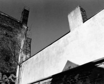
For the urban landscapes that I now do, I prefer the skies to be a good strong mid grey. This I achieve with no filtration at all. I use Delta 400 in a two-bath developer and I get the skies I want with no need to burn them in. During my most recent exhibition, a number of visitors enquired what filter I used and were visibly shocked when I replied "none".
Here is an example of the effect that I get (straight print):

I would suggest using the Minus Blue filter and processing in a two-bath developer. You should then get strong skies which you can, a la Adams, then burn-in further.
Bests,
David
www.dsallen.de


