Colors

Recent Classifieds

Forum statistics

Threads
198,508
Messages
2,776,357
Members
99,636
Latest member
Johan Siggesson
Recent bookmarks
1

nickandre

Member
Joined
Oct 22, 2007
Messages
1,918
Location
Seattle WA
Format
Medium Format
So, I had an idea. I've been hunting for a way to figure out which film gives me which colors. I'm debating doing a test to compare the colors which different films give. I would shoot a bunch of different films, print them, and then post the results as to which gave the which colors when shooting a standard scene and probably compare it to a digital image which I'll try to get as close to reality as I can. This would settle which films gave the "best" colors.

Negative films:
Fuji Superia 100 and 400
Fuji Reala 100/Kodak Gold 100
Fuji 160S and C/Kodak 160NC and VC
Kodak Ektar 100/my roll of 100 UC

Slides:
Velvia/E100VS
Sensia or Astia
E100G
Kodachrome

First off, has a test like this already been done?

If not, would people be interested in seeing this? Should I scrap all this and just continue taking pictures? I guess the reason I'm doing this is because I have started shooting Ektar because I liked the colors it gave me. I found that my prints from Reala were somewhat dull and grainy, and my pictures from Ektar are sharp and colorful up to 11x14. This would be to make sure I wasn't getting ripped off.

I could also compare Kodak to Fuji. I've heard talk but never seen direct comparisons.

Any thoughts or comments?
 

E76

Member
Joined
Mar 20, 2008
Messages
401
Location
Baltimore, MD
Format
Medium Format
Having searched and found nothing like you propose, it sounds like a great idea. My only concern concerning the digitized images is accuracy. If your entire workflow (from scanning to display) is not calibrated it won't be worth much.
 

mts

Member
Joined
Feb 12, 2004
Messages
372
Location
Los Alamos,
Format
Multi Format
Forget the digital comparison. Digital signal processing and white balance settings affect color balance and don't render proper fidelity for a comparison. Shoot the MacBeth color checker chart and then compare your films to the original chart. These charts are made with pigment paints and are extremely uniform and represent a better standard. You will find each film renders it slightly differently and also that films that seem to render color accurately may not yield the best skin tones, etc.

Yes, the comparison has been done many times. The market and personal preference determines the "best" color films. You pays your money and takes your choice.
 

kevs

Member
Joined
Aug 21, 2006
Messages
711
Location
North of Pangolin
Format
Multi Format
In the past, photo magazines like Amateurish Photography ran exhaustive film tests to check grain, colour rendering, sharpness etc. Whether they still bother I'm unsure. Personally, I wouldn't bother. If you're going to do this anyway, you'll need a standard colour chart, a model for skin tones, some way of checking resolution and lots of time, patience and money. Oh, and don't forget the sturdy tripod, and to lock up the mirror (if using an SLR) before exposure. :smile:
 

Mark Antony

Member
Joined
Mar 27, 2007
Messages
789
Location
East Anglia,
Format
Multi Format
Which films give the 'best' colours?
What you are proposing is very difficult, you'll need a colour test chart like the Kodak/Macbeth charts. In the frame include subjects that represent the sort of things you photograph skin tones, neutral grey card possibly some organic material like flowers, printed material, some people use spirit bottles and a metallic object like an old Leica IIIc :smile:.
You've seen the stuff people put in these frames.
But most important of all is your light source should be constant colour temp in a studio with warmed up light and you'll probably need a colour meter.
Both Kodak and Fuji used to supply 'ladies' as we'd call them for our lab to use. They would have skin tone normally Caucasian and a neutral B/G sometimes she'd have a grey card and if I remember a flowery or bright dress. Mini-labs could buy sets of these on different emulsions to set up their printers they would have over/normal/under frames to set up the 'slopes' and a 'bulls eye' grey patch that you'd put under a densitometer and measure 180 RGB as the target correcting the channels.
I used to spend Sunday afternoons setting up our Noritsu 1202v thank heavens when Agfa bought out their MSC- no more channels.

My advice is to shoot a colour chart at the start of each roll in the type of light you normally shoot in, choose the film that gives you the best colours for your subject- that film choice will change depending on the subject.
Here is Fuji Astia:
102731443.jpg

Mark
 

Ektagraphic

Member
Joined
Feb 3, 2009
Messages
2,927
Location
Southeastern
Format
Medium Format
Why don't you use some E200 or E100GX too.....
 

markbarendt

Member
Joined
May 18, 2008
Messages
9,422
Location
Beaverton, OR
Format
Multi Format
This would settle which films gave the "best" colors.

This would only be true for you.

I have started shooting Ektar because I liked the colors it gave me.

And you prove why.

--------

Choosing the "right" or "best" pallet and texture are purely subjective decisions. I actually really like Superia xtra 1600.

The best you could hope for is to make comparitive observations about characteristics. i.e. X is grainier than Y but more saturated.

I'd say shoot what you like and don't worry about the test.
 
OP
OP
nickandre

nickandre

Member
Joined
Oct 22, 2007
Messages
1,918
Location
Seattle WA
Format
Medium Format
That's the thing. At the end of this I'll probably be left with tons of data and I may or may not change my film. If I like ektar there's no reason for me to change. I wouldn't be testing resolution, I just care about colors. After all, this is color photography.
 

Ed Sukach

Member
Joined
Nov 27, 2002
Messages
4,517
Location
Ipswich, Mas
Format
Medium Format
Which films ...
My advice is to shoot a colour chart at the start of each roll in the type of light you normally shoot in, choose the film that gives you the best colours for your subject- that film choice will change depending on the subject.
Here is Fuji Astia:
102731443.jpg

Mark

**Interesting** ...

I haven't seen a "Colour Chart #13" before - What Is this, and where can I obtain one?
 

Photo Engineer

Subscriber
Joined
Apr 19, 2005
Messages
29,018
Location
Rochester, NY
Format
Multi Format
There are two things to be aware of:

1. In blind tests, with no true comparison such as the "real chart", people preferred the more brilliant colors regardless of how inaccurate they were. If a neutral scale was there, and was neutral, it fooled them into accepting more variation than if one was not present. In some cases, they accepted off color neutrals even though the scale was colored as long as the colors were pleasing. So, in the above color chart there is no stepped neutral, just one gray patch so to speak. It can fall into this category.

2. High contrast of films is often mistaken for good color. A low contrast film may appear dull, but have more accurate color.

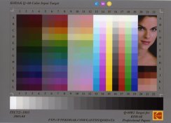
So, what do you want? Accurate color, accurate tone reproduction, both, neither or what? There are Kodak and Macbeth color charts that are better than the above and that incorporate more color patches.

I have posted the Color Checker and a Kodak chart before but here is one of the more advanced Kodak charts.

PE
 

Attachments

  • kodak q-60 color chart.jpg
    kodak q-60 color chart.jpg
    54.9 KB · Views: 540

Sirius Glass

Subscriber
Joined
Jan 18, 2007
Messages
50,321
Location
Southern California
Format
Multi Format
I would like to see the range of color for each film posted on the color gamut chart.

Steve
 

Sirius Glass

Subscriber
Joined
Jan 18, 2007
Messages
50,321
Location
Southern California
Format
Multi Format
I have seen each film plotted against the Musell chart and the CIE chart. It is quite revealing.

PE

PE,

If you know of any publications on present day films, I would like to know the source(s) if you can remember.

Steve
 

Photo Engineer

Subscriber
Joined
Apr 19, 2005
Messages
29,018
Location
Rochester, NY
Format
Multi Format
Steve;

Unfortunately, there are none that I know of. These were considered highly confidential by each and every company and naturally, I have none at all in my posession. I do have some remaining sheets of the CIE chart paper we used. Thats about it.

PE
 

StorminMatt

Member
Joined
Nov 19, 2008
Messages
257
Format
35mm
I think that what needs to be remembered is that 'best colors' is hardly an absolute here. Both the subject and personal preference are HUGE factors here. When it all comes down, photography is a little like music. You can argue with someone all day and all night about how, say, Beethoven is MUCH more technically astute music than the Village People (or even try to convince that person that the Village People is NOT music). But if the Village People is what gets someone excited and makes them happy, virtuoso musicianship means NOTHING. The same goes for color charts and any other techical data about film.
 

Photo Engineer

Subscriber
Joined
Apr 19, 2005
Messages
29,018
Location
Rochester, NY
Format
Multi Format
Matt;

I can agree and disagree with you on this. In music, a discordant set of notes or atypical beat can be accepted. How about you seeing pictures with reddish or yellowish tinted flesh tones. How about a green sky. As it turns out, there is a very set limit as to how much "error" in color photos can be accepted. Generally it is not on the hue axis but rather on the saturation axis that error is accepted and even preferred.

So, a greenish sky is a no-no in normal practice, but a light blue sky is not as acceptable in most cases when compared to a deep blue sky. People complain that the sky in the light blue case is washed out and the greenish sky is off-color.

Music (sound) and vision are quite different in the range of tolerance accepted.

PE
 

2F/2F

Member
Joined
Apr 29, 2008
Messages
8,031
Location
Los Angeles,
Format
Multi Format
In my first photography class, we did just this using all available 35mm E-6 films. The instructor put out a list of films, and had us each sign up to use a different film. We brought the film and our cameras into the next class and loaded them up. She put a MacBeth chart and a Kodak gray card into a daylight-balanced product shooting booth (Orbiculight). We each put our cameras onto the tripod and shot a bracketed sequence around the grey card exposure. She picked the best exposure from each film, made slides out of them, labeled them, then put them all into a picture frame with glass on both sides for use on an overhead projector.

The last time I visited her, she still had the frame, though the school no longer lets her teach on transparency film. Beginning classes are all b/w there now. Beginning photo is a req'd course for all art/design majors at the school (as are drawing, art history, 2D design, and 3D design). After the beginning photo course, most art students skip straight to the digital photography and software classes, while the students who are specifically majoring in photo go on to the more specific photo classes using film (though digital is now being allowed into advanced photo classes via petition - students must have taken beginning digital photo and beginning electronic darkroom, use at least an 8 Mpix camera with manual controls, and give a good reason for using digital instead of film).

IMO, every color photographer should do a similar test for his- or herself. That way, you are not relying on manufacturers' descriptions of films, or on what some stranger on the Internet says about a film. I have done this for myself with all 4x5 Kodak and Fuji negative films, though I did it in sunlight diffused with a white sheet. However, you have to print to do it with neg film, so the enlarging paper used makes a difference as well, as does your ability to print that grey card perfectly neutrally. I loved the range offered by Kodak Portra, Supra, and Ultra papers way better than the range offered by Fuji Type P and Type C. However, Kodak has seen it fit to get rid of all of these great options for control in printing, leaving us only with Supra.
 
Last edited by a moderator:

rossawilson1

Member
Joined
Oct 16, 2008
Messages
154
Location
salisbury, U
Format
Multi Format
I just went from Fuji 160C to Reala as my main film. I thought there would be some difference but the change is quite dramatic. Though charts would be useful, I think you'd need some skin tone in there too, also if possible a fake plant with coloured flowers.

I wonder what Fuji 160S is like compared to Reala..
 

Mark Antony

Member
Joined
Mar 27, 2007
Messages
789
Location
East Anglia,
Format
Multi Format

StorminMatt

Member
Joined
Nov 19, 2008
Messages
257
Format
35mm
Music (sound) and vision are quite different in the range of tolerance accepted.

PE

Yes, but there is still that element of taste. And that's what I am trying to get at more than anything technical. If you consider, for instance, saturation, most people DO prefer a bold blue sky to a washed out looking one (even if the sky was actually washed out when the picture was shot). But at the same time, some people consider Velvia to be God's gift to humanity, while others consider it to be gaudy and overdone Disneychrome. What's the difference here? Just simply personal taste.
 

Photo Engineer

Subscriber
Joined
Apr 19, 2005
Messages
29,018
Location
Rochester, NY
Format
Multi Format
Matt, I guess you did not read my post then. I said exactly what you did, that people prefer a bold (saturated) blue to a washed out one! In fact, the majority prefer bolder colors.

Look at Ciba prints (dye bleach or Ilfocolor). It is revered as being the finest print material, but all it has going for it is very good dye stability and most Kodak and Fuji print products have caught up in that area. What it lacks is true color. All of the colors are exaggerated to a high level and contrast is rather high as well. To me, the Ilfocolor prints look garish, but they are beautiful in their own right.

Someone once said that people want a color film that makes a garbage dump look like a flower bed (or something like that).

PE
 

philipp.leser

Member
Joined
Oct 23, 2008
Messages
17
Format
Medium Format
I had quite a revealing experience after sending an Ektar 100 out to a lab and requesting a photo cd. The scans look great, but are very contrasty and saturated. To find out what happened I scanned a few frames myself using Vuescan and neutral settings. Just correcting for the film base and setting the white and black points yields quite subdued colors that are nowhere as cartoonish as the scans are, although the look is easily achieved by applying a high contrast curve.

It makes me wonder what all the rave about Ekar's ultra high saturation is all about; it seems to me like the settings of the scan software and post-processing have a much greater effect on the colors than the film itself. And as most labs print using a scanned negative today, it seems as if there isn't any way to avoid that.
 

StorminMatt

Member
Joined
Nov 19, 2008
Messages
257
Format
35mm
It makes me wonder what all the rave about Ekar's ultra high saturation is all about

Because Ektar IS highly saturated - for a C41 film. But Velvia in print form, it is not. It seems to me that Ektar is roughly as saturated as Kodachrome (although less contrasty). But Kodachrome is considered a relatively low saturation film because it is generally compared with other slide films like Velvia. So this is simply a case of all things being relative.
 

philipp.leser

Member
Joined
Oct 23, 2008
Messages
17
Format
Medium Format
Because Ektar IS highly saturated - for a C41 film. But Velvia in print form, it is not. It seems to me that Ektar is roughly as saturated as Kodachrome (although less contrasty).

What would an accepted method for comparing those be, then? Scanning both using only a film base color correction and setting the white and black points?

Regards,
Philipp
 
Photrio.com contains affiliate links to products. We may receive a commission for purchases made through these links.
To read our full affiliate disclosure statement please click Here.

PHOTRIO PARTNERS EQUALLY FUNDING OUR COMMUNITY:


Ilford ADOX Freestyle Photographic Stearman Press Weldon Color Lab Blue Moon Camera & Machine
Top Bottom