Color vs Black and White, the eternal debate

The Gap

H
The Gap

  • 4
  • 2
  • 43
Ithaki Steps

H
Ithaki Steps

  • 2
  • 0
  • 69
Pitt River Bridge

D
Pitt River Bridge

  • 5
  • 0
  • 77

Forum statistics

Threads
199,002
Messages
2,784,430
Members
99,765
Latest member
NicB
Recent bookmarks
2

MattKing

Moderator
Moderator
Joined
Apr 24, 2005
Messages
53,098
Location
Delta, BC Canada
Format
Medium Format
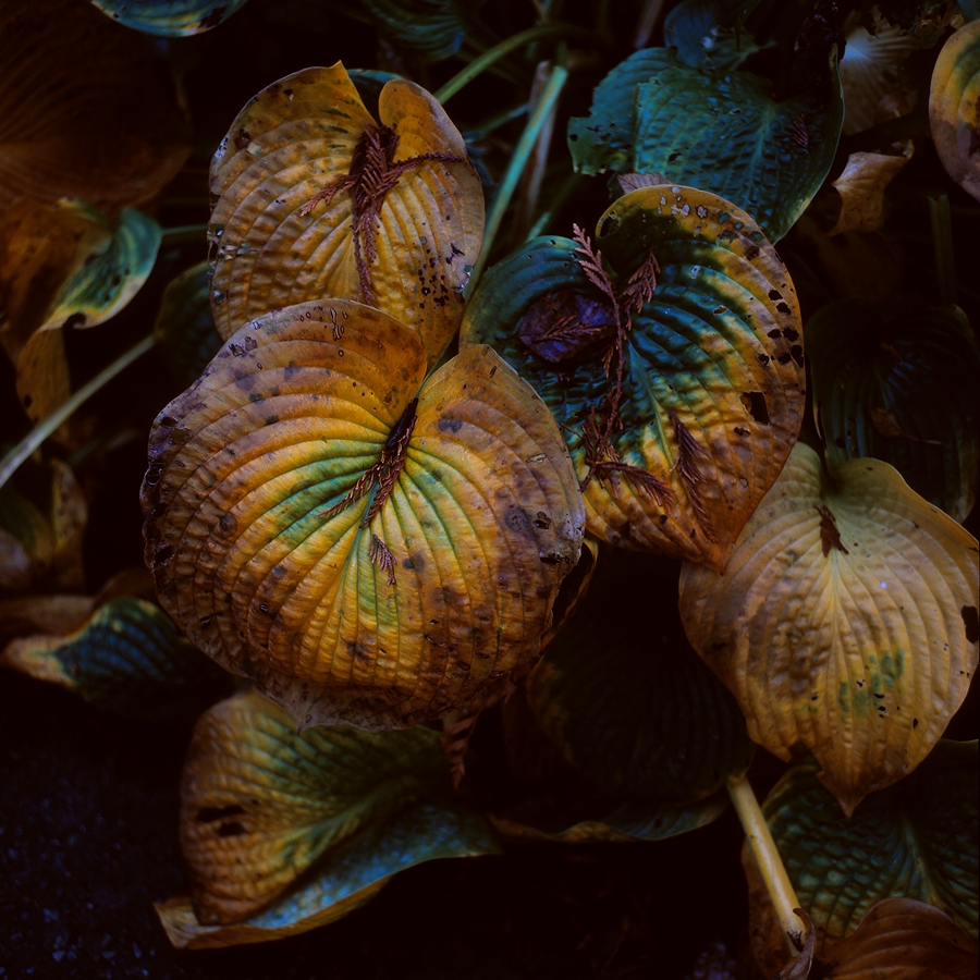
This would be really boring without the colour:
But I don't think it is "about" colour.
Rather, it is dependent on colour to communicate what it represents.
And it was certainly the colour that attracted me to it, and it is the colour that makes me happy to share it.
Returning, as I'm fond of doing, to a musical analogy, music without rhythm, or tonal range, or harmony, or vibrato or a myriad of other things may still be music, but without the "colour" that those various characteristics add, it isn't normally very successful.
 

chuckroast

Subscriber
Joined
Jun 2, 2023
Messages
2,388
Location
All Over The Place
Format
Multi Format
William Eggleston, Untitled (Greenwood, Mississippi), 1973.

Is this about a lamp? About the ceiling? About a lamp on the ceiling? About a red ceiling? About a lamp on a red ceiling? About the colour red? About a photograph of the colour red? About bad taste? About nothing other than the fact that it existed? Is the blood-like red a metaphor? What's interesting about it, the fact that there is (was) a lamp and wires on a ceiling that someone decided to paint a bloody red, that it's a photograph of a lamp and wires on a ceiling that is painted a bloody red, or that William Eggleston thought it interesting to take a photograph of a lamp and wires on a ceiling that is painted a bloody red?

The difficulty is always figuring out what it's about, if, indeed, it's about anything.


egglestonceiling.jpg

Looks more like an accidental shot when loading the camera ...
 

GregY

Member
Joined
Apr 12, 2005
Messages
3,434
Location
Alberta
Format
Large Format
If this picture was in black and white, I don't think anyone would pay much attention to it. Indeed, it's a good example of a photo that's " all about color. "

Not much to pay attention to in colour.... it's just red.
 

DREW WILEY

Member
Joined
Jul 14, 2011
Messages
13,991
Format
8x10 Format
Not exactly. The colors would have been smacked you in the face in fashion of an actual dye transfer print. The brass trim would look gold, and the purple tinge of the lightbulb would comprise an annoying counterpoint to the dominant red. I'm not saying I like the image. But Eggleston is making a cultural statement in line with a broader portfolio. All those insanely rigged extension cords, ripe for burning down some poverty stricken neighborhood dive, or whatever. The garish color makes it sinister. Black and white, it's just graphic, and clumsily so. He knew what he was doing, whether you're an Eggleston fan or not.
 
Last edited:

Alex Benjamin

Subscriber
Joined
Aug 8, 2018
Messages
2,510
Location
Montreal
Format
Multi Format
Not exactly. The colors would have been smacked you in the face in fashion of an actual dye transfer print. The brass trim would look gold, and the purple tinge of the lightbulb would comprise an annoying counterpoint to the dominant red. I'm not saying I like the image. But Eggleston is making a cultural statement in line with a broader portfolio. All those insanely rigged extension cords, ripe for burning down some poverty stricken neighborhood dive, or whatever. The garish color makes it sinister. Black and white, it's just graphic, and clumsily so. He knew what he was doing, whether you're an Eggleston fan or not.

All this.
 

DREW WILEY

Member
Joined
Jul 14, 2011
Messages
13,991
Format
8x10 Format
The color is not meant to be pretty, but provocative. A lot of shots Eggleston took of the South had a sinister feel.
 

Alex Benjamin

Subscriber
Joined
Aug 8, 2018
Messages
2,510
Location
Montreal
Format
Multi Format

Vaughn

Subscriber
Joined
Dec 13, 2006
Messages
10,102
Location
Humboldt Co.
Format
Large Format
...


The poster is suggestive

Shows the image is not solely about color...the human element is strong in this one...as is red.

B&W as an abstraction....IMO, more of a subtraction than an abstraction. A removal of a layer of information, showing that less can be more.
 
Last edited:

Craig

Subscriber
Joined
Apr 8, 2004
Messages
2,336
Location
Calgary
Format
Multi Format
I think there is an implied assumption here that photographs = art.

However, there are many other reasons to take a photograph, such as documentary photography, where the intention is to document something as accurately as possible. In that case, the world has colour, so only a colour photograph can truly document what is present.

I know people who take photographs of trains and everything related - stations, servicing facilities etc, for the purposes of making models later. The photos are intended to be a "slice of time". Only colour works, since the exact shade of weathered paint on a locomotive at a particular date is important. The photos have no pretension of being art, the purpose is strictly to record something at a particular time.

Even if we consider "art", if you're taking photos of the leaves changing on the trees in the fall, or flowers; photos of a stand of red maple trees looks boring in B&W, the whole scene would be about the colours of nature.
 

dcy

Subscriber
Joined
May 9, 2025
Messages
518
Location
New Mexico, USA
Format
35mm
Personally, I believe a good photograph is mainly about the form and composition and will be good in both black and white and color.

I couldn't disagree more. What got me interested in B&W in the first place was the fact that you see different things and a boring color photo can be really interesting in B&W and vice versa.

Agreed Drew. Absolutely an artificial debate....not really eternal....

Artificial indeed. I've been scratching my head over this thread. I shoot both color and B&W. Heck, sometimes even take pictures with my phone. 🙂

I shoot color and B&W for different reasons. I like the DIY aspect of B&W and I like that I notice the light and "texture" more than when I shoot color. I like to shoot color when I see lovely colors.
 

BMbikerider

Member
Joined
Jul 24, 2012
Messages
2,957
Location
UK
Format
35mm
It is not the one vs the other. It is more a question of whether they are equivalent or if not whether they need a different approach.

Before I took up colour printing in the early 1990's I I remember I used to 'think in B&W'. I could visualise tones and how they would appear (especially Infra red) but I seemingly lost the ability when I started in colour work and never managed to gain it back. Consequently I now think my B&W images are more difficult to get looking right than colour.
 

snusmumriken

Subscriber
Joined
Jul 22, 2021
Messages
2,512
Location
Salisbury, UK
Format
35mm
It certainly provokes me!
Surely the whole thing about Eggleston is that he photographed the mundane and/or unattractive precisely because it isn’t meaningless? I imagine what attracted him about that scene - as part of a wider portfolio, as @DREW WILEY says - was both the colour and the wiring. Without the colour it arguably doesn’t have enough content to make the grade, and also wouldn’t match his other work.
 

Vaughn

Subscriber
Joined
Dec 13, 2006
Messages
10,102
Location
Humboldt Co.
Format
Large Format
I see the purpose of the red is to give place, meaning, and mystery to the large sexual poses poster on the wall.

What other color can those walls be?!
 

DREW WILEY

Member
Joined
Jul 14, 2011
Messages
13,991
Format
8x10 Format
Eggleston didn't paint the place, he found it that way. Who knows the weirdo occupant or perhaps "business" owner was thinking. Could be the back room of a shady dive. Eggleston is on record claiming he was always interested "only in color". I don't believe that a bit; he zeroed in on certain "off" subjects.

The red itself wouldn't have the same punch unless the offset of a little yellow and blue were there in the poster area itself. So it is about color too. The yellow is replicated in the brass lightbulb fixture, and a bit of blue in the bulb itself, although that would be more apparent in a DT print than on the web. I'm not going to overthink it. The image really works only in relation to his larger venue of Southern shots.
 
Photrio.com contains affiliate links to products. We may receive a commission for purchases made through these links.
To read our full affiliate disclosure statement please click Here.

PHOTRIO PARTNERS EQUALLY FUNDING OUR COMMUNITY:


Ilford ADOX Freestyle Photographic Stearman Press Weldon Color Lab Blue Moon Camera & Machine
Top Bottom