Color vs Black and White, the eternal debate

3 Columns

A
3 Columns

  • 6
  • 7
  • 135
Couples

A
Couples

  • 4
  • 0
  • 102
Exhibition Card

A
Exhibition Card

  • 6
  • 4
  • 140

Recent Classifieds

Forum statistics

Threads
199,059
Messages
2,785,574
Members
99,792
Latest member
sepd123
Recent bookmarks
1

pentaxuser

Member
Joined
May 9, 2005
Messages
19,991
Location
Daventry, No
Format
35mm
I was going to submit photos of myself in colour and b&w for group inspection and rigorous critique until I saw the words "bad" and "awful" being used so had to think again on a "just in case" basis in event that my face doesn't fit either of the two ways

I may yet sum up the courage to submit photos but only when I have renewed my supply of those bitter almond pills -on a just in case basis, you understand😟

pentaxuser
 
OP
OP

nikos79

Member
Joined
Mar 9, 2025
Messages
577
Location
Lausanne
Format
35mm
I was going to submit photos of myself in colour and b&w for group inspection and rigorous critique until I saw the words "bad" and "awful" being used so had to think again on a "just in case" basis in event that my face doesn't fit either of the two ways

I may yet sum up the courage to submit photos but only when I have renewed my supply of those bitter almond pills -on a just in case basis, you understand😟

pentaxuser

Oh come on I was just exaggerating:smile:
Please we would love to see your photos.
 
OP
OP

nikos79

Member
Joined
Mar 9, 2025
Messages
577
Location
Lausanne
Format
35mm
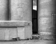
I'll start where I ended. Making a good photograph is extremely difficult. It takes a lot of work to get there, and it takes a long time to get there — time to learn the instruments you work with, time to learn how photography works, time to figure out what you want to photograph, how you want to photograph it, and why — and it takes a fair amount of luck.

Even for really excellent photographers, success rate is really low. But it does get higher if you've mastered the what, the how and the why. Meaning, amongst other things, understanding what colour figures in the world, what colour does in a photograph, what colour means to you as well as to others, how colour affects people, how a photograph translates colour, etc.

Once you get there, "evaluating" your photo becomes the easy part. And there won't be questions about whether it works better one way or the other, because, ideally, the answer will be obvious.

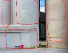
You'd understand this if you did your own printing, because something similar happens. With experience, you know, very instinctively, in which size enlargement — on 8x10, 11x14, 16x20, etc. — a photo will work "best." Not that they don't work in various sizes, but some you know that they work better big, and some you know that they work better small.

What's interesting is that once you've figure that out, and once you've found a size that works for you in general, you tend to take certain types of photos a certain way because you know you'll print them a certain size. It's not deliberate, a bit unconscious, but it's noticeable. And that's because you understand that size is also part of the process, and part of the impact the photo will have.

Finally we couldn't agree more and quite an insightful roadmap you presented.
You might not know but you agree actually a lot with my teacher in many things
 

Milpool

Member
Joined
Jul 9, 2023
Messages
755
Location
n/a
Format
4x5 Format
I don't mind ridicule so here is a submission. I made an Ektachrome exposure a few seconds after the TMX exposure. The B&W print is Ilford MG Classic.

c-25b-15 s.jpg


2s.jpg


I was going to submit photos of myself in colour and b&w for group inspection and rigorous critique until I saw the words "bad" and "awful" being used so had to think again on a "just in case" basis in event that my face doesn't fit either of the two ways

I may yet sum up the courage to submit photos but only when I have renewed my supply of those bitter almond pills -on a just in case basis, you understand😟

pentaxuser
 
OP
OP

nikos79

Member
Joined
Mar 9, 2025
Messages
577
Location
Lausanne
Format
35mm
I don't mind ridicule so here is a submission. I made an Ektachrome exposure a few seconds after the TMX exposure. The B&W print is Ilford MG Classic.

View attachment 404771


View attachment 404773

I think the color gives some depth to the image by showing the sky more but on the other hand it creates some unwanted attention to the red bucket.

So I would prefer it in color, if it wasn't for the red bucket :smile:

As it is now probably in b&w since the form is more prevalent like that.

But i dont think they are that different the volumes are pronounced nicely on both
 

BrianShaw

Member
Joined
Nov 30, 2005
Messages
16,545
Location
La-la-land
Format
Multi Format
I like the red bin and bucket. Gives the eye some additional relief, in addition to the sliver of sky, from a somewhat flat color palette. I guess it takes all kinds...

The B&W ain't bad either.
 

MattKing

Moderator
Moderator
Joined
Apr 24, 2005
Messages
53,159
Location
Delta, BC Canada
Format
Medium Format
The parallels between the grey/blue door and the sky seem critical to me, particularly with the offsetting reds.
In the B&W version, the door almost disappears.
The colour version is like music with an alto and a tenor singing in response to each other.
 

gary mulder

Member
Joined
Nov 29, 2006
Messages
143
Format
4x5 Format
Who's Afraid of Red, Yellow and Blue ? I’am not. The color version is briljant. Yes,I know Newman’s work provokes aggression.
 
OP
OP

nikos79

Member
Joined
Mar 9, 2025
Messages
577
Location
Lausanne
Format
35mm
Now I watched it again to a bigger screen of my laptop.
I would go with the B&W version.There are 4 major parts in the image that do not blend well in color (talking mainly with the left and right wall)
 

GregY

Member
Joined
Apr 12, 2005
Messages
3,463
Location
Alberta
Format
Large Format
Now I watched it again to a bigger screen of my laptop.
I would go with the B&W version.There are 4 major parts in the image that do not blend well in color (talking mainly with the left and right wall)

You know N79, your opinions are just that....& may differ from others. In my opinion, both versions of the photograph 'work'..... The black and white version emphasizes the structure (& the door gets lost). In the colour version the blue of the door resonates with the sky and the grey bin connects somewhat with the grey object on top of the red bin.
 
OP
OP

nikos79

Member
Joined
Mar 9, 2025
Messages
577
Location
Lausanne
Format
35mm
I think in the B&W I would want more contrast
 

Attachments

  • c-25b-15 s.jpg
    c-25b-15 s.jpg
    1,023.5 KB · Views: 9
OP
OP

nikos79

Member
Joined
Mar 9, 2025
Messages
577
Location
Lausanne
Format
35mm
You know N79, your opinions are just that....& may differ from others. In my opinion, both versions of the photograph 'work'..... The black and white version emphasizes the structure (& the door gets lost). In the colour version the blue of the door resonates with the sky and the grey bin connects somewhat with the grey object on top of the red bin.

I agree both work. If I said otherwise, I would be contradicting what I have been saying all the time now in the forum :smile:
But I just prefer BW because I find it slightly better, personal opinion.
 
OP
OP

nikos79

Member
Joined
Mar 9, 2025
Messages
577
Location
Lausanne
Format
35mm
But when I see a photograph I see it as a whole. I cannot say I like it because of the red bin or because of the blue sky. This is just 3% of the photograph. In order for it to work all 100% needs to work
And the "essence" of this photo for me (no matter in B&W or color) is that it is a mysterious scene and juxtaposition of volumes with a window (the sky) to another level behind it. Strange photo indeed
 
Last edited:

dcy

Subscriber
Joined
May 9, 2025
Messages
546
Location
New Mexico, USA
Format
35mm
No, you got me wrong. Not bad just different.

You literally use words like "bad" and "awful".

It can be very good commercial, fashion, sports, conceptual, gallery photography for instance.

This sounds very dismissive.

The photograph I dismissed is perfect "instagram" style. Made to impress and to be reproduced forever.

You judge a photograph's merit based on your imagination of what was going through the photographer's head.

I do not know what you mean by "instagram" style.
 
OP
OP

nikos79

Member
Joined
Mar 9, 2025
Messages
577
Location
Lausanne
Format
35mm
Mind also the geometry balance
 

Attachments

  • 2s.jpg
    2s.jpg
    337.3 KB · Views: 2

dcy

Subscriber
Joined
May 9, 2025
Messages
546
Location
New Mexico, USA
Format
35mm
I think the color gives some depth to the image by showing the sky more but on the other hand it creates some unwanted attention to the red bucket.

Who decides that it's unwanted? Shouldn't that the the photographer's decision and not yours?
 

GregY

Member
Joined
Apr 12, 2005
Messages
3,463
Location
Alberta
Format
Large Format
I think Milpool provided a good set of photographs. But I think in general your comments are inconsequential to the photos. In a magazine, i'd flip to the next page, if in a photo textbook i'd think ok.... if in an exhibition, i'd look and keep walking on to the next photo. Some things are just experienced, and deep discussion doesn't always bring some beneficial conclusion.
 
Joined
Aug 29, 2017
Messages
9,505
Location
New Jersey formerly NYC
Format
Multi Format
The color shot is more interesting and attractive to the eye. There's not much going on in the shot. It's not a girl in a bikini. So the colors up the ante.
 
OP
OP

nikos79

Member
Joined
Mar 9, 2025
Messages
577
Location
Lausanne
Format
35mm
You literally use words like "bad" and "awful".
Yes I did. Just a bit figurative that's all and carried away. I really meant different or uninteresting for me. It is just photos after all, I am sure the photographer has 1000 more like them, it is not that I dismissed their Magnus opus.

This sounds very dismissive.
Not at all. In order to be successful in any of these domains I mentioned you need to be very skilled and study that domain a lot. But again, not interesting for me.
You judge a photograph's merit based on your imagination of what was going through the photographer's head.

I do not know what you mean by "instagram" style.

Instagram style:
Aesthetic desperation dressed as depth. High contrast to simulate drama and fake emotion. Honey-sweet sunsets. The list can go long.. It doesn’t whisper. it shouts.

And then comes the moody alley. One person, a lonely dark figure walking into a beam of light lost there. Shadows, symmetry, silence, pretending to be serious. But this isn’t quiet, it’s calculated and carefully constructed. The same cry for attention, just dressed in black and white. Can't you see the fakeness?
 
Photrio.com contains affiliate links to products. We may receive a commission for purchases made through these links.
To read our full affiliate disclosure statement please click Here.

PHOTRIO PARTNERS EQUALLY FUNDING OUR COMMUNITY:


Ilford ADOX Freestyle Photographic Stearman Press Weldon Color Lab Blue Moon Camera & Machine
Top Bottom