Thanks, yes that is very interesting, I will go through that carefully.
I think I may have solved the puzzle, well maybe...
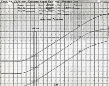
This first image, represents a positive, where the negative has a blue layer that has a higher speed point than red or green. the gamma of each is identical and has been adjusted to 2.4. Filtration has been applied to remove the orange mask for a neutral black,
Note: X and Y are both linear scales, normalised to 0-1, so become intensity ratios. This 'film and paper' has a negligible toe and shoulder.
View attachment 192023
This second image, is identical to the first but the filtration has been applied to remove the orange mask for a neutral white. Note that the slope of each layer should change because of the filtration however the slopes will never be same between all three layers as the blue has higher speed point. (I have not adjusted the slopes for that reason)
View attachment 192024
This final image, is like the second in that filtration has been used to remove the orange mask for a neutral white, but the blue layer of the negative now has a different gamma (2.2), so both a neutral highlight and midtone has been achieved.
View attachment 192025
I have done this in more detail tracing the whole process through from scene, to negative, to positive and this seems to be the best explanation thus far.
I’m working on a similar program (it’s called simple image tools, if you search for that tag on the various image sharing sites you’ll find images made with it in varying stages of development) and ran across this thread while doing some research. Ted, you’re about where I was about a year ago here in this post.
I thought I’d provide some input to hopefully move you forward a bit, if you’ve already gotten there, then great.
As others have alluded, digital is just another type of paper. It’s a nearly infinitely malleable piece of paper, but it’s a type of paper nonetheless. With that being said, there are a couple of truths that apply to that paper: all the math and colorspace stuff works best if your image data is in scene referred linear light space, meaning if something in a scene is twice as bright, it has twice the sample value.
This means that in order to really correctly digitize film, you must first correctly linearize it. Once you’ve done that, it isn’t really any different than digital image data from any other source, and you deal with it the same way.
Looking at your charts, you’re trying to get there and you’re close, but I suspect what you’re missing is that with color film the contrast curve of each color channel should be parallel, but isn’t. They’re close, but not totally parallel.
Look at the published characteristic curves for Portra 160 (E-4051, pub feb. 2016), at first blush, they look parallel, but upon closer inspection, the blue channel is slightly steeper, and the red channel is slightly less steep relative to the green channel. Your charts above largely reflect that. Portra 400 and 800 show an even greater difference than 160, and Ektar 100 is kind of wonky where the lines aren’t particularly straight and not particularly parallel.
So what do you do about it? Well, when I look at Portra’s published curves, I see three bw contrast curves offset from each other, one assigned to red, one assigned to blue, and one assigned to green. When I develop and scan bw film, I develop to a given contrast index, scan it in as a raw positive, then invert and linearize it with that contrast index. With color negative film each of those channel curves will have a contrast index. You need to linearize each one separately just like you would bw. Once you’ve done that, you still need to take that now linear positive image data, white balance it, conform it to a color space, and optionally do per hue angle hue and saturation adjustments so that a Macbeth chart looks correct, though the hue and saturation adjustments will mostly remove the look of that emulsion, so it depends on how agressive you want to get with that. All the post linearization stuff doesn’t really have anything to do with film as you’re now dealing with linear digital data, and should probably be a whole nother topic in hybrid or digital.
What I was searching for which caused me to stumble across this thread is what are the known contrast indexes for the various currently manufactured color negative films for in AIM development. Kodak does publish them in the film tech sheets, but those charts are small and not very high resolution, which makes using them to map out to digital linear data somewhat inprecise and difficult. I’ve manually exposed and mapped out the contrast curves of a couple of films that I regularly shoot, but that is extremely time consuming and if I’m to get simple image tools to a place where it can reasonably handle a relatively large number of films and be useful to more people than me, then I need to find either higher resolution published characteristic curves, or actual CI numbers, or ask the community to help me shoot and make high resolution in AIM characteristic curves.


 Though thus far this seems to me to the most correct answer, the math seems to add up, unless I have made a mistake... At some point I will post a more detailed analysis from which covers scene->negative->print.
 ?
?
