I have yet to find a negative to contrasty for carbon. We have many controls at our finger tips for control. Try one of those negatives. You may be surprised.
-
Welcome to Photrio!Registration is fast and free. Join today to unlock search, see fewer ads, and access all forum features.Click here to sign up
You are using an out of date browser. It may not display this or other websites correctly.
You should upgrade or use an alternative browser.
You should upgrade or use an alternative browser.
Carbon Transfer Questions
-
A
- Thread starter Vlad Soare
- Start date


Recent Classifieds
-
For Sale Arca Swiss Z1+ fliplock ball head
- Started by Guivd
-
Want to Buy Intellifaucet D250 K250 etc
- Started by Rafal Lukawiecki
-
For Sale RB67 and Graflex odds & ends
- Started by OrientPoint
Forum statistics
OP
OP
 , but at least I've got the correct contrast.

Vald, Those Van Dyke negs should work great.
I have made negatives with too much contrast for carbon -- but they have too much for any process. Mostly with copy film -- over-developed to the point of bullet proof highlights, but thin shadows. And even some of those I might go back to and try again.
I have made negatives with too much contrast for carbon -- but they have too much for any process. Mostly with copy film -- over-developed to the point of bullet proof highlights, but thin shadows. And even some of those I might go back to and try again.
Jim, how are you sensitizing your tissue? I have found that "double coating" the tissue has helped significantly... and it also cuts back on exposure times. For 9x12 tissue, I sensitize with 20ml. I give two, 10ml coats ... .
Andrew ... when you write "double coating" ... you need to let us know how much dichromate you're delivering to the tissue. It sounds like you're simply doubling the dichromate ... which you could do by doubling the % of the stock solution in the first 10ml application and only single coating.
Jim, I use 6ml of dichromate and 6ml. of acetone on my 10x12 tissue. I'm thinking that Andrew uses 10ml & 10ml if he is using one to one as I do. I know he will chime in.
FWIW, I use 5ml of stock to 15ml acetone for a 9x11 tissue - total of 20ml which is applied 10ml at a time, without much wait between the time the first application dries (or at least nothing left to brush) and the second application.
As long as it works and as long as one is relatively consistent!
As long as it works and as long as one is relatively consistent!
Someone (the late Gordon Chappel) once explained perfectly to me the relationship between dichromate dilution and contrast -- and as soon as I walked out his door and started down the road, it left me completely! Oh, well.
I am very sorry to learn of Gordon's passing. He was a good guy and made some very beautiful (monochrome) carbon prints using sumi inks.
Here's the deal on the relationship between dichromate dilution and contrast: As you increase the concentration of dichromate you are also changing the color of the solution. A 2% solution is light yellow, and a 5% is dark orange. This color change in the sensitizer acts as a filter of the actinic exposing light, causing the light to penetrate less deeply into the emulsion. Thus, almost all the hardening of the emulsion is occurring on the surface producing a very flat
print. Ammonium dichromate is often used at high concentrations because it is lighter in color than potassium dichromate.
Charles Berger
Charles, welcome and thanks for this information. I started my carbon printing using Ammonium Dichromate and have had success using dilutions up to 12%. Generally i find that I'm using 1 1/2% or 3% most of the time. My in camera negatives that required the high strength dichromate usually had density ranges in the 2.36 and above range. Gordon was a friend and a great printer both in color and monochrome. When he and his wife died tragically it was a huge loss to us all.
Seems to be too simple of an answer, Charles. More is going on than that. For example, exposure times increase with lowing the dichromate solution -- your explanation should having it go the other way (ie, less yellow, the faster the UV should be able to penetrate the gelatin and the faster a black is achieved). But the opposite actually seems to happen -- from experience it appears that the more dichromate, the shorter the exposure needed to achieve a black.
And while I cannot remember exactly what Gordon's explanation was -- it had nothing to do with the color or color strength of the dichromate.
And while I cannot remember exactly what Gordon's explanation was -- it had nothing to do with the color or color strength of the dichromate.
Mr. Berger is an expert in color carbon and thus I'd be inclined to trust his insight on the effect of tissue color and its effect on contrast. From what I understand, the problem is most pronounced with the cyan layer in tri-color carbon printing.
Vaughn, I would hazard a guess that exposure times increase with lower sensitization simply because there is less sensitizer.
Vaughn, I would hazard a guess that exposure times increase with lower sensitization simply because there is less sensitizer.
Also factor in that the hardening of dichromated colloids is pH dependent (speed, contrast and keeping qualities of the sensitized layers) and that changes in concentrations change pH levels - but i have found the light restraining effect of various solution concentrations to be quite significant.
The color of the tissue is significant. I did not mean to imply otherwise. But it is not the only factor, and might not even be the most significant factor, especially for monochromatic carbon printing. An interesting test would be to use a standard concentration of AD (say, 1%) and add yellow food coloring to see how the contrast changes (if the food coloring washes out).
No matter what concentration of pigment or AD is used, one has to give enough UV exposure to harden the gelatin layer deep enough to have a thick enough layer to achieve a good black (or the desired strength of color in color carbons). So what is happening in the upper layers as one gets enough UV down deep in the tissue will determine contrast.
A stronger concentration of AD would allow chemical reactions to happen at a higher rate as the UV struggles to get down into the tissue. Thus in highlight areas of the neg that are blocking UV light and allowing much less to hit the tissue, there is far more activity than if the concentration of AD was lower. This would lower the over-all contrast. But without testing, it would be difficult to determine which is more significant -- the color or the rate of chemical reactions due to changes in AD concentration.
AD and PD react to UV in gelatin at different rates, which has nothing to do with their color.
It is interesting that, as pigment concentration is increased (thus slowing down UV penetration in a similar way as increasing the yellow coloring) the native contrast of the tissue actually increases.
OP
OP
Do you guys ever feel the need to dodge or burn a carbon print? I understand that the flexibility and long scale of the process make it easy to fit any negative to any tissue, but how about lightening an ugly shadow under the sitter's eyes, or darkening the background to make the subject stand out, etc.?
I suppose one would need some kind of protective goggles and gloves, but apart from that, is it feasible?
I suppose one would need some kind of protective goggles and gloves, but apart from that, is it feasible?
Vlad, you can dodge and burn carbon prints. I have welders glasses and gloves bit seldom have to do this. In fact not at all. With the controls you have you can make the adjustments with pigment load and dichromate sensitizers and exposure. Masks are another option.
I normally do none, but once I had a small area (inside a hollow log) that I wanted to lighten up just a little. After about 2/3's of the exposure, I took a Sharpie (black marker pen) and drew on the glass of the contact printing frame to make a temporary mask -- worked great. Someone at one of my workshops wanted a small waterfall to be a little brighter, so he did the same. And of course one could make a full-blown mask for an image. These do not require one to look at the UV light.
Someone had the idea of taking one of those coiled tube blacklight bulbs (uses a regular light socket), making a tinfoil snoot for it and using it to burn in areas of the image. I have burnt in a side of the image (due to strong side-lighting) just by moving the contact printing frame off to the side a bit.
Vaughn
OP
OP
Great ideas. Thank you!
OP
OP

Bad moon phase I'm afraid....
....ok, just joking, I have no idea.
....ok, just joking, I have no idea.
I'll vote for bad moon phase, also. I have had mold growing on my still-damp tissues, but those tend to be craters, not bumps. And once the gelatin starts to gel, it does not seem likely that anything poorly mixed (dry pigment or sugar) would rise up to the surface.
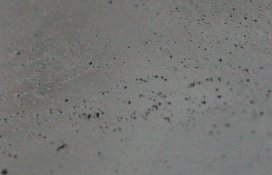
If the bumps are hollow, then they are air bubbles I suppose.
Vaughn
If the bumps are hollow, then they are air bubbles I suppose.
Vaughn
I'd vote for pigment separation. It looks to me like pigment particles that did not get mixed well. If you used pigment powder you need to disperse the pigment first. Like making your own watercolor paint. Or it could just be "phases of the moon!" That last one works for me!
OP
OP
The bumps are not hollow. Besides, when I had air bubbles they looked like pits on the surface rather than bumps.
It could be the pigment. It's powder, and I dispersed it in water first. It seemed to disperse well, and the glop looked OK, but I guess some small clumps may have remained. It's funny that everything looked so perfect before drying, though. Perhaps the shrinking of the drying gelatin made them stand out.
Next time I'll try to filter the glop before pouring.
Thanks.
Last edited by a moderator:
Vlad, I always filter my glop at least 4 times. When I measure the amount I'm going to pour I filter again. I think that one can not filter enough especially if you are using powdered pigments. Try using a combination of powdered and liquid pigments. I find that using no more than 1 gram of powdered pigment and the balance in liquid does not cause problems. The powder must be ground very, very fine and filtered very well.
OP
OP
I see. That must be the problem, then. I didn't filter it at all. 
I'm using pure lampblack, which is so fine that when I open the bottle I immediately see the powder rise into the air like an extremely fine smoke, even though there's no perceptible movement of the air, no draft or anything. It's the finest powder I have ever seen.
Next time I'll filter the glop a few times.
Thank you.
I believe there is some clumping that can happen when mixing the fine powder, so filtering might help.
I'd vote for pigment separation. It looks to me like pigment particles that did not get mixed well. If you used pigment powder you need to disperse the pigment first. Like making your own watercolor paint. Or it could just be "phases of the moon!" That last one works for me!
What would you mix it with, Vaughn....some alcohol or water or...?
I was thinking maybe mixing it in a mortarand pestle with a liquid...
| Photrio.com contains affiliate links to products. We may receive a commission for purchases made through these links. To read our full affiliate disclosure statement please click Here. |
PHOTRIO PARTNERS EQUALLY FUNDING OUR COMMUNITY:  |