Carbon transfer: preventing light scatter in tissue with light pigments

West coast Vancouver Island

D
West coast Vancouver Island

  • 0
  • 1
  • 44
Under the Pier

H
Under the Pier

  • 1
  • 0
  • 45
evancanoe.JPG

A
evancanoe.JPG

  • 5
  • 1
  • 80
Ilya

A
Ilya

  • 4
  • 1
  • 80

Recent Classifieds

Forum statistics

Threads
197,681
Messages
2,762,872
Members
99,439
Latest member
May68
Recent bookmarks
0

koraks

Moderator
Moderator
Joined
Nov 29, 2018
Messages
21,007
Location
Europe
Format
Multi Format
I'm sure at least one of you here must have run into this. It seems I'm running into a light scatter / halation problem in carbon printing. Question: how to prevent light scatter inside carbon transfer tissue?

Here's the background info:

I poured some tissues with rather low pigment loads of light-colored pigments to begin with. Cyan, magenta and yellow. (Yes, you can tell where this is going and no, I'm not sure if I'm going to pull through with this ungodly plan, but let's see how far I can get.)
I'm using acrylic paints for now as the pigment source so I have no clue about actual pigment content. Probably around 4% or less going by what I can gather from Calvin Grier. That's further watered down in my tissue which only uses 1% of the paint. It's by far insufficient and I'm going to drastically increase this one way or another, but I decided to give the very low-pigment tissues a try to see what they threw at me. Overall glop recipe is as follows:
8% technical grade gelatin
5% sugar
A little less than 0.25% glycerin
1% acrylic paint, with pigment PV 19 (magenta), PY 128 (yellow) or PB 15 + PW 6 (cyan).

Tissues are poured on blixed-out RA4 paper, so a white gelatin surface, in this case it happens to be a lustre finish. Tissue size is around 20 square centimeters and have around 20ml of glop each, so that makes a 1mm wet height.

Sensitization is with ammonium dichromate solution, adjusted to the contrast of the negative, using a foam foller for application.

Exposure is done with an el-cheapo UV LED flood light. It's not the cause of the problem; it images tack sharp with B&W.

Transfer is done to whatever surface is convenient, but I used gelatin-sized art paper for these tests.

The entire process is proven to work well with black pigment, i.e. India ink, at the same concentration. The glop recipe is identical to what I currently use for B&W tissue, replacing the India ink in my black tissue with the mentioned colorants.

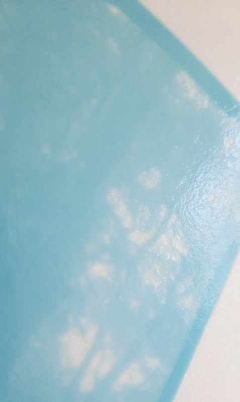
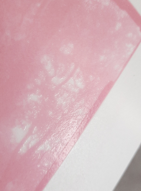
Well, the prints are super, super fuzzy. Looking at the nature of the fuzziness, my bet is that this is a light scatter issue, where the UV penetrates right through the emulsion and bounces back against the support surface, creating a diffuse secondary (and tertiary?) image around the primary image.

Here are two examples; same negative, cyan and magenta tissues:


20220908_1504161.jpg
20220908_1519401.jpg


Yellow is similar, but even more difficult to visually inspect because, you know, yellow on a white background...

Any suggestions on how to prevent this problem?

I've got some glop outgassing now with a higher magenta pigment concentration that I intend to pour onto black (developed out) RA4 paper; my logic says this should make a difference. Merely increasing pigment concentration probably also does something, but the pigments I use are rather transparent to begin with (deliberate choice) and especially magenta and cyan are generally not that great UV blockers anyway.

@Andrew O'Neill perhaps? I know you toyed with color carbon at least once a few years back...does this problem ring a bell with you? If not, what difference in materials do you spot?
 

Andrew O'Neill

Moderator
Moderator
Joined
Jan 16, 2004
Messages
11,783
Location
Coquitlam,BC Canada
Format
Multi Format
I think you answered your own question about it being halation effects. I have only seen this effect with gross over exposure. I used acrylic paints as well when I first started experimenting with tri-colour, then switched to daniel smith water colours. I dabbled with tri-colour for about 6 months. I was able to make pretty decent prints, but it wasn't really my thing.
 

AgX

Member
Joined
Apr 5, 2007
Messages
29,973
Location
Germany
Format
Multi Format
You mght add a dye as sharpening means. Best one that you could wash out after or with development.
 
OP
OP
koraks

koraks

Moderator
Moderator
Joined
Nov 29, 2018
Messages
21,007
Location
Europe
Format
Multi Format
Thanks, so happy you chimed in, and so quickly as well.

Yes, exposure has a lot to do with it as well, although the example shown wasn't overexposed excessively. I might give the water colors a try although I'm (again) tempted to have a go at dry pigments. I rooted around the water colors section in the arts supply store but everything tracked back to the same pigments I already had found in acrylic. Maybe the water colors are more concentrated though.

it wasn't really my thing.

You mean color, or specifically color carbon? Did you do the digital negative thing or separations onto photographic film?
The whole business with inkjet negatives is the most annoying aspect for me at this point. I just hate working with inkjet, really badly.

You mght add a dye as sharpening means.

That's actually an interesting idea. I bet some kind of yellow dye should be available that washes out of the emulsion easily. I'd have to look into this. Any suggestions in what kind of direction to look?


Btw, if I look at the few videos of color carbon printers, I don't notice any dyes or even dark colored tissue supports. Maybe increasing pigment concentration alone should be enough to solve the issue.
 

Andrew O'Neill

Moderator
Moderator
Joined
Jan 16, 2004
Messages
11,783
Location
Coquitlam,BC Canada
Format
Multi Format
Thanks, so happy you chimed in, and so quickly as well.

Yes, exposure has a lot to do with it as well, although the example shown wasn't overexposed excessively. I might give the water colors a try although I'm (again) tempted to have a go at dry pigments. I rooted around the water colors section in the arts supply store but everything tracked back to the same pigments I already had found in acrylic. Maybe the water colors are more concentrated though.


You mean color, or specifically color carbon? Did you do the digital negative thing or separations onto photographic film?
The whole business with inkjet negatives is the most annoying aspect for me at this point. I just hate working with inkjet, really badly.


That's actually an interesting idea. I bet some kind of yellow dye should be available that washes out of the emulsion easily. I'd have to look into this. Any suggestions in what kind of direction to look?


Btw, if I look at the few videos of color carbon printers, I don't notice any dyes or even dark colored tissue supports. Maybe increasing pigment concentration alone should be enough to solve the issue.

I was working with inkjet negs. It was mainly the look of the finished print that didn't sit well with me. It had a plasticky feel, even after soaking it in a water bath. I was making tri-colour gum at the same time, and preferred its look.
I think you should increase your pigment load, then back off on your exposure. I feel confident that that will take care of the issue.
 
OP
OP
koraks

koraks

Moderator
Moderator
Joined
Nov 29, 2018
Messages
21,007
Location
Europe
Format
Multi Format
Yeah, I see what you mean. Gum just has more of a rustic surface texture, I suppose. Carbon, especially on heavily sized surfaces, tends towards silver gelatin a lot in terms of its finish. I've got a small double-transfer here on my desk that looks just like an RC print. But I mean, it's *really* a close call. Didn't soak it after the transfer, so it's essentially ferrotyped.

Not sure if I'll ever do gum again. I must say Calvin Grier's results do appeal to me, but it's kind of an....involved approach. Maybe, one day. First I'll have to get tired of carbon again.

What did you use for digital negatives, Pictorico or Fixxons? I've got some of the latter on order. Here in Europe, Pictorico can be had, but it's pretty steeply priced and supply seems to be scarce. No trace at all of the Fixxons. I resorted to eBay for this.
The film I used up to this point just doesn't hold any ink. It holds it alright, but it reticulates like mad upon drying, regardless of the quantity. It's just no use.

I think you should increase your pigment load, then back off on your exposure. I feel confident that that will take care of the issue.
Great, thanks. I'm going to give that a try. I just hung some tissues to dry, 2 on the developed paper (so black surface), 2 on the blixed out white paper. Magenta paint concentration increased from 1% to 5%. I did some experiments yesterday with drops of paint solution on paper to get a ballpark estimate for the required concentration and I think it should be between 5% and 8% at least for magenta. The two different support colors will allow me to test if it makes any difference at all or if it's all down to pigment concentration and exposure.
 
  • nmp
  • Deleted

gone

Member
Joined
Jun 14, 2009
Messages
5,505
Location
gone
Format
Medium Format
I rooted around the water colors section in the arts supply store but everything tracked back to the same pigments I already had found in acrylic.

That makes sense, a pigment is a pigment, but the means of carrying it to your work is going to be different. There will be vast differences in the amount and quality of pigments too as you go up or down in the prices. Top dollar paints will be pure pigment w/ no fillers.

A watercolor should have finer pigments than acrylic, as it needs to completely dissolve on the paper, while the acrylic pigment doesn't. Watercolor depends on it's medium being completely transparent when dry. The pigments would also seem more accessible in watercolors as there is no medium to bind them other than user added water.
 
OP
OP
koraks

koraks

Moderator
Moderator
Joined
Nov 29, 2018
Messages
21,007
Location
Europe
Format
Multi Format
a pigment is a pigment

Wellll...there's pigments and there's pigments.

Top dollar paints will be pure pigment w/ no fillers.

No, they won't; all paints are mostly fillers (or 'medium'). Pigment pastes are still mostly fillers, but according to Grier at least up to around 40% pigment. Such pastes are however unusable as paints; they're impossible to work with on a canvas etc. They are nice for carbon printing, and indeed I may look into this some further. I did some quick searching and at least for 2 out of the 3 pigments I was looking for they appeared to offer a ready-made pigment paste.


A watercolor should have finer pigments than acrylic, as it needs to completely dissolve on the paper, while the acrylic pigment doesn't.

I don't think watercolor pigments are necessarily finer ground than acrylic pigments. Particle size can affect hue, so that's one factor manufacturers are likely to use to determine optimum grinding. Then there's tinting strength and transparency as well, and the difficulty/ease with which the pigment can be bound to make a dispersion. Pigments don't dissolve, so there's always a dispersion agent that interfaces between the pigment and the water or oil carrier.

Watercolor depends on it's medium being completely transparent when dry.

Only partly, pigments do vary in transparency themselves. Part of it has to do with particle size, but not all, as I understand. I'm sure there's a good reason why transparency is listed as a key property of pigments (not just paints; the actual dry pigments) if you're shopping for them.


The pigments would also seem more accessible in watercolors as there is no medium to bind them other than user added water.

I don't think that's technically correct, but perhaps we have a different understanding of the term 'medium'. There's always a binder to enable the pigment to be dispersed in water or oil. Try painting with a pure pigment by only adding water to it; it simply won't work. You'll be spreading lumps and clumps of pigment across the paper, yielding a grainy result that mostly wipes off of the paper as soon as the water's gone.

There's a variety of binders out there; the most simple and old ones are things like tempera (egg yolk), or gum arabic (sometimes combined with honey). Acrylics use contemporary 'high-tech' binders that I don't know the composition of; for watercolors this will to a large extent be the same today, as some of these modern binders (more accurately: dispersion agents) are probably better at preventing issues like clumping, yellowing or cracking. In any case, I don't think there's such a thing as a paint without a binder.

It's all magnificently interesting stuff and I have a feeling I'll be forced to learn much more about it. That's OK though!
 
Last edited:

Andrew O'Neill

Moderator
Moderator
Joined
Jan 16, 2004
Messages
11,783
Location
Coquitlam,BC Canada
Format
Multi Format
Yeah, I see what you mean. Gum just has more of a rustic surface texture, I suppose. Carbon, especially on heavily sized surfaces, tends towards silver gelatin a lot in terms of its finish. I've got a small double-transfer here on my desk that looks just like an RC print. But I mean, it's *really* a close call. Didn't soak it after the transfer, so it's essentially ferrotyped.

Not sure if I'll ever do gum again. I must say Calvin Grier's results do appeal to me, but it's kind of an....involved approach. Maybe, one day. First I'll have to get tired of carbon again.

What did you use for digital negatives, Pictorico or Fixxons? I've got some of the latter on order. Here in Europe, Pictorico can be had, but it's pretty steeply priced and supply seems to be scarce. No trace at all of the Fixxons. I resorted to eBay for this.
The film I used up to this point just doesn't hold any ink. It holds it alright, but it reticulates like mad upon drying, regardless of the quantity. It's just no use.


Great, thanks. I'm going to give that a try. I just hung some tissues to dry, 2 on the developed paper (so black surface), 2 on the blixed out white paper. Magenta paint concentration increased from 1% to 5%. I did some experiments yesterday with drops of paint solution on paper to get a ballpark estimate for the required concentration and I think it should be between 5% and 8% at least for magenta. The two different support colors will allow me to test if it makes any difference at all or if it's all down to pigment concentration and exposure.

Grier's results are quite amazing, no doubt! I'll stick with mono carbon for now, though.
For digi negs, I use some brand from a screen printing shop... Have you tried a screen printing supply shop? Quite cheap compared to Pictorico. Hold ink really well.
 
OP
OP
koraks

koraks

Moderator
Moderator
Joined
Nov 29, 2018
Messages
21,007
Location
Europe
Format
Multi Format
No, haven't tried that route yet. I'll have to try and find one; I'm not sure if screen printing is a 'thing' around here. I did try the different transparency materials at the local arts supply store. They all sucked.
 
OP
OP
koraks

koraks

Moderator
Moderator
Joined
Nov 29, 2018
Messages
21,007
Location
Europe
Format
Multi Format
Well, here's a small update. I tried the tissue with 5% acrylic paint, and made identical prints from the white-base and the black-base tissue. In terms of image quality, there appears to be no meaningful difference between these two prints. What's more: increasing the pigment concentration seems to have resolved the halation problem. I only did magenta for now, but hopefully the story will be identical for yellow and cyan (I don't see why it wouldn't).
So @Andrew O'Neill you were right in your expectation - which is great in several ways :smile:

What's not so great is that the glop and tissue don't work so well anymore with this much acrylic paint in it. I noticed the glop has a tendency to skin over, just like hot milk or pudding, which I think is just the acrylics in the paint hardening out. This might be prevented by frequent stirring of the glop; I admit I generally just let it sit for a couple of hours more or less undisturbed to get rid of the trapped air/bubbles. However, I don't think I'm going to bother, because the tissue also seems to become problematic in terms of the actual transfer and development. One of both prints I just made didn't transfer well, with about 40% of the tissue drifting away from the final support during development. I could salvage it mostly, so I can make the side-by-side comparison still, but it's evidently a major problem. The tissue also develops with much more difficulty than my normal tissue. I think both problems can as well be attributed to curing of the acrylics.

So I'm going to have a look at different paints in first instance, shifting my focus to watercolors in the hope that they're more concentrated than the acrylics. But frankly I see myself getting some powdered pigments and the necessary binders, anti-foaming agents, dispersal agents and some minor equipment (morter & pestle, muller) and see if I can get a decent enough dispersal this way with a controlled pigment concentration. I'm not going to actually get a planetary ball mill or a tumbler for this; if I can't do it by hand, I'll have to just find a way to make readily available paints or pastes work.
 

Rick A

Subscriber
Joined
Mar 31, 2009
Messages
9,857
Location
Laurel Highlands
Format
8x10 Format
Well, here's a small update. I tried the tissue with 5% acrylic paint, and made identical prints from the white-base and the black-base tissue. In terms of image quality, there appears to be no meaningful difference between these two prints. What's more: increasing the pigment concentration seems to have resolved the halation problem. I only did magenta for now, but hopefully the story will be identical for yellow and cyan (I don't see why it wouldn't).
So @Andrew O'Neill you were right in your expectation - which is great in several ways :smile:

What's not so great is that the glop and tissue don't work so well anymore with this much acrylic paint in it. I noticed the glop has a tendency to skin over, just like hot milk or pudding, which I think is just the acrylics in the paint hardening out. This might be prevented by frequent stirring of the glop; I admit I generally just let it sit for a couple of hours more or less undisturbed to get rid of the trapped air/bubbles. However, I don't think I'm going to bother, because the tissue also seems to become problematic in terms of the actual transfer and development. One of both prints I just made didn't transfer well, with about 40% of the tissue drifting away from the final support during development. I could salvage it mostly, so I can make the side-by-side comparison still, but it's evidently a major problem. The tissue also develops with much more difficulty than my normal tissue. I think both problems can as well be attributed to curing of the acrylics.

So I'm going to have a look at different paints in first instance, shifting my focus to watercolors in the hope that they're more concentrated than the acrylics. But frankly I see myself getting some powdered pigments and the necessary binders, anti-foaming agents, dispersal agents and some minor equipment (morter & pestle, muller) and see if I can get a decent enough dispersal this way with a controlled pigment concentration. I'm not going to actually get a planetary ball mill or a tumbler for this; if I can't do it by hand, I'll have to just find a way to make readily available paints or pastes work.

For me, switching from acrylic to water color fixed 99% of my carbon transfer issues.. I also use Speedball Super Black India ink for single black transfer. So much less frustration with the process.
 

Vaughn

Subscriber
Joined
Dec 13, 2006
Messages
10,031
Location
Humboldt Co.
Format
Large Format
Acrylics are not the way to go. Far too many additives that can interfer with the image-making.

Watercolor paint in tubes is carried by gum arabic, with a touch of honey or some type of sugar to keep it from drying out. I found them to be the easiest and most repeatable pigment source for me...just not the cheapest. I also prefer the level of gloss.

Inks, such as Black Cat are used a lot. I do not care much for them, but I was getting some nice color with lampblack watercolor mixed with Sumi ink (for a little warmth). I like how neutral lampblack can be (depending on manufacturer) and I can add a little color as desired (Burnt sienna, for example).

Pigment concentration affects many things, including contrast, exposure time, amount of relief (if wanted) and so forth. You may want to nail that down pretty quick.
 

Andrew O'Neill

Moderator
Moderator
Joined
Jan 16, 2004
Messages
11,783
Location
Coquitlam,BC Canada
Format
Multi Format
Water colours such as Daniel Smith work really well for tri-colour. If I were into it seriously, I'd probably give Grier's pigments a go. Mixing up my own from scratch? No thank you.
For mono work, I use Daniel Smith Lamp Black and various other colours. I also sometimes use India Ink for a more punch black.
 
OP
OP
koraks

koraks

Moderator
Moderator
Joined
Nov 29, 2018
Messages
21,007
Location
Europe
Format
Multi Format
For me, switching from acrylic to water color fixed 99% of my carbon transfer issues.. I also use Speedball Super Black India ink for single black transfer. So much less frustration with the process.

Thanks Rick, that certainly gives me confidence that this is a step forward.
Around here, Talens India ink is more common than Speedball. Apart from small differences in pigment load, I understand both work very well. I use Talens and it's excellent; it's a very stable pigment dispersion of incredibly fine size. Calvin Grier recommends it; that must mean something.

Acrylics are not the way to go. Far too many additives that can interfer with the image-making.

Yeah, I think I just found out the hard way. Mind you, there's an acrylic I sometimes use which uses iron oxide as a pigment. I quite like it because it's a neutral-toned black. I might look for the same in watercolor form inspired by your and Rick's comments.

I do not care much for them

Could you elaborate? I'm curious as to what the limitations were you ran into with them. Was it more of a technical issue, or an aesthetic one? For me, the only qualm I have with the Talens India ink is that it's on the warm side for my taste, at least for some images.

Pigment concentration affects many things, including contrast, exposure time, amount of relief (if wanted) and so forth. You may want to nail that down pretty quick.

Absolutely. In monochrome I've now printed with ink percentages ranging from 1% to 6% or even higher. I've settled on 1% for now as it still gives decent exposure times. I might move down a bit for my silver negatives, but if I proceed with digital negatives, I suspect I may have to move up a bit instead. Honestly I don't care much/at all for inkjet printed negatives, but they're the most realistic shot I have at color carbon.

If I were into it seriously, I'd probably give Grier's pigments a go.

Definitely; he's all out of magenta though AFAIK. Btw, at least for Y and M I can get various paints that use the same pigments that Grier uses. That still leaves plenty of room for variation in terms of particle size and additives/binders etc, but at least there seems to be some convergence between what he ended up using and what is quite common in the artist's paints industry. Cyan is a little trickier, although this also seems to be pretty much the same pigment I'm using. In that sense, I'm taking inspiration from his choices.
For now, it's just messing around though, so I try to get something to work with whatever I can find at the local store. I also find it important to give them some business (however little it is they get from me). There's a story attached to that, but in short I really want to support a local business that has been fun to have around for the past 15 years or so. I did buy Calvin's gum book though for similar reasons. He doesn't strike me as a starving artist per se, but if someone does very useful work, I might as well occasionally express that financially as well.

I like the thoughts, suggestions and considerations gents, please keep them coming!

PS: I've now got 3 glops outgassing on the hotplate, they're a Windsor & Newton watercolor (cyan), a Van Gogh (yellow; this brand is basically Talens as well) water color and also a Talens gouache (magenta). The latter probably sounds fishy to you guys, but it actually looks promising. I think it's probably a bit thin pigment-wise. The Windsor & Newton looks like it has the highest pigment concentration of the lot; it may very well be worth the significantly higher price compared to the others.

20220909_180058[1].jpg
 

Vaughn

Subscriber
Joined
Dec 13, 2006
Messages
10,031
Location
Humboldt Co.
Format
Large Format
Grier's color pigments are a great way to go -- especially if wanting to skip the testing required to nail that down. Fortunately, I have kept happily busy for the last 30 years with monochrome carbon prints.

There have been some interesting projects using pigments sourced from the places photographed (coal mines, burnt forests). A ball mill would probably be handy for large amounts of pigment. Dick Sullivan experimented using gallon paint cans turning on a motor base -- worked great until the inside of the can lid got worn down, the lid fell off, and the whole mess spilled out onto the floor. A mess indeed!

I use Grahms Watercolors -- made in the Pacific Northwest...so, local and the lampblack I use has been very consistent as far as I can tell. I use a minimum amount of pigment...about 6 to 7 grams of watercolor per liter. Considering the weight is mostly water and gum arabic, there is not much actual carbon there. If poured onto transparent material for tissue, light easily passes thru it. Like the OP, sharpness has never been an issue with just black...once the prints are dry they are tack sharp. Wet prints look like soft mush.

Edit: I pour 1.2 ml of glop per square inch.

But using a minimum amount of pigment is tricky -- small changes in the amount of pigment proportionally makes bigger changes in the print (contrast, color, exposure time). Thicker tissues, required when using minimum pigment, handle quite differently than thinly poured high-pigment tissues. And of course, sensitizer strength and density range of the negatives are quite different, too.
 
Last edited:

Andrew O'Neill

Moderator
Moderator
Joined
Jan 16, 2004
Messages
11,783
Location
Coquitlam,BC Canada
Format
Multi Format
Thanks Rick, that certainly gives me confidence that this is a step forward.
Around here, Talens India ink is more common than Speedball. Apart from small differences in pigment load, I understand both work very well. I use Talens and it's excellent; it's a very stable pigment dispersion of incredibly fine size. Calvin Grier recommends it; that must mean something.


Yeah, I think I just found out the hard way. Mind you, there's an acrylic I sometimes use which uses iron oxide as a pigment. I quite like it because it's a neutral-toned black. I might look for the same in watercolor form inspired by your and Rick's comments.


Could you elaborate? I'm curious as to what the limitations were you ran into with them. Was it more of a technical issue, or an aesthetic one? For me, the only qualm I have with the Talens India ink is that it's on the warm side for my taste, at least for some images.


Absolutely. In monochrome I've now printed with ink percentages ranging from 1% to 6% or even higher. I've settled on 1% for now as it still gives decent exposure times. I might move down a bit for my silver negatives, but if I proceed with digital negatives, I suspect I may have to move up a bit instead. Honestly I don't care much/at all for inkjet printed negatives, but they're the most realistic shot I have at color carbon.


Definitely; he's all out of magenta though AFAIK. Btw, at least for Y and M I can get various paints that use the same pigments that Grier uses. That still leaves plenty of room for variation in terms of particle size and additives/binders etc, but at least there seems to be some convergence between what he ended up using and what is quite common in the artist's paints industry. Cyan is a little trickier, although this also seems to be pretty much the same pigment I'm using. In that sense, I'm taking inspiration from his choices.
For now, it's just messing around though, so I try to get something to work with whatever I can find at the local store. I also find it important to give them some business (however little it is they get from me). There's a story attached to that, but in short I really want to support a local business that has been fun to have around for the past 15 years or so. I did buy Calvin's gum book though for similar reasons. He doesn't strike me as a starving artist per se, but if someone does very useful work, I might as well occasionally express that financially as well.

I like the thoughts, suggestions and considerations gents, please keep them coming!

PS: I've now got 3 glops outgassing on the hotplate, they're a Windsor & Newton watercolor (cyan), a Van Gogh (yellow; this brand is basically Talens as well) water color and also a Talens gouache (magenta). The latter probably sounds fishy to you guys, but it actually looks promising. I think it's probably a bit thin pigment-wise. The Windsor & Newton looks like it has the highest pigment concentration of the lot; it may very well be worth the significantly higher price compared to the others.

View attachment 315547

Fun! Looking forward to seeing your results!
 

Vaughn

Subscriber
Joined
Dec 13, 2006
Messages
10,031
Location
Humboldt Co.
Format
Large Format
Black cat inks are commonly used -- but generally too warm and too glossy for my images.

Made a few prints this week -- I used a 12% solution (my standard is at 5ml per 100 sq inches), as I am having way too much fun using Kodak Pro Copy film (and some Ilford Ortho) to create some pretty snappy negatives (up there in the 3.0 density range). But that is not far off my 'normal' 8% solution of Ammonium dichromate.

For monochrome carbons from camera negatives, I usually suggest standardizing on a 4% solution. That gives one some room to move up or down in concentration as needed. If using inkjet negatives, one can be consistent with negative contrast and it is easier to pick a single percentage to concentrate on (pun intended, sorry). And full color carbons are a whole different beastie! Have fun!!
 
Last edited:
OP
OP
koraks

koraks

Moderator
Moderator
Joined
Nov 29, 2018
Messages
21,007
Location
Europe
Format
Multi Format
Great stuff @Vaughn, not only are your contributions interesting, they also breathe the fun and satisfaction you find in the printmaking process!

There have been some interesting projects using pigments sourced from the places photographed (coal mines, burnt forests).

Yes, fascinating; I think one of the ones about the coal mines is one that was actually done not too far away from here. I think it was title 'This mountain is me' or something. A guy photographed the tips of long decommissioned coal mines in our country, picking up some remnants of coal here and there and using that to make prints of the photos he took. It's a fun thing; once it's done, of course it's done. It can still be fun recreating something along those lines, of course. Perhaps other kinds of pigments. Grier appears to be on that same track as well. But I'll have to learn to crawl before I try to run.

Like the OP, sharpness has never been an issue with just black...once the prints are dry they are tack sharp. Wet prints look like soft mush.

Yah, weird isn't it. It's sometimes unbelievable how that wet pudding mess dries up into something that actually has definition even if you study the prints with a powerful loupe. This is also the qualm I have with inkjet negatives (well, one of many, really). Prints from such negatives break down on close inspection. I happen to like small prints with lots of definition. That doesn't mesh very well with doing inkjet negatives on a budget. Maybe if you throw big bucks at it, but not going there, not me.


(up there in the 3.0 density range)

Long exposures! I like to keep them a bit shorter, so substantially less dense negatives than yours. I don't measure density ranges; my normal sensitizer at this moment is 8%, but a small print (a little over 4x5") only takes 0.5ml - 1ml of it. For larger prints (8x10) I generally use only 1-3 ml. This is with silver negatives; for digital negatives it's more like a 1% or 2% concentration at most. But there are many issues I need to iron out with my digital negatives. Let's see if that actually turns out to be feasible. But yes, inkjet negatives do have the advantage of near-perfect predictability, so a bit more of the process can be standardized. With color, that's more a matter of necessity than of convenience.

In case the small sensitizer volumes sound odd: I prefer sensitizing with as little water as possible, adding ethanol to make just enough to allow for even coating; this speeds up the drying process. I eliminated the hairdryer from my process, but still use forced air (and lots of it). Works a treat; it's consistent, tissues dry really well and it's fairly quick (from sensitize to expose in 20 minutes or so is feasible although I generally wait a bit more). I built a small drying cabinet that hangs underneath a work top; I'm quite happy with it so far. I also moved from a foam brush to a roller for sensitizing. The brush used to work OK for small tissues, but I had problems with the larger ones. The rollers give me perfect evenness every time. It's a great tip I picked up from Sandy on the groups.io place.
 

Vaughn

Subscriber
Joined
Dec 13, 2006
Messages
10,031
Location
Humboldt Co.
Format
Large Format
For an 8x10 negative (9x11 tissue) I use 5ml of sensitizer mixed 1:3 with acetone. My tissues I pour tend to be 12.5" x 19 "... so sensitized with 12 ml stock sensitizer and 36ml of acetone. With rollers now, with brushes for years.

I like the high volume for easy and even coating.

I am going for raised relief, so longer exposures mean I am diving deeper into the tissue. My exposures under a 750W merc vapor lamp are running at one to two hours.

I also find that tissue with less pigment and high sensitizer strength seems to hold highlights a lot easier.
 
OP
OP
koraks

koraks

Moderator
Moderator
Joined
Nov 29, 2018
Messages
21,007
Location
Europe
Format
Multi Format
I also find that tissue with less pigment and high sensitizer strength seems to hold highlights a lot easier

Yes, it follows. It's one thing I need to spend much more attention on. I'm not sure if I'm willing to go to the lengths of doing multiple tissues for shadows & highlights separately, so low pigment loads may just be more essential than I assumed before.

@Sean Mac that's great info! Had had already had a brief look at the handprint website as Grier refers to it as well. But I need to do a lot more digging there. I was not aware of Cornelissen, many thanks!
 

Sean Mac

Subscriber
Joined
Aug 13, 2015
Messages
135
Location
Dublin. Ireland
Format
Multi Format
Yes, it follows. It's one thing I need to spend much more attention on. I'm not sure if I'm willing to go to the lengths of doing multiple tissues for shadows & highlights separately, so low pigment loads may just be more essential than I assumed before.

@Sean Mac that's great info! Had had already had a brief look at the handprint website as Grier refers to it as well. But I need to do a lot more digging there. I was not aware of Cornelissen, many thanks!

When I was dabbling with the gum bichromate process last year I read quite a few very helpful posts from you, so I'm delighted to share the few crumbs of knowledge I might possess.

In the EU of course we can't forget......

https://www.kremer-pigmente.com/en/
 

AgX

Member
Joined
Apr 5, 2007
Messages
29,973
Location
Germany
Format
Multi Format
I've now got 3 glops outgassing on the hotplate, they're a Windsor & Newton watercolor (cyan), a Van Gogh (yellow; this brand is basically Talens as well) water color and also a Talens gouache (magenta). The latter probably sounds fishy to you guys, but it actually looks promising. I think it's probably a bit thin pigment-wise. The Windsor & Newton looks like it has the highest pigment concentration of the lot; it may very well be worth the significantly higher price compared to the others.

View attachment 315547

In the 80's or so Schmincke introduced for educational use a set of Cyan, Magenta, Yellow and also Blue, Red, Green as pastes. I think they were acrylic pastes.

Anyway, this exists today as Gouache pastes (as set and in 60, 250ml).

Also they now offer C,M,Y as acrylic fluids and pastes (in 60, 120, 250ml).

And C,M,Y as airbrush acrylic fluids (in 250, 1000ml).

Have you tried any of these?
 
Last edited:
Photrio.com contains affiliate links to products. We may receive a commission for purchases made through these links.
To read our full affiliate disclosure statement please click Here.

PHOTRIO PARTNERS EQUALLY FUNDING OUR COMMUNITY:


Ilford ADOX Freestyle Photographic Stearman Press Weldon Color Lab Blue Moon Camera & Machine
Top Bottom