
ronlamarsh
Member
Has anyone used this 140lb paper for Salt or cyanotype? If so how did you like it?


Then I put the stuff in the 'sun' and instead of going blue it turned a nice dark green.

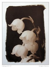
Okay, so following Matthew's lead, here is that cyanotype now toned in coffee. This looks a helluva lot better.
Details: Drinking-strength Melitta dark roast, about 1/2 litre, about 3 hours.
Edit: Matthew, I'd love to see what the negative looks like from that image of the factory. If you could post it then I'd be really grateful. If you have the time of course.


I'm happy to, but if you want more info, PM me and we will have to move it over to DPUG.
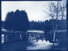
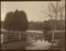
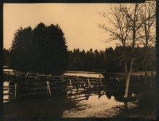
original image from 35mm neg:
paper negative from the above:
cyano before bleaching and toning:
How did u make the paper neg from 35mm? Print it the contact print the print?
| Photrio.com contains affiliate links to products. We may receive a commission for purchases made through these links. To read our full affiliate disclosure statement please click Here. |
PHOTRIO PARTNERS EQUALLY FUNDING OUR COMMUNITY:  |