Alternative color processes.

Recent Classifieds

Forum statistics

Threads
199,072
Messages
2,785,816
Members
99,795
Latest member
VikingVision
Recent bookmarks
1

jim10219

Member
Joined
Jun 15, 2017
Messages
1,632
Location
Oklahoma
Format
4x5 Format
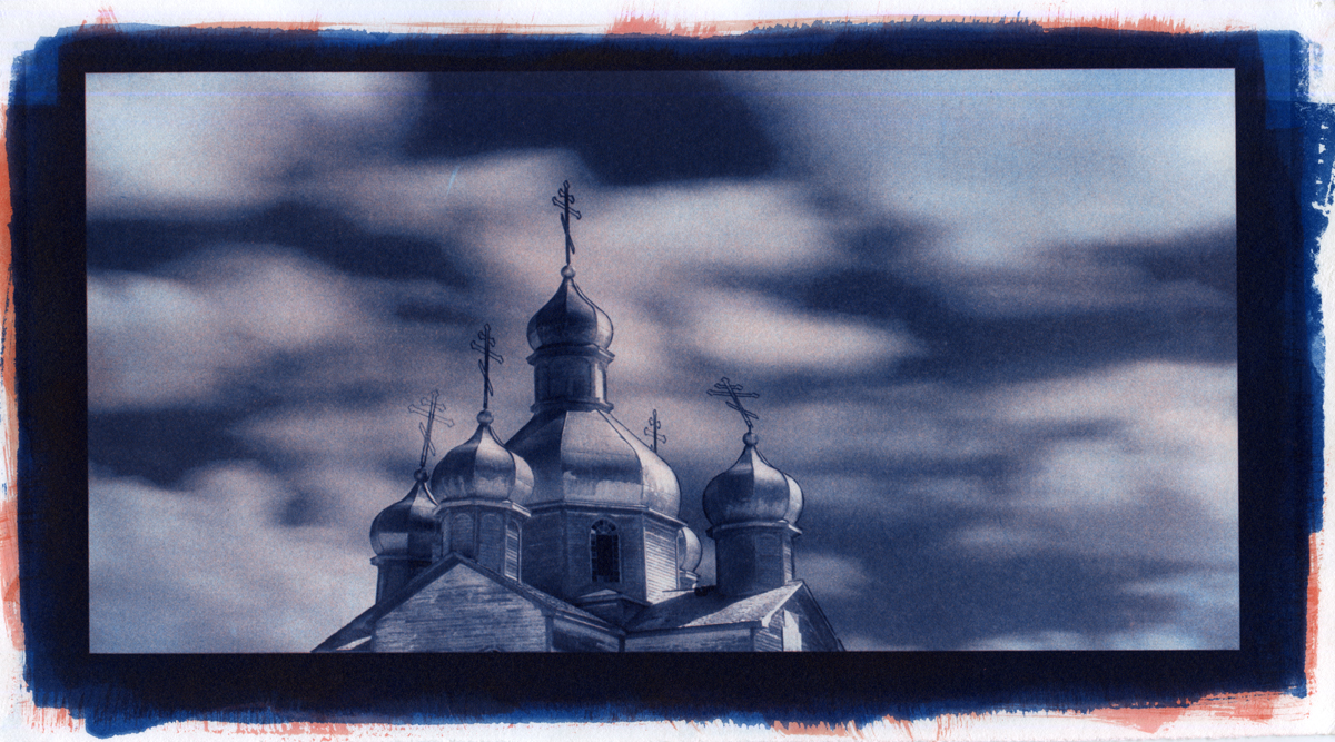
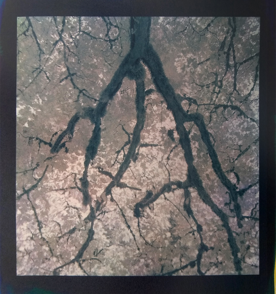
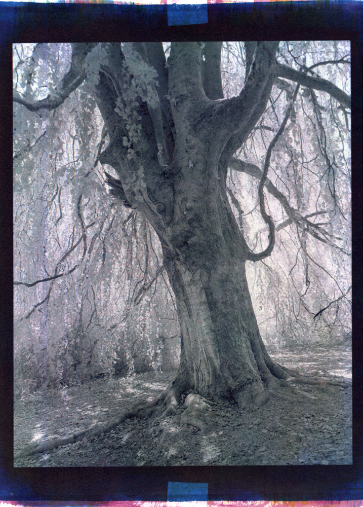
In a similar line to gum prints, there are also casein and temperaprints. I've done casein, but haven't yet attempted a temperaprint (see the work of Peter Fredrick). All three can get you the tri color, or really any color, you want.
 

AgX

Member
Joined
Apr 5, 2007
Messages
29,973
Location
Germany
Format
Multi Format
Who wouldn't?! But since they don't make the stuff to do them, you have to make it all yourself which is extremely difficult and expensive and requires a bunch of specialized tools.
There still is a industrial supplier.
 

Andrew O'Neill

Moderator
Moderator
Joined
Jan 16, 2004
Messages
12,063
Location
Coquitlam,BC Canada
Format
Multi Format

Andrew O'Neill

Moderator
Moderator
Joined
Jan 16, 2004
Messages
12,063
Location
Coquitlam,BC Canada
Format
Multi Format
HA! I was just there. Which article did you look at?

I just went over there. When I started, there was only maybe a few articles. Now there are many! I don't see it there. Another simple one to follow is this one. I've used the water colours that he uses (Cotman), but I didn't like them. I prefer Daniel Smith's.
 

AgX

Member
Joined
Apr 5, 2007
Messages
29,973
Location
Germany
Format
Multi Format
I never did.

Moreover in Germany imbibition processes become out of fashion after the war anyway, in contrast to America. That there even had been a dye-transfer lab in Germany the recent years, was quite surprising.
 

macandal

Member
Joined
Mar 6, 2009
Messages
145
Location
San Francisco, CA
Format
4x5 Format
Another simple one to follow is this one.
Ok, I just read his instructables tutorial and it was great for someone like me who knows nothing about the process and needs everything explained to him like a child. I really do appreciate that. However, if the photo at the beginning is what he's trying to reproduce and his results are the photos at the end, I don't know...??? I think two things may be causing what I don't like.

  1. His reproduction (final result) looks very "grainy." This may have to do with his paper selection. A "glossier" type of paper may have eliminated this "grainy" look I'm seeing.
  2. He only uses three types of colors (pigments): Cyan, Yellow, and Magenta. I've seen a YouTube tutorial where the artist used two additional colors to add contrast to the print: a "lighter" black, and a "darker" black. If I remember correctly, the artist said these two colors added contrast to what could be a flat picture, which is also what I notice in his final print.

Another thing I would like to know is how do you figure out your exposure time? I'll be using a UV light source (I made this box myself) and I would like to know how to get my development time. He gives you some times in the tutorial but it seems very arbitrary. Is there a way to pinpoint a development time more accurately?

I'm sure I'll have more questions, but this is a great start. I'm in the middle of reading a tutorial by Norman Breslow. It's written in a question-and-answer format, I'm hoping it's good too.

Thank you.
 

Andrew O'Neill

Moderator
Moderator
Joined
Jan 16, 2004
Messages
12,063
Location
Coquitlam,BC Canada
Format
Multi Format
Ok, I just read his instructables tutorial and it was great for someone like me who knows nothing about the process and needs everything explained to him like a child. I really do appreciate that. However, if the photo at the beginning is what he's trying to reproduce and his results are the photos at the end, I don't know...??? I think two things may be causing what I don't like.

  1. His reproduction (final result) looks very "grainy." This may have to do with his paper selection. A "glossier" type of paper may have eliminated this "grainy" look I'm seeing.
  2. He only uses three types of colors (pigments): Cyan, Yellow, and Magenta. I've seen a YouTube tutorial where the artist used two additional colors to add contrast to the print: a "lighter" black, and a "darker" black. If I remember correctly, the artist said these two colors added contrast to what could be a flat picture, which is also what I notice in his final print.

Another thing I would like to know is how do you figure out your exposure time? I'll be using a UV light source (I made this box myself) and I would like to know how to get my development time. He gives you some times in the tutorial but it seems very arbitrary. Is there a way to pinpoint a development time more accurately?

I'm sure I'll have more questions, but this is a great start. I'm in the middle of reading a tutorial by Norman Breslow. It's written in a question-and-answer format, I'm hoping it's good too.

Thank you.

adding a black by four colour separation (CMYK), will increase dmax... I don't do that. I use cyanotype as my cyan, then drop yellow and red layers over top. I'm quite please with the dmax. I don't use shiny papers... never heard of anyone doing that with gum. I use a good paper like Hahnemuhle Platinum Rag. For about a year now, I've been printing with just two negatives, my monochromatic images. The first negative is for cyanotype, the second negative is for both the red and yellow. I'm really liking my results. I've also been dropping just an orange layer (forgot the pigment name) over top of the cyanotype, to give it a more bluish/purple look. I've stuck a few in my gallery. The church image is orange over cyanotype. The next two are red and yellow over cyanotype.


Photrio.com contains affiliate links to products. We may receive a commission for purchases made through these links.
To read our full affiliate disclosure statement please click Here.

PHOTRIO PARTNERS EQUALLY FUNDING OUR COMMUNITY:


Ilford ADOX Freestyle Photographic Stearman Press Weldon Color Lab Blue Moon Camera & Machine
Top Bottom