- Joined
- Mar 13, 2007
- Messages
- 68
- Format
- Large Format
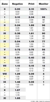
Is 0.16 to high for a zone 1?


Is 0.16 to high for a zone 1?
Is 0.16 to high for a zone 1?
Yep, most print films say -2 to +6 are OK.
Yes, but look at the shadows in -2. Not OK in my book!
Is 0.16 to high for a zone 1?
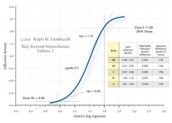
Canonically, Zone I is usually set at 0.1 to determine the film speed in the Zone system, but if the film you're testing has a long toe, you might find setting it a bit higher (or overexposing slightly) gives you better shadow separation. As long as you've got enough room at the other end, so you're highlights aren't hard to print, then you can go a bit higher.
Sorry, Yes minus BF.
I suspect that Adams and others chose 0.1 as the Zone I density or the "speed point," because it's a fairly low number that is reliably measurable
A log density of 0.1 was chosen as the speed point by the people who gave us the respective ANSI, DIN and ISO standards. The correlation to Zone I was Adams' choice. My eyes cannot detect a difference between Zone 0 and I, so, I don't find it useful pictorially.
Like many (and conversely, unlike many, I'm sure), I like a full range of print values and that includes the subtle difference between 0 and I and between IX and X.
I find this interesting Ralph-----I can see it plainly, especially since I have had cataracts removed in both eyes and am now enjoying my lens implants----wow!---what a difference it made in how I can perceive tonality. Your're probably laughing, but I'm very serious about this.
Impressive, but I can only say that there is a definite tonality difference that I can see between 0 and I without any special effort to see it. Therefore, in my obviously simplistic view, it has pictorial value.
Impressive, but I can only say that there is a definite tonality difference that I can see between 0 and I without any special effort to see it. Therefore, in my obviously simplistic view, it has pictorial value.
| Photrio.com contains affiliate links to products. We may receive a commission for purchases made through these links. To read our full affiliate disclosure statement please click Here. |
PHOTRIO PARTNERS EQUALLY FUNDING OUR COMMUNITY:  |