ChristopherCoy
Subscriber
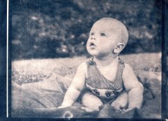
I thought my previous CT was a success, and it some form it was. However, I continued to get more and more frustrated trying to get good tonality in my cyanotypes. Add to that a pack of nearly wasted and very expensive Bergger paper, I was ready to cut ties with this process and try something else. After all, that is my nature - when something gets complicated, abandon it for something easier. But I stuck with it. I wrote my frustrations down in my journal, and spent a few days thinking about it.
After deciding to stick with it no matter what, I did some research and reading online. I found Mrhar's website and read about printing negatives in the best UV blocking color. So that's just what I did. I printed his color blocker, scanned it, and ran the analyzer. Turns out my negatives are better at blocking UV when their a funky, nearly lime green color.
Additionally, thanks to Christina Anderson, I found a cheaper alternative for experimentation, which I think I actually like better than Bergger. The Canson XL Bristol Recycled is about $9 a pack for 25 sheets, holds up to multiple baths, and prints a deeper blue than Bergger. It will be my paper of choice for the foreseeable future. As well, I found that applying the coating with a glass rod is much better than a foam brush.
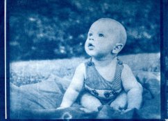
I told a friends last night via email that if feelings were fireworks, I'm sure all of you could see them from here. I was incredibly excited to knock this print out. The first test left a little too much to be desired in the highlights, so I fogged this paper for about a minute before laying down the negative. To say that I am THRILLED with the results is an understatement.
I'll be attempting this one again later today and trying to tweak a few things that I think could be improved, but I am simply overjoyed with this result.
And the icing on the cake is that I didn't need any ChartThrob curves, or anything.


