Wanted to get some feedback on this

Misc. Abstract

A
Misc. Abstract

  • 0
  • 0
  • 0
Death's Shadow

A
Death's Shadow

  • 2
  • 4
  • 77
Friends in the Vondelpark

A
Friends in the Vondelpark

  • 1
  • 0
  • 90
S/S 2025

A
S/S 2025

  • 0
  • 0
  • 80
Street art

A
Street art

  • 1
  • 0
  • 72

Recent Classifieds

Forum statistics

Threads
197,454
Messages
2,759,444
Members
99,377
Latest member
Rh_WCL
Recent bookmarks
1

Square Composition

  • Yes I like square and this is nice

    Votes: 80 87.0%
  • No I don't like square but this is nice

    Votes: 9 9.8%
  • Square for this is lousy, and I like square compositions

    Votes: 2 2.2%
  • All Square compositions are lousy

    Votes: 1 1.1%

  • Total voters
    92
OP
OP
rwboyer

rwboyer

Member
Joined
Oct 16, 2009
Messages
522
Location
MD USA
Format
Medium Format
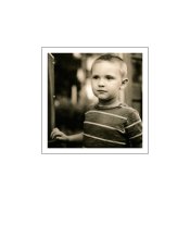
I was just giving hell with that statement. I see where you are coming from now. It is compositionally complicated. I do like that(to me) the angles scream abstract while the square leans toward structure.

I don't mind - that is what I asked for. I would never shoot anything like this for commercial purposes - too complicated and complicated = problems/controversy/arguments simple+exactly what the art director asked for no more no less = client happy = photographer needs to shoot other stuff for fun.

RB
 

MikeSeb

Subscriber
Joined
Jun 12, 2005
Messages
1,104
Location
Denver, CO
Format
Medium Format
Err, what was the question? [mops up drool].

It works for me as is.

Was it Darkroom317 or BobNewYork who mentioned "camera clubs"? What a collossal waste of time those are.
 

Vaughn

Subscriber
Joined
Dec 13, 2006
Messages
10,022
Location
Humboldt Co.
Format
Large Format
I like the square and I like your image, but...

I would have moved the camera just a little to the left, to include just a touch of window, her foot in the lower right corner and her body a little more centered in the square. (But it is not my image, so I didn't)

Between the off-balanced composition and her pose, she looks a bit stiff and uneasy. It does put a little more edge in the image, if that was your intent.

Vaughn
 

Donima

Member
Joined
Oct 19, 2009
Messages
17
Location
california
Format
Medium Format
Not that i dont like the model, i do! But i think i would rather see the image without the model. I also prefer the square format that i get with my 500cm. Don
 
OP
OP
rwboyer

rwboyer

Member
Joined
Oct 16, 2009
Messages
522
Location
MD USA
Format
Medium Format
I like the square and I like your image, but...

I would have moved the camera just a little to the left, to include just a touch of window, her foot in the lower right corner and her body a little more centered in the square. (But it is not my image, so I didn't)

Between the off-balanced composition and her pose, she looks a bit stiff and uneasy. It does put a little more edge in the image, if that was your intent.

Vaughn

More window and more space around her foot? Wouldn't that be camera to the right? camera to the left would center the subject more but cut out more of the window and reduce the space around her foot.

I am confused but interested in your comments - just the way the I read them they seem contradictory.

Anyway - I framed to optimize the conflicting diagonals from the stairs and the molding on the opposite wall vs their relationship to the corners of the square from a structural standpoint - the pose was mostly inspired by the line of the stairs, back mall molding, and railing.

RB
 
OP
OP
rwboyer

rwboyer

Member
Joined
Oct 16, 2009
Messages
522
Location
MD USA
Format
Medium Format
Not that i dont like the model, i do! But i think i would rather see the image without the model. I also prefer the square format that i get with my 500cm. Don

Another photographer buddy told me that when he saw the print hanging in my work area - then again he is a landscape guy and can count the number of people shots he has done on like one hand.

I do absolutely agree that the setting was the compositional focus - I guess that what experiments are for and why photography is a blast.

RB
 

Vaughn

Subscriber
Joined
Dec 13, 2006
Messages
10,022
Location
Humboldt Co.
Format
Large Format
Sorry, by "just a touch of window", I meant less than there is now. With her foot closer to the corner -- puts a little more energy down there. And I would try to match this with the other lower corner -- so that you would also keep the energy you have there from that line coming right out of the corner.

So there would be a little more wall showing behind (to the left) of the figure, balancing the figure a little better (subjective opinion, I know) in the frame.

But you have a strong image there. You have the softer rounded female form, surrounded by sharp angular male forms. She is not bathed in light, but is being struck and almost shoved back by the light bursting through the window. Her hand is in an active pose -- not a hand at rest. And that can be said for her pose in general. My suggestions above would change that -- not necessarily for the better.

It is a very active composition, there is a lot of tension in it. It grabs our attention and makes us want to wait to see the rest of the story. Which might be a reason that one can have it on the wall and not tire of the image.
 
Last edited by a moderator:

Darkroom317

Member
Joined
Mar 2, 2009
Messages
653
Location
Mishawaka, IN
Format
Large Format
Was it Darkroom317 or BobNewYork who mentioned "camera clubs"? What a collossal waste of time those are.

It was me. I wouldn't sy they are a an absolute waste of time. The only problem I seem to have is that out of the two clubs I belong to, I am one of two film shooters.

My only point was; that people who don't know much about the 6 X 6 format often don't like square photographs.

I especially like how in the OP's photograph, the woman's left leg mirrors the railing.
 
OP
OP
rwboyer

rwboyer

Member
Joined
Oct 16, 2009
Messages
522
Location
MD USA
Format
Medium Format
Sorry, by "just a touch of window", I meant less than there is now. With her foot closer to the corner -- puts a little more energy down there. And I would try to match this with the other lower corner -- so that you would also keep the energy you have there from that line coming right out of the corner.

So there would be a little more wall showing behind (to the left) of the figure, balancing the figure a little better (subjective opinion, I know) in the frame.

But you have a strong image there. You have the softer rounded female form, surrounded by sharp angular male forms. She is not bathed in light, but is being struck and almost shoved back by the light bursting through the window. Her hand is in an active pose -- not a hand at rest. And that can be said for her pose in general. My suggestions above would change that -- not necessarily for the better.

It is a very active composition, there is a lot of tension in it. It grabs our attention and makes us want to wait to see the rest of the story. Which might be a reason that one can have it on the wall and not tire of the image.

Thanks a lot for the clarification - I think the I was successful at what i was trying to do based on your comments and that is good feedback.

The other thing that I appreciate is your comments that are more calling into question if what I was trying to do was "appropriate" - or maybe ill conceived in the first place. Both are important to me.

I really enjoy making images that are a couple of things at once and a little complicated - not cluttered - complicated. For me it is a breath of fresh air after spending years shooting idiotically simple things for other people.

Thanks again for spending the time and thought process.

RB
 
OP
OP
rwboyer

rwboyer

Member
Joined
Oct 16, 2009
Messages
522
Location
MD USA
Format
Medium Format
It was me. I wouldn't sy they are a an absolute waste of time. The only problem I seem to have is that out of the two clubs I belong to, I am one of two film shooters.

My only point was; that people who don't know much about the 6 X 6 format often don't like square photographs.

I especially like how in the OP's photograph, the woman's left leg mirrors the railing.

I am shy about pointing out specific intent regarding my own photos especially when it comes to things that I myself am not sure about the success of failure of but I just have to respond to the leg/line/railing thing...

In this particular comp I was struggling with balancing the whole shooting match in a square and trying to achieve some sort of equilibrium between symmetry and juxtaposition or contradictory line. I usually am a much more intuitive shooter but I was having an issue with what I was seeing vs what I wanted so here is what I did.

My best to have a natural line of the model - imagine a center line if you will mirror the diagonal of the railing, molding, and downward line of the stairs.

The line of of each of her legs - the part below the knees - mirror the diagonal in the molding below the window in the lower right of the composition and the number of diagonals from the stair treads being the same in the opposite direction.

RB
 

Larry Bullis

Subscriber
Joined
May 23, 2008
Messages
1,254
Location
Anacortes, WA, USA
Format
Multi Format
All well and good (what a dead metaphor that is!).

With respect to all that's been said, I can't help but think that your model looks like maybe she'd rather be doing something else.
 
Joined
Jan 21, 2003
Messages
15,708
Location
Switzerland
Format
Multi Format
Square is one choice. Sometimes it works. Sometimes it doesn't. But if I have a camera that shoots a square ( = all my cameras except 35mm and 5x7) I aim for the print to be square for no particular reason.
For me the choice is more about how the pictures look on the wall, together. When I shoot with a square format, I try to make the square work.
Yet, if the square doesn't work, I don't mind cropping either.
Whatever the situation takes I'm willing to put up to make it work in the print.
 

BobNewYork

Member
Joined
Jan 1, 2008
Messages
1,067
Location
Long Island,
Format
Medium Format
In my opinion Thomas - you've nailed it! A photograph doesn't have to be anything...and by the same token it doesn't have to not be anything either. If the image works, firstly for the photographer and secondly for his or her audience...it works!

Bob H
 

markland

Member
Joined
Sep 27, 2008
Messages
14
Format
Medium Format
I like the composition as such, and exposure is great, but it's not clear to me why she's on the stairs...in the middle of the day and in lingerie. While I don't mind the sentiment, it seems a bit out of place or rather the 'story' is off. She's beautiful, the shot is beautiful, but it says something close to 'why am I waiting?' which isn't too compelling for me.
-Mark
 
OP
OP
rwboyer

rwboyer

Member
Joined
Oct 16, 2009
Messages
522
Location
MD USA
Format
Medium Format
I like the composition as such, and exposure is great, but it's not clear to me why she's on the stairs...in the middle of the day and in lingerie. While I don't mind the sentiment, it seems a bit out of place or rather the 'story' is off. She's beautiful, the shot is beautiful, but it says something close to 'why am I waiting?' which isn't too compelling for me.
-Mark

Mark,

Thanks for the feedback - any imaginary hints of a story that you would tell instead? Anyhow - I treated the whole thing as more of a still life than a portrait or journalistic image.

RB
 

SafetyBob

Member
Joined
Apr 19, 2011
Messages
290
Location
Yukon, OK
Format
Medium Format
RB, I see exactly what you wanted to accomplish with this lovely photo. Reminds me why I need to get my 6x6 equipment out more often. It has been killing me though about her hand.....as said, those very long and only four fingers are really drawing my attention....and the sad part is, I am not sure of how to best handle that if I even saw it in the first place. Maybe rotate the hand clockwise to show the whole hand? Have her lightly pressing her hand on her clothing to get away from those long fingers just hanging there?

I thought about how lovely just a face shot or close up would be of her, but then the staircase would be half way up her back with perfectly creamy background to show off her face.

All that said, when I first just "looked" at the photo, I loved it. Your model is beautiful, I love the square format, and the black and white just screams emotion to me. GREAT job!!

Bob E.
 

RalphLambrecht

Subscriber
Joined
Sep 19, 2003
Messages
14,560
Location
K,Germany
Format
Medium Format
I hear you - I originally bought a square camera for flexibility and put a grid screen in it so that I could visualize landscape and portrait comps without flipping the camera around but as I got used to it somethings just screamed square to me.

This one screamed square to me.

The funny thing is some of my best shots that were great square my clients insisted on a portrait crop. Amazing.

RB

I've seen suure prints mdtd in s portrait frame . looks great!
 
Joined
Jan 21, 2003
Messages
15,708
Location
Switzerland
Format
Multi Format
I've seen suure prints mdtd in s portrait frame . looks great!

I like that too. The portrait frame looks very nice with square prints, especially when top weighted.

Example: I print 8x8" on 11x14" paper. In a 16x20" overmat I mount it according to the attached picture.

The print is 8x8". The opening in the overmat is 9x9". There is 3.5" on each side of the opening, 4.5" on top of the opening, and 6.5" below.

To me it makes a very balanced frame.
 

Attachments

  • Untitled-1.jpg
    Untitled-1.jpg
    52.9 KB · Views: 208

j-dogg

Member
Joined
Jun 26, 2010
Messages
1,542
Location
Floor-it-duh
Format
Multi Format
Composition in square format seems to work well because it opens the door for symmetrical composition as well as asymmetrical, both in the same photograph.
 
Photrio.com contains affiliate links to products. We may receive a commission for purchases made through these links.
To read our full affiliate disclosure statement please click Here.

PHOTRIO PARTNERS EQUALLY FUNDING OUR COMMUNITY:


Ilford ADOX Freestyle Photographic Stearman Press Weldon Color Lab Blue Moon Camera & Machine
Top Bottom