UltraStable - Permanent, Non Fading Color Photographs . . Color-Carbon Par Excellence

$12.66

A
$12.66

  • 6
  • 3
  • 109
A street portrait

A
A street portrait

  • 1
  • 0
  • 140
A street portrait

A
A street portrait

  • 2
  • 2
  • 135
img746.jpg

img746.jpg

  • 6
  • 0
  • 107
No Hall

No Hall

  • 1
  • 8
  • 140

Recent Classifieds

Forum statistics

Threads
198,800
Messages
2,781,051
Members
99,708
Latest member
sdharris
Recent bookmarks
0

Bob Carnie

Subscriber
Joined
Apr 18, 2004
Messages
7,735
Location
toronto
Format
Med. Format RF
Thank you for posting Mr Berger, I have sent you an email ,, but for all APUGers that are following this thread..
CMB is a legend and I am so happy that he is on this thread, thrilled in fact.
I look forward to the manual and like Dave C will follow this .

Sandy King is in the room outside right now teaching 10 people how to make carbon tissue and prints in my working darkroom . lets just say the advent of neg making has made this process practical for us all.

I have spent some time in Maine 1 week in the early 90's using this product and John Bentley is in Toronto and I have watched his progress , from the time he was staying with me, to him buying his bus , to going to Mexico and his meeting Todd Gangler.

I plan to follow this with interest as any serious printer would.
 

Photo Engineer

Subscriber
Joined
Apr 19, 2005
Messages
29,018
Location
Rochester, NY
Format
Multi Format
PE, I get the feeling that you and Henry Wilhelm don't agree on some things ? ? Also, when talking about longevity, you're mainly questioning the support, not the carbon colors themselves, right?

Everything I said was either learned by experimentation or in the ICIS short course on Image Stability that I took in 2006. The course was taught by an ANSI image stability committee member, and Henry Wilhelm was also an ANSI committee member at that time. I met Henry when he gave his first talk in the 80s, and he and I toured the Image Permanence Institute at RIT together and talked about image stability for nearly 3 hours in 2006, the day I took that course. I can say that I see both sides of this picture and there is no agreement in the industry on this. Since both methods give quite different results though, I have to take a wait and see attitude and point out both positions.

I hope you see my POV.

As for the later comments here by Mr. Berger, there are some points that I would differ with. For example, Ilfochrome does retain some of the dye fragments after processing, just as Kodak and Fuji products wash out most harmful ingredients and leave behind dye stabilizers. I agree with his comments on the stability of supports. Much has been done on the stability of Kodak and Fuji supports, but what has been done on the UltraStable suppor?

Again, we just have to wait and see.

PE
 
OP
OP
holmburgers

holmburgers

Member
Joined
Aug 13, 2009
Messages
4,439
Location
Vienna, Austria
Format
Multi Format
Davec, thanks for posting the link over to your DPUG thread. I saw that but haven't had a chance to read the whole thing. As for what I paid for these sheets... only shipping actually! I have a very generous collaborator who is helping me to develop the dichromated-gelatin dye-transfer process and he knew of my interest in color carbon. I wouldn't let the lack of commercially available color-carbon tissues discourage you from trying to make your own. Not sure of the current state, but the folks at Bostick & Sullivan were working on it, and if we can find a good source for the pigments, it's something worth trying on our own.

I suspected the use of a diazo sensitizer, which is something I know very little about, only that it is used in screen printing and a diazo sensitizer is available through Speedball. Does it have properties similar to dichromates? For instance, could a monochrome carbon printer be just as satisfied with this kind of sensiziter or are there limitations? It's nice to know that there might be an alternative to the inevitable day when dichromates become outlawed (fingers cross-linked.... carbon joke there...)

Ok, so knowing this, I'm looking forward to the lab manual. In my ignorance, I might've tried to clear the print with sodium bisulfite.

Somewhere I read that continuous tone negatives are just as suited for U.S., but are there any caveats in using them?

Lastly, I'm curious how Luis Nadeau fits into the picture. For being the leading author on the topic of color carbon, I'm surprised his name hasn't popped up yet.

Thanks for everyone who is contributing to the thread.
 
Joined
Aug 6, 2005
Messages
1,798
Location
Ventura, Ca
Format
ULarge Format
Your 2 cents is most appreciated. Do you know if he made these tissues himself? It'd be really interesting to compare the hue of these against the UltraStable sheets. I hope you can get around to doing color soon.

As per melinex, it is interesting to think that we invented these materials within the last 60 years (+/-) and therefore how can we really know if they'll last. Hopefully though... because I just bought a 1000' of polyester film sleeving.

PE, I get the feeling that you and Henry Wilhelm don't agree on some things ? ? Also, when talking about longevity, you're mainly questioning the support, not the carbon colors themselves, right?

To me, the idea of using a high quality artist's paper is the most fool proof in terms of longevity. This, we know about.

When transferring the carbon layers to the UltraStable receiving film, does it adhere to the pure melinex, and the opaque backing is on the other (base) side? Or is there an opaque subbing layer on the carbon/"emulsion" side?

There is a lot of knowledge about one of the finest printing methods I've ever seen in this thread. Like Bob said anyone who is a serious printer should be following with interest.

I have transferred my carbons to Melinex with no prep to the surface at all either side. I'm saving what I have for color work in the future. There is a huge learning curve for me I think.
 

Marco B

Subscriber
Joined
Jan 13, 2005
Messages
2,736
Location
The Netherla
Format
Multi Format
Thanks J!

Well, it seems that nothing is more stable than a carbon print because it is actually pigment trapped inside the gelatin. You can think of it like making a photograph with painter's pigments, and these substances can be incredibly stable. Vermeer's paintings haven't faded for 350 years!

Thanks for the compliment to my countries ancestors :wink:, but I think you are giving them to much credit... It is well known that at least some of the organic, but also some of the inorganic, pigments used in the heydays of Dutch painting (16-17th century), were fugitive and could fade rather easily. For pigments used by 19th century painters, a time when many new and untested pigments came available, the situation was even worse. Some of the famous Van Gogh paintings, and the colors therein, are rapidly "fading" to ugly greys and browns, due to use of at the time "novel" pigments... :pouty::

See also this excerpt from this page about Vermeer:

"It is believed that the curious bluish tone of the foliage in The Little Street is due to the fact that the yellow lake, which mixed together with a blue original created the proper green tone, has faded with time. One of the names given to a common yellow lake was "schijtgeel", weld or fading yellow as it is called. As almost every other painters of the time, Vermeer used, red madder, a ruby red pigment noted for its brilliancy and transparency, but fugitive when applied in very thin layers. Madder is an organic pigment derived from the roots of the madder plant. Vermeer glazed (see glaze - glazing and Vermeer's palette for an in-depth study of artist's pigments) . The rather dull appearance of some of the flesh tones in Vermeer's faces may be due to the fact that red madder, has faded leaving the white/yellow mixture to dominate. Another example of a glaze which has in time faded in Vermeer's painting can be found in the Girl with a Pearl Earring. Presently, the picture's background appears uneven and spotted. During the 1994-1995 restoration it became clear that this appearance had been caused by the degraded composition of a peculiar glaze used by Vermeer. It was ascertained that the background was originally meant to have a deep greenish tone which can no longer been seen. Vermeer had glazed a very transparent layer of indigo mixed with weld over the dark black underpainting. Indigo and weld are both pigments of organic origin. Indigo is deep blue dyestuff derived from the indigo plant, weld is a natural yellow dyestuff obtained from the flowers of the wouw or woude plant as it was called in Dutch. Mixed together with a rich binding medium (linseed oil) they form a transparent greenish tone. Weld was widely used for dying silk since it was one of the purest and yellow shades available but was equally valuable to the artist. It seems that Vermeer used indigo only rarely."

And this Scientific American article about some of the Van Gogh color problems caused by an at the time modern chromium based yellow switching oxidation state:

http://www.scientificamerican.com/blog/post.cfm?id=x-rays-blow-up-secret-to-van-goghs-2011-02-14

Marco
 
Last edited by a moderator:

Marco B

Subscriber
Joined
Jan 13, 2005
Messages
2,736
Location
The Netherla
Format
Multi Format
Some links to organizations involved in art conservation that you may find useful to explore:

http://www.conservation-us.org/
http://www.cci-icc.gc.ca/index-eng.aspx
http://www.incca.org/
http://www.getty.edu/conservation/
http://www.campbellcenter.org/pages/resources.html

And you may find this page revealing and handy, from the Watercolors page on the Handprint webpage:
Doing your own lightfastness tests

And especially the results of light fastness tests of specific coded pigments as summarized here:
Summary of 100 common pigments: http://www.handprint.com/HP/WCL/palette1.html

and detailed info here:
Detailed summary of 750 pigments: http://www.handprint.com/HP/WCL/waterfs.html

if you think the above test isn't relevant (it's about watercolor paint mainly), than realize that watercolor paints are actually paints without any significant amount of binder like oil, so almost pure pigment. Hence testing watercolor will at least give you a "worst case" result for the stability of the pigment involved and probably faster test results.

Marco
 
Last edited by a moderator:
OP
OP
holmburgers

holmburgers

Member
Joined
Aug 13, 2009
Messages
4,439
Location
Vienna, Austria
Format
Multi Format
Marco,

Why do I always pick the worst examples?? :laugh: I admit that my statement about Vermeer was backed by absolutely zero research... just seemed like a convenient example of an old artist with vivid colors.
Fascinating read though!
 

Photo Engineer

Subscriber
Joined
Apr 19, 2005
Messages
29,018
Location
Rochester, NY
Format
Multi Format
Marco;

Don't forget George Eastman House as an organization that is concerned with conservation and restoration.

PE
 

Marco B

Subscriber
Joined
Jan 13, 2005
Messages
2,736
Location
The Netherla
Format
Multi Format
Marco;

Don't forget George Eastman House as an organization that is concerned with conservation and restoration.

PE

Yes, sorry, you are completely right. These were just the bookmarks from my "Art" collection of bookmarks, not the "Photography" department:

https://www.imagepermanenceinstitute.org/
https://ritdml.rit.edu/

But since we were also talking pure pigments, I thought the other links potentially very useful as well, and maybe in some ways even more relevant in that context.
 
OP
OP
holmburgers

holmburgers

Member
Joined
Aug 13, 2009
Messages
4,439
Location
Vienna, Austria
Format
Multi Format
Over the weekend I did a very quick & dirty test with a cyan carbon print. I did everything wrong; no safe edge (severe frilling), black-lights were too close so I got uneven exposure, etc. BUT, I did achieve my very first carbon print!

I also did not wash it very thoroughly and the strangest thing has happened in the intervening days; a orangeish stain has manifested. I'm guessing that I did not wash out the sensitizer, but I'm curious what this is. The working instructions will probably lend some clues.

It was transferred to Kodak dye-transfer paper actually, and I don't know if that mordant would have an effect.

I can post it, though I'd prefer to show a better example once I work out the kinks.
 

CMB

Member
Joined
Mar 17, 2011
Messages
117
Location
Santa Cruz,
Format
Multi Format
Chris,

I'm glad to learn of your successful experiments with the UltraStable films. The fact that these (presensitized) color pigment films were made more than 15 years ago, and are still usable, illustrates another reason why dichromate
(which would have spontaneously hardened these gelatin emulsions in less than 48 hrs) was abandoned as a sensitizing agent.

My guess is that the stain you are seeing is a consequence of (a) washing out the exposed pigment film onto a gelatin coated paper (here, dye-transfer); (b) not clearing the print as described in the lab Manual (which unfortunately you do not have); and (c), as you said, the mordant may be playing a part (did you thoroughly wash the DT paper before using?).

I'm pretty sure the clearing baths will not remove sensitizer stain after this much post-processing time, but if you wish to try, here's a snip from the (soon to be posted) manual relevant to that protocol:

6. Clearing

When all four colors have been processed and fully dried, residual
chemicals are removed by immersing the print in Clearing Bath A for
1 minute, followed by a brief cold water rinse and then placed in
Clearing Bath B for an additional minute. After a final rinse, the
print is dried and ready for finishing.

Stock Clearing Bath A:
Water (at 110 F) 930 ml
Potassium Permanganate 6 g
Sodium Chloride (Table Salt) 14 g

Stock Clearing Bath B:
Water (at 110 F) 940 ml
Sodium (Meta)Bisulfite 30 g
Sodium Sulfite 30 g

To make working solutions of A and B, dilute each in cold water at 1:20.
 

gmikol

Subscriber
Joined
Mar 2, 2009
Messages
633
Location
Vancouver, W
Format
35mm
Just a quick question...

With it's (presumably) diazo sensitizer, was UltraStable intended to be used with imagesetter negatives, or could it / was it intended for use with continuous-tone negatives?

I always thought that diazo-based sensitizers were extremely high-contrast.

--Greg
 
OP
OP
holmburgers

holmburgers

Member
Joined
Aug 13, 2009
Messages
4,439
Location
Vienna, Austria
Format
Multi Format
Charles,

Yes, I absolutely see why you went with diazo sensitization. It is quite remarkable honestly! By the way, do my emulsion #'s indicate a specific date, 1996?

I think the stain must be a function of (a) mainly, as it is only in the whites of the print, and not in the area outside where the negative was. I'll try to scan it and post it for the sake of showing this. I did not wash the DT paper other than a 10' soak before sandwiching.

Thanks much for the clearing instructions.

Greg, from what little I've read so far, it was intended for high resolution half-tone negatives as well as cont. tone.

Does the lab manual cover negative sensitometery? I guess time will tell!
 

CMB

Member
Joined
Mar 17, 2011
Messages
117
Location
Santa Cruz,
Format
Multi Format
UltraStable: Sensitizers and Sensitometry

Although some of this has been discussed here before, it bears repeating:

1. Light hardened gelatin layers (carbon, Fresson), unlike gelatin hardened by AgX-tanning developers (carbro and dye-transfer) have a "soft" and diffuse boundary between soluble and insoluble which are sensitive to slight differences in processing . Most apparent in the highlights and in neutral color balance, these processing variations make it difficult to produce two similar continuous tone color carbon prints. Although prized by artists and hobbyists, these one-of-a-kind- print characteristics make the con-tone carbon process unsuitable for most commercial applications. Furthermore, the absence of shoulder in the (straight line) characteristic curve of carbon tissue impairs the printing of highlights (e.g. the details of a white-on-white wedding dress) necessary for accurate photographic reproduction.

2. The UltraStable sensitizer (Diazidostilbene Sodium Sulfonate) is similar to dichromate in its ability to create a variable thickness image in response to actinic light exposure. It is also subject to the same problems of highlight loss and repeatability that affect dichromated gelatin layers. By using dot area rather than negative density (half-tone-vs-con-tone), pigment films can be processed with a high degree of repeatability and no highlight loss.

3. UltraStable pigment films are capable of producing a four-color neutral gray scale (using screened separation negatives) with densities ranging from from .02 to 2.50+ with a base fog density of less than .01 (when printed on a white PE base). By comparison, dichromate sensitized carbon tissue, has a high base fog density (typically .10+) and when used with continuous tone separation negatives, has no visible highlight contrast until reaching a .20-.30 density level.

4. UltraStable films are balanced so that the exposure times are the same for all four colors. Once the time to produce the recommended Cyan solid (non-screen) density of 1.39 is determined, identical exposures of the other color layers will produce Solid Densities of (approximately) M=1.34, Y=.96 and K=1.24, which, when combined, will result in a neutral (4/C) gray scale.
 

Photo Engineer

Subscriber
Joined
Apr 19, 2005
Messages
29,018
Location
Rochester, NY
Format
Multi Format
As an OTOMH guess, if those are Status D densities in paragraph #4, this indicates a relatively high level of cyan and magenta impurity in the blue region and thus somewhat unsaturated colors. The high level of K correction indicates narrow dyes at the same time. Am I correct?

PE
 
OP
OP
holmburgers

holmburgers

Member
Joined
Aug 13, 2009
Messages
4,439
Location
Vienna, Austria
Format
Multi Format
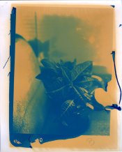
UltraStable Cyan - Rough & Rowdy, Down & Dirty TEST

Ok, so here is my aforementioned test with a print from a cyan tissue.

It's a comedy of errors, but in my own opinion it has a certain degenerate beauty about it. As you can see, the stain is very apparent, and has been steadily growing since the "time of conception". It was completely non-existent at first.

This negative (which is a bit smaller than 8x10") is from a reversal processed 4x5" positive that I projected onto Agfa Mammography X-ray film. The negative itself is not perfect, and yet the tonality of this print is nonetheless promising.

It's such a thrill to have these materials, and I promise this won't be the last image I make with them! Though it might be some time until I get to 3-color, as I need to commit some more effort towards my dye-transfer process.
 

Attachments

  • UltraStable Test (Plant)001.jpg
    UltraStable Test (Plant)001.jpg
    150.2 KB · Views: 280

totalamateur

Member
Joined
Oct 17, 2008
Messages
143
Format
Medium Format
Count me in as one who is closely watching the thread- and thanks for posting the alternative sensitizer to chromate, Diazidostilbene Sodium Sulfonate, using chromates is the single greatest source of heartburn I have with the process.

Most of the discussion here has been related to the stability of the print, which will outlast me in any case - does anyone have any comment on the appearance of these prints? (unfortunately there are no color carbon prints in my geographical area that I can locate.)
 
OP
OP
holmburgers

holmburgers

Member
Joined
Aug 13, 2009
Messages
4,439
Location
Vienna, Austria
Format
Multi Format
Post 4 on this thread has these two examples of Tod Gangler's work with UltraStable (purportedly)

http://farm2.static.flickr.com/1345/5129253631_4146724910_o.jpg
http://farm5.static.flickr.com/4059/5129253627_11ef55cd67_o.jpg

2nd picture down is another UltraStable print.. Dead Link Removed

Also, check Davec's post in this thread; #23.

From what I've heard, the colors are not as saturated as some other print methods, due to an inherent lack of transparency in the pigments. I'm not sure to what degree this holds true however.

I wonder if a screen-printer's diazo sensitizer could be a "drop-in replacement" for dichromates..
 

Davec101

Member
Joined
Jul 29, 2005
Messages
1,216
Location
Cambridge, U
Format
Large Format
Most of the discussion here has been related to the stability of the print, which will outlast me in any case - does anyone have any comment on the appearance of these prints? (unfortunately there are no color carbon prints in my geographical area that I can locate.)

I asked Michael Ward who printed Sarah Moon's work in the 90's, what he considered the qualities of a finely crafted pigment transfer print were in an article i recently wrote, he said

‘The lushness and density of colour. The union of that colour with it's surface. In other words, materials complimenting each other. The print being an object, not just a record. This process allows for artistic sensitivity in that application. A good pigment transfer print can be appreciated as much for it's material presence as for it's image. I think it has a more physically tangible quality than the results of some other photographic processes.’

First time i saw them was a visual revelation much like when i saw my first platinum print, when printed well with the right subject matter pigment transfer prints are stunning.
 

CMB

Member
Joined
Mar 17, 2011
Messages
117
Location
Santa Cruz,
Format
Multi Format
UltraStable:Sensitometry

As an OTOMH guess, if those are Status D densities in paragraph #4, this indicates a relatively high level of cyan and magenta impurity in the blue region and thus somewhat unsaturated colors. The high level of K correction indicates narrow dyes at the same time. Am I correct?

PE

Yes, you are correct regarding the Status D density readings. The spectral impurities characteristic of color pigments limit their saturation values. The UltraStable black layer (a pigment, not a dye) is used primarily to provide additional density and detail in the shadow areas and not for color correction.
 

CMB

Member
Joined
Mar 17, 2011
Messages
117
Location
Santa Cruz,
Format
Multi Format
UltraStable Process Instructions

Here's a PDF of the UltraStable Process Instruction (rev:6/96):
 

Attachments

  • UltraStable Process Instructions.pdf
    132.5 KB · Views: 1,162
OP
OP
holmburgers

holmburgers

Member
Joined
Aug 13, 2009
Messages
4,439
Location
Vienna, Austria
Format
Multi Format
Thanks much for posting this. It's remarkably cool that exposure times are equal once you figure out just one.

Any idea if the stain in my posted cyan print is characteristic of improper clearing? Or is it virtue of the mordant in Kodak DT paper?
 
OP
OP
holmburgers

holmburgers

Member
Joined
Aug 13, 2009
Messages
4,439
Location
Vienna, Austria
Format
Multi Format
That's a fantastic glimpse at the coating procedure.

That magenta appears to be much thinner & thus more transparent than the US tissue. Is there anything noteworthy about that difference?

I hope to see more on your youtube channel Charles, great stuff!
 
Photrio.com contains affiliate links to products. We may receive a commission for purchases made through these links.
To read our full affiliate disclosure statement please click Here.

PHOTRIO PARTNERS EQUALLY FUNDING OUR COMMUNITY:


Ilford ADOX Freestyle Photographic Stearman Press Weldon Color Lab Blue Moon Camera & Machine
Top Bottom