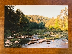
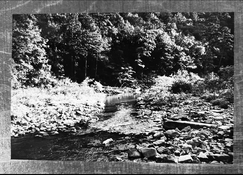
The scans sent don’t show the yellowing as much as the prints...!
I'd suggest doing your own prints. You evidently have a good idea what you want your prints to look like, so it makes good sense to take control over that part of the process as well. Whether you use inkjet, send digital files to get silver halide prints back, or darkroom optical enlargement, doesn't matter - in all instances you can control what color rendition you want. Within the capabilities of the process and your own competencies of course. The latter is very flexible, as you can learn (which coincidentally is also fun).
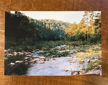
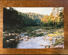
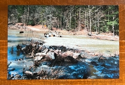
I've simulated a magenta + yellow adjustment on one of those prints:
It's of course an approximation, since I'm working with a quick & dirty adjustment of a photo of a print, posted back to you as a digital file...a real print will always look differently.
Note that what the others said is of course very true and won't change, ever: early morning and late afternoon/evening light is warm, and shadows are cool. Exploit it, embrace it or work around it as you desire.
Learn to look like painters do, and forget things you think you know about objects having colors. Trees are NOT green. Rocks are NOT grey. People are NOT pink or brown. Water is NOT blue. As kids, we somehow learn to draw/paint this way, but it's nonsense in the end.
Look at a Van Gogh painting and ask yourself if those colors are real. They can't be, right? They are! He painted exactly what he saw - exaggerated the colors, yes (and some of them have faded/shifted, especially the yellows)! Look at his portraits and note how faces have streaks of green in them, how shadow areas are stark blue (e.g. his Auvers church) or cyan (some of his almond blossoms - spring light!), and how his trees are cacophonies of greens, blues, whites, tans, yellows...It looks unreal, until you start actually carefully looking at the real world and isolating the colors under different lighting conditions. You start to notice that what he did was eerily accurate - just amplified.
Look at a scene as it really is, and not at the objects as you think you recognize them. Your photo above: try not to look at a stream, the rocks in it, the trees in the background. Notice a patch of dark greens on the left, an area of cyan hues in the center, vibrant yellows and oranges to the right. The bottom half consists of pale blues and magentas, with flashes of yellow. Forget about objects and their names. Look at things like shape, value (dark/light), color, spatial relationships. And then decide where you want to take them; what you want to emphasize, shift in a certain direction, etc. Digital space is vastly more flexible in this sense than optical printing, but the latter certainly also offers certain possibilities for playing around (it just takes more time, more effort, more experience in getting anything done).
Getting your prints made at Blue Moon might give you better results, but it won't be because they work in a certain way - if the prints are better, it's just because the person doing the color balancing somehow leans closer to your preferences than whatever man or machine made the other prints. It'll still be a crap shoot. The only way out of it, is to take control.