-
Welcome to Photrio!Registration is fast and free. Join today to unlock search, see fewer ads, and access all forum features.Click here to sign up
You are using an out of date browser. It may not display this or other websites correctly.
You should upgrade or use an alternative browser.
You should upgrade or use an alternative browser.
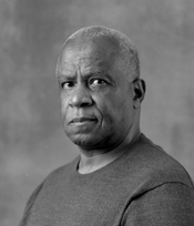
Too milky
-
A
- Thread starter Darryl Roberts
- Start date


Recent Classifieds
-
For Sale Sinar Norma 4x5 5x7 set and some Sinar accessories.
- Started by Jammoh
-
Free 3 enlarging lenses
- Started by jvo
-
For Sale Pentax 67 body with metered prism and grip
- Started by Guivd
-
For Sale Lens boards:Toyo, Canham, cambo, grafle
- Started by darinwc
-
For Sale Toyo 110mm lens boards (45 CF 45AR, 45ARII A11, AX
- Started by binglebugbob
Forum statistics
pentaxuser
Member
Do you mean too low in contrast i.e. too much greyness? It looks perfect to me but if too milky for you have you tried 1-2 grades higher?
pentaxuser
pentaxuser
Is this a scan of the negative, or of a print?
There is plenty of information in the image to make it less flat. I've done it here digitally, but it could be done equally well or better by printing at a higher contrast grade.

But I think the main issue is that the shirt and the background are quite close in tone to the sitter's skin tone. It's just one of those annoying things you have to think about in B/W.
BTW, I find that background distractingly 'busy' - you might want to think about putting it further away?
There is plenty of information in the image to make it less flat. I've done it here digitally, but it could be done equally well or better by printing at a higher contrast grade.
But I think the main issue is that the shirt and the background are quite close in tone to the sitter's skin tone. It's just one of those annoying things you have to think about in B/W.
BTW, I find that background distractingly 'busy' - you might want to think about putting it further away?
Sirius Glass
Subscriber
I do not see any problem with the photograph. Maybe your standards are wrong. Send your standards in for a CLA and see if the world appears brighter.
If mine I would crop substantially and vignette perhaps a stop darker in order to draw attention to his face. Unless, of course, this is an advertisement for a sweat shirt. Handsome man.
pentaxuser
Member
I have changed my mind. While the original is OK for me, I feel that on balance I prefer your version Jonathan which appears easily achieved in a darkroom by a higher grade
pentaxuser
pentaxuser
As others have said, contrast can be boosted in printing - you generally want a somewhat "flat" negative so you have all the tonality you might want in the final available in the neg.
Beyond that, you could control your lighting a little more; say, put something like a grid spot on the BG to get it a bit brighter behind the head and cut the overall BG lighting and you'll get a subtle sort of "halo" that makes the face pop a bit more. Flag off your key so the light falls off a bit from the chest down - you can burn that in printing, but flagging lets you control the balance of the lower body to the background. An open-end black net is a huge help for stuff like this, too.
Beyond that, you could control your lighting a little more; say, put something like a grid spot on the BG to get it a bit brighter behind the head and cut the overall BG lighting and you'll get a subtle sort of "halo" that makes the face pop a bit more. Flag off your key so the light falls off a bit from the chest down - you can burn that in printing, but flagging lets you control the balance of the lower body to the background. An open-end black net is a huge help for stuff like this, too.
- StevenPaul
- Deleted
It is all in the lighting -- says someone with some little experience in studio lighting.
But you did a good job of recording what was there. Create the lighting in the scene you want, and I think your film and printing will get you there.
Edit: What I meant was use the film, its development and your printing/display methods to enhance the light you see and are photographing. Avoid depending on process to create the sense of light falling on the scene.
Last edited:
Sirius Glass
Subscriber
I do not see any problem with the photograph. Maybe your standards are wrong. Send your standards in for a CLA and see if the world appears brighter.
it looks good to me
Great minds run on the same paṯh.
Welcome to APUG Photrio!!
I think the main issue is that the shirt and the background are quite close in tone to the sitter's skin tone.
This. I'dd add that you need to crop a little higher, for two reasons. One is the shirt is the least interesting aspect of the whole portrait but the one that takes the most space on the photo, increasing the feeling of dullness. Second, is that the way you have him pose makes it look like the more you go down, the fatter he gets, which isn't flattering. Get higher and closer. He has a nice face and an intriguing look.
Focus is slightly off. Eyes aren't sharp.
Lighting needs to be a tad stronger to get a bit more shadow in the face, put the fill at two stops below. From the catchlight, main light seems a little too much to your left. Not sure here if you were going for one of the "classic" looks — Rembrandt ?
Sirius Glass
Subscriber
This. I'dd add that you need to crop a little higher, for two reasons. One is the shirt is the least interesting aspect of the whole portrait but the one that takes the most space on the photo, increasing the feeling of dullness. Second, is that the way you have him pose makes it look like the more you go down, the fatter he gets, which isn't flattering. Get higher and closer. He has a nice face and an intriguing look.
Focus is slightly off. Eyes aren't sharp.
Lighting needs to be a tad stronger to get a bit more shadow in the face, put the fill at two stops below. From the catchlight, main light seems a little too much to your left. Not sure here if you were going for one of the "classic" looks — Rembrandt ?
I agree, crop the bottom to get rid of the distracting bulge.
Hell no! That belly and that look go together!!!!
Edit to add -- I know it is the closest part of the body to the camera, but this dude's got huge arms. There is some power behind that belly. That is what I believe the OP wants to bring out in the lighting...and soft light (the bounced light?) is not backing up the feeling of strength.
Edit to add -- I know it is the closest part of the body to the camera, but this dude's got huge arms. There is some power behind that belly. That is what I believe the OP wants to bring out in the lighting...and soft light (the bounced light?) is not backing up the feeling of strength.
Last edited:
pentaxuser
Member
The eyes look sharp to me and the torso looks right for a man of his age. If it were me I'd be happy to receive this portrait with the modified contrast
I can imagine his grandkids seeing it and saying it was exactly grandad as they saw him
pentaxuser
I can imagine his grandkids seeing it and saying it was exactly grandad as they saw him
pentaxuser
Valerie
Subscriber
His forward shoulder is sharper than his eyes....
And I agree about the angle of the shot being off. Raise the camera a bit.
A lighter or darker backdrop would help him stand out.
And I agree about the angle of the shot being off. Raise the camera a bit.
A lighter or darker backdrop would help him stand out.
Great minds run on the same paṯh.
Welcome toAPUGPhotrio!!
Agreed to, it is what it is, any other methods would just be different.
Anything you do dont change films, HP5 is such a fine film for large format portraits.
The eyes look sharp to me and the torso looks right for a man of his age. If it were me I'd be happy to receive this portrait with the modified contrast
I can imagine his grandkids seeing it and saying it was exactly grandad as they saw him
pentaxuser
My comment was in no way a criticism of the man's shape—he's probably slimmer than I am. What I said was that the angle in which he is posed makes it seem like he's getting fat in the belly. From a purely photographic point of view, it's distracting and enhances the feeling of dullness in the whole, as the body, dressed in a uninteresting shirt, takes too much space.
pentaxuser
Member
Alex, I never thought you were criticising his shape. It is simply that I see merit in a portrait which is "warts and all"( is that a Canadian saying as well?) and you see merit in improving his appearance. Neither of us is wrong
pentaxuser
pentaxuser
I'm going to agree with Alex, in so far as the point of view doesn't work particularly well with the subject.
I would be more likely to choose that point of view with someone skinny and tall.
But speaking more generally, I would suggest more differentiation between foreground and background, and I would think that that subject's face is of much more interest than his belly. Getting in closer, from a slightly higher angle of view would probably help as well with the foreground/background differentiation. And if the subject could lean forward slightly, rather than leaning back, it might help as well.
If you have enough depth of field, this subject might look good as well with his arms crossed in front of him. That too would help with the differentiation.
With cropping and some digital play, I ended up with the following. Note that the plane of sharpest focus is closer to the forehead than the eyes. The expression though is great, as is the lighting on the face. You just need to adjust the background.
Attachments
As the cropped version works so well, I would suggest staying with the same subject distance, but using a longer lens, if you have it.
As the cropped version works so well, I would suggest staying with the same subject distance, but using a longer lens, if you have it.
It's not better, it's just different. Original he looks more warm and accessible. Cropped he looks like a lawyer.
It's not better, it's just different. Original he looks more warm and accessible. Cropped he looks like a lawyer.
Actually, given the belly on some lawyers I've known, he actually looks more like a lawyer in the first one
 .
.Alex, I never thought you were criticising his shape. It is simply that I see merit in a portrait which is "warts and all"( is that a Canadian saying as well?) and you see merit in improving his appearance. Neither of us is wrong
pentaxuser
Got it, and agree!
 I'm also on the "warts and all" school of photography, which is one of the (many) reasons I don't do formal portraiture, which is a genre onto itself, with many codes and in which one of the goals is to make people look as good as possible.
This case is unclear: background and lighting setup says "formal", casual wear says "this is a friend sitting for me." Wish the OP would chime in on this.
| Photrio.com contains affiliate links to products. We may receive a commission for purchases made through these links. To read our full affiliate disclosure statement please click Here. |
PHOTRIO PARTNERS EQUALLY FUNDING OUR COMMUNITY:  |