What About Bob
Subscriber
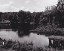
I would like to post up images here from scans of my analog prints but I have been at a loss for a some time and It has to do with calibration of images from scanned images.
I have an old emachines flat screen monitor that I have no idea how to calibrate. I have viewed test patterns for both black and white and color and the results after calibration ends up not looking optimal. The default setting when resetting the monitor's values gives a heavily bright image that is very harsh on the eyes.
Right now I have the brightness, contrast and gamma set so that the web pages look decent/good on screen as well as other windows stuff but when it comes to viewing my scanned-in images they look on the dark side with a good amount of shadow detail being lost. However if I put those same images onto my phone they look awesome. So what I have been doing as of recent is adjusting my images to make them look on the phone, as a guide. This makes the images dark on my monitor while web pages look good. If I match my scanned prints to look good on my monitor then they look light on my phone. Yet others images on the web look fine on my phone?
My question is should I upload a darker example image or an example image that looks good on my monitor or an example image that looks good on my phone? Thanks
I hope I didn't confuse too much. I think I confused myself a little more.