What an interesting topic.
I had always interpreted "tonality" in a black and white print or scan to be a mapping - a function if you will, mapping the colours and luminosity in the scene seen, which is always in colour, to a set of greys.
In my view, the choice of this mapping is entirely personal, artistic, and (mostly) controllable: as the world is in colour, there is no universally 'correct' greyscale mapping of it. There are however, mappings that are possibly more pleasant than others for a large majority of the population (I wonder if there is perceptual research backing this) and so perhaps the expression 'good tonality!' means, for some:
'Hey! I
intuitively like how you chose to map the colours you saw in the scene to this particular distribution of grey scale values = good tonality!'.
Importantly, in my (no doubt personal) interpretation, this mapping is
not about the absolute "range" or 'completeness' of tones included. That is, 'good' tonality is not necessarily about how
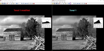
many shades of gray I can fit in. In fact, as suggested by others, smooth tonality ("many shades of grey", ie distribution of tones in the histogram that tends to uniform) might fit some images whereas 'high contrast' (very heavy tailed histogram, loads of density in peaks, heavy tails of near blacks and near whites) might fit another image.
In my understanding, tonality refers instead to the choice of exactly
which particular grey level in the available range should the photographer pick to represent any chosen colour "items" in the scene.
Eg let's think for simplicity at a discretised grayscale palette. Let's say we have a scanner able to digitise at 14bits/pixel. This gives us 16,384 values to chose from as the destination gray, with 0 being absolute black and 16.383 being absolute white.
We take a picture containing a red apple and a banana. Our task is to map the red and the yellow to pleasant gray values in the [0, 16,383] range. How do we pick? We have a few variables at hand
- lighting of the scene
- any filters?
- film
- developer
- exposure time
- exposure methods
- processing time
- processing temperature
- choice of scanner/enlarger head
- choice of paper
- ...
With these tools at hand we can then take a decision on how to map that red and that yellow to some grey between 0 and 16,383. Do we want
- the red to be very dark, much closer to the black background than to the yellow? [eg apple= 200, banana= 6000]
- the red to be a very similar shade of gray as the yellow, both far from the black background? [eg apple= 4560, banana= 6000]
- the yellow to be very fair, close to white, as far as possible from the black? [ eg banana= 12000]
- both objects to be very fair as far as possible from the black background? [eg apple = 10235, banana = 12000]
- something else?
I believe the outcome of the decision leading to the mapping of those colours to certain grey shades will be relevant to the viewer, who will then express a judgement on a 'good/poor tonality'. I believe we carry expectations on what shade of grey should most objects be represented with to be vaguely 'correct'. I think the brain strives to look for correctness even when evaluating a BW image.
So perhaps 'poor tonality' in the example above would be an image in which the banana grey is very close to the apple grey, as our brain struggles to fit that against a colour representation of the scene (we know that a red apple is extremely different from a yellow banana in the real world).
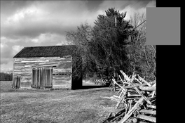
A few examples from flickr
example 1
example 2
example 3
example 4
example 5
There are two images here that I would consider prime examples of 'poor tonality'. The remaining three I would pick them as examples of good tonality. Would be interesting to do this properly and perform some kind of blind rating to see if we reach some sort of consensus.