• Welcome to Photrio!
    Registration is fast and free. Join today to unlock search, see fewer ads, and access all forum features.
    Click here to sign up

The grey area...

Recent Classifieds

Forum statistics

Threads
201,943
Messages
2,832,427
Members
101,027
Latest member
yukinosita_yuk
Recent bookmarks
0

StoneNYC

Member
Allowing Ads
Joined
Aug 5, 2012
Messages
8,345
Location
Antarctica
Format
8x10 Format
So I was over at a friends house, and I happened to notice this photograph in a frame, it had been sent to her by her sister, and was a postcard, the image looks very familiar and it was driving me crazy because I knew that I knew the artist and I thought that I need the model too, it just looks so familiar.

After staring at it for a long time I realize that it was Sally Mann.

Anyway, I got to thinking about her book that had been given to me by my ex for a Christmas gift, and this has nothing to do with the content, but the greys...

Here's the postcard image...
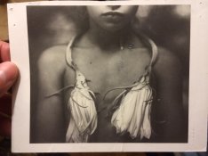
ImageUploadedByTapatalk1401039314.930460.jpg

This is obviously a photograph taken with the digital camera of another photograph, but I hope that the image will translate so that you can see what I'm talking about.

There's just no black it all, it's all gray, and that struck me as interesting, now as many of you know I do develop my own film, I often like a higher contrast image, but also on top of all that, I scan... *ducks*

I realize that on a computer you can just move the slider and remove some of the blacks so that everything kind of goes gray, but in traditional film photography my question to you is was this done as part of the exposure itself in the camera, or was the removal of blacks somehow accomplished in the darkroom?

I know that this can be a little bit of both, and very much opinionated, but it just made me think, I've definitely taken an image and made it low contrast by over exposing and under developing to give it a certain low contrast look, but I don't see this image as a low contrast image, it's different somehow, very defined edges yet soft, and the lighting is smooth, but I know that Sally mostly shot around the house with her 8x10, and this probably was not studio lit...

However I've inly done the "over expose and under develop" in landscape work, not with people, so I'm not familiar with how it looks.

So is there something about the actual exposure and development process that mostly accomplish this goal, and then printing was the secondary method, or was this once a normal contrast and normal black-and-white negative that she was able to print to this amount of softness of grays in the darkroom?

Thanks.
 

NB23

Member
Allowing Ads
Joined
Jul 26, 2009
Messages
4,307
Format
35mm
Stop scanning, go in the darkroom.
Or photoshop at will until you reach total grayness.

I'm not sure i understand your post...
 

chriscrawfordphoto

Member
Allowing Ads
Joined
Mar 12, 2007
Messages
1,893
Location
Fort Wayne, Indiana, USA
Format
Medium Format
Looks like a print from an underexposed negative, but it might also have been printed with with a lower-contrast paper (or low-contrast filter on VC paper).
 

chriscrawfordphoto

Member
Allowing Ads
Joined
Mar 12, 2007
Messages
1,893
Location
Fort Wayne, Indiana, USA
Format
Medium Format
Stop scanning, go in the darkroom.
Or photoshop at will until you reach total grayness.

I'm not sure i understand your post...

He's trying to. Read his post, he wants to know how to get this look IN THE DARKROOM.
 

Rudeofus

Member
Joined
Aug 13, 2009
Messages
5,119
Location
EU
Format
Medium Format
Through exposure, development and scene contrast you can set the contrast range on your film, which you can then translate into a contrast range on paper. In the case of multigrade paper you can even adjust print tone range in this stage alone.

In other words: while there are many things that you can do only, or at least much easier, with digital post processing, what you see in this post card can be trivially achieved in every dark room.
 

Rudeofus

Member
Joined
Aug 13, 2009
Messages
5,119
Location
EU
Format
Medium Format
Wouldn't an under exposed image create a higher contrast image?

Only if you then overdevelop. Negative contrast is set by scene contrast and development, not by exposure.
 

cliveh

Subscriber
Allowing Ads
Joined
Oct 9, 2010
Messages
7,805
Format
35mm RF

Kawaiithulhu

Member
Allowing Ads
Joined
Sep 20, 2013
Messages
549
Location
Southern Cal
Format
Multi Format
You're trying to imitate a dry plate tintype and most of those have a baseline gray instead of white, plus they don't get as deep black as silver/gelatin prints. https://www.google.com/search?q=dry...ruoASRtID4Cg&ved=0CAgQ_AUoAQ&biw=1189&bih=926

Assuming that you're starting with a normal negative you can try this in the printing stage: Flash the paper to raise the fog level to that light gray, there are no clean whites. Underexpose the print to avoid going dark black. Don't over develop.

Alternately maybe it could be done with underexposing a print and then staining/toning the paper afterwards.

I kind of prefer the toning idea, part of the charm of the original image is that it isn't straight B&W grays but looks mildly sepia or warmed somehow. (maybe just my monitor)

The original image does look like a medium contrast rendition if not up into grade 3, I think you got that right on. It's not that everything is bland, but that the range is limited and held away from the bright and dark ends.
 

markbarendt

Member
Allowing Ads
Joined
May 18, 2008
Messages
9,422
Location
Beaverton, OR
Format
Multi Format
My guess would be that the softness is not an adjustment to the film exposure or development. Instead I'd guess that it was soft lighting.

Matte Finish paper prints more gray, gloss paper prints blacker.

It could be deliberate underexposure of the paper, soft print grade.

....
 
OP
OP
StoneNYC

StoneNYC

Member
Allowing Ads
Joined
Aug 5, 2012
Messages
8,345
Location
Antarctica
Format
8x10 Format
The actual postcard is also a little yellow so that's the sepia you're seeing.

I'm also fairly certain this was shot on film not dry plate, but yes I did recognize the similarity and so wanted to potentially mimic the wet plate style of portraiture with clean film instead (collodion and dry plate work will come later in my career).
 

NB23

Member
Allowing Ads
Joined
Jul 26, 2009
Messages
4,307
Format
35mm
Yes... This is an alternative printing method. I'm not experienced in those.

I'd use ortho film, iso 3, soft paper. I already got similar results but that was pure luck.
 
OP
OP
StoneNYC

StoneNYC

Member
Allowing Ads
Joined
Aug 5, 2012
Messages
8,345
Location
Antarctica
Format
8x10 Format
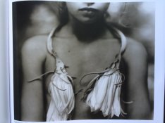
Just found the image in her book, it's indeed toned, not just the postcard paper.

ImageUploadedByTapatalk1401046374.701861.jpg
 

gandolfi

Member
Allowing Ads
Joined
Jan 28, 2005
Messages
1,820
Location
Denmark
Format
Large Format Pan
I have seen th eoriginal back in the 90ties..

Quite sure of two things:
1: Film based (I actually the image was taken before she went into wet plate..)
2: definitively not toned. (except maybe for a slight archival selenium toning..)
 

gandolfi

Member
Allowing Ads
Joined
Jan 28, 2005
Messages
1,820
Location
Denmark
Format
Large Format Pan
gandolfi, could it have been a platinum print? Which she did do at that time.

no - it was a huge VERY VERY beautiful print on fiber based papers - one of the imidiate family (sp?)

(there were also platinum prints there - but different subjects and much smaller)
 
OP
OP
StoneNYC

StoneNYC

Member
Allowing Ads
Joined
Aug 5, 2012
Messages
8,345
Location
Antarctica
Format
8x10 Format
I understand she spent a lot of work in the darkroom on many failed negatives as well.

I know she is very good at printing and shooting I just couldn't tell which came from the grey. Thanks for some insight. I can't wait to start printing when I start school in the fall. I do wish I could learn from Gandolfi, but anything is better than nothing.
 

jp498

Member
Allowing Ads
Joined
Oct 5, 2009
Messages
1,525
Location
Owls Head ME
Format
Multi Format
I'd guess soft lighting and/or softer grade printing paper. That look is pretty common with platinum prints, so if she'd been doing those, she'd probably developed a taste for a nice range of greys without high contrast. I like this style better than her wet plate stuff which seems more often needlessly complex or sometimes overworked if that's possible.
 
OP
OP
StoneNYC

StoneNYC

Member
Allowing Ads
Joined
Aug 5, 2012
Messages
8,345
Location
Antarctica
Format
8x10 Format
I'd guess soft lighting and/or softer grade printing paper. That look is pretty common with platinum prints, so if she'd been doing those, she'd probably developed a taste for a nice range of greys without high contrast. I like this style better than her wet plate stuff which seems more often needlessly complex or sometimes overworked if that's possible.

Well gandolfi says it was fiber based, and also I don't think she was doing platinum ones yet at that time? I'm not an officianado though...
 

MattKing

Moderator
Moderator
Joined
Apr 24, 2005
Messages
55,273
Location
Delta, BC Canada
Format
Medium Format
I'm not an officianado though...
Stone has coined a new word, and I kind of like it! :smile:

On a slightly more serious note though, I think it would help you Stone if you sought out more examples of many of the older and alternative processes. Not on the internet - real world prints. Either historical, or current prints.

They are very different than what I think you, Stone, tend to prefer in your own work, but if you take some time to learn about and appreciate the differences in textures, tones, sheen and even feel, you might find that you will start to understand more about some of the stuff we talk about here.
 
OP
OP
StoneNYC

StoneNYC

Member
Allowing Ads
Joined
Aug 5, 2012
Messages
8,345
Location
Antarctica
Format
8x10 Format
Stone has coined a new word, and I kind of like it! :smile:

On a slightly more serious note though, I think it would help you Stone if you sought out more examples of many of the older and alternative processes. Not on the internet - real world prints. Either historical, or current prints.

They are very different than what I think you, Stone, tend to prefer in your own work, but if you take some time to learn about and appreciate the differences in textures, tones, sheen and even feel, you might find that you will start to understand more about some of the stuff we talk about here.

I'm sure, it took me a long time to get this far... Small steps :wink:
 
Photrio.com contains affiliate links to products. We may receive a commission for purchases made through these links.
To read our full affiliate disclosure statement please click Here.

PHOTRIO PARTNERS EQUALLY FUNDING OUR COMMUNITY:


Ilford ADOX Freestyle Photographic Stearman Press Weldon Color Lab Blue Moon Camera & Machine
Top Bottom