I think Fotoimpex tones compression comment is refering to a 4 stops push.
Strange, why they are underlining that. If you push you compress the tones every time


I think Fotoimpex tones compression comment is refering to a 4 stops push.
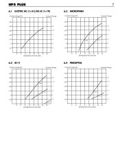
Fotoimpex's Microphen description has following information
"Microphen is exactly the opposite of Perceptol. This developer can easily push films up to 3 stops (with a developer temp. of 30 degrees), but the contrast and grain are basically uncontrollable. The contrast increases almost linearly with the developing time, and even the lowest-contrast Fomapan negative has no chance of avoiding a sharp contrast curve. HP5 can be pushed up to 1600 ASA and the Adox CHS films can be pushed even up to 4 Stops. Even Tmax and Delta films can be pushed past their ratings and still show the middle gray-tones.
A film pushed 4 stops with this developer has a very unique look - almost like a lith print. Black tones blend together and the middle tones and highlights and compressed together. The ADOX CHS 100 looks even better, but with somewhat markedly accentuated grain."
https://www.fotoimpex.com/chemistry/ilford-microphen-to-mix-1000-ml.html
That is controversial to the 8 stop linearity.. Or is Fotoimpex talking about only pushing in that description?
To show an scanned image to be technically judged, better is to place an Stouffer T2115 desnsity wedge so the film and the wedge are scanned alongside, also spot metering readings in key places should be mentioned.
Anyway it looks to me that this image would have required quite more exposure and shortened development.
What problem would greater exposure and shorter development time address?
FYI, the highlights were measured around EV 15, and the shadows around EV 8, as mentioned in another post.
wouldn't a shortened development time lead to a thinner negative, and therefore less overall contrast?
What problem would greater exposure and shorter development time address?
Their description of the way the shadows are effectively crushed and the mids/ high shoved up onto the shoulder can (if exposed correctly) make a neg that delivers something pretty remarkable on a high grade of paper - Art 300 at G4 and upwards, then bleach/ sulfide/ gold toned does pretty well with this sort of neg - brings the grain out strongly.
@138S: No, I'm fine with the result--
exposing at box speed seems to be the way to go.
my takeaway from the conversation is that if you want to print via enlarger, you probably *do* want to overexpose Foma 400-- if your end result is primarily digital (which mine is right now), exposing at box speed seems to be the way to go.
I'm reasonably satisfied with how the shot turned out-- I have highlight detail on the chimney (although since in real life it's a red-brick chimney, it's still a bit heavy on exposure-- as you note, I was hitting 7+ stops, which I've found with foma/arista 400 to be about it's breaking point), and other than under the porch (where I'm not particularly interested in shadow detail), I have plenty of detail in the woods.
But much of your response appears to be theorycraft, and that was the point in posting this particular photograph-- there's been a lot of theory in this discussion, but little discussion of specifics: where in this photo do I need more shadow detail? Are the shadows "muddy"? Have I preserved highlight detail? I'm familiar with "expose for the shadows, develop for the highlights", but without context, it's a largely meaningless mantra.
understand the medium, which I felt I needed to re-engage darkroom printing.

So a lot of subjective terms such as "muddy" or "blocked" are being thrown around. I'd like an opinion on this photo, which is essentially, straight out of the scanner. Basic inversion was performed, and out of consideration, it's resized to fit HD monitors. It was a fairly bright day, with heavy shade. I'm curious as to whether people think it was over- or under-exposed.
View attachment 267203
It's Arista .EDU Ultra 400, scanned on an Epson v800 with Silverfast, using the NegaFix module, and the histogram set to the full range of the image.
I'll need to do some further sensitometric tests on Foma 400 - I also noticed that the highlights tended to roll-off pretty quickly with overexposure on the small amount I used - along with a stronger tendency to halation on high contrast edges - potentially caused by the higher turbidity of the emulsion used.
XTOL has a lot of trouble building good highlights on Foma 400.
Interesting thanks. So then reports suggesting Fomadon Excel is an XTOL clone must be incorrect, as I find Foma 400 gives incredible tonal range in the highlights using Excel in 1+1. I meant to try Xtol at some point, wondering if Excel is only a clone of some past formulation of Xtol, and by using Xtol I could get even better result, but it sounds like I should stick to Excel.
What the highlights look like depends a lot on the developer used. XTOL has a lot of trouble building good highlights on Foma 400. Other developers don't seem to have as much trouble doing that.
Do you have any proof on this or is this pure feeling?
I don't mean to attack, but it would be nice to see examples or tests or this kind of claims. Otherwise we are just running in circles here..
edit: I mean we have some way to test this out, right?
this is why I do film tests and post them here.
https://www.photrio.com/forum/resou...plenished-xtol-for-8-45-at-24c-in-a-jobo.427/
That is so great. Thanks.
I know your backgrounds but oh how I wish the tests would have been done with some really "general" way like using Rodinal, D-76 or Xtol 1+1 and using normal tank agitation
| Photrio.com contains affiliate links to products. We may receive a commission for purchases made through these links. To read our full affiliate disclosure statement please click Here. |
PHOTRIO PARTNERS EQUALLY FUNDING OUR COMMUNITY:  |