Scanning new Portra with Vuescan

Three pillars.

D
Three pillars.

  • 1
  • 0
  • 9
Water from the Mountain

A
Water from the Mountain

  • 3
  • 0
  • 39
Rijksmuseum Amsterdam

A
Rijksmuseum Amsterdam

  • 0
  • 0
  • 35
Lotus

A
Lotus

  • 4
  • 0
  • 51
Magpies

A
Magpies

  • 4
  • 0
  • 88

Recent Classifieds

Forum statistics

Threads
197,521
Messages
2,760,505
Members
99,394
Latest member
Photogenic Mind
Recent bookmarks
0

kaiserkudo

Member
Joined
Aug 23, 2012
Messages
22
Location
Darling Down
Format
Medium Format
Hey guys,

Have been everything I can on scanning technqiues with my Epson V700 in combination with Vuescan.

I have been using the advanced workflow technique of locking the film base exposure/colour and then scanning as a raw output into PS. From there I have tried the Color Neg plug-in but I wasn't too happy with any of the profiles which didnt do too well with new Portra 400. So I cancelled the plug in and tried inverting the raw scan myself by using Photoshop auto levels and an inverse curves layer. From here I increased the contrast, brightness and vibrance slightly.

I'm really a novice at film scanning and this is the first time I've used Portra so i don't know what I should be aiming for in terms of getting the great tones and colors that Portra is known for.

Anyway I'd like your opinion on these final scans as I'm not the best judge of color. Am I in the right ball park. ANy idea of how I can improve these further?

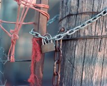
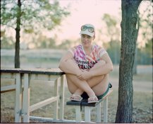
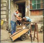
Both were shot with RZ67 with 110mm wide open (f/2.8) in late afternoon sun / partial shade and overexposed 1 stop (according to incident meter readings). Developed normally in Rollei Digibase c-41 chemistry.

cheers,

ashkai029-L.jpg


ashkai025-L.jpg
 

jd callow

Moderator
Moderator
Joined
Jan 31, 2003
Messages
8,466
Location
Milan
Format
Multi Format
kaiser, scaning software can only do so much. The last step is on you to adjust density (how dark/light) and color balance in an app like photoshop. Your images look pretty good to me, but maybe a tad light and a bit cyan.
 
OP
OP

kaiserkudo

Member
Joined
Aug 23, 2012
Messages
22
Location
Darling Down
Format
Medium Format
Thanks. I'm doing raw linear scans with Vuescan and doing the inversion manually in CS4 with levels and curves. I was under the impression this was the best way to get max info out of the film and have full control over the inversion. I've been trying to use more film over digital as I found I was always fiddling around so much with the digital captures to get the colour I wanted. I thought it would be easier to get great colours from film, but am finding I am spending even more time in the scanned film files in PS. Maybe I should just stick to the "press here idiot" mode of Epson Scan or send them out to a good lab to get scanned.
 

jd callow

Moderator
Moderator
Joined
Jan 31, 2003
Messages
8,466
Location
Milan
Format
Multi Format
I do the same. I scan with vuescan to a *.png file. I let vuescan do the inversion, although i've done both. The png file allows me to use the ps raw utility, which for my negs (color and high contrast) gives me some options (highlight recovery and fill) that may not be needed with something as smooth as Portra. My negs tend to be crossprocessed transparencies and or night shots. Color film in a digital workflow is not as easy as digital, but it is not too bad and quicker than traditional. In the traditional workflow I can generally get my color and density nailed in 2-4 test prints, which is 10-20 sec for the exposure and 4 mins of processing for each test. When shooting digital I'll spend maybe as much as a minute or 2 on tweaking the color (Raw import + curves in PS). When scanning I'll spend maybe twice that tweaking the color and density and then probably a minute per 10 meg a pixel spotting the scan.

The attached image is one I did yesterday. The skin is too ruddy, but they are as close as I am going to get them, highlights and shadow detail are far better than I could have gotten on a c-print. The reason being the image is crossprocessed e200. Total time tweaking was about 4 or 5 mins.
 

Attachments

  • romainia_s.jpg
    romainia_s.jpg
    814.4 KB · Views: 140

j.c.denton

Member
Joined
Feb 24, 2012
Messages
107
Location
Germany
Format
Medium Format
I've shot my frist two rolls of Portra 160 last month in my holidays as I am usually a slide film shooter. I found the conversion easier than Ektar 100 I tried before. Nevertheless, getting colors right with negative film has been a challenge. I found two solutions. One is to scan with Vuescan to RAW and use the NegFix8 script. This gives good results most of the time. The other is to use the ColorNeg plugin you mentioned before. Its success vastly depends on doing the linear RAW scan right. In addition, it seems to be more successful on one frame than on the other. My advice is to look for a well exposed frame with some next-to-neutral grey in it and run the plugin to get the best settings for that film stripe. Then, apply the settings on all images. Mind you, this will not take care of the white balance differences in each image. But my personal experience has been so far, that I'm better with getting the colors right via the conversion and handling color temperature in Lightroom afterwards.

Christian
 

pschwart

Subscriber
Joined
Jul 15, 2005
Messages
1,143
Location
San Francisco, CA
Format
Multi Format
These need some Photoshop editing before you can use them to evaluate your scanning :smile: Here is the result of a levels tweak, a curve adjustment layer for the color, and a bit of sharpening. Total time: probably less than 5 minutes.

kaiserkudo.jpg
 
OP
OP

kaiserkudo

Member
Joined
Aug 23, 2012
Messages
22
Location
Darling Down
Format
Medium Format
Thanks for the advice. Do you find the NegFix 8 more successful than ColorPerfect? I guess its on an image by image basis? I'm fairly certain I'm doing the raw linear scan properly in Vuescan - so I'm giving ColorPerfect the correct scan that it likes to use. So far though I've had better results with the manual inversion using curves and levels (just talking about the new Portra here - I may have more luck with Fuji Reala and 400H using ColorNeg, I havent scanned these yet).

Pschwart, thanks for the edit. I find that too contrasty and oversharpened for my tastes though and the colors look too warm. I'll admit though that the original I posted could probably go a bit deeper in the blacks - although Im kinda searching for that lower constrast, creamy pastel look.

Thanks
 

pschwart

Subscriber
Joined
Jul 15, 2005
Messages
1,143
Location
San Francisco, CA
Format
Multi Format
To each his own. FYI: sharpening was high pass with a radius of 2, then opacity reduced to 75%, so not much sharpening at all.
 

artobest

Member
Joined
Oct 19, 2011
Messages
165
Location
South Wales
Format
Medium Format
Kaiser, to my eyes your results are the most pleasing and the most 'Portra' in this thread so far. You are very close, and that beautiful Portra clarity and delicacy is there, but try this: before scanning as Positive, adjust the black and white point for each channel individually (scanning histograms can be misleading, so be sure to leave enough headroom at each end that you don't get clipping). Then scan and invert in PS and, using an adjustment layer, set your black and white points with more precision. Afterwards, you may find it necessary to adjust the gamma for individual channels as well. Finally, apply other adjustments, such as Saturation, Selective Colour or Colour Balance, as needed (or for creative effect). Happy scanning - Portra is currently my favourite film!
 

glhs116

Member
Joined
Jul 4, 2009
Messages
146
Format
35mm
ColorPerfect will probably give you the best results ultimately. It is what I use ninety percent of the time. However, it is more fraught with pitfalls than any other method. Here are some ways of getting screwed up conversions out of ColorPerfect:

1. Clip any of the three channels in either end of the histogram
2. Include anything that is not film in the image. For example, some of the holder or even a largish hole in the emulsion
3. Fail to ASSIGN the colour profile that matches your WORKING PROFILE in whatever your image editor is (I use PhotoLine for cost reasons)
4. Fail to go to Options and set the black and white clipping points in ColorPerfect to something more conservative
5. Fail to assign the right film type
6. Fail to observe the %white clipped box at the top
7. Fail to adjust the gamma and saturation sliders to your taste first and adjust the black level slider last

Because it is so finicky I do often end up doing a manual inversion if I have a problematic image. However, whenever I have successfully been able to use ColorPerfect it has always done a better job than my own efforts. In particular, it is brilliant at removing colour casts that shift from highlights to shadows (like the typical green brights/purple darks situation you can easily get into in manual inversions). Also, it is much better at retaining fine texture. However, for the same reason, it is more revealing of scanner limitations and sometimes a manual inversion gives a "smooth" look that is appealing.

For a very long time I battled with black splotches in my shadow areas when using ColorPerfect. I eventually found out that this was largely a result of not assigning a colour profile which matched my working colour space. I find the software useful enough that I most often even run my positive images through it. But it is certainly a punishing learning curve to get the best out of it.

For what it is worth:
A set of my manual inversions:
Manual Negative Inversion - a set on Flickr

A set of my ColorPerfect inversions of negatives scanned as positive:
ColorNeg - a set on Flickr

A set of my ColorPerfect processing of positive "slide film" scans:
ColorPos - a set on Flickr

Sam
 

jd callow

Moderator
Moderator
Joined
Jan 31, 2003
Messages
8,466
Location
Milan
Format
Multi Format
Using the curve tool I made the following changes to the images posted:
Young girl:
Input >> Output
Green 127 >> 145
Blue 127 >> 144

Pad lock
Green 127 >> 152
Blue 127 >> 154

By adjusting these channels the density fell into place by my eyes and it took about minute for both. The trick for me is to push the green channel beyond where it needs to be and then pulling it back (when the color goes from blue to mag and or cyan to green) and then doing the same for the Blue channel. I know CC is difficult thing at first, but practice makes it pretty intuitive. After a while you should be able to look at an image and immediately see what is needed.

In my experience automated tools can never replace the human eye and if they work even 90% of the time, if you have not developed the skill then you'll be stuck the other 10%.
 

glhs116

Member
Joined
Jul 4, 2009
Messages
146
Format
35mm
Just ran those two through ColorPerfect with my usual settings and a quick eyeball ballpark guess on CCs. I probably spent no more than a minute on these two. It's just to give you an idea of what you can expect from the plugin when you get it set up correctly. As jd was mentioning above, it has a concept of CC filters for tuning the colour balance. Basically, it makes a first best guess at the colour balance, your second option is to click a neutral area in the image if there is one and finally you can just start adding and subtracting virtual cc filters just as if you were doing it olde skool but much faster.

For the girl I clicked a white spot on her sleeve to get close and then added a little blue and green to taste.

For the locks I clicked on a mid-tone section of the grey metal chain and tuned slightly from there. Honestly, on the second one I could do better if I knew how golden or not the light was supposed to look. Also, the chain and post one has some pretty burnt highlights on the one chain. ColorPerfect will work best if you don't have clipping on your original scan.

Sam
 

Attachments

  • CP_ashkai025-L.jpg
    CP_ashkai025-L.jpg
    159 KB · Views: 94
  • CP_ashkai029-L.jpg
    CP_ashkai029-L.jpg
    108.9 KB · Views: 101
Last edited by a moderator:

jd callow

Moderator
Moderator
Joined
Jan 31, 2003
Messages
8,466
Location
Milan
Format
Multi Format
the pad lock and the girl look a tad pink (see the sky in both and the highlights in the post on the paddlock). here is what I got.
 

Attachments

  • paddlock.jpg
    paddlock.jpg
    142.9 KB · Views: 100
  • girl.jpg
    girl.jpg
    109.6 KB · Views: 93

glhs116

Member
Joined
Jul 4, 2009
Messages
146
Format
35mm
It's just the rose tinted glasses with which I see the world! ;-)

And there's nothing wrong with your versions either. A little colder, a little more punchy on the contrast. A matter of taste, I'd say. But for the original poster I think he was wondering whether he was in the ballpark on his inversions and I would say that we have both shown that he was really very close. It just needed that overall green cast removing. The base scan itself obviously had plenty of information for all the versions we have seen in this thread. So, kaiserkudo, you are VERY close and your scanning technique looks fine.

Sam
 
OP
OP

kaiserkudo

Member
Joined
Aug 23, 2012
Messages
22
Location
Darling Down
Format
Medium Format
Guys thanks for much for all that information. For what it's worth I only have the trial version of Color Perfect at the moment and its in German - but from further reading I have worked out how to use the film type, gamma white and black point clipping functions. Might need to pony up to the full version me thinks.

Both of your edits look great and I guess it comes down to personal aesthetics. This lighting at time of shooting was quite contrasty and mixed - think low sun about 45 mins before sunset, filtering through lots of green foliage, and with patchy areas of shade.

It's good to know I'm headed in the right direction. Going to shoot some Ektar this weekend so I'm sure looking forward to seeing how I go converting that as well.

Just to clarify - I haven't been touching any histograms in Vuescan - only locking film base exposure and color and scanning as a linear raw file (tiff, jpg, dng etc all deselected). Should I be setting white and black point clipping in levels in Vuescan?
I couldn't see an option there to edit any histograms - although I'm sure its there. i've only been using the program for 4 days or so. (Pro version, if that makes a difference). The instructions/guides on getting a linear scan from Vuescan didn't mention doing any levels adjustments during the scanning stage so its got my poor brain confused haha.

thanks again for the help,

matt
 

j.c.denton

Member
Joined
Feb 24, 2012
Messages
107
Location
Germany
Format
Medium Format
Hi Sam,

Thanks for the advices, they are very welcome. I concur, ColorPerfect gives me the best results ultimately as well and I suspect your points explain why it is off in some of the photos while in others it works flawless. I noticed the same advantages concerning color casts and texture detail. In addition, the gradation in the shadows is superior to other ways I tried. BTW, the choice of color profile also affects the saturation of the converted image, so using the same profile as the working space is definitely an important point.

For slide film, I've gotten the most success with IT8 calibration. Colors are right and consistent. VueScan does not seem to correct for zone brightness, so I always tweak gradation afterwards in Lightroom. But this workflow has proven itself reliable.

Christian
 

j.c.denton

Member
Joined
Feb 24, 2012
Messages
107
Location
Germany
Format
Medium Format
Hi matt,

first of all, the German version is a translated version of the original, which is in English - and cheaper as well. I myself use the English one for that last reason despite German is my mother language ;-) You can grab it from this side:

C F Systems Innovations in Sight and Sound - Photoshop plug-ins page

Concerning Vuescan, yes, its not the most obvious tool to set up. Lots of traps, information is wide spread on the internet. First of all, if you output as raw, changes to the histogram should not be included. But some have experienced changes in the image data when saving is set to be done after scanning instead of while scanning. You usually choose the first option, saving after scan, to have the dust removal been included. But it looks like this might alter the data in other ways as well. If you want a safe raw scan to establish a reliable workflow first, abandon dust removal for the time being and set output to saving during scan.

Locking film base color and exposure is still advisable as it should adjust the analog gain of the different color channels of the scanner to compensate for the orange mask, resulting in a lower noise level esp. in the blue channel. This only works if the analog gain can be set independently on your scanner. But using the locking options in vuescan should not harm the output anyway.

Christian
 

glhs116

Member
Joined
Jul 4, 2009
Messages
146
Format
35mm
I am a long time Vuescan user. It is serviceable stuff but a little user-unfriendly. Basically, it is very easy to get the linear scan you need and it sounds like you are already doing it. If, in Vuescan you select the "negative" film type then it will auto-expose for the film base if it can see some. You can lock in this value with the lock exposure button. If, in "output" you select that you also want a "raw" file you will get an additional tiff file which is the linear positive scan of the film. Should be all ready for your favourite inversion technique or colorperfect. No tweaking of levels needed, Vuescan should do it all for you. If you are scanning with other software like EpsonScan or Nikon Scan then you typically need to scan as positive, set gamma to 1 and fine tune the levels manually. But it sounds like you've got it sorted fine anyway with Vuescan doing it for you.

j.c.denton, I'm a recent convert to scanning slides with IT8.7 profiles. I didn't even have any targets until recently. However, I can see a real improvement on my crummy HP scanner using them. I still shove the resulting calibrated file through ColorPerfect in ColorPos mode. I guess I'm just used to the controls by now. I usually prefer the file after ColorPerfect even when I start with IT8.7. But that may just be me. I'm fairly comfortable with the software now although it took long enough and I've certainly spent plenty of time in the past shaking my virtual fist at it.

Sam
Sam
 
Photrio.com contains affiliate links to products. We may receive a commission for purchases made through these links.
To read our full affiliate disclosure statement please click Here.

PHOTRIO PARTNERS EQUALLY FUNDING OUR COMMUNITY:


Ilford ADOX Freestyle Photographic Stearman Press Weldon Color Lab Blue Moon Camera & Machine
Top Bottom