-
Welcome to Photrio!Registration is fast and free. Join today to unlock search, see fewer ads, and access all forum features.Click here to sign up
- Home
- Forums
- Analog Workflow Forums (100% Analog/Traditional)
- Analog Equipment
- Large Format Cameras and Accessories
You are using an out of date browser. It may not display this or other websites correctly.
You should upgrade or use an alternative browser.
You should upgrade or use an alternative browser.
Reshoot Night shot help
-
A
- Thread starter Darryl Roberts
- Start date


Recent Classifieds
-
For Sale Kodak Ektachrome Infrared EIR aka Aerochrome
- Started by YoIaMoNwater
-
Want to Buy Old Kodak 101 roll film
- Started by blee1996
-
For Sale Schneider Kreuznach Super Angulon MC 120mm f8
- Started by RoboRepublic
-
Sold JOBO MultiTank 2 2521 4 X 5
- Started by Inayat Noor
-
For Sale Ilford 5X7 Paper Lot
- Started by davela
Forum statistics
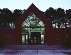
I have a few questions and comments. I have some experience with this kind of photography for Commercial purposes. What time of day did you take this photo? The sky is very bright in relation to the face of the library. The Google map shows that the building front/face is "looking" South/Southwest, is this correct? In my experience I found that there is only about a 30 minute window when the outside light brightness matches the inside light brightness AND the sky light is dark enough so as not to overpower the scene. The angle of the building face in relation to the sunrise/sunset arch track may make it very difficult to achieve all 3. To me, the best case scenario would be later in the Summer when the Sun is farther South, almost at sunset so the light is shining on the face and a shaded cloud bank is in the distance behind the building to darken the sky. This is a very tall order, you may have to visit the scene many times for everything to be just right. You really want all 3 light sources to be within 2 stops, 3 at the most. As to which film, in either 4x5 or 6x7 roll film, I would use Portra 400 or Portra 160.
Last edited:
I don’t like the color shift.
Then filter it differently.
Are you post processing digitally or printing in the darkroom?
What aspects of the colors are unhappy with?
OP
OP
I have a few questions and comments. I have some experience with this kind of photography for Commercial purposes. What time of day did you take this photo? The sky is very bright in relation to the face of the library. The Google map shows that the building front/face is "looking" South/Southwest, is this correct? In my experience I found that there is only about a 30 minute window when the outside light brightness matches the inside light brightness AND the sky light is dark enough so as not to overpower the scene. The angle of the building face in relation to the sunrise/sunset arch track may make it very difficult to achieve all 3. To me, the best case scenario would be later in the Summer when the Sun is farther South, almost at sunset so the light is shining on the face and a shaded cloud bank is in the distance behind the building to darken the sky. This is a very tall order, you may have to visit the scene many times for everything to be just right. You really want all 3 light sources to be within 2 stops, 3 at the most. As to which film, in either 4x5 or 6x7 roll film, I would use Portra 400 or Portra 160.
Thank you VERY much for your magnificent insight.
OP
OP
Then filter it differently.
Are you post processing digitally or printing in the darkroom?
What aspects of the colors are unhappy with?
digitallly
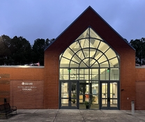
I’m unhappy with the purple. The cellphone shot nailed what I’m working toward.
Their night lights were on.
Attachments
I’m unhappy with the purple
First of all, I'm with @randyB - if you want the colors to 'come out right', look carefully at the colors of the scene. Try to realize what you see, not what you think you see. Especially places we're familiar with, we perceive different than they really look in a certain light. The brain makes a mishmash of what we see and what we recall from previous visits. It can be challenging to shake that and to observe what's really there - and what's not.
The purple is mostly blue; for some reason (something psychological, no doubt) it seems purple. I know what you mean though; it looks purple to me, too, but once you start working on the image, you realize it's really blue. So color balance it less blue. The whole scene is blue because that's what the light was like; in the end you're never entirely going to get rid of this.
Keep in mind the smartphone shot has HDR applied, like most phones do these days. It makes such images look pretty great.
The night lights being turned on around the building helps help, too, in balancing the sky with the foreground.
If you decide to shoot this again, I'd suggest (in addition to waiting for better light) not underexposing too much, especially on color negative film. You can always burn the sky and the interior a bit, but the hues of the brickwork and patio will be unsalvageable if you underexpose the sheet. This seems to be part of your problem.
Especially if you scan, you can shoot this on Ektar just fine; you can correct in digital space what needs correcting. If you were to print this optically, I would agree with @randyB and shoot it on Portra 400 or so.
And of course, perhaps just accept that digital photography is really great for certain (many) things. Look at what you get from a straightforward smartphone shot. Nothing wrong with using that if you want to get the job done.
OP
OP
First of all, I'm with @randyB - if you want the colors to 'come out right', look carefully at the colors of the scene. Try to realize what you see, not what you think you see. Especially places we're familiar with, we perceive different than they really look in a certain light. The brain makes a mishmash of what we see and what we recall from previous visits. It can be challenging to shake that and to observe what's really there - and what's not.
The purple is mostly blue; for some reason (something psychological, no doubt) it seems purple. I know what you mean though; it looks purple to me, too, but once you start working on the image, you realize it's really blue. So color balance it less blue. The whole scene is blue because that's what the light was like; in the end you're never entirely going to get rid of this.
Keep in mind the smartphone shot has HDR applied, like most phones do these days. It makes such images look pretty great.
The night lights being turned on around the building helps help, too, in balancing the sky with the foreground.
If you decide to shoot this again, I'd suggest (in addition to waiting for better light) not underexposing too much, especially on color negative film. You can always burn the sky and the interior a bit, but the hues of the brickwork and patio will be unsalvageable if you underexpose the sheet. This seems to be part of your problem.
Especially if you scan, you can shoot this on Ektar just fine; you can correct in digital space what needs correcting. If you were to print this optically, I would agree with @randyB and shoot it on Portra 400 or so.
And of course, perhaps just accept that digital photography is really great for certain (many) things. Look at what you get from a straightforward smartphone shot. Nothing wrong with using that if you want to get the job done.
Awesome reply, thank you.
Cell phone cameras are spooky, doing all sorts of magic, HDR, color temperature bracketing AI voodoo.
For film in the old days (film) you'd make color temperature readings of the interior lighting and filter appropriately. Maybe you would get lucky and inside and outside lights would be the same (tungsten)
Commercial photographers would use blue photofood bulbs in interior lamps to match daylight, quite the trick to get color and intensity of lighting to match.
LED lamps, ???
Hi there:
Do you have a spot meter? That way, you can set up early and wait for the right lighting ratios to materialise. The issue seems to be the time in the evening you shot it, rather than the film or format. 15-20 minutes later could make all the difference. The best time also depends on whether there’s cloud cover to drop the sky exposure further.
Rating the film a little lower than box speed would help gather more information as well, although I wouldn’t go more than 1 stop. In fact, if you had a healthy negative, your existing shot wouldn’t look too shabby if you simply printed it brighter but burned in the sky above the trees.
The high color saturation of Ektar is going to exacerbate color differences in the lighting. I concur that better results could be found with a portra film. But that’s less important than the above.
Ideally you’d also filter the artificial lighting with a weak CTB and moderate minus green gel to reduce the color contrast with the sky but I’d guess you may not have that luxury.
Jarin
Last edited:
Fill flash. And any color film but Ektar.
Fill flash. And any color film but Ektar.
Nah, it’ll show up in the glass. Even if it didn’t, unless it’s at a very low level (-4), it’s ugly light to look at besides. Even uglier than the indigenous street lighting.
But we can agree on Ektar.
My advice is to pick the right time to shoot.
J
Yep, low level fill… just enough to take the edge off. Not enough to overpower the building exterior lighting. The wait for that magic 5 minute window that happens only twice a year might be inconvenient. It’s worth a try rather than dismissing out of hand, although I’m sure that you’re experienced in balancing lighting. 
Last edited:
Fill flash. And any color film but Ektar.
I found Ektar is not good for mixed lighting. I can only get good color balance if all the lights are of the same color temperature. Otherwise if I balance for 1 part of the image the other will be off. Of course if you do masking in PS you can do it but I am not good at doing that.
Yep, low level fill… just enough to take the edge off. Not enough to overpower the building exterior lighting. The wait for that magic 5 minute window that happens only twice a year might be inconvenient. It’s worth a try rather than dismissing out of hand, although I’m sure that you’re experienced in balancing lighting.
I happen to be, yes. I often have to match a dozen or more HMIs by eye. At any intensity level, the flash will appear in the large glass front of the building, although to be fair, maybe large movements on the camera can fix this, with other consequences. Flash is also very much a taste thing, so what looks good to one may look awful to another. Some people may prefer the strong hard look of older color movies, others may sigh relief at more naturalistic modern lighting. I apologize for my flippant tone. Clearly I tend toward the latter.
Unless it's rain, sleet or snow, I'd guess there are 10 or more useful minutes each day for the ratio to be ideal. But waiting and planning for light is another aspect of my job.
I've seen a lot of good night photography on Portra 160. Patrick Joust on flickr has a lot of examples. It will also give you more latitude so you can balance the extreme brightness levels in the image more.
Ektar can be a tricky film.
Ektar can be a tricky film.
| Photrio.com contains affiliate links to products. We may receive a commission for purchases made through these links. To read our full affiliate disclosure statement please click Here. |
PHOTRIO PARTNERS EQUALLY FUNDING OUR COMMUNITY:  |