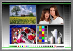
I strongly recommend the MacBeth Color Checker chart, basic larger version. It's a bit pricey but worth every cent. You need to keep in a clean, cool, dry, dark place, which will make it last many years. The colors are especially accurate, including a true neutral gray scale. Expose it with the utmost care in terms of the exact color temperature your film is rated at (for example, 5500K for Kodak daylight films). Ideally have a color temp meter on hand and a few balancing filters unless its natural softbox white light outdoors equivalent to 5500K and not overcast or open shade blue-ish. Precisely meter the gray patch equivalent to 18% gray card gray (but more accurately printed than ordinary gray cards). If all this is done correctly, you will have a master negative for calibrating your enlarger setting with any particular paper batch. All the effort put into making this precise master negative will save you time, hassle, and money once in the darkroom. The point is to get your actual RA4 print to match this master neg as closely as possible. As your get closer and closer to ideal results, you'll notice that all the gray patches will turn out well tonally separated from one another and each completely neutral gray, with out any hue bias. All the primary and secondary color patches (R,G,B, C,M,Y) will "sing" with the same intensity and hue purity - IF viewed under a high-quality 5000K viewing source (also a valuable investment worth every penny. Avoid CFL, LED, and ordinary fluorescent lighting like the plague. If necessary, look at your results under the same kind of outdoor softbox conditions in which you took the neg to begin with). This is kinda like playing the chords on the piano, and just has to be done if you want full control of color. Once you've established the ideal setting on your colorhead, record it. Later batches of paper will be easier to calibrate because they probably won't be a lot different. But for creative, esthetic, and corrective purpose, you will of course have to tweak the color setting each non-standarized ordinary negative going forward for the look you want. Please don't be discouraged. It is really quite easy to do if you set aside a couple hours to experiment with your master negative until it prints ideally on test strips or small prints. It might save you many hours of unnecessary frustration later on. Think of that high quality color chart as just as valuable an expenditure of money as a fine lens, but actually quite a bit cheaper to acquire. Ordinary paint store chips are a very distant substitute, but free, if that is your priority.