Readymade Color Target for RA-4?

Texting...

D
Texting...

  • 0
  • 0
  • 18
The Urn does not approve...

D
The Urn does not approve...

  • 3
  • 2
  • 50
35mm in 616 test

A
35mm in 616 test

  • 0
  • 1
  • 76
Smiley

H
Smiley

  • 0
  • 1
  • 48

Recent Classifieds

Forum statistics

Threads
197,484
Messages
2,759,935
Members
99,385
Latest member
z1000
Recent bookmarks
0

Chris Maurer

Member
Joined
Dec 22, 2016
Messages
7
Location
California
Format
Multi Format
Hello - I'm interested in getting started wet printing my color negatives. Typically I just jump in and go for things, often haphazardly. This time I would first like to validate my process first. I was thinking a pre-developed color target might be available to prove my RA-4 processing is on-point. With confidence in my output process (RA-4) I can work backward to tighten up the other parts in the image chain (exposure, film type and film developing) and spend less time doubting my RA-4 process. If targets aren't available I'll just shoot a variety of 'calibration' frames on my preferred film stock, which for better or worse, would include variables from other parts of my process.

Insight appreciated.
 

DREW WILEY

Member
Joined
Jul 14, 2011
Messages
13,708
Format
8x10 Format
I strongly recommend the MacBeth Color Checker chart, basic larger version. It's a bit pricey but worth every cent. You need to keep in a clean, cool, dry, dark place, which will make it last many years. The colors are especially accurate, including a true neutral gray scale. Expose it with the utmost care in terms of the exact color temperature your film is rated at (for example, 5500K for Kodak daylight films). Ideally have a color temp meter on hand and a few balancing filters unless its natural softbox white light outdoors equivalent to 5500K and not overcast or open shade blue-ish. Precisely meter the gray patch equivalent to 18% gray card gray (but more accurately printed than ordinary gray cards). If all this is done correctly, you will have a master negative for calibrating your enlarger setting with any particular paper batch. All the effort put into making this precise master negative will save you time, hassle, and money once in the darkroom. The point is to get your actual RA4 print to match this master neg as closely as possible. As your get closer and closer to ideal results, you'll notice that all the gray patches will turn out well tonally separated from one another and each completely neutral gray, with out any hue bias. All the primary and secondary color patches (R,G,B, C,M,Y) will "sing" with the same intensity and hue purity - IF viewed under a high-quality 5000K viewing source (also a valuable investment worth every penny. Avoid CFL, LED, and ordinary fluorescent lighting like the plague. If necessary, look at your results under the same kind of outdoor softbox conditions in which you took the neg to begin with). This is kinda like playing the chords on the piano, and just has to be done if you want full control of color. Once you've established the ideal setting on your colorhead, record it. Later batches of paper will be easier to calibrate because they probably won't be a lot different. But for creative, esthetic, and corrective purpose, you will of course have to tweak the color setting each non-standarized ordinary negative going forward for the look you want. Please don't be discouraged. It is really quite easy to do if you set aside a couple hours to experiment with your master negative until it prints ideally on test strips or small prints. It might save you many hours of unnecessary frustration later on. Think of that high quality color chart as just as valuable an expenditure of money as a fine lens, but actually quite a bit cheaper to acquire. Ordinary paint store chips are a very distant substitute, but free, if that is your priority.
 
OP
OP
Chris Maurer

Chris Maurer

Member
Joined
Dec 22, 2016
Messages
7
Location
California
Format
Multi Format
Thanks for the details. This is familiar to me as I worked in pre-press for offset printing for years. I appreciate your input and I will take it to heart. I have a color swatch book (specific density printing reference) that I use in a pinch but maybe I'll pony up for a fresh color checker.
 

cmacd123

Member
Joined
May 24, 2007
Messages
4,300
Location
Stittsville, Ontario
Format
35mm
Back in the distant past - the Kodak colour darkroom Data-guide came with a "Shirley" negative - a head and solders portrait shot as an original image on the then current profesional colour negative, - like Vericolour. (example I used to check out some unreal computer stuff : https://www.facebook.com/photo.php?fbid=10209054167302701&set=a.10209054167062695 )

this might be an example of what your own test negative can do, or indeed if you can find the old book and the negative is still there, it might be a fun reference. kodak included a wallet size print made in their own lab as a reference.
 

foc

Subscriber
Joined
Jun 30, 2010
Messages
2,495
Location
Sligo, Ireland
Format
35mm
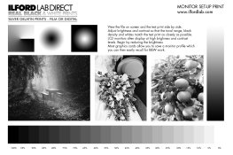
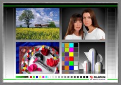
Would these be of any help?

Ilfordlabmon.jpg
 

Attachments

  • Fuji Test Print lr.jpg
    Fuji Test Print lr.jpg
    477.5 KB · Views: 93

Bikerider

Member
Joined
Jun 6, 2008
Messages
431
Location
Stanley, Co. Durham, UK
Format
35mm
The biggest mistake when assessing colour balance and depth of colour is looking at the overall picture when it is still wet and deciding if it is correct. The print must be dry first and you check the shadows for colour balance defects. Checking when it is dry is even more essential if you use Kodak paper because the shadows when they come out of the washing stage are blue. It is only when the print is dry are correct colours visible.

I always wipe the print with a rubber blade and finish off the drying with a cheap hand held hair dryer.
 

DREW WILEY

Member
Joined
Jul 14, 2011
Messages
13,708
Format
8x10 Format
It takes a bit of experience to appreciate just how much better the MacBeath Chart is compared to cheaply printed ones. Manufacturing a true neutral gray scale isn't that easy, not to mention precise primary and secondary hues. Ideally, you want everything equal, with no hue or tonality bias from that specified. It does make a difference when fine-tuning calibrations.
 
Photrio.com contains affiliate links to products. We may receive a commission for purchases made through these links.
To read our full affiliate disclosure statement please click Here.

PHOTRIO PARTNERS EQUALLY FUNDING OUR COMMUNITY:


Ilford ADOX Freestyle Photographic Stearman Press Weldon Color Lab Blue Moon Camera & Machine
Top Bottom