Rating portra 400

Junkyard

D
Junkyard

  • 1
  • 2
  • 45
Double exposure.jpg

H
Double exposure.jpg

  • 5
  • 3
  • 175
RIP

D
RIP

  • 0
  • 2
  • 211
Sonatas XII-28 (Homes)

A
Sonatas XII-28 (Homes)

  • 1
  • 2
  • 188
Street with Construction

H
Street with Construction

  • 1
  • 0
  • 182

Recent Classifieds

Forum statistics

Threads
199,337
Messages
2,789,888
Members
99,877
Latest member
Duggbug
Recent bookmarks
0

dylan77

Member
Joined
Oct 5, 2019
Messages
105
Location
Australia
Format
35mm
I’m pretty new to film and are using portra 400, as I shoot portraits/fashion. I’m continually getting mixed results, from to yellow to quite flat, while achieving more of a digital than film look.

Is there an optimal time to shoot this film, and rate it, And is there a reason my photos look digital?

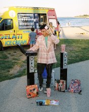
The first two shots taken was at the end of golden hour in shade. The second photo was taken in Golden hour.

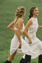
Any of Photos 3 4 or even 5 are what I’m aiming for and which actually look like film and portra. Quite different to mine. Confused
 

Attachments

  • 9F047ABA-E253-4F46-A92C-FBAD45A53D6A.jpeg
    9F047ABA-E253-4F46-A92C-FBAD45A53D6A.jpeg
    1.2 MB · Views: 181
  • DD525AF2-9B97-461D-861D-C252952FCC32.jpeg
    DD525AF2-9B97-461D-861D-C252952FCC32.jpeg
    1.6 MB · Views: 185
  • 70551DB2-FD5F-4352-83F2-ECC804B529BE.jpeg
    70551DB2-FD5F-4352-83F2-ECC804B529BE.jpeg
    646.9 KB · Views: 177
  • 71822B20-219C-4906-99F2-E61D9081E93D.jpeg
    71822B20-219C-4906-99F2-E61D9081E93D.jpeg
    844.6 KB · Views: 176
  • B9359FDD-7149-460B-AB15-3EBFE3AC116D.jpeg
    B9359FDD-7149-460B-AB15-3EBFE3AC116D.jpeg
    817.4 KB · Views: 186
Last edited:

Mesabound

Member
Joined
Aug 31, 2020
Messages
50
Location
US
Format
Multi Format
Those do not look digital to me, and tbh I think they look better than 3-5 (or these would certainly all look better on Portra 400, at least).

Experiment, but I'd guess you'd be happier rating it between 200-320 and pulling the processing appropriately. This will yield the more muted contrast and saturation you've cited. You might also just prefer Portra 160.
 
OP
OP
dylan77

dylan77

Member
Joined
Oct 5, 2019
Messages
105
Location
Australia
Format
35mm
Those do not look digital to me, and tbh I think they look better than 3-5 (or these would certainly all look better on Portra 400, at least).

Experiment, but I'd guess you'd be happier rating it between 200-320 and pulling the processing appropriately. This will yield the more muted contrast and saturation you've cited. You might also just prefer Portra 160.

I’m not sure what pulling the processing means? Can I do this with 35mm film?
 

Mesabound

Member
Joined
Aug 31, 2020
Messages
50
Location
US
Format
Multi Format
Overexposing + shortening the development time = pulling (reduced contrast + saturation)
Underexposing + lengthening the development time = pushing (increased contrast + grain, among other things)

Yes, not sure what labs might offer around you (not all offer push/pull processing) but if you self develop all things are possible. Portra 400 has such a wide latitude you could also just try overexposing by 2-3 stops with normal development (at a certain point, maybe 4 or 5 stops over, you will get noticeable color shifts); might yield desirable results for you. Or shooting it at 400 but shortening the development! Each will have slightly different nuances depending on conditions.

I've actually been experimenting w/ this film for the last month-ish, have currently run rolls at 400, 800, 1600, and 3200. I have one loaded at 320 right now; if I end up with any good examples I will throw them in here.
 
Last edited:

Alan9940

Member
Joined
Jun 17, 2006
Messages
2,430
Location
Arizona
Format
Multi Format
I rate Portra 400 at 200 and have the lab develop normally. Portra can take a lot of overexposure so 1 stop isn't a problem. I typically shoot desert scenes with this film and have never seen anything I'd describe as flat. Experiment some more and I'm sure you'll arrive at results acceptable to you.
 

bernard_L

Member
Joined
Feb 17, 2008
Messages
2,062
Format
Multi Format
I’m pretty new to film and are using portra 400 (...)
In that situation, I would advise to first understand Portra 400 as it was meant to be by Eastman Kodak; instead of getting into push/pull that may be more or less properly executed by whatever lab you entrust your films to.
The flat lighting of your #4 is IMO mostly a consequence of the on-camera (or nearly so) flash. And the yellow cast of #5 results either from rather heavy-handed d*****l manipulation, or light bounced off a yellow wall behind the photographer.
Any of Photos 3 4 or even 5 are what I’m aiming for and which actually look like film and portra.
Who said so? To me they do not look like Portra; or Gold 200, or Superia 200 or...; except maybe when I tried C-41 at home:cry:
 

pentaxuser

Member
Joined
May 9, 2005
Messages
20,041
Location
Daventry, No
Format
35mm
dylan77, I take it that all 5 shots are yours but shots 1&2 do not meet with what you want as these are digital looking and 3,4&5 are not digital looking.

If my interpretation of what you have said is correct then can you tell is what it is about shots 1&2 that look digital and are not what you are looking for

Unitl we know this it may be difficult to say what you need to do to change things

Thanks

pentaxuser
 
OP
OP
dylan77

dylan77

Member
Joined
Oct 5, 2019
Messages
105
Location
Australia
Format
35mm
dylan77, I take it that all 5 shots are yours but shots 1&2 do not meet with what you want as these are digital looking and 3,4&5 are not digital looking.

If my interpretation of what you have said is correct then can you tell is what it is about shots 1&2 that look digital and are not what you are looking for

Unitl we know this it may be difficult to say what you need to do to change things

Hi. In shots 3,4, more so The main thing I like is that the colours are of less contrast and the whole photos have nice old school film colour to them.

In this following photo the white look quite muted to. This photo is a good example to of being rated right, and shot in the right conditions. Thanks


pentaxuser
 

Attachments

  • 6403C3E5-510E-4B8C-9B8A-1EE987C6C0B0.jpeg
    6403C3E5-510E-4B8C-9B8A-1EE987C6C0B0.jpeg
    155.4 KB · Views: 113
Last edited:

MattKing

Moderator
Moderator
Joined
Apr 24, 2005
Messages
53,343
Location
Delta, BC Canada
Format
Medium Format
To me, the shots that the OP seems to like the most appear to be the closest to being under-exposed.
 

pentaxuser

Member
Joined
May 9, 2005
Messages
20,041
Location
Daventry, No
Format
35mm
Thanks Dylan So I think you are saying that the whites the two ladies are wearing are not bright enough and you want to know what to do to get such whites brighter without affecting the other colours i.e. you are happy enough with the colours of their boots, skin, hair and the grass in the background

If I have got this correct then I wonder if there is anything that can be done at the taking stage with this film. I have no idea if or how scanning can be manipulated to achieve this but this shot looks perfect to me

I'll be frank and say that I fear you may be using the wrong film to get what you want and I cannot suggest what film you might need I'll rely on others to say how you might achieve your aim, assuming that what you want to do can be done at the taking stage

pentaxuser
 
OP
OP
dylan77

dylan77

Member
Joined
Oct 5, 2019
Messages
105
Location
Australia
Format
35mm
To me, the shots that the OP seems to like the most appear to be the closest to being under-exposed.

Yes.This is par of what I’m trying to work out, though not sure how to do it, as people say don’t underexpose
 
OP
OP
dylan77

dylan77

Member
Joined
Oct 5, 2019
Messages
105
Location
Australia
Format
35mm
Thanks Dylan So I think you are saying that the whites the two ladies are wearing are not bright enough

No this is what I’m looking to achieve.

and you want to know what to do to get such whites brighter without affecting the other colours i.e. you are happy enough with the colours of their boots, skin, hair and the grass in the background

If I have got this correct then I wonder if there is anything that can be done at the taking stage with this film. I have no idea if or how scanning can be manipulated to achieve this but this shot looks perfect to me

I'll be frank and say that I fear you may be using the wrong film to get what you want and I cannot suggest what film you might need I'll rely on others to say how you might achieve your aim, assuming that what you want to do can be done at the taking stage

pentaxuser
 

pentaxuser

Member
Joined
May 9, 2005
Messages
20,041
Location
Daventry, No
Format
35mm
No this is what I’m looking to achieve.

OK Dylan I'll leave it to others like Matt to advise you

pentaxuser
 

MattKing

Moderator
Moderator
Joined
Apr 24, 2005
Messages
53,343
Location
Delta, BC Canada
Format
Medium Format
Yes.This is par of what I’m trying to work out, though not sure how to do it, as people say don’t underexpose
Your problem may be related to your metering technique.
 

BrianShaw

Member
Joined
Nov 30, 2005
Messages
16,608
Location
La-la-land
Format
Multi Format
Photos 4 and 5 look like a strobe was used. Am I right, and if so... what camera, strobe, and metering? My first reaction was same as Matt... overexposed. That’s not a “film look”, BTW.
 

BrianShaw

Member
Joined
Nov 30, 2005
Messages
16,608
Location
La-la-land
Format
Multi Format
... and the running girls... I’m struggling to see what you think is wrong about it.
 
OP
OP
dylan77

dylan77

Member
Joined
Oct 5, 2019
Messages
105
Location
Australia
Format
35mm
... and the running girls... I’m struggling to see what you think is wrong about it.

No I love this. It would be great to replicate this. The other information I don’t know as these images are off Pinterest
 

Sirius Glass

Subscriber
Joined
Jan 18, 2007
Messages
50,417
Location
Southern California
Format
Multi Format
I do not see anything wrong with your photographs. Yes learning to use a light meter might make some difference, but stick to box speed with color negative films because there is no need to overexpose nor underexpose.
 

BrianShaw

Member
Joined
Nov 30, 2005
Messages
16,608
Location
La-la-land
Format
Multi Format
The other information I don’t know as these images are off Pinterest
So you haven’t shot any film yet? Buy a roll of Portra 160 and Portra 400, shoot box speed and let us know what looks best to you. I think you might like 160 best.
 
Last edited:

MattKing

Moderator
Moderator
Joined
Apr 24, 2005
Messages
53,343
Location
Delta, BC Canada
Format
Medium Format
My camera has in camera metering
How are you using it?
:D
Every time I take a meter reading - whether with an in camera meter or a separate meter - I evaluate the reading, taking into account my knowledge of the meter's reading pattern, my judgment about the reflectivity of the subject, and my desired results.. I then adjust the camera (if necessary) to take the reading and my evaluation into account.
All of which sounds way harder and more complex than it actually is.
More generally though, can you show us results you have obtained, and tell us how you got them, and what you like and don't like about them?
I would say though that, other than the preponderance of female form, I don't see a lot of consistency in what you are presenting, so it is difficult to advise you how to get where you are going.
Does this example appeal to you? It is from scanned film (actually slide film) and it definitely looks like film to me, but the most important ingredient in the recipe was the light.
(I chose the example to match your preferred subject matter :whistling:)
upload_2020-11-13_15-53-31.png
 
Joined
Jan 31, 2020
Messages
1,299
Location
Germany
Format
Multi Format
Guys, the OP is not that hard to understand: the first two are his which he's not entirely happy with, the other three are examples from the web.
Dear dylan77, your pictures look good. Not long ago you got lots of advice on white balance in another thread. Now it looks like you want bad white/color balance...:D At least that seems to be all that your examples have in common. As you have your images scanned anyway, just do that in post. Throw the colours off a bit, and for a look like in the last two examples, raise the black point. I think what you're looking for is more a faded print look than a film look per se.
Btw just copying pictures off the web without at least keeping a link to the source is not very nice to the creators of the pictures.
 
Photrio.com contains affiliate links to products. We may receive a commission for purchases made through these links.
To read our full affiliate disclosure statement please click Here.

PHOTRIO PARTNERS EQUALLY FUNDING OUR COMMUNITY:


Ilford ADOX Freestyle Photographic Stearman Press Weldon Color Lab Blue Moon Camera & Machine
Top Bottom