PMK VS Pyrocat-HD Stuff

Chrome Halo 2

A
Chrome Halo 2

  • 0
  • 0
  • 77
Chrome Halo

A
Chrome Halo

  • 0
  • 0
  • 53
Narcissus

A
Narcissus

  • 0
  • 0
  • 51
Mirror of Desire

A
Mirror of Desire

  • 0
  • 0
  • 48

Forum statistics

Threads
187,912
Messages
2,618,905
Members
96,887
Latest member
Broadphoto
Recent bookmarks
0

sanking

Member
Joined
Mar 26, 2003
Messages
5,437
Location
Greenville,
Format
Large Format
(Long and Technical)

Recently I decided to do some tests with VC papers to provide some concrete information on a couple of issues regarding stained negatives about which there has been considerable speculation but little if any sensitometric data. Two questions were of interest to me.

1. How will a stained negative that is developed to print on a #2 graded silver paper print on a VC paper using a #2 filter?

2. Do PMK and Pyrocat-HD negatives print differently on VC papers.


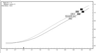
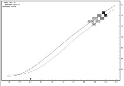
To answer the first question I selected negatives from previous tests of Ilford FP4+ film developed in Pyrocat-HD and PMK. The negatives selected had a CI of .52, when measured in Blue mode, which is about right for printing on silver graded papers in my conditions.

To test this I first made contact prints with both the PMK and Pyrocat-HD negatives on a #2 Arista graded paper, exposing with the enlarger. The tests were developed in Ansco 130 1:2 for 2:30 minutes.

The resulting prints were virtually identical when adjusted for the slightly higher density of the Pyrocat-HD negatives. I concluded from this that 1) when printing on graded silver papers the reading in Blue mode provides a fairly accurate indicator of paper printing scale, regardless of the color of the stain, and 2) there is little if any difference in the print regardless of which of the two developer one uses.

I then made prints with these same negatives on Arista VC using a #2 filter, same conditions as above. Both prints were very flat and it became obvious that in order to print on the VC papers with the same contrast as on the graded paper I would need to either, 1) use a higher VC filter, or 2) use a negative of much higher CI. After some experimentation I found that a #5 filter was needed with the VC paper to match the result on #2 graded paper. Next I determined how much the CI of the negative would need to be increased so that the #2 graded paper would match a print on VC paper with a #2 filter. Again, after some experimentation I found that a negative CI of .70 was needed to print with the same contrast on VC paper using a #2 filter as a negative with a CI of .52 printed on graded paper.

The curve for these negatives is attached. As you can see, the curves are virtually identical, even though the EFS of Pyrocat-HD at 125 is slightly higher than PMK, which bumps it up slightly on the y-axis.

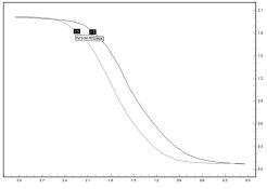
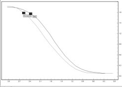
In order to answer the second of the two questions, i.e. do PMK and Pyrocat-HD negatives print differently on VC papers, I measured the densities of the prints made on VC paper #2 paper (using the PMK and Pyrocat-HD negatives with a CI of .70}. I then plotted the curves, which are attached.

Examination of the curves indicates these differences.

1. The PMK print has a *slightly* longer toe than the Pyrocat-HD print.
2. The Pyrocat-HD print has a longer straight line.
3. The PMK print shows a lot of shouldering, which indicates considerable highlight compression (or compensation).

Persons who understand how negative curves correlate to print values understand that neither curve is superior to the other, though for a given type of film and/or lighting condition one might give better results than the other.

Curves are characteristics of film developers. They are there to be used by people who understand them, but they don’t in and for themselves indicate that one developer is superior to another. But they do show important differences that will translate into differences in the tonal values of our prints.


Sandy
 

Attachments

  • NegativeCurve.jpg
    NegativeCurve.jpg
    40.5 KB · Views: 332
  • PrintCurve.jpg
    PrintCurve.jpg
    41.1 KB · Views: 326
Last edited by a moderator:

Kirk Keyes

Member
Joined
Jun 17, 2004
Messages
3,234
Location
Portland, OR
Format
4x5 Format
Sandy,

Could you label the axis of your graphs? Thanks - Kirk
 
OP
OP

sanking

Member
Joined
Mar 26, 2003
Messages
5,437
Location
Greenville,
Format
Large Format
Kirk Keyes said:
Sandy,

Could you label the axis of your graphs? Thanks - Kirk

Kirk,

Plain old H&D curve stuff. The x-axis, along the horizontal, corresponds to values of exposure expressed in relative logE values, which means that the numbers are in correct proportion to each other but do not corresopond to any specific standard of measurment. The y-axis, on the vertical, relates to values of image density, also in log values, that corresond to the common log of opacity.

Sandy
 

noseoil

Member
Joined
Oct 6, 2003
Messages
2,894
Location
Tucson
Format
Multi Format
Sandy, thanks for posting these tests. Would the toe of the PMK print be one relative difference in the "muddiness" of a PMK print (like comments on the azo forum) when compared to Pyrocat, with respect to shadow detail? That extra little bit of speed in Pyrocat formula seems to be one factor in the shadow detail being more open and full.
 

esearing

Member
Joined
Aug 17, 2004
Messages
364
Location
North GA
Format
4x5 Format
Thanks Sandy. Trying to get my head around this by putting this in real life situations; I would assume that both PMK and HD are equivalent for low contrast situations where there are mostly middle tones (ie caucasian portraits or a cloudy day in the woods where shadow contrasts are lacking).

Where these two seem to differ is where the contrast and range of tones at the ends need to be more separated (example slit canyons at mid morning, where sunlight is strong at top of slits, yet still dark at bottom). IT would also appear that HD would not have as much pure black or pure white in a print compared to the PMK print which may or may not be desirable.

PS Thanks for continuing to share your knowledge here and elsewhere.
 

Donald Miller

Member
Joined
Dec 21, 2002
Messages
6,233
Format
Large Format
Sandy,

Thank you for your work on this. The contrast difference graded to VC materials is of particular interest and parallels my actual printing difference in the darkroom. My results have indicated that the densities Ansel Adams proposed in "The Negative" no longer apply in my printing with my materials (Forte and Oriental graded, and VCFB).

As I read your curves they indicate that Pyrocat does offer better tonal separation throughout it's curve by virtue of the shorter toe and the absence of the shouldering indicated with PMK.

Did you do any work on the issue of stain color in the compression of highlight tonal scale between PMK and Pyrocat when used with VC materials and the effects of the stain color as it effects the colors of VC filters?
 

GreyWolf

Member
Joined
Feb 10, 2003
Messages
166
Location
North of Cal
Hello Sandy,

From this observation...

"Again, after some experimentation I found that a negative CI of .70 was needed to print with the same contrast on VC paper using a #2 filter as a negative with a CI of .52 printed on graded paper."

Would I be foolish to now make the assumption that this would be similar for all VC papers?

I am also curious as to why there is such a dramatic difference in the CI required when printing on VC paper. Would you be able to explain this in simple terms or perhaps at least speculate on the possible reasons?

When you printed on the graded paper would it be correct to assume that you were using your enlarger light source without any VC filters in play and as such used that as your baseline for a #2 graded paper?

If so... how different would you speculate that the color output of your enlarger is without filters, is in relation to your enlarger with a filter in place to print a #2 VC paper?

My personal experience with my enlarger (Saunders 4500) is that with VC paper I print approximately one grade harder without a filter as I do with a #2 Ilford filter in play. In other words...I must use a #3 filter to closely approximate a print that would otherwise print the same (time adjusted of course) without any filter being used.

I am just surprised by the the extreme difference that you are reporting in CI from a graded paper to a VC paper.

Kind Regards,
 
OP
OP

sanking

Member
Joined
Mar 26, 2003
Messages
5,437
Location
Greenville,
Format
Large Format
GreyWolf said:
I am just surprised by the the extreme difference that you are reporting in CI from a graded paper to a VC paper.

Kind Regards,


I was not especially surprised by the very large difference for the CI requirements of graded and VC papers because it is consistent with observations and examples made by Barry Thornton in the Edge of Darkness, which also show a difference of 2-3 grades. However, since some people have reported less of a difference there may be a variety of factors in play that need to be explored in more detail, including the type light in the enlarger, type of VC filters used, different spectral response of papers, etc.

So in that respect it may be useful to state all of the factors in play in my testing. Here is what I used for the test. My exposing light is a Beseler 23-C enlarger with the standard incandescent bulb (Wiko PH/111A, 125V75W). When I printed on the graded paper I did not use a filter. For the VC tests I used the Kodak Polymax filter set. The #2 filter is amber in color, while the #5 is strongly magenta.

As previously noted, the papers that I used were Arista, a graded #2 paper, and Arista VC paper. I did not verify if there was any difference in contrast with the VC papers in printing with a #2 filter and without it, though from past experience I know that if there is any difference it is quite small.

Sandy
 
Last edited by a moderator:

gainer

Subscriber
Joined
Sep 20, 2002
Messages
3,703
I have a 23C and a 6X7 Chromega side by side. I believe the quartx halogen bulb has a higher color temperature than the 111. There is not usually very much difference between the two without filter, even though one is condenser. On the Chromega I seldom use anything but magenta for higher contrast, while I use Ilford filters on the 23C. I can't relate the mount of magenta exactly to contrast grade, but sometines I use quite a lot on stained negatives. Other times, I use 15 to 30 magenta to increase contrast in the shadows. The stain, being proportional to the silver, overpowers the magenta somewhere up the line and renders the highlights nicely.
 
OP
OP

sanking

Member
Joined
Mar 26, 2003
Messages
5,437
Location
Greenville,
Format
Large Format
Donald Miller said:
Sandy,


As I read your curves they indicate that Pyrocat does offer better tonal separation throughout it's curve by virtue of the shorter toe and the absence of the shouldering indicated with PMK.

Did you do any work on the issue of stain color in the compression of highlight tonal scale between PMK and Pyrocat when used with VC materials and the effects of the stain color as it effects the colors of VC filters?

Donald,

I did not do any specific work on the issue of stain color, but in general I agree with Barry Thornton's observations (in Edge of Darkness) about the printing difference with VC papers between the yellow stain of PMK, which serves to low the printing contrast on VC papers, and the brown tone of pyrocatechin type developers (Diaxactol, Pyrocat-HD). Brown stain also lowers the overall contrast but it causes less highlight shouldering and can therefore be compensated for by increasing time of development. Yellow stain is more insidious because the longer you develop the more shouldering you get, and so the compression/compensation, instead of starting around Zone VIII, will start in Zone VI or VII with longer time of development. There are some type of subjects that will benefit from this type of compression, for example, shooting interiors with bright light streaming through, or shooting a scene in the sun with side by side white an black objects which both require texture.

We also have to consider the film. It would be counter-productive to use a film with a tendency to shoulder, say HP5+, with a developer that produces a lot of compression in the highlights. This would give you very muddy highlights. So PMK and HP5+ on the fact of it appears to me to be a very poor combination. On the other hand, some films have a tendency to do the opposite, i.e. not compress at all in the shoulder but flare upward. Tri-X 320 is such a film and practice shows that it works very well with PMK as the developer compression counters the flaring shoulder and helps to hold texture in the upper highlights.

But in any event, the point here is that there are important differences between these two developers that need to be considered, of which the most important is the way they render highlight detail. Overall, and just looking at the results with the FP4+ film, here is what I would say about the print curve that was attached earlier.

1. PMK gives slightly better separation in Zones I and II, while the transition with Pyrocat-HD is more gradual, but texture extends deeper into the shadow because of the slight increase in EFS.

2. Tonal values are rendered about the same in Zones III through VI.

3. Separation is much better with Pyrocat-HD in Zones VII and VIII.

4. Separation is much, much better with Pyrocat-HD in Zone IX and above, but with certain kinds of subjects the compensation of PMK will allow you to print these values whereas some burning in might be required with Pyrocat.

In general I would say that Pyrocat-HD renders tonal values more in a way that is seen with traditional high definition semi-compensating developers such as FX-2, whereas PMK (and Rollo Pyro) are rather unique for their extreme compensation/compression.

Obviously some of my comments are speculation, albeit informed speculation based on concrete data.

Sandy
 
Last edited by a moderator:

Kirk Keyes

Member
Joined
Jun 17, 2004
Messages
3,234
Location
Portland, OR
Format
4x5 Format
sanking said:
Kirk,

Plain old H&D curve stuff. The x-axis, along the horizontal, corresponds to values of exposure expressed in relative logE values, which means that the numbers are in correct proportion to each other but do not corresopond to any specific standard of measurment. The y-axis, on the vertical, relates to values of image density, also in log values, that corresond to the common log of opacity.

Sandy

OK - I just wanted to make sure that you weren't doing something more advanced, like trying to do a tone-reproduction graph.

So Graph 1 is of the negs with expsoure on the x and blue channel neg density on y.

And Graph 2 is print density on VC paper on y. Is it neg density in blue channel on x? Also, is this of the 0.51 CI negs?

Could you supply the graph of the negs on the Grade 2 paper for comaprison? And also the 0.51 negs on grade 2.

The Pyrocat neg in graph 2 looks a little flat compared to the PMK in the middle tones - how about a graph of the Pyrocat @ grade 5 and the PMK at say grade 4 so the graphs have a more similar slope.
 
OP
OP

sanking

Member
Joined
Mar 26, 2003
Messages
5,437
Location
Greenville,
Format
Large Format
Kirk Keyes said:
OK - I just wanted to make sure that you weren't doing something more advanced, like trying to do a tone-reproduction graph.

So Graph 1 is of the negs with expsoure on the x and blue channel neg density on y.

And Graph 2 is print density on VC paper on y. Is it neg density in blue channel on x? Also, is this of the 0.51 CI negs?

Could you supply the graph of the negs on the Grade 2 paper for comaprison? And also the 0.51 negs on grade 2.

The Pyrocat neg in graph 2 looks a little flat compared to the PMK in the middle tones - how about a graph of the Pyrocat @ grade 5 and the PMK at say grade 4 so the graphs have a more similar slope.

Yes, Graph 1 blue channel exposure on x-axis.

Can supply the graphs of the .52 CI negative. Will do so later.

The Pyrocat neg in graph 2 has the same CI as the PMK negative. The slopes are virtually identical for the two negatives.

Sandy
 
OP
OP

sanking

Member
Joined
Mar 26, 2003
Messages
5,437
Location
Greenville,
Format
Large Format
Kirk Keyes said:
Could you supply the graph of the negs on the Grade 2 paper for comaprison? And also the 0.51 negs on grade 2.

Attached is the graph for the 0.51 (actually 0.53 and 0.54) negatives, based on analysis from blue channel reading.

I did not do a graph of these negatives on VC paper with the #2 filter since the contrast was so obviously off, and I appear to have discarded the contact prints that were done with this set of negatives with the #5 filter. However, the results were almost identical in terms of overall contrast to the CI .70 negatives made with the #2 filter.

Sandy
 

Attachments

  • NegCurve#2.jpg
    NegCurve#2.jpg
    39.4 KB · Views: 169
Last edited by a moderator:

jim appleyard

Member
Joined
Nov 21, 2004
Messages
2,370
Format
Multi Format
Sandy, if you have the time and energy, I'd like to see a comparision between Pyrocat HD, PMK and Wimberly's WD2D (with and without the "+"). Ah, no hurry!
 

Eric Rose

Member
Joined
Nov 21, 2002
Messages
6,802
Location
T3A5V4
Format
Multi Format
Jim why don't you do it yourself and let us all know the results. Sandy I think was spurred on to do this round of testing because of some very general comparisons of PMK and HD done elsewhere.
 
OP
OP

sanking

Member
Joined
Mar 26, 2003
Messages
5,437
Location
Greenville,
Format
Large Format
EricR said:
Jim why don't you do it yourself and let us all know the results. Sandy I think was spurred on to do this round of testing because of some very general comparisons of PMK and HD done elsewhere.

The reason for the tests was somewhat more specific. Someone on the pure silver list, who previously had taken UV readings of a PMK negative with a spectraphotometer, asked me to do the same with a Pyrcocat-HD negativeb. His premise was that these readings, if different, would suggest that PMK and Pyrocat-HD negatives would print differently on VC paper. I did not have time to have the test done, but thought, why not just test this directly with negatives made with the two developers? So I looked through my file of negative tests and found PMK and Pyrocat-HD negatives that closely matched in terms of CI in blue channel reading. The rest was pretty routine.


Sandy
 

Eric Jones

Member
Joined
Oct 5, 2004
Messages
124
Location
Los Angeles
Format
Multi Format
Looking at the graphs just above the name of each developer there are two boxes, one reads 100++ for Pyrocat and 64+ for PMK. Now I am assuming they are the speed of the film in this particular developer, agitation technique, etc. But, I was wondering what the (+) signs mean? Perhaps, 100++ is actually 100 + 2/3 stop and 64+ is 64 + 1/3 stop? Thanks for any additional info.
 
OP
OP

sanking

Member
Joined
Mar 26, 2003
Messages
5,437
Location
Greenville,
Format
Large Format
Eric Jones said:
Looking at the graphs just above the name of each developer there are two boxes, one reads 100++ for Pyrocat and 64+ for PMK. Now I am assuming they are the speed of the film in this particular developer, agitation technique, etc. But, I was wondering what the (+) signs mean? Perhaps, 100++ is actually 100 + 2/3 stop and 64+ is 64 + 1/3 stop? Thanks for any additional info.

That is also my understanding about the meaning of the + signs. I don't have my WinPlotter manual on hand at the time, and honestly don't remember what it says about this, but I have always understood it to be as you suggest.

However, these tests were not conducted to test film speed so the comparison numbers are not necessarily a true indicator of EFS of the two developers.

Sandy
 
OP
OP

sanking

Member
Joined
Mar 26, 2003
Messages
5,437
Location
Greenville,
Format
Large Format
sanking said:
I appear to have discarded the contact prints that were done with this set of negatives with the #5 filter.

Sandy

Kirk,

Although I discarded the contact prints made with the .52 CI negatives on VC paper with the #5+ filter I found the densitometer readings that I made of the prints before they were discarded. Curiously, although there is still a bit more compression in the highlights with the Pyrocat-HD print than with the PMK print the overall look is much closer on this print than with the .70 CI negatives printed on VC paper with a #2 filter.

I am fairly certain that this is due to the fact that the stain constitutes a much larger percentage of total density on the .70 negatives and therefore has a bigger impact on the way these negatives interact with VC papers. Then again, perhaps it is simply that the strong magenta color of the #5+ filter overwhelms the color of the stain?

In any event, the curve for the .52 negatives printed with the #5+ filter is attached.

Sandy
 

Attachments

  • PrintCurve#2.jpg
    PrintCurve#2.jpg
    38.8 KB · Views: 131

Kirk Keyes

Member
Joined
Jun 17, 2004
Messages
3,234
Location
Portland, OR
Format
4x5 Format
Sandy - it would be interesting to see that graph with an adjustment to the exposure data (i.e. add or subtract a constant value to one or the other) so that the curves have a common middle point and then see how much difference there is on the ends of the curves.

But I suspect that you're seeing mostly the effect of the limited expsoure range of the grade 5 paper (VC or otherwise) - that's why they look so similar.
 

Kirk Keyes

Member
Joined
Jun 17, 2004
Messages
3,234
Location
Portland, OR
Format
4x5 Format
It would be interesting to see Graph #2 with a correction for speed so that both curves share a common point, at say 1.0 print density. It would better emphasis the differences between them.
 
OP
OP

sanking

Member
Joined
Mar 26, 2003
Messages
5,437
Location
Greenville,
Format
Large Format
Kirk Keyes said:
Sandy - it would be interesting to see that graph with an adjustment to the exposure data (i.e. add or subtract a constant value to one or the other) so that the curves have a common middle point and then see how much difference there is on the ends of the curves.

But I suspect that you're seeing mostly the effect of the limited expsoure range of the grade 5 paper (VC or otherwise) - that's why they look so similar.

Kirk,

I have not had a chance to think this through, but it seems to me that adding or subtracting a constant value to one of the curves would distort the curve in both the shadow and highlights, but primarily in the highlights, because of the different way the VC paper responds to the color of the stain.

You could probably get a more accurate idea about how the curves look reference to one another simply by shifting one up or down on the y-axis.

Sandy
 

Kirk Keyes

Member
Joined
Jun 17, 2004
Messages
3,234
Location
Portland, OR
Format
4x5 Format
sanking said:
Kirk,

I have not had a chance to think this through, but it seems to me that adding or subtracting a constant value to one of the curves would distort the curve in both the shadow and highlights, but primarily in the highlights, because of the different way the VC paper responds to the color of the stain.

You could probably get a more accurate idea about how the curves look reference to one another simply by shifting one up or down on the y-axis.

Sandy

It's not the y-axis I'm talking about - I'm suggesting that you add/subtract a fixed amount to one of the curves on the x-axis to slide one of the curves left or right so that the two curves overlap at one point, say at 1.0 on the y-axis. This will make a "correction" to your data so that both sets of data are "speed matched".

THis is kind of the same thing as printing both graphs out on separate papers with matching scales and then overlapping the papers, holding them up to a light, and then sliding the papers back and forth until the two graphs overlap at some point.

To find the amount of the correction, simply determine the difference between the two curves at your desired point. I've printed out Graph 3, and at 1.0 on the y-axis, the two curves differ by about 0.21 on the x-axis - so add 0.21 to the x-axis data from the Pyrocat curve, or subract 0.21 to the x-axis data from the PMK curve. This will make the print densities on the two curves overlap at 1.0.

This doesn't shift highlights or shadows differently because you apply the same "correction factor" to all the exposure data points on that one of the curves. It may not be something you can do in the WinPlotter software - something like Excel would do this very easily.

Doing this will make the difference between the two curves more obvious.
 
Photrio.com contains affiliate links to products. We may receive a commission for purchases made through these links.
To read our full affiliate disclosure statement please click Here.

PHOTRIO PARTNERS EQUALLY FUNDING OUR COMMUNITY:


Ilford ADOX Freestyle Photographic Stearman Press Weldon Color Lab Blue Moon Camera & Machine
Top Bottom