thank you very much for all the replies! Bromoil process looks truly fascinating and I think I'm gonna give it a try.
it depends really what you are asking, what sort of ink drawing - there are so many sort of ink drawings - pen? brush?
if you could provide a link to an example of the sort of thing you're looking for it might help, otherwise all suggestions are rather in the dark.
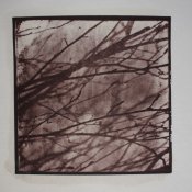
a number of artists have looked at prints of mine similar to the attached and exclaimed "sumi-e!"
it is a salt print made using a similar process of (enlarged) intermediate positives and negatives on lith film, from a fragment of an ordinary 35mm negative, to that bsdunek mentions.
You are right - I should have been more specific of what kind of results I am after. I guess I just wanted to see what are the options

I would like to get the look of a shan shui, which is a traditional Chinese ink painting.
Here are some examples of paintings that I have on my mind:
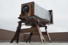
Together with a Swiss wood master, Martin Zaugg (Dogumentor on Apug), we built a huge 20"x60" camera with a custom made 1000m f14 lens (wide angle for this format) which looks like this:
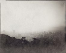
In the beginning I thought it would be very straight forward - just make a print from a paper negative which thanks to the fiber in the paper would give the final print a look I want. I made this test print before making the camera and it looked very promising:
This is a scan from paper negative so that's why you get all this nice texture. Unfortunately I noticed when contact printing, the texture is gone. It is obviously because modern photographic papers don't have heavy textured surfaces. When contact printing it is the surface and texture of the negative that is more important rather than the fiber inside (as I thought in the beginning).
I then tried to make my own calotypes but because the useful aperture (I mean sharp-ish) of the lens is f64-f128, the exposure would take hours in some cases. Obviously I had to abandon this idea.
I tried to put some hand made paper in between the neg and print which just made the print soft, I tried to put some on the top of the neg but that didn't work either. I tried to print on wood, heavily textured hand made paper and fabric - all the time the print looked like an old photograph rather than a painting.
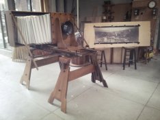
Here is one of the first paper negative from the camera:
And here you can see the camera together with a Vandyke print on fabric (from paper neg):
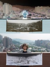
I saw some great salt prints so I start making vandykes (as they are similar to salt prints, cheaper and easier). Recently I bought Ilford Art 300 paper to use as a negative just to check if the texture from this paper can help. So far I am not really happy with the results. I made vandyke prints from it on hand-made paper and watercolour canson. I am still about to make a print on fabric. Also I encountered some problems with the ilford art paper - the negatives have even more contrast than already contrasty foma paper negs I used before (you loose some detail in highlights) - that could be adjusted slightly using green filter (not easy to make on such a big lens) or toning the print.
Anyway I already invested lots of time and money into this project and I feel a bit frustrated that I can't finally get the look I have in my mind. I would much more prefer to continue using vandyke prints as I like the colours and I feel already quite confident in making them so if anyone has an advice how I can achieve it in this way, I would highly appreciate. Otherwise I am also willing to learn yet another new technique like bromoil.
Btw here are some bromoils I found really cool: