Opinions please, "Couples", crop this image or not?

Dog Opposites

A
Dog Opposites

  • 2
  • 3
  • 115
Acrobatics in the Vondelpark

A
Acrobatics in the Vondelpark

  • 6
  • 5
  • 200
Finn Slough Fishing Net

A
Finn Slough Fishing Net

  • 1
  • 0
  • 112
Dried roses

A
Dried roses

  • 14
  • 8
  • 206
Hot Rod

A
Hot Rod

  • 5
  • 0
  • 120

Recent Classifieds

Forum statistics

Threads
197,471
Messages
2,759,576
Members
99,514
Latest member
cukon
Recent bookmarks
1

Sirius Glass

Subscriber
Joined
Jan 18, 2007
Messages
50,129
Location
Southern California
Format
Multi Format
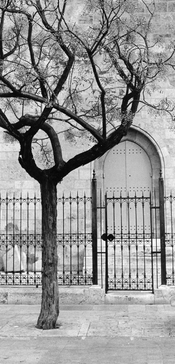
Funny. There was a time when I took great pains to avoid splitting a photo into two equal halves with the horizon, a tree or anything else. I also jumped through hoops to avoid telephone poles, power lines, road signs, etc, in my photos. I was shooting slides, so no cropping.

A few years ago I enrolled in a medium format photography class at my local university. As part of that class, I was assigned the task of discussing the photography of Lee Friedlander -- perhaps because the instructor noticed I was interested in similar subject matter. At first, his telephone poles - sometimes right down the middle of the composition - made me crazy. I am pretty sure that's why he did it -- a middle finger for the rule makers. Now you will often see powerlines and telephone poles in my photos, too, though almost never on a midline.

As for the composition under discussion, I prefer @Rolleiflexible's version in post #43. In every version which includes the couple on the right (ground level) I am bothered by how close to the edge of the frame they are. Like, fingernails-on-chalkboard bothered. I am sure they are very nice people, but I am happy to be rid of them.

One or a few right down the middle compositions are fine, but many of them become static and boring. That is the reason for the guideline.
 

Helge

Member
Joined
Jun 27, 2018
Messages
3,938
Location
Denmark
Format
Medium Format
I don't think it's for us to judge the merits of the photograph. Matt likes the couples. The OP had his reasons for framing this image as he did. But for the OP's invitation to reconsider it, I would find it presumptuous to offer an opinion. But since we are all now in a discussion, in effect, of what we would do if it were our photograph: I would look for a way to put the strong lines of the image to work, while not dwarfing the human (and canine) element. My crop, attached. (Which might be better titled, Trio.)

Too “pretty”?
 

Pieter12

Member
Joined
Aug 20, 2017
Messages
7,495
Location
Magrathean's computer
Format
Super8
I find the square format (wink, wink, Sirius) to be the most flexible when it comes to composition. Most of the traditional guidelines can be ignored. A horizon straight across the middle of a square image can be very calming, very stable. And since it is only the subject that really clues you in to which end is up, the horizon can be severely tilted and gain a dynamic the might be lost or disturbing in a more horizontal or vertical format. You can also push subjects to the edge, top or bottom and because the edges of the frame are all equidistant, the effect is made without being overly startling.
 

Mike Lopez

Member
Joined
Jan 30, 2005
Messages
625
Format
Multi Format
I find the square format (wink, wink, Sirius) to be the most flexible when it comes to composition. Most of the traditional guidelines can be ignored. A horizon straight across the middle of a square image can be very calming, very stable. And since it is only the subject that really clues you in to which end is up, the horizon can be severely tilted and gain a dynamic the might be lost or disturbing in a more horizontal or vertical format. You can also push subjects to the edge, top or bottom and because the edges of the frame are all equidistant, the effect is made without being overly startling.
The entire frame is the subject.
 

Sirius Glass

Subscriber
Joined
Jan 18, 2007
Messages
50,129
Location
Southern California
Format
Multi Format
I find the square format (wink, wink, Sirius) to be the most flexible when it comes to composition. Most of the traditional guidelines can be ignored. A horizon straight across the middle of a square image can be very calming, very stable. And since it is only the subject that really clues you in to which end is up, the horizon can be severely tilted and gain a dynamic the might be lost or disturbing in a more horizontal or vertical format. You can also push subjects to the edge, top or bottom and because the edges of the frame are all equidistant, the effect is made without being overly startling.

<< He enters stage left, walks to the middle of the stage, turns to the audience, takes a bow, exits stage right after the applause subside>>
 

Alex Benjamin

Subscriber
Joined
Aug 8, 2018
Messages
2,241
Location
Montreal
Format
Multi Format

Helge

Member
Joined
Jun 27, 2018
Messages
3,938
Location
Denmark
Format
Medium Format
The reference escapes me. The original is too pretty? My suggested crop is too pretty? What does it mean, to be "too pretty"?

I simply mean you might have neutered the originals qualities into a more formalistic idea of safe minimalism.
It might not dare enough. It might not be on the edge of anything.

You might go further in that direction and get something like this

1CE045BA-AAC6-4E11-9596-536B4CE7192C.jpeg


or this
 

Attachments

  • 0C7BCB80-6AB6-4340-8D9B-E6E320D99451.jpeg
    0C7BCB80-6AB6-4340-8D9B-E6E320D99451.jpeg
    494.4 KB · Views: 97
Last edited:

Vaughn

Subscriber
Joined
Dec 13, 2006
Messages
10,012
Location
Humboldt Co.
Format
Large Format
I find the square format (wink, wink, Sirius) to be the most flexible when it comes to composition. Most of the traditional guidelines can be ignored...

Yeah! My first camera was a Rolleiflex...love the square... 😎
 

Attachments

  • Bruce.jpg
    Bruce.jpg
    125 KB · Views: 97

Rolleiflexible

Subscriber
Joined
Mar 22, 2005
Messages
2,196
Location
Mars Hill, NC
Format
Multi Format
Yeah! My first camera was a Rolleiflex...love the square... 😎

I can't imagine starting out with a Rolleiflex. My dad started me with a Canon TX and that felt rich to me. Years later, as a young lawyer in Manhattan, I screwed up my courage and visited Ken Hansen's shop on Madison Avenue, where I bought my first Rolleiflex, a worn but loved 3.5E. (Still have it.) Ken was a great and kind man but the whole thing felt intimidating -- his store was sacred ground and I felt like a poser in there. I told Ken I had wanted to buy a Rolleiflex years earlier, and he asked why I had waited. "Because I was not worthy of the camera," I replied. Ken got a good laugh out of that. I bought many Rolleiflexes and Leicas from him over the years -- I miss him.
 

Vaughn

Subscriber
Joined
Dec 13, 2006
Messages
10,012
Location
Humboldt Co.
Format
Large Format
My aunt bought the Rolleiflex for my dad at a military PX in Spain back in the mid-50s. My dad used it for the family snapshots with a 35mm adapter inside until about 1970. He replaced it with a Kodak Instamatic 804 (top of the line). The Rollei went to my sister first who decided photgraphy was not for here, then to me in 1974...tho I did not start using it regularily until 1977 when I made my first prints.
 

BMbikerider

Member
Joined
Jul 24, 2012
Messages
2,915
Location
UK
Format
35mm
The crop is much much better. The mix of sky, deep shadow, and a mish mash of bits of the building and what to me looks like one person and a pigeon detract from the remainder of the image. It is a stronger image with the distractions out of the way.
 

Rolleiflexible

Subscriber
Joined
Mar 22, 2005
Messages
2,196
Location
Mars Hill, NC
Format
Multi Format
I simply mean you might have neutered the originals qualities into a more formalistic idea of safe minimalism.
It might not dare enough. It might not be on the edge of anything.

I will take that as a compliment. An image (regardless of medium) tells a story with a syntax driven by principles of design -- rhythm, balance, tension and so on. There is no one right way to communicate a story, in words or in images. What you perceive as a "formalistic idea of safe minimalism," I consider a syntactic arrangement of elements in the frame. Far from neutering the image, the composition does not call attention to itself, and allows the eye to see the elements for what they are: Couple, dog, tree, door. An "edgier" composition calls attention to itself, pulls the viewer out of the image, and makes the viewer think about what the artist intended by the unusual arrangement. Your first crop in this post, for example, draws my eye to the large empty space above the couple, and I disengage from the image and wonder why you have directed my attention there.

In the end we are all different and experience the world differently and that is the beauty of art -- it enables us to see the world as others do. I suppose I do see the world from a more formal, and minimal, and rule-driven perspective. I am a lawyer, after all.
 

KitosLAB

Member
Joined
Dec 4, 2022
Messages
195
Location
Ukraine
Format
35mm
No, don't cut. At the very top above the heads of the couple there are steps that lead even higher. When the eye reaches them, there is a feeling that there is something further there. By cutting it out of the frame, this feeling disappears.
 

Rolleiflexible

Subscriber
Joined
Mar 22, 2005
Messages
2,196
Location
Mars Hill, NC
Format
Multi Format
My aunt bought the Rolleiflex for my dad at a military PX in Spain back in the mid-50s. My dad used it for the family snapshots with a 35mm adapter inside until about 1970. He replaced it with a Kodak Instamatic 804 (top of the line). The Rollei went to my sister first who decided photgraphy was not for here, then to me in 1974...tho I did not start using it regularily until 1977 when I made my first prints.

Like learning how to drive in a Porsche. :smile:
 

Helge

Member
Joined
Jun 27, 2018
Messages
3,938
Location
Denmark
Format
Medium Format
I will take that as a compliment. An image (regardless of medium) tells a story with a syntax driven by principles of design -- rhythm, balance, tension and so on. There is no one right way to communicate a story, in words or in images. What you perceive as a "formalistic idea of safe minimalism," I consider a syntactic arrangement of elements in the frame. Far from neutering the image, the composition does not call attention to itself, and allows the eye to see the elements for what they are: Couple, dog, tree, door. An "edgier" composition calls attention to itself, pulls the viewer out of the image, and makes the viewer think about what the artist intended by the unusual arrangement. Your first crop in this post, for example, draws my eye to the large empty space above the couple, and I disengage from the image and wonder why you have directed my attention there.

In the end we are all different and experience the world differently and that is the beauty of art -- it enables us to see the world as others do. I suppose I do see the world from a more formal, and minimal, and rule-driven perspective. I am a lawyer, after all.

The crucial word in my post was “might”. But we are mincing words here.
All of this is throwing ideas up. Yours is absolutely valid.
In my experience, certain kinds of imperfections can actually aid an image.
But that depends very much on whether it is printed large and/or whether it is consumed quickly, or hung on the wall.
There is a certain yin yang effect, and dynamic immediacy to some of the other crops, I think.
Were as yours is more static, and easily understandable.
 
Last edited:

Rolleiflexible

Subscriber
Joined
Mar 22, 2005
Messages
2,196
Location
Mars Hill, NC
Format
Multi Format
The crucial word in my post was “might”. But we are mincing words here.
All of this is throwing ideas up. Yours is absolutely valid.
In my experience, certain kinds of imperfections can I actually aid an image.
But that depends very much on whether it is printed large and/or whether it is consumed quickly, or hung on the wall.
There is a certain yin yang effect, and dynamic immediacy to some of the other crops, I think.
Were as yours is more static, and easily understandable.

Helge! Don't pull back from the edge! :smile: I appreciate your criticism. You and I are both reënacting here a Kabuki drama that has been staged countless times in the heads of every artist in every medium. There isn't a time you or I have looked into the viewfinder and wondered how best to compose the unmediated reality about us into a rectilinear image that means something, that mediates the chaos into something worth communicating. I'm not sure these posts accomplish anything other than giving me (hopefully you too) a way to explore my own biases. I appreciate your thoughts.
 

Sirius Glass

Subscriber
Joined
Jan 18, 2007
Messages
50,129
Location
Southern California
Format
Multi Format
Helge! Don't pull back from the edge! :smile: I appreciate your criticism. You and I are both reënacting here a Kabuki drama that has been staged countless times in the heads of every artist in every medium. There isn't a time you or I have looked into the viewfinder and wondered how best to compose the unmediated reality about us into a rectilinear image that means something, that mediates the chaos into something worth communicating. I'm not sure these posts accomplish anything other than giving me (hopefully you too) a way to explore my own biases. I appreciate your thoughts.

Formats can influence the composition. I prefer square to the 35mm rectangular which is a bit too wide. With 35mm I have to consider whether I cam compose with the whole form or plan on cropping later in the darkroom.
 

MattKing

Moderator
Moderator
Joined
Apr 24, 2005
Messages
51,936
Location
Delta, BC Canada
Format
Medium Format
Like learning how to drive in a Porsche. :smile:

I learned to drive a manual transmission in an MGB.
Challenging, but really rewarding when you get the hang of it.
Just like a Rollieflex :smile:
Even if a Mamiya C330 is better suited to me.
 

Rolleiflexible

Subscriber
Joined
Mar 22, 2005
Messages
2,196
Location
Mars Hill, NC
Format
Multi Format
I learned to drive a manual transmission in an MGB.
Challenging, but really rewarding when you get the hang of it.
Just like a Rollieflex :smile:
Even if a Mamiya C330 is better suited to me.

I learned to drive stick in my friend's brand new 1974 Super Beetle. Sort of like a Porsche, come to think of it. Nearly fifty years later, I'm driving a 2014 Turbo Diesel Beetle. With a stick. I wonder whether people who prefer manual cameras drive sticks. Control freaks?
 

MattKing

Moderator
Moderator
Joined
Apr 24, 2005
Messages
51,936
Location
Delta, BC Canada
Format
Medium Format

Rolleiflexible

Subscriber
Joined
Mar 22, 2005
Messages
2,196
Location
Mars Hill, NC
Format
Multi Format

MattKing

Moderator
Moderator
Joined
Apr 24, 2005
Messages
51,936
Location
Delta, BC Canada
Format
Medium Format
I was just about to go print more kallitypes (because the world needs more) and you send me a nine-page thread to distract me? Get behind me, Satan.

We are here to serve :smile:
 

Vaughn

Subscriber
Joined
Dec 13, 2006
Messages
10,012
Location
Humboldt Co.
Format
Large Format
I learned to drive a manual transmission in an MGB.
Challenging, but really rewarding when you get the hang of it.
Just like a Rollieflex :smile:
Even if a Mamiya C330 is better suited to me.
Rollei is like a Porsche? My Rolleicord reminds me more of my 71 Superbeetle I drove for 10 years. Learned to drive a 1968 VW bus -- more like the 'flex...heavier, more do-dads. If Rolleis were like porsches, they'd always need more servicing... 😎

Driving my BIL's Bug Eye Sprite was always fun.
 
Photrio.com contains affiliate links to products. We may receive a commission for purchases made through these links.
To read our full affiliate disclosure statement please click Here.

PHOTRIO PARTNERS EQUALLY FUNDING OUR COMMUNITY:


Ilford ADOX Freestyle Photographic Stearman Press Weldon Color Lab Blue Moon Camera & Machine
Top Bottom