Newbie, first roll developed but odd colours

Frank Dean,  Blacksmith

A
Frank Dean, Blacksmith

  • 6
  • 3
  • 51
Woman wearing shades.

Woman wearing shades.

  • 0
  • 1
  • 58
Curved Wall

A
Curved Wall

  • 6
  • 0
  • 84
Crossing beams

A
Crossing beams

  • 9
  • 1
  • 106
Shadow 2

A
Shadow 2

  • 5
  • 1
  • 78

Recent Classifieds

Forum statistics

Threads
198,842
Messages
2,781,712
Members
99,725
Latest member
saint_otrott
Recent bookmarks
0

MattKing

Moderator
Moderator
Joined
Apr 24, 2005
Messages
52,947
Location
Delta, BC Canada
Format
Medium Format
Scanning discussions are outside APUG's charter.

That being said, it helps to understand how labs work.

The scans you received will reflect adjustments made by the scanning software and/or the operator. There is no such thing as a truly "unmodified" scan.

So unless you include a reference and instruct the scanner operator to give you scans that are faithful to that reference, you can expect different settings for different scenes - and sometimes different settings for different versions of the same scene!

It wasn't totally different when labs used to optically print. Colour analyzers and the operators of minilab printers would sometimes make adjustments that were way off!

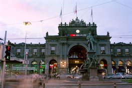
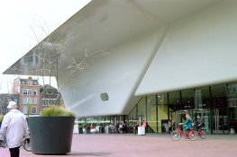
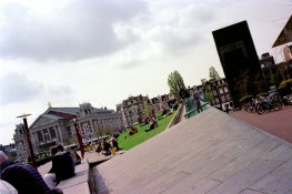
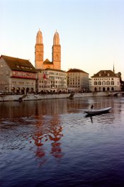
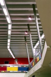
By the way, I see some distinct differences between the lighting for these two shots (which will affect the film's response), as well as important differences to the predominant background (which will affect how the negatives are analyzed - either by the scanner + software or an analogue colour analyzer).

One would need to either do their own, manual optical print or have their own calibrated scanner with software that permits creation of a reference and manual adjustments in order to avoid these factors.
 
OP
OP

RockyT

Member
Joined
Feb 20, 2015
Messages
17
Format
35mm RF
I got a reply from the lab and was told they are processed. I think I'll do my own scans next time so that'll be my next step for getting consistency. I apologise if some of my questions are trivial. I'm going to keep shooting and I hope to contribute more in the future. Thanks again to all the members for the advice :smile:
 
OP
OP

RockyT

Member
Joined
Feb 20, 2015
Messages
17
Format
35mm RF
Just wanted to update this thread with recent experience. I got myself a scanner and tried scanning a couple of frames. They seem to turn out a lot more neutral which I like but I had a beach scene which was very problematic and was nicer from the lab. Thanks again to everyone for the tips :smile:, I'm really enjoying learning about the film process. This is that same picture from my scanner

attachment.php
 

Attachments

  • Lana.jpg
    Lana.jpg
    481.8 KB · Views: 164

Nodda Duma

Member
Joined
Jan 22, 2013
Messages
2,685
Location
Batesville, Arkansas
Format
Multi Format
That came out better. I second the recommendation to try Portra because of how nice skin tones come out.

I maintain that if you put a colour reference chart into the first image on any roll of film, then you have the have the ability to correct to a known reference when you get your scans back regardless of scanning or dev being off a bit.

If you have a colour printer then you can print your own on a piece of A4 from time to time. Its so easy, why wouldn't you do it.

What color reference chart would you recommend? Macbeth?
 
Last edited by a moderator:

RobC

Member
Joined
Nov 5, 2007
Messages
3,880
Location
UK
Format
Multi Format
That came out better. I second the recommendation to try Portra because of how nice skin tones come out.


What color reference chart would you recommend? Macbeth?

It realy doesn't matter, I'd print your own and then scan it. That way you knw what the RGB used was to create it and you know what rgb your scan achieves and can adjust scan settings to reproduce what you see in the print of it.

Then when you scan your subject neg with card in it, you can adjust it to match colour of your test card scan.

This way of doing it suggests a neutral toned film/result so if you want to retain the look of any particular film type such as portra, then do some test photos with tha film and your test card and scan and adjust to find settings for that particular film type.

The point is that having a known reference in the form of a coulour chart in photo makes it much easier to adjust/ find settings for that film type.
 
Last edited by a moderator:

I.G.I.

Hi guys, I'm a newbie in film photography and I recently made a decision to step up into medium format with a Hassy and a Rollei. I was really interested in film because I've seen so many samples in the past where the colours and tones are just uniquely beautiful. I shot my first few films and just got the scans back today but I'm somewhat disappointed with the results mainly on the colours. I shot with an Ektar100 and the results I got looked like it had an instagram filter applied onto it. My initial thoughts was maybe they were bad scans but I hope you guys can help point me in the right direction on how to improve. Do these results seem normal to you? If not what do you think could be the potential problem? Could it be bad scans or maybe the chemicals used were old (the films used were well before their expiry date)? I was expecting to get very transparent like tones and colours from the ektar. I'm really new to film so I'd love to hear any suggestions on comments, thank you for your time.<br>

Rocky

rollei

I use regularly Ektar; I do the scanning myself, and from my experience I would say the following.

The primary culprit for your dissatisfaction are the scans, most probably done on "Auto" since they are both very saturated and very high contrast, and the colour balance is slightly off. The second issue is that the images with the model are a tad underexposed. I've read on several occasions experienced users to suggest shooting Ektar at ISO 70 or even 50. With more exposure you get lighter more transparent colours (I don't know how to describe it better, English is not my mother tongue).

Ektar might be marketed as "high saturation", but in my experience it is not the saturation that's special about it, it is the distinctive colour palette - it makes Portra looks dull and banal in comparison. Contrary to what other posters have said I find Ektar very easy to scan, and very easy to flatten the negatives (something I will never say about Fuji Pro which otherwise I love).

And finally regarding the use of colour-correction filters you asked elsewhere in the thread. I adhere religiously to them (well I exaggerate a bit, but you get the idea), and perhaps for that reason I never have issues with colour balance or casts.

Indeed the appreciation of colour is one of the most subjective things. With that proviso I post two examples: the multiple exposure at dusk is with 80B; the overcast image is with 81A. Please keep in mind that I never use the Saturation adjustment, neither in the scanning software nor in Photoshop (I use PH only to correct scratches on the negative and to resize and change profile). Therefore what you see is what I get straight from Ektar.
 

Attachments

  • SBB_3246.jpg
    SBB_3246.jpg
    173.5 KB · Views: 92
  • Amsterdam_0010.jpg
    Amsterdam_0010.jpg
    145.6 KB · Views: 87
OP
OP

RockyT

Member
Joined
Feb 20, 2015
Messages
17
Format
35mm RF
It realy doesn't matter, I'd print your own and then scan it. That way you knw what the RGB used was to create it and you know what rgb your scan achieves and can adjust scan settings to reproduce what you see in the print of it.

Then when you scan your subject neg with card in it, you can adjust it to match colour of your test card scan.

This way of doing it suggests a neutral toned film/result so if you want to retain the look of any particular film type such as portra, then do some test photos with tha film and your test card and scan and adjust to find settings for that particular film type.

The point is that having a known reference in the form of a coulour chart in photo makes it much easier to adjust/ find settings for that film type.

Thanks for those tips Rob, I think that will come in handy in the future.

I use regularly Ektar; I do the scanning myself, and from my experience I would say the following.

The primary culprit for your dissatisfaction are the scans, most probably done on "Auto" since they are both very saturated and very high contrast, and the colour balance is slightly off. The second issue is that the images with the model are a tad underexposed. I've read on several occasions experienced users to suggest shooting Ektar at ISO 70 or even 50. With more exposure you get lighter more transparent colours (I don't know how to describe it better, English is not my mother tongue).

Ektar might be marketed as "high saturation", but in my experience it is not the saturation that's special about it, it is the distinctive colour palette - it makes Portra looks dull and banal in comparison. Contrary to what other posters have said I find Ektar very easy to scan, and very easy to flatten the negatives (something I will never say about Fuji Pro which otherwise I love).

And finally regarding the use of colour-correction filters you asked elsewhere in the thread. I adhere religiously to them (well I exaggerate a bit, but you get the idea), and perhaps for that reason I never have issues with colour balance or casts.

Indeed the appreciation of colour is one of the most subjective things. With that proviso I post two examples: the multiple exposure at dusk is with 80B; the overcast image is with 81A. Please keep in mind that I never use the Saturation adjustment, neither in the scanning software nor in Photoshop (I use PH only to correct scratches on the negative and to resize and change profile). Therefore what you see is what I get straight from Ektar.

Thanks for the tips about the filters. Another member has given me some advice and he also suggested using them. I'll have to look into it a bit more, sometimes I like the casts made from the lighting but for portraits I think its nicer to have a clean palette. I've got a few more rolls of Ektar left so I'll try them at 50, I'm currently trying the HP5, provia 100 and fujicolor 400h. It's so nice to have these options readily available, the unique look on each film is like having interchangeable sensors :tongue:
 

wiltw

Subscriber
Joined
Oct 4, 2008
Messages
6,450
Location
SF Bay area
Format
Multi Format
First of all, how Kodak characterizes Ektar 100 in their data sheet:

"The World's Finest Grain Color Negative Film!
  • Ultra-vivid color

    Technology: Optimized Emulsion Spectral Sensitivity and Image Modifier Chemistry
    Benefit: Ultra-vivid color"

Ektar was MADE TO BE vivid in color, it is not what I would want for natural looking and not larger than life color rendition in portraits.
When shooting weddings a few decades ago, I would choose emulsions based on purpose of shots...my portraiture emulsion was quite different in color rendition than my wedding coverage emulsion! I would go to weddings with both types of film loaded into different backs, so I could make the shot's appearance more suited to the purpose of the shot!

Secondly, with ANY color neg emulsion, the explicit COLOR PRINT PAPER chosen to print a shot affects its rendition! I would actually choose my lab based upon the type of color paper they printed my negs with...a different lab for portraits than for shots meant to be more vivid! Here is what Kodak says about the current version of Endura print paper:

"Award-winning KODAK PROFESSIONAL ENDURA Papers set the gold standard for print quality. KODAK PROFESSIONAL ENDURA Premier Paper is designed to raise the limits for portrait/social professional paper even further — with more vibrant colors.

ENDURA Premier Paper features a technological breakthrough, the latest advancement in coupler technology, which expands your capability to create high-quality print output — professional, compelling prints that accurately preserve memories. Now, due to Kodak's innovative cyan dispersion and emulsion technology, you can benefit from an even larger color gamut, all the while maintaining clean whites, rich blacks, and realistic skin tones. This paper will produce more colors than were possible with previous ENDURA Papers.

Increased color gamut for stronger, brighter, more vibrant colors"​

On the other hand, Fuji's Fujicolor Crystal Archive Professional Paper Super Type PDN is described by them:

"At a Glance
Lifelike color reproduction resulting in accurate and vibrant colors with a "true-to-life" look.
Overview
Features

"Excellent skin tone reproduction that captures the diversity of skin tones faithfully.
Ideal gradation balance delivering neutral and deep blacks and unbiased grays over the entire density range."
In comparison, Fuji's Fujicolor Crystal Archive Professional Paper Super Type P is described by them:

"At a Glance
Designed for wedding & portrait photographers...
Overview
Fujicolor Crystal Archive Professional Paper Super Type P delivers superb color reproduction for a variety of skin tones. Its improved professional base delivers superb, pure whites and bright highlights for enhanced clarity and three-dimensionality.
Features

"Designed for weddings & portraits
Superb color reproduction
Especially skintones
"​

Lastly, the process of scanning turns photos into R-G-B and requires the application of brightness and contrast and color saturation assumptions of what the scanner user expects. Just as dSLR postprocessing includes ASSUMPTIONS in the picture styles applied to digital shots converted from RAW data to JPG files, scanner software makes similar ASSUMPTIONS. Likely the scanner software is more like Kodak's expectations from its print paper than Fuji's assumptions about its print papers, particularly the one marketed for weddings and portraits.

Similar to how I can alter the appearance of a digital camera shot in postprocessing, dialing up/down the contrast and dialing up/down the color saturation, similar adjustments can be performed on the output file of any digital scanner. I have already mentioned how I would choose film AND choose color lab for its paper, to alter the presentation of the final photo to my client. A similar approach would apply to a digitally scanned image of a shot taken on film today.
 
Last edited by a moderator:

I.G.I.

Thanks for those tips Rob, I think that will come in handy in the future.


Thanks for the tips about the filters. Another member has given me some advice and he also suggested using them. I'll have to look into it a bit more, sometimes I like the casts made from the lighting but for portraits I think its nicer to have a clean palette. I've got a few more rolls of Ektar left so I'll try them at 50, I'm currently trying the HP5, provia 100 and fujicolor 400h. It's so nice to have these options readily available, the unique look on each film is like having interchangeable sensors :tongue:

Well, filters are not a kind of antiseptic bath killing everything indiscriminately :smile: You still capture the authentic light atmosphere (including any cast from different light sources etc.) but without major shifts in tonality that are either very difficult/time consuming to correct; or if corrigible leave you with weak channels and a noisy file. If interested I can post tomorrow more samples with 81 warming filter; with 82A cooling; and with FLD for correcting fluorescent lighting. All this might sound a bit cumbersome, but after a few times using filters becomes a second nature.

Fuji Pro films are an interesting beast with distinctive palette and more pronounced grain (compared to Kodak Ektar and Portra line) that gives a wonderful impression of acutance; pity the ISO 160 is no more available in 35mm.
 

I.G.I.

Ektar with 81A
attachment.php


Ektar with 82A at twilight
attachment.php


Superia 200 with FL-D (telltale magenta cast around the non fluorescent light fixtures)
attachment.php


I treat manufacturers' descriptions with a liberal pinch of salt; not to mention the fact that language is extremely poor in description of colour - there are barely less of a dozen descriptive names for colours. As a result with regard to colour I trust my eye and brain more than marketeers' writings. From my experience with Ektar I will definitely not describe it as "ultra-vivid color", that's the sort of nonsensical language acrobatics only marketing people could come with. Fuji Superia (200) for instance is much more saturated and contrasty than Ektar; if the later is "ultra-vivid" how one could describe Superia then ?! "Non plus ultra vivid" ?
 

Attachments

  • Amsterdam_0032.jpg
    Amsterdam_0032.jpg
    153.2 KB · Views: 134
  • Limat_0058.jpg
    Limat_0058.jpg
    160.4 KB · Views: 141
  • metro_0023.jpg
    metro_0023.jpg
    161.5 KB · Views: 130
OP
OP

RockyT

Member
Joined
Feb 20, 2015
Messages
17
Format
35mm RF
Thank you for your samples, admittedly I'm starting to appreciate the nuances those filters make. I'll probably have to hold on the purchases for the moment though as the bills for new accessories do add up :sad:. Also as for the marketing descriptions I am in the same mindest as you IGI, I prefer to get an understanding of the palette based on samples rather than box descriptions but good to know that others feel the same way :smile:
 

I.G.I.

Thank you for your samples, admittedly I'm starting to appreciate the nuances those filters make. I'll probably have to hold on the purchases for the moment though as the bills for new accessories do add up :sad:. Also as for the marketing descriptions I am in the same mindest as you IGI, I prefer to get an understanding of the palette based on samples rather than box descriptions but good to know that others feel the same way :smile:

I got all my filters - both for colour and for B&W - from fleabay, otherwise the total expenditure would have reached insane a level.

Good luck in your quest for visual delights :smile:
 
Photrio.com contains affiliate links to products. We may receive a commission for purchases made through these links.
To read our full affiliate disclosure statement please click Here.

PHOTRIO PARTNERS EQUALLY FUNDING OUR COMMUNITY:


Ilford ADOX Freestyle Photographic Stearman Press Weldon Color Lab Blue Moon Camera & Machine
Top Bottom