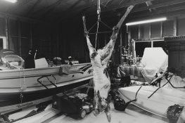
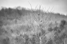
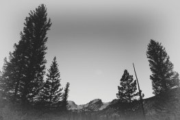
Would love some feedback on a couple photos I edited this week. I'm increasingly editing my black and white images in a low contrast manner, preferring the mid-zones, like 3-8ish. If you look at old black and white photos (before Ansel Adams), it was far less common to have as much contrast as is popular today. Michael Kenna is one of my fav. photographers and his stuff is contrasty, but in my own work I've gravitated towards low contrast. There are probably several ways to accomplish this, but I tend to slide down ''structure'' or "clarity" and will lift the the tone curve some to bring the blacks up to somewhere around zone 3. I started in the darkroom and pretty much use Lightroom in a really primitive manner (as much like the real darkroom as possible!!), and this is how I've accomplished the look I preferred in the darkroom using a lower contrast paper. Curious your thoughts/feedback/suggestions on my methodology.
Thanks!
Thanks!