
rorydancarl002
Member
I have only just begun my journey of discovery in both Pt/Pd printing and digital negatives. Going into this, I had high hopes and expectations of both aspects. I can see from posts that you have all been where I am now, and many of you have pioneered and continually improved the techniques I am trying. I'd like to share with this forum a few of my initial impressions and observations and my reactions to them in the (rather selfish) hope that you can help accelerate me along my journey - or, in some cases, perhaps reset my expectations.
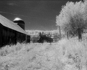
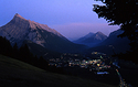
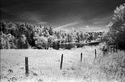
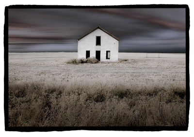
I will admit up front that I am somewhat of a sharpness addict - having originally jumped into large format photography by the lure of the quality it can produce. I now work all digitally (current Pt/Pd printing excepted) and still strive for a similar "look". From an aesthetic perspective, I started in black and white (silver) and found that my style was more suited to color. I started in landscapes and found my passion lay with architecture. However, my current photography tends towards very subdued colors, with many of my images having a rather monochromatic look. As a result, I have found myself lured back to black and white and have used that as a springboard for me to try Pt/Pd printing.
From a technical perspective, I am working with Pt/Pd in a 1:3 ratio with just a couple of drops of FO #2 in the emulsion to eliminate a slight fog I found without a restrainer. My only paper right now is the Cranes Weston Diploma. I am using straight Ammonium Citrate for the developer and EDTA for clearing (all from a B&S kit.) I have used the HSL-RNP array and ChartThrob to select a color and produce a curve. I am printing diginegs on Picotrico OHP with an HP B9180.

 A fun thought exercise, tho.
