I'm putting together a series of prints and I'd appreciate any opinions on how best to mat and hang them. I'd appreciate responses to the poll and/or discussion on the thread. I realize this is kind of subjective but I'd like to hear what you guys think.
Here is the salient information:

Here is the salient information:
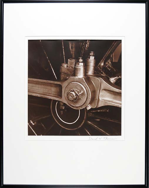
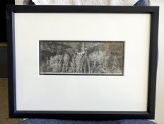
- Most of the prints are 12x16 inches matted to 16x20
- A few of the prints are 12x12 inches square
- I'm using 16x20 inch metal exhibition frames. If I want to use different size frames for the square prints they will be similar but won't match exactly to the other frames. So I'm kind of reluctant to go that route.