• Welcome to Photrio!
    Registration is fast and free. Join today to unlock search, see fewer ads, and access all forum features.
    Click here to sign up

Modern Film with an Old Look?

The bowling green

A
The bowling green

  • 0
  • 0
  • 26
Indian ghost pipe plant.

H
Indian ghost pipe plant.

  • 3
  • 1
  • 32

Forum statistics

Threads
202,942
Messages
2,847,857
Members
101,549
Latest member
mennojim
Recent bookmarks
0
Foma 400 is a good film, but it's irrelevant to this thread, as are almost all other panchromatic films. So are most 'ortho' films, as they are usually specialist technical emulsions for high contrast etc. Ilford's Ortho+ is a 'normal contrast' film - it's sort of like FP4+ with no red sensitivity & is the closest you can get to the same sort of colour response.

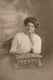
Strand's early work (pre-1920) as published by Stieglitz was shot on a small camera (recall 1/4 plate, but this may be wrong) then enlarged to a 11x14 neg for a platinum or Satista print. The colour responses in the images strongly suggest an ortho plate was used.

The current Fomatone 532 has something of the feel of Strand's later (1950s) contact printed work.
 
Flavio,
NB23 could give you master classes on photography.
NB23 makes a living out of photography.
NB23's work is in demand.
NB23 is in demand.
NB23 doesn't give a damned penny about other people's feelings on the internet. "You is no likey? I is no care." To be read with a mexican accent.
NB23 dislikes fomapan 400.
 
This question has been discussed on other threads with the conclusion that the "look" has less to do with the actual film used but with other factors. These would be lighting technique. choice of subject, etc. My suggestion would be to study the lighting used in the photos you like.

Orthocchromatic sensitivity can be obtained by using a minus red (cyan) filter with any panchromatic film. Choice of developer is really not important.
 
Last edited by a moderator:
Film and chemistry is important, but I would also suggest the lens is also a factor. Do not use anything better than a triplet (anastigmat). Or try this.
. shoot the subject in super 8 film. get it processed. put the film on the projector. stop the frame from which you like. Make a 4x5 ( camera movements) neg. depending on the original lens of the super 8 and enlargement and the background (surface and tone) upon which you are viewing the super 8 will make a difference. The high grain, low definition, low contrast. etc. I did some 20 years ago at art school for a project, everyone agreed it looked vintage!!!!
 
Orthocchromatic sensitivity can be obtained by using a minus red (cyan) filter with any panchromatic film.

Mmm... something that I think hasn't been mentioned, if we're trying to replicate 1900s emulsions:

First there were "blue sensitive" emulsions, that were mostly... blue sensitive. "Orthochromatic" films, which came later, were not only blue sensitive but also green sensitive. They were considered a major improvement because of this; this meant more natural rendering of tones.

A cyan filter in a modern orthochromatic emulsion will also leave it green-sensitive.

I know, i'm just nit-picking... And I agree with you, lighting will have much more influence.
 
Last edited by a moderator:
Flavio,
NB23 could give you master classes on photography.
NB23 makes a living out of photography.
NB23's work is in demand.
NB23 is in demand.

Whoa!!

Is somebody having a bad Christmas...?

NB23 doesn't give a damned penny about other people's feelings on the internet. "You is no likey? I is no care." To be read with a mexican accent.

You do "give a damned penny", otherwise you wouldn't have replied in such a way.

My previous post about NB23 and Ilford Pan F was intended as silly humor. I see you have experiencing a transitory attack of condescending seriousness. May you have better times ahead.

(To be read with proper US or UK english accent please.)
 
Last edited by a moderator:
. . . . . . . .My suggestion would be to study the lighting used in the photos you like.

Orthocchromatic sensitivity can be obtained by using a minus red (cyan) filter with any panchromatic film. Choice of developer is really not important.

Two remarkably important pieces of information I thank you for! :smile: So simple I bet they eluded others, too. :whistling:

One point I'd make, as a professional symphonic musician and conductor - I usually listen to musically opinionated people no matter how irritating they can be - their excellence is usually based on personal use of such information that has been the backbone of their excellence, no matter how unorthodox those opinions might seem. I cite the bitter verbal wars between Brahms and Wagner - two giants of diametrically opposed philosophy and technique.

I suspect the same is true in the photographic world. :cool:
 
I cite the bitter verbal wars between Brahms and Wagner - two giants of diametrically opposed philosophy and technique.

LOL! But consider that Brahms was a generous, nice person while Wagner was probably the worst character in all symphonic music history.
 
LOL! But consider that Brahms was a generous, nice person while Wagner was probably the worst character in all symphonic music history.


There are varying opinions on this matter . . . . Brahms actually had few close friends and could be pretty ascerbic. Robert Schumann was very wary of him when he was around Clara . . . Wagner had lots of friends, too, and was irresistable to women. However, Karl Marx and his crowd abandoned the old jerk when he wrote "Parsifal", which Marx called a "four hour consecration" and "a total sellout."

Bach is painted historically as being a saint, but on one occasion he tried to kill a student with a knife because he couldn't count (it took three people to drag him of the poor kid), and speaking of secular saints, lookit' what's happening to Dr. Huxtable.

Music history is especially sanitized. :laugh:

Cheers! :munch:

PS: Here's my fave Brahms story: ". . . . in later life, he was known for his rudeness. Once, as he left a party in Vienna, he said: "If there is someone here whom I have not insulted, I apologise."

PPS: it should be noted, however, that Brahm's reputation as a serial cat killer was started by the pro-Wagner critic Eduard Hanslick, encouraged by Wagner himself, and has finally been laid to rest as untrue by modern research.

And Tchaikovsky, a character himself, referred to Brahms as "that old bore."
 
Last edited by a moderator:
Music history is especially sanitized. :laugh:

Cheers! :munch:

PS: Here's my fave Brahms story: ". . . . in later life, he was known for his rudeness. Once, as he left a party in Vienna, he said: "If there is someone here whom I have not insulted, I apologise."

Thanks; i think i was too naive when reading composers' biographies. The quote is a very good one!

BTW i am a music lover and about half of my records (the black 12-inch thingies) are of "classical" music, mostly romantic and early XX century. I wish i was a conductor!!

Although, on the other hand, i have had some electrical accidents one or two times, so perhaps I am already...
 
Best not to get me started in this area! I rely on such anecdotes in my daily teaching life, and my symphony concert talks and lectures!
:D
 
One other possibility (albeit limited) is Kodachrome developed as B&W. I haven't pursued this beyond salvaging some 120 that became stranded when developing was discontinued, so I have no really definitive results. However my impression is that is resembles the 1920's - 1930's pics on glass and nitrate that I have been archiving for a local museum; grain and somewhat blocked highlights.

This is probably doing it the hard way. There must be a film/filter/developer combination that would produce an ideal result with a little experimentation.

I have a few rolls of the stuff left; really must get out with it. Could be cool to be out shooting Kodachrome!
 
I cite the bitter verbal wars between Brahms and Wagner - two giants of diametrically opposed philosophy and technique.

Always interesting when considering that both composers were beginning to stretch the concept of tonality. It is not accidental that Schenberg greatly appreciated Brahms' work. A few years ago when looking at the score of the liebestod I was surprised at how progressive the harmonies were. Our modern day ears do not hear what certainly shocked people in 1859.

Wagner was a thoroughly disagreeable person. He was bad to everyone even Meyerbeer who was an early champion of his work. But as I am fond of saying, one does not have to love the cow to like its milk.
 
After reading through all the comments and replies, I am probably more confused then when I started!! However, I have certainly learned some things via these discussions and I typically do from the group here. I am humbled by the knowledge of the collective group no doubt. I encourage others to continue to comment and share your thoughts and experiences. I will read the messages again and then develop a starting point for my tests and my journey. Thanks for your input and suggestions. Keep them coming!
 
After reading through all the comments and replies, I am probably more confused then when I started!! . . . . . . . I will read the messages again and then develop a starting point for my tests and my journey. Thanks for your input and suggestions. Keep them coming!

Good comment! I've had to do that here, too! So much knowledge, but ultimately we have to do it ourselves . . . I've been finding a lot of the comments and help I've been given makes more sense after the fact than before . . . like so much of the wisdom of my former music teachers!

There is tremendous talent on this forum, and a huge amount of individualism, too. The last remnants of an era are here, and skilled people often find a way of skinning the cat that is outside the box.

I'm sure we'll all learn from your journey - keep us informed of your progress! You'll certainly achieve your goal, and perhaps a new way to get the "look" you are after with the current crop of emulsions! :smile:
 
Surely someone is still making Ortho sheet film. It was used, among other things for studio photographs of men. Red noses did not photograph dark. Before that there was "blue" sensitive film. I think panchromatic films came along about 1930 or shortly thereafter.....Regards
 
you make a good point about x-ray film. I assume they make it sensitive to blue or green still and the blue version may be closest to what I am looking for. I recall playing around with some x-ray large format film many years ago and had a very difficult time with controlling contrast. I may need to revisit that again and see what I can do with it now.
 
Surely someone is still making Ortho sheet film. It was used, among other things for studio photographs of men. Red noses did not photograph dark. Before that there was "blue" sensitive film. I think panchromatic films came along about 1930 or shortly thereafter.....Regards

http://www.harmanexpress.com/prod/33/ILFORD-ORTHO-PLUS.htm#

And panchromatic films were around long before 1930, however it wasn't until the 1930s that they became the predominant film choice.
 
That's an excellent point about the images in the journal being hand wiped photogravures. Obviously nothing on earth is ever going to give someone those type of blacks and tones from just film and printing. It makes sense, as those images were for publication in printed material. It's a process that I know something about, and if done right is very beautiful. Pretty labor intensive, and you need etching experience ideally. It's more in the line of fine art etching than photography.

It's something to think about. Most people's introduction and interest in B&W photography comes from print publications rather than seeing the work itself. So we learned from ink on paper, not silver IN photographic emulsions. The same can be said about painting, and it's been put forward that modern painters, meaning around 50+ years ago I guess, changed their styles to go w/ what they saw in books rather than what was up on walls. It brought about a lot of flat, 2-D painting w/o a lot of depth, which I like, but that's personal taste. Exposure to Asian art helped as well. In my mind, if you're after those sort of blacks, and I love them myself, it might be the province of traditional art techniques, or at least plate photography.

Nowadays we are more influenced by images made by glowing pixels on a computer monitor rather than images in books. At some point it will be reflected in the actual photographic work, w/ an attempt to give the images more of a back lit sort of look I'm sure. It takes a while to see these changes come about.
 
Last edited by a moderator:
Nice, thanks for the encouragement. I have a good starting place and I honestly look forward to the journey as much as the end goal. I am at a point where I am excited to try things I normally wouldn't and explore new ways and methods to unlock some of my creativity. Modern images created with digital cameras and even modern films via coated and sharp lenses just are not what I am after. I find a greater sense of emotional connection and response for myself in the older work late 1800's and early 1900's, mostly pictorial in nature, as opposed to straight photography. It will be fun seeing what I settle on to pursue and refine for a new portfolio.


Good comment! I've had to do that here, too! So much knowledge, but ultimately we have to do it ourselves . . . I've been finding a lot of the comments and help I've been given makes more sense after the fact than before . . . like so much of the wisdom of my former music teachers!

There is tremendous talent on this forum, and a huge amount of individualism, too. The last remnants of an era are here, and skilled people often find a way of skinning the cat that is outside the box.

I'm sure we'll all learn from your journey - keep us informed of your progress! You'll certainly achieve your goal, and perhaps a new way to get the "look" you are after with the current crop of emulsions! :smile:
 
As an example of an early print, attached is a fairly color true scan of a studio portrait from 1909, 3.7 in x 5.5 in, pearl surface.It is sharp and the the grain appears fine, giving a smooth appearance so I guess it is a contact print.It is probably toned in some way. Of course at that time there was a variety of styles of which this is only one.
 

Attachments

  • 1909 print.jpg
    1909 print.jpg
    305.9 KB · Views: 132
Alan thanks for positing. I appreciate it.


As an example of an early print, attached is a fairly color true scan of a studio portrait from 1909, 3.7 in x 5.5 in, pearl surface.It is sharp and the the grain appears fine, giving a smooth appearance so I guess it is a contact print.It is probably toned in some way. Of course at that time there was a variety of styles of which this is only one.
 
Photrio.com contains affiliate links to products. We may receive a commission for purchases made through these links.
To read our full affiliate disclosure statement please click Here.

PHOTRIO PARTNERS EQUALLY FUNDING OUR COMMUNITY:


Ilford ADOX Freestyle Photographic Stearman Press Weldon Color Lab Blue Moon Camera & Machine
Top Bottom