- Joined
- Dec 4, 2014
- Messages
- 3
- Format
- Medium Format
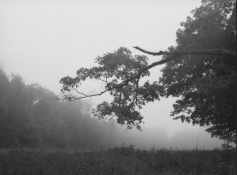
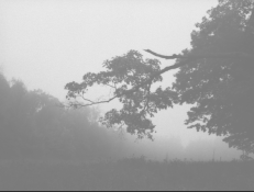
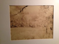
I can't seem to find a whole lot of info on printing low contrast, high key images on purpose for stylized effect. While I was playing around with this image and trying to figure out how I wanted to approach printing it, I found that I kind of liked the effect of cutting out blacks entirely. I was wondering if anyone could point me in a helpful direction. I'm looking for resources/opinions on this style of printing, assuming it is a style that folks have intentionally pursued.