Low contrast on purpose?

The Gap

H
The Gap

  • 1
  • 2
  • 22
Ithaki Steps

H
Ithaki Steps

  • 2
  • 0
  • 57
Pitt River Bridge

D
Pitt River Bridge

  • 3
  • 0
  • 62

Forum statistics

Threads
198,997
Messages
2,784,372
Members
99,764
Latest member
BiglerRaw
Recent bookmarks
0

thpt

Member
Joined
Dec 4, 2014
Messages
3
Format
Medium Format
I can't seem to find a whole lot of info on printing low contrast, high key images on purpose for stylized effect. While I was playing around with this image and trying to figure out how I wanted to approach printing it, I found that I kind of liked the effect of cutting out blacks entirely. I was wondering if anyone could point me in a helpful direction. I'm looking for resources/opinions on this style of printing, assuming it is a style that folks have intentionally pursued.
 

Attachments

  • Screen Shot 2014-12-04 at 5.17.19 PM.png
    Screen Shot 2014-12-04 at 5.17.19 PM.png
    246.7 KB · Views: 205
  • Screen Shot 2014-12-04 at 5.17.30 PM.png
    Screen Shot 2014-12-04 at 5.17.30 PM.png
    208.2 KB · Views: 219

Mark Fisher

Member
Joined
Dec 13, 2003
Messages
1,691
Location
Chicago
Format
Medium Format
If you don't want deep blacks, use a low contrast filter and expose less. Normally, print time is determined to get maximum black somewhere so you would simply print for less time. A low contrast filter will help (a lot) and a soft working developer like Selectol Soft (halps maybe half a grade, need to mix your own) will also help. The trick will still be getting any detail in your highlights.
 
OP
OP

thpt

Member
Joined
Dec 4, 2014
Messages
3
Format
Medium Format
Thanks! I suspected the highlights would be an issue. I guess I should be more articulate about my question. I have a bit of experience printing, so I have some ideas about how I would get into the ballpark printing like this. My big curiosity is whether there is a tradition of this kind of approach. I don't totally know what my criteria for success is if that makes any sense. I'm comfortable enough just experimenting in left field on my own, but I don't want to be re-inventing wheels in blissful ignorance. I apologize if this question may be too subjective or philosophical. Figured it may interest someone. Haha.
 

Jim Noel

Member
Joined
Mar 6, 2005
Messages
2,261
Format
Large Format
To make true High Key prints, you must begin with an appropriate negative. Essentially all elements of the image need to be placed above Zone V during film exposure. I say essentially all elements because some workers like to have a small spot of dark as a point of interest. When properly exposed in this manner, and developed normally the image can be printed in high key on a normal grade paper and normal development. Trying to take the average negative and altering it to look high key in printing does not produce the desired effect. It will look fake.
 

Allen Friday

Member
Joined
Mar 30, 2005
Messages
882
Format
ULarge Format
First thought: You mention "high Key" in the first sentence of the OP. I don't see anything high key in the photo you have posted. Perhaps you could explain a bit more what you mean by that.

Second thought: I have done quite a few images with a restricted range of tones, mainly whites with few blacks or darks, mainly midtones with few whites or blacks, or mainly blacks with few whites. I have found that the best way to do this is at the taking stage, not at the printing stage. If I start with a standard negative and try to restrict the tones by exposing less or by printing extremely low contrast, things just look flat--it works sometimes, but only with the right scene.

To me, it seems like you may be coming at the issue from the wrong direction; you have negative that you want to print a certain way, but it is a very difficult negative to get there. Perhaps if you could articulate what result you want, and the expose and print for that result, the results would be more satisfactory.
 

ic-racer

Member
Joined
Feb 25, 2007
Messages
16,552
Location
USA
Format
Multi Format
I can't seem to find a whole lot of info on printing low contrast, high key images on purpose for stylized effect. While I was playing around with this image and trying to figure out how I wanted to approach printing it, I found that I kind of liked the effect of cutting out blacks entirely. I was wondering if anyone could point me in a helpful direction. I'm looking for resources/opinions on this style of printing, assuming it is a style that folks have intentionally pursued.

Using only a portion of the paper's tonal range is not new. Ray K. Metzker did a body of work later in his life that was printed for a limited tonal range on the paper. You may be interested in researching this work.
0718_1_lg.jpg
 

adelorenzo

Member
Joined
Mar 10, 2012
Messages
1,421
Location
Whitehorse, Yukon
Format
4x5 Format
If I was printing this, I would have to get mist as white as possible. Snow or mist that isn't white makes me crazy. So, I'd do a test strip to get the highlights (mist) where I want them and then use the contrast filtration to try get the shadows where I want them. With low contrast you risk the print looking flat or muddy. Personally I'd probably be printing this image as high contrast to set the vegetation out from the mist but it's all up to you and what you want the print to be.

If you get something you like please share it!
 
OP
OP

thpt

Member
Joined
Dec 4, 2014
Messages
3
Format
Medium Format
Hmmmm. It's possible that I should be asking this in more of an alternative process kind of setting and that the term "high key" is skewing things quite a bit. Here's something I did last year that I believe is "high key" by normal definitions. I mean, it's lith and IR which makes things that much more convoluted, but I think it can still serve for some differentiation to better explain myself. In this image I still have full white and black. Everything is skewed light, but the whole range is there somewhere. What I'm curious about is intentionally limiting tonal range. It's a very "what if" kind of question. Specifically, what if I wanted to flatten the image and make it less natural and more graphic by compressing all the dark tones into a muddy gray and focusing attention on the remaining light tones. It's just an idea. My question is whether this is related to some kind of technique I'm not yet aware of. It seems like there's a fairly universal inclination to always pursue a full tonal range. Just wondering if there are folks out there bucking that or if this is just silliness on my part. Thanks.

attachment.php
 

Attachments

  • photo.JPG
    photo.JPG
    99.9 KB · Views: 316

M Carter

Member
Joined
Jan 23, 2013
Messages
2,147
Location
Dallas, TX
Format
Medium Format
Contrast is just another compositional tool. Whether a low-con look is popular now or not, if it makes your images say what you want them to say, go for it. Do it well and your stuff will certainly stand out from the crowd.

I was about to mention Lith myself. Go to google image search and enter "tim rudman lith" - you'll see a lot of his low contrast and high key work.

He has several books about the process. The good thing is, all you need is (very affordable) lith developer (though it may lead you to mixing your own fix to preserve highlights, getting into bleaches for high-key, and toners) and maybe a thrift-store plate warmer if you want to try warmed up chemistry. Your existing trays, enlarger, etc. will all work fine.

It's a strange, beautiful, and very "creative", interpretive way to print... in fact, there's about 1000 ways you can go with just one neg. (And experimenting with pre-flashing may be a big help to you as well).
 

MattKing

Moderator
Moderator
Joined
Apr 24, 2005
Messages
53,097
Location
Delta, BC Canada
Format
Medium Format
There is a difference between low contrast, and a narrow range of tones. High Key may be quite contrasty, even if the tonal range is narrow.
 

JW PHOTO

Member
Joined
May 15, 2006
Messages
1,148
Location
Lake, Michig
Format
Medium Format
I like what Michael R 1974 says and agree nearly 100%. I say nearly, because there are exceptions to the rule. When I took Photograpy 101 in college I found it was much more benificial to expose and print the way my instructor liked than the way I liked. Later on I shot weddings and portraits and had to cater to the whims of the brides mother and other peoples tastes. Now, I just try to please myshelf, which isn't always that easy and screw everybody else. I now only like what I like and what pleases me. Getting old has certainly changed the way I look at things that's for sure. The sad part is I wish I had caught on to that attitude many years ago. Of course I would not been shooting as many protraits or weddings doing it "my way". John W
 

David Lyga

Member
Joined
Nov 25, 2007
Messages
3,445
Location
Philadelphia
Format
35mm
The OP, thpt:

You have dared to touch upon the very soul of photography: the deep, subjective aspect.

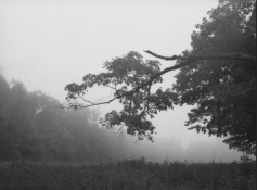
I can say without equivocation that I have had a love/hate relationship with contrast for the past 50 years. There really ARE some pictures which can go both ways and, thusly, never for those photos is there a definitively correct contrast.

High contrast gives definition: not in terms of acutance, but in terms of 'statement'. But low contrast also does something right: it imparts a sensuality and poetry to certain scenes that, oftentimes, renders a solace unachievable through other means. It 'holds' the strong feelings in check.

'Seeing' is of vital importance with artistic ability. And whether you ponder the paintings of the Great Masters in a good museum, or do such with your own photographic 'masterpieces', you are allowed to think deeply about this contrast impetus and its effects upon one's artistic sensibilities.

The problem emanates from the fact that a transparency (i.e., a negative) has a LOT more tonal range than a print can possibly, and effectively, have, which goes only from pure white to pure black. If, with a contrasty scene, you 'want it all' on the print, you are going to have it 'all' but with tonal steps that appear drab and lifeless. For certain moody scenes that is not only OK, but better as well. But, if the same contrasty scene is presented in a way approaching the tonal range on that negative, you will have a print that is suddenly full of life but lacking either (or both!) much shadow detail or highlight differentiation. You cannot have it all and there lies the frustration. You MUST decide what is important with such scenes and then act accordingly. Then that becomes artistic maturity if you succeed in presenting an effective print. - David Lyga
 
Last edited by a moderator:

norm123

Member
Joined
Sep 18, 2010
Messages
278
Location
Montréal
Format
Multi Format
First thought: You mention "high Key" in the first sentence of the OP. I don't see anything high key in the photo you have posted. Perhaps you could explain a bit more what you mean by that.

Second thought: I have done quite a few images with a restricted range of tones, mainly whites with few blacks or darks, mainly midtones with few whites or blacks, or mainly blacks with few whites. I have found that the best way to do this is at the taking stage, not at the printing stage. If I start with a standard negative and try to restrict the tones by exposing less or by printing extremely low contrast, things just look flat--it works sometimes, but only with the right scene.

To me, it seems like you may be coming at the issue from the wrong direction; you have negative that you want to print a certain way, but it is a very difficult negative to get there. Perhaps if you could articulate what result you want, and the expose and print for that result, the results would be more satisfactory.

I agree with this. Everything begins with the subject and how I expose it. Composition is important too.

Norm
 

Theo Sulphate

Member
Joined
Jul 3, 2014
Messages
6,489
Location
Gig Harbor
Format
Multi Format
High contrast gives definition: not in terms of acutance, but in terms of 'statement'. But low contrast also does something right: it imparts a sensuality and poetry to certain scenes that, oftentimes, renders a solace unachievable through other means. It 'holds' the strong feelings in check.

Nicely and eloquently stated!
 

Roger Cole

Member
Joined
Jan 20, 2011
Messages
6,069
Location
Atlanta GA
Format
Multi Format
If you don't want deep blacks, use a low contrast filter and expose less. Normally, print time is determined to get maximum black somewhere so you would simply print for less time. A low contrast filter will help (a lot) and a soft working developer like Selectol Soft (halps maybe half a grade, need to mix your own) will also help. The trick will still be getting any detail in your highlights.

Freestyle has a store brand of "Selectol Soft clone" print developer if you want to use it and not mix your own:

http://www.freestylephoto.biz/750710-LegacyPro-Select-Soft-Paper-Developer-to-Make-1-Gallon

EDIT: I just noticed they say stock solution may only last 24 hours. I can't imagine why they sell it in a gallon mix of powder then. It should be in smaller packs to make no more than a quart at a time if that's true. Anyone have any experience with this?
 

phelger

Member
Joined
Nov 17, 2006
Messages
110
Location
Luxembourg
Format
Multi Format
As said above to create a high key image 1) the subject must fit the technique, and in that sense your misty landscape could be fine. 2) your negative must be exposed accordingly, ie. the main parts of the subject placed above zone V. But, IMO high key implies there are just a few elements of real shadow or blacks, and that is produced by over-developing the film, how much is a matter of your own taste. Then to avoid disturbing grain you select a slow film! That might give you a negative which prints easily
Good luck
Peter
 
Photrio.com contains affiliate links to products. We may receive a commission for purchases made through these links.
To read our full affiliate disclosure statement please click Here.

PHOTRIO PARTNERS EQUALLY FUNDING OUR COMMUNITY:


Ilford ADOX Freestyle Photographic Stearman Press Weldon Color Lab Blue Moon Camera & Machine
Top Bottom