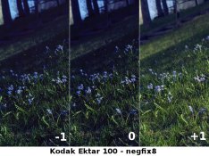
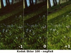
The overall pallete is quite ghastly, particularly the articulation of red and the almost Kodachrome-like quality of pale sky.
Firstly, its important to reinforce something: scanners are not "OK". All scans of film will require work. My Epson V700 has been found by my lab to have a moderate blue displacement. I use Photoshop Elements 8 for post-scan and print RIP work to TIF files.
How are you setting the scans for viewing — on the web or via hard printing?
You say in your post that it was evening and a bit red, and you point the finger at the film that, probably by dint of its design, "lifts" the R/ channel higher (like Velvia does to the G/ and B/ channels), but it still has a very peculiar blue shift. So in effect, this lift is perhaps not satisactory to you?
Colour is always set for the destination device (e.g. web or printer) when working on scans (via Photoshop or some other software). Additionally, the rendering intent must be correct (absolute, relative or perceptual), as must the profile, all again to match the destination device and desired use. If not, the colours you see at your end will not be the same as the printer or screen (not all screens display colour correctly) — it's not rocket science to line everything up, but it does require a bit of training.
The negatives are not beyound redemption. Straighten, correct colour, crop and reassess.