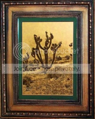
Have been trying several techniques for getting the"gold" to look right(to me).Also finding some images look better than others for the orotone effect and learning which densities to shoot for. In my opinion images shot on paper negatives appear most like the Curtis orotone images(probably because of the blue sensitivity,like older glass plates).I stripped the Joshua tree print I put up before and applied my latest "gold" backing,the wife liked it enough to frame it.
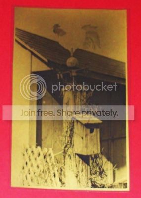
I'm having enough trouble with my digital camera that I'm shooting pics to post that think it's headed for the trash bin.one pic is correct the next way off in color and focus appears sharp on one and not on the next exposure of the same picture (nothing moved go figure).I'm going to post my latest anyway so please over look the inconsistencies...


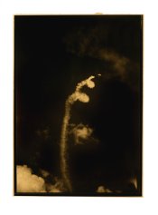
This last one is the worst,bad image and dig camera went south on focus but thought it would illustrate poor image choice.