You need to increase exposure when cutting the development times.
To get maximum warmth I would use a harder grade of paper increase the exposure and cut development to a minimum. Just diluting a developer further does nothing useful if everything else isn't controlled to match.
Sometimes the warmth appears slightly greenish but a short toning in KRST or simila selenium toner turns that green to a reddish colour.
Ian
My initial test was motivated by comments in other threads:
Ian Grant: "... Longer exposures and short development times give greater warmth. ..."
Nicholas Linden: "To get warmer tones try diluting the developer (a lot, start with 2-3x normal dilution), extending the developing time (2x or more) and increasing the exposure (as needed). You will have to play around, but it is possible to get almost sepia-like tones.
My test supports the claim that dilution doesn't change much. It just seems to slow things down. It also supports the advice I was given to never vary development details to tune the look of an image, but to do it all with exposure and contrast settings. Once the print has been in the developer long enough it settles down to a constant look that is invariant with developer type, developer dilution, how long the developer has been sitting in the tray etc.
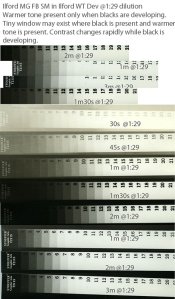
I did another test today to understand how colour changes with development. My most under-developed print had a very sepia look, but of course had no black. My next test aimed to put middle grey on segment 10. This test shows how the print is much less contrasty as the image approaches steady-states. It also shows the tones all have the saturation of the maximum black, and as you approach maximum black, the colour disappears. One of my prints had a beautiful deep chocolate as the darkest colour, and that might be nice for some images, but I wasn't able to get a black-> chocolate ->sepia-> white gradation.
My conclusion is that Ilford WT developer is not something I will use regularly. I may occasionally wish to hunt for the tiny sweet spot where you get close to black and slightly more tone, but that will rarely happen.
I think you are right about KRST toning. The few times I have tried it with Ilford MG RC, I got slightly purple tones that I don't like that much. The 'greenish' tones of Ilford WT paper will probably mix well with the KRST purple and yield something I like more.
(After all that's said, I do still like the look of Ilford WT paper.)