How to reach this colour palette?

about to extinct

D
about to extinct

  • 0
  • 0
  • 17
Fantasyland!

D
Fantasyland!

  • 9
  • 2
  • 94
perfect cirkel

D
perfect cirkel

  • 2
  • 1
  • 121
Thomas J Walls cafe.

A
Thomas J Walls cafe.

  • 4
  • 6
  • 277

Recent Classifieds

Forum statistics

Threads
198,745
Messages
2,780,268
Members
99,692
Latest member
jglong
Recent bookmarks
0

CasioCassette

Member
Joined
Jan 30, 2023
Messages
25
Location
Hungary
Format
35mm
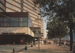
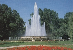
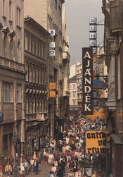
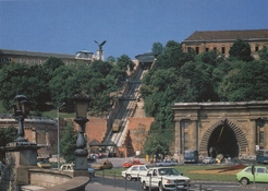
I've found a dozen of these 1980s postcards of Budapest landmarks at home, had them scanned, and I'm loving the colours and vintage feel of these photographs.

How could I reach the colours like on these samples, using (35mm) film stocks available today? Is it even possible to come close to this colour palette? I would assume these were shot on transparency film, whatever stocks were available in Hungary at the time (for this reason I think Kodachrome is unlikely).

Would any of today's slide film be able to give back this atmosphere/palette? I also have lots of color correction and compensating filters to play around with, but don't really know where to start. Or perhaps I should try colour negative film? I have an upcoming trip to Budapest and thought I'd try if I could take some images that have the same vintage feel. I have Provia, Velvia 50, Velvia 100, and E100 in my fridge as well as some colour negative film.

I'm still quite a beginner in photography, and I'd be grateful for any and all advice and suggestions how I can go about it.

Thanks a lot!
 

Attachments

  • Postcard_1.jpg
    Postcard_1.jpg
    545.5 KB · Views: 104
  • Postcard_2.jpg
    Postcard_2.jpg
    561.6 KB · Views: 102
  • Postcard_3.jpg
    Postcard_3.jpg
    536 KB · Views: 98
  • Postcard_4.jpg
    Postcard_4.jpg
    571.4 KB · Views: 103

koraks

Moderator
Moderator
Joined
Nov 29, 2018
Messages
22,701
Location
Europe
Format
Multi Format
No currently manufactured slide film will look like this. The original slides in all likelihood didn't quite look like those postcards, in fact.

What you're seeing is fairly low saturation, low contrast and low color purity (i.e. crossed over). #1 and #3 have a strong yellow cast, #2 has a strong cyan cast; #4 is fairly neutral, but low contrast.

Of course, as long as you scan your film, it doesn't matter too much what you start out with; you can adjust the colors to taste in digital post-processing. If I wanted to approximate these results and I had to use film (left to my own devices, I'd just shoot digital), I'd shoot on something like Kodak ProImage 100. If I were hard-pressed to also print it optically, I'd print it on plain-Jane Fuji Crystal Archive Lustre (no Supreme, DPII etc.) and maybe use pre-flashing to recreate the color casts and reduce contrast.

Keep in mind that when looking at these images, you're looking at the output of a long imaging chain:
* Choice of film stock
* Choice of shooting conditions, time of day, exposure
* Development, although this would likely have been 'by the book'
* Choices made when making the color separations (massive influence!!)
* Choices in screening for printing
* Choices in printing ink/pigment set
* Aging of pigments over time before these cards got to you (again, a big influence)
* Choices in digital display (e.g. these could have been presented with a lot more 'punch')
All considered, the choice of film is a minor factor in the bigger scheme of things.
 

BrianShaw

Member
Joined
Nov 30, 2005
Messages
16,521
Location
La-la-land
Format
Multi Format
Kodak ColorPlus would be my first choice in an attempt to match that feel.

But part of what you are seeing might be the result of either postcard printing technology and/or pigment fading that has occcured over time...
 

BrianShaw

Member
Joined
Nov 30, 2005
Messages
16,521
Location
La-la-land
Format
Multi Format
Here is an example of Kodak ColorPlus, which I think will get you as close as you can without post-processing. I used a Kodak Retina IIIc, 50 mm lens, and (I think) metered with a Gossen LunaPro.

001.jpg
 
OP
OP

CasioCassette

Member
Joined
Jan 30, 2023
Messages
25
Location
Hungary
Format
35mm
No currently manufactured slide film will look like this. The original slides in all likelihood didn't quite look like those postcards, in fact.

What you're seeing is fairly low saturation, low contrast and low color purity (i.e. crossed over). #1 and #3 have a strong yellow cast, #2 has a strong cyan cast; #4 is fairly neutral, but low contrast.

Of course, as long as you scan your film, it doesn't matter too much what you start out with; you can adjust the colors to taste in digital post-processing. If I wanted to approximate these results and I had to use film (left to my own devices, I'd just shoot digital), I'd shoot on something like Kodak ProImage 100. If I were hard-pressed to also print it optically, I'd print it on plain-Jane Fuji Crystal Archive Lustre (no Supreme, DPII etc.) and maybe use pre-flashing to recreate the color casts and reduce contrast.

Keep in mind that when looking at these images, you're looking at the output of a long imaging chain:
* Choice of film stock
* Choice of shooting conditions, time of day, exposure
* Development, although this would likely have been 'by the book'
* Choices made when making the color separations (massive influence!!)
* Choices in screening for printing
* Choices in printing ink/pigment set
* Aging of pigments over time before these cards got to you (again, a big influence)
* Choices in digital display (e.g. these could have been presented with a lot more 'punch')
All considered, the choice of film is a minor factor in the bigger scheme of things.

Koraks, thank you for your informative answer! I didn't even consider all those variables... from taking the image to printing the postcard, not to mention the fading, as Brian said.

In suppose I never considered that the original slides must have looked different from the final print. I've always romanticized old slide films as a way of connecting to the look and atmosphere of bygone times which I'm so fond of aesthetically. Especially because very few were slide film options were left on the market by the time I started photography.

ColorPlus is out of stock here but ProImage 100 is available. I haven't shot ProImage before, but now is good opportunity to do so!
 

koraks

Moderator
Moderator
Joined
Nov 29, 2018
Messages
22,701
Location
Europe
Format
Multi Format
I've always romanticized old slide films as a way of connecting to the look and atmosphere of bygone times which I'm so fond of aesthetically.

The issue is that the 'vintage look' that we associate with 1960s-1980s color materials is based largely on how these materials look today - with all the color shifts that happened over time. And even while we are aware of this problem at some level, we still can't help but thinking of the 1970s as tan- or magenta-colored, and photographic technology of those days limited to such "vintage palettes". It looks vintage because by now, it has become vintage and has degraded.

Take these examples:
1716822340255.png

1716822355178.png


There was maybe a year between these images, if that. They're both from around 1973-1974. If you load some modern Ektachrome into your camera and shoot out of a window in a rather dull place somewhere in the Adriatic at around 7pm some day late August after a storm has cleared, you may get something quite close to the first image above. And I'm pretty sure that the second slide looked perfectly natural color-wise when it was new, just the same. The problem is - I wasn't there in 1974 when that slide came back from the lab, and even if I had, how could I ever accurately recall what the colors looked like?

So there's an inescapable bias in how we experience the past when it comes to photos. Some of the 'vintageness' that we see really is the contrast and color rendition of the film we had back then. But a lot of it is just poor storage, humidity and fungus doing their work.

I really like the colours of this, very similar to my postcards.

Yes, although I'd like to point out that it's not necessarily inherent to the film.
1716822841415.png

You can balance it pretty much any way you like, especially digitally. Now it looks like a 1994 postcard...
 

BrianShaw

Member
Joined
Nov 30, 2005
Messages
16,521
Location
La-la-land
Format
Multi Format
Sure, digital post processing can get you many different looks but remember that this is: Analog Workflow Forums (100% Analog/Traditional) Darkroom Color: Film, Paper, and Chemistry :smile:

The image I posted was a "straight scan", whatever that really means, done by company which processed the film, The Darkroom in California USA.

Your comment about 'vintage look" is spot on. I have a very nostolgic picture of my Mom which has lost cyan coupler over the years... and most people think that it originally looked like that.
 
Last edited:

koraks

Moderator
Moderator
Joined
Nov 29, 2018
Messages
22,701
Location
Europe
Format
Multi Format
The image I posted was a "straight scan", whatever that really means

When it comes to color negative scanning, a "straight scan" means "whatever color balance happened to be decided on by the combined algorithms involved in scanning". There's no absolute color balance baked into a color negative like there is in a slide. As to analog workflow - it's fine to share digitized examples here. In this regard, there's no inherent difference between both versions of your photo that we posted. They're both arbitrary renditions.
done by company which processed the film, The Darkroom in California USA.

They don't charge much for this, I hope? Objectively speaking, that's a really poor scan.
 

loccdor

Subscriber
Joined
Jan 12, 2024
Messages
1,503
Location
USA
Format
Multi Format
Koraks is right about the vintage postcard look more coming from the printing process. I have a collection of postcards from this era too and always appreciated how they looked.

However, there are color films that feel more vintage than others. Harman Phoenix looks really 70s to me.
 

BrianShaw

Member
Joined
Nov 30, 2005
Messages
16,521
Location
La-la-land
Format
Multi Format
When it comes to color negative scanning, a "straight scan" means "whatever color balance happened to be decided on by the combined algorithms involved in scanning". There's no absolute color balance baked into a color negative like there is in a slide. As to analog workflow - it's fine to share digitized examples here. In this regard, there's no inherent difference between both versions of your photo that we posted. They're both arbitrary renditions.


They don't charge much for this, I hope? Objectively speaking, that's a really poor scan.

You seem to be missing my implied point about the forum this is being discussed in, but that's okay; peace.

That's their default "free" scan. Yup... it's marginal. The 4-inch machine print looked the same... marginal.
 
Last edited:

BrianShaw

Member
Joined
Nov 30, 2005
Messages
16,521
Location
La-la-land
Format
Multi Format
However, there are color films that feel more vintage than others. Harman Phoenix looks really 70s to me.

Good point! Despite the initial excitement I've not seen much discussed about that film lately. Definitely an "old skool" look.
 

koraks

Moderator
Moderator
Joined
Nov 29, 2018
Messages
22,701
Location
Europe
Format
Multi Format
You seem to be missing my point about the forum this is being discussed in

We could do a kettle & pot routine at this point. The color discussion is really deeply flawed once people start to confound about a film's color rendition with all manner of post production choices (digital or otherwise). That's what the examples I posted in this thread all illustrate. The fact that they're digital, analog and hybrid emphasizes the fact that the same problem exists across the board; the only way to sort of avoid it is to shoot slides and scan those in a calibrated workflow - but that's also pretty much the only approach that will never result in what OP wants to achieve, so it's moot.
 

Ian Grant

Subscriber
Joined
Aug 2, 2004
Messages
23,262
Location
West Midland
Format
Multi Format
The issue is that the 'vintage look' that we associate with 1960s-1980s color materials is based largely on how these materials look today - with all the color shifts that happened over time. And even while we are aware of this problem at some level, we still can't help but thinking of the 1970s as tan- or magenta-colored, and photographic technology of those days limited to such "vintage palettes". It looks vintage because by now, it has become vintage and has degraded.

Your time frame is off by a few years. The huge step change was in 1972 with the introduction of Kodak's C41 Kodacolor II film, & process, compared to C22 it was chalk and cheese. I used Agfacolor films, prior to that, which were better than Kodak C22.

I remember the shock and the amazement on picking up the prints from my first C41 Kodacolor II film, I still have the prints.

The next step change was E4, Kodak films were so, so, Fuji excellent, then E6 another huge step change.

Ian
 
OP
OP

CasioCassette

Member
Joined
Jan 30, 2023
Messages
25
Location
Hungary
Format
35mm
Koraks is right about the vintage postcard look more coming from the printing process. I have a collection of postcards from this era too and always appreciated how they looked.

However, there are color films that feel more vintage than others. Harman Phoenix looks really 70s to me.

Vintage postcards seem to have this 'look' apparently, such as this one which I liked so much I ended up buying the original postcard. I think that on my linked example the colours are more wild and unreal than on the images I posted, but I guess it's the same process after all.

Harman Phoenix is something I've yet to try, but I'm interested in the look. I've heard the results are hugely dependent on the scanning... but I don't want to go off topic.
 

BrianShaw

Member
Joined
Nov 30, 2005
Messages
16,521
Location
La-la-land
Format
Multi Format
Many postcards are lithographs, rather than photographs. So simulating the look is the best one can do, however one does that...
 

pentaxuser

Member
Joined
May 9, 2005
Messages
19,934
Location
Daventry, No
Format
35mm
What you're seeing is fairly low saturation, low contrast and low color purity (i.e. crossed over). #1 and #3 have a strong yellow cast, #2 has a strong cyan cast; #4 is fairly neutral, but low contrast.
The OP's examples all look pretty good to me and quite different from your Budapest example or the very pinkish one of a ship which does remind me of the kind of look that negatives of the 1970s seem to render due to ageing

Whatever kind of film the OP's postcards were made from they seem to have retained their quality for reproduction or at least if the postcards were themselves made in the 1980s they have aged very well

pentaxuser
 

lamerko

Member
Joined
Oct 27, 2022
Messages
758
Location
Bulgaria
Format
Multi Format
If I'm not mistaken, Hungary was a member of the CMEA and part of the Soviet bloc during the Cold War. At that time, reversible films of the ORWO concern were used in printing. They did have a specific look, but perhaps of greater importance was the imperfect method of color separation, creation of the printing plates, and fixing of the print.
 

koraks

Moderator
Moderator
Joined
Nov 29, 2018
Messages
22,701
Location
Europe
Format
Multi Format
if the postcards were themselves made in the 1980s they have aged very well

I don't doubt they are and as offset prints, they'll generally age a lot better than photographic prints from the same era. As long as they weren't pasted to a window for 40 years, at least.

quite different from your Budapest example
It was an extreme example to show you can make whatever photo look like an old and faded postcard. I could have made it a lot more subtle, and in fact I initially did, but I found it too...subtle.
the very pinkish one of a ship
That's a very badly degraded slide. Not an offset printed postcard.
So yes, they both look very different. They both illustrated different aspects and I evidently picked extremes to illustrate the point. Otherwise someone might have come along and said something like...
flexaretoperator:
Well I don't know much about these postcards except for the postcards my mum would get me of Roger Moore as Ivanhoe, but I'd just like to clarify and reach consensus if I may because there seems to be a discrepancy between two trains of thought here, with one stating that original postcards have a certain vintage look, and while it is uncertain whether this look is due to a choice of film stock and I feel it's safe to state that we don't know exactly and probably will never be able to find out which film stocks were used for precisely these postcards, another line of reasoning contends that the look of such cards are the result of choices made elsewhere in the printmaking process, and if I may say so, the examples posted do not show all that much difference and to me they look like they could have been made by the same printing house or indeed the same jolly group of craftsmen, so I'd appreciate it if the participants of this thread could give their views on how this vintage look materializes so that we can finally put this matter to rest.
...and there would have been no end to it.

@lamerko; precisely. Recreating these in a truly original way would involve traveling back in time. The alternative is take an image of whatever origin and twist it to one's heart's content in Photoshop.
 

Romanko

Member
Joined
Sep 3, 2021
Messages
889
Location
Sydney, Australia
Format
Medium Format
How could I reach the colours like on these samples, using (35mm) film stocks available today?
I agree that it would be hard if at all possible to replicate the look using any of the modern transparency films. They are way too saturated and high contrast and have different colour rendering. The most practical way is to shoot digital and use that post-processing technique where you "borrow" a color palette from another image. I haven't done it myself but the tutorials I saw look impressive.

If you intend on shooting film I would recommend choosing Portra 400 or similar film with straight characteristic curves and "neutral" color rendering. Assuming you will be scanning the film this would give you the best starting point.
 
OP
OP

CasioCassette

Member
Joined
Jan 30, 2023
Messages
25
Location
Hungary
Format
35mm
Thanks everyone for the useful ideas and insights.

I certainly had doubts about modern transparency films due to their high contrast. I have 2 rolls left of cold-stored (to my knowledge) Fuji Sensia (which has provided nice results) and which is a less high contrast film, but expired film is an entirely different and unpredictable route...

I'll probably shoot colour negative for this trip, and see what turns out :smile:
 

NB23

Member
Joined
Jul 26, 2009
Messages
4,307
Format
35mm
Use a summar lens.
Or use a smena-8 camera, Vilia, and so on.

That’s all.
 
Photrio.com contains affiliate links to products. We may receive a commission for purchases made through these links.
To read our full affiliate disclosure statement please click Here.

PHOTRIO PARTNERS EQUALLY FUNDING OUR COMMUNITY:


Ilford ADOX Freestyle Photographic Stearman Press Weldon Color Lab Blue Moon Camera & Machine
Top Bottom