How to achieve the look?

A street portrait

A
A street portrait

  • 0
  • 0
  • 52
A street portrait

A
A street portrait

  • 1
  • 0
  • 45
img746.jpg

img746.jpg

  • 4
  • 0
  • 52
No Hall

No Hall

  • 1
  • 2
  • 56
Brentwood Kebab!

A
Brentwood Kebab!

  • 1
  • 1
  • 115

Recent Classifieds

Forum statistics

Threads
198,790
Messages
2,780,868
Members
99,704
Latest member
Harry f3
Recent bookmarks
0

phfitz

Member
Joined
Dec 26, 2004
Messages
539
Format
Large Format
Jmal,

You may want to try printing with the lenses they used back then, single coated tessar types. They do give a different 'look' to the prints by moving the tonal scale around a bit. Try to find a Wollensak Raptar or Kodak Ektar in 50mm length, they each have a different 'look'. Condensers aren't really needed with VC paper but would be more correct for vintage prints.

Have fun with the hunt.
 

Uncle Bill

Member
Joined
Apr 24, 2005
Messages
1,395
Location
Oakville and
Format
Multi Format
I have friends who comment on the fact my photos look "retro", I take it as a compliment.
Generally what has been said here gets you there, use an older Camera: Leica M3, Pentax Spotmatic, Nikon F, Minolta SRT 101 etc.; a traditional film emlusion like Ilford HP5, FP4, Kodak Tri-x, Plus X, Foma, Efke/Adox from Central Europe; and use an old standby developer like D76/ID-11, HC110 or Rodinal.
 

jimgalli

Subscriber
Joined
Sep 7, 2002
Messages
4,236
Location
Tonopah Neva
Format
ULarge Format
Print them with a half tone dot matrix and black ink like the newspapers did in 1955.
 
OP
OP

jmal

Member
Joined
Oct 13, 2006
Messages
529
Location
Kansas
Format
35mm
Roger--I am always hesitant myself to use the equipment as a reason, but the shots I've seen on old Leicas seem to have lower contrast and a different tonal scale. Perhaps this has to do with technique as well. However, I almost contradict myself, because while many of the shots I really like seem grayer than those I make, it is clear that they are often printed on higher grade paper.
Uncle Bill--I use an FM2 with an AI lens and Tri-X, Plus-x, or HP5+. While I no longer use D76, I have yet to get the look I'm after. I think much of it is similar to music nerds who constantly seek the holy grail of tone on a given instrument. Meanwhile, the audience never notices. Another thing to consider is the subject itself. It may be that I choose subjects that don't lend themselves to the look I like.

test123.jpg

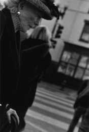
Attached is a shot I did in D.C. and it is pretty close to at least one of the looks I am after.

Jmal
 

Michel Hardy-Vallée

Membership Council
Subscriber
Joined
Apr 2, 2005
Messages
4,793
Location
Montréal, QC
Format
Multi Format
Attached is a shot I did in D.C. and it is pretty close to at least one of the looks I am after.

Jmal

In all honesty, I don't see a "look" here. I just see a low-contrast scene. The lighting pattern really is what defines the tones. Any film with a traditional emulsion would give you something like that in this lighting situation.
 

k_jupiter

Member
Joined
Feb 3, 2004
Messages
2,569
Location
san jose, ca
Format
Multi Format
Pan-Thermic 777. Supposedly gave a lot of the Magnum Photographers 'that' look.

tim in san jose
 
OP
OP

jmal

Member
Joined
Oct 13, 2006
Messages
529
Location
Kansas
Format
35mm
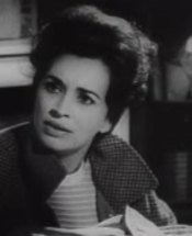
mhv--You are right in that it is a low contrast scene. It was taken on an overcast day in the winter. However, to me it has a classic, darker look akin to Robert Frank, etc. It is an example of one look I like. It is not the same look that I had in mind when I began the post. For that, still refer back to the shot I posted from La Jetee. Your comments prompted me to browse through some books and I realized that I like either lower contrast, dark prints or high contrast prints. Something I wasn't completely aware of previously. In particular, I notice that Roy DeCarava usually prints dark, with low contrast. I love his look/style. It's the well balanced, middle of the road prints that I am least drawn to, though I suppose there are examples of very balance photos that would knock me out.

Jmal
 

Michel Hardy-Vallée

Membership Council
Subscriber
Joined
Apr 2, 2005
Messages
4,793
Location
Montréal, QC
Format
Multi Format
Between the still from La Jetée and your shot, you will notice a few important things. First is that the shot has a full tonal range, whereas yours has a limited one. Second is that the grain is more pronounced, yours is smoother. Finally, and most importantly, the gradations of La Jetée are harsher and have way less detail. There is also a little bit of dodging on the eye in the shadow.

For the so-called "look," it's really about the film/processing. That's the kind of stuff AA recoiled in horror from and called soot-and-chalk while crossing himself with his spot meter. 35mm films for a long time really looked as if they only had four tones: black, white, and two greys. I think in digital we could call that effect "posterization" to a certain extent.

I've even seen prints by Gisèle Freund made from medium format negatives from the 1930s that had that look! No wonder the Straight photo pictorialists always insisted that the view camera negative was the only one that could guarantee proper tonality. And by view camera I mean 8x10 ! Berenice Abbott's portrait of Joyce was taken with a 3x4 glass plate, and it has very limited tonality.

I've also noticed that bad prints of B&W movies display in an exaggerated form "the look." Here's a shot from the copy of "Night of the Living Dead" that's available freely from the Internet Archive. I've seen a restored version, and this copy is a really bad one. All the midtones are almost gone. The contours are unsharp, and sometimes have almost halos. But that's from the bad printing.

But even with a low-tech film and a flarey lens, I'm not sure you will achieve the look. Here's a portrait from my gallery: (there was a url link here which no longer exists)

It was taken with Efke KB100 developed in XTOL, and the lens is a pre-war Contax Zeiss Triotar 85mm, uncoated. I have a pretty good amount of midtones, way more than the still from La Jetée. The technology used to take it was available to Chris Marker then (except XTOL, but D-76 would have given similar results).

Probably by enlarging a lot a small portion of the negative one can reduce tonal gradations enough. But I fear the film technology has already advanced too far.
 

Attachments

  • Image 1.png
    Image 1.png
    81.1 KB · Views: 200
Last edited by a moderator:

firecracker

Member
Joined
Jan 22, 2005
Messages
1,950
Location
Japan
Format
35mm
For that, still refer back to the shot I posted from La Jetee.

Out of my curiousity, how do you rate the image quality from DVD? I saw that Chris Marker's film on VHS back in college in my class, so obviously I wasn't getting into anything other than his poetry-like style of cinema, which is very exquisite...
 
OP
OP

jmal

Member
Joined
Oct 13, 2006
Messages
529
Location
Kansas
Format
35mm
Firecracker--I was blown away with the DVD. I'm not sure if this has to do with the quality of the DVD itself or the fact that I saw it on VHS ten or so years ago. Anyhow, I have the book version as well and I think the DVD kills it. Considering that Marker shot it on a 35mm Pentax, one would think the book would/could be equally good, but it's not. There may be something to watching it on a large screen tv also.

Jmal
 

tim elder

Member
Joined
Oct 9, 2005
Messages
147
Location
New York, NY
Format
Multi Format
Considering that Marker shot it on a 35mm Pentax, one would think the book would/could be equally good, but it's not.
Jmal

I was always curious if he used a still camera or a motion camera for La Jetee. How did create the one moving image in the film with a still camera, a motor drive?

Tim
 

nworth

Member
Joined
Aug 27, 2005
Messages
2,228
Location
Los Alamos,
Format
Multi Format
If you look at real photographs, you will probably see better quality than what you see in books or magazines. A few books and photgravures are exceptions, with very good reproduction. But that exceptional quality comes at a very high cost both in prepress preparation and in actual printing.

The instructor at a recent workshop I attended made a point that the only thing the film sees is light, and that you must learn to photograph the light, not just the subject. Looking carefully at some photographs since then, I realize that he was right. The really successful photographs make use of subtle and not so subtle contrasts between parts of the image. It is the way the light interacts with the scene that makes an interesting picture. Incidentally, not all photos have a full range of tones from pure black to pure white. There are many subjects where the tonal range is and should be restricted. But the interplay of contrasts within the tonal range is still key to success.
 

Roger Hicks

Member
Joined
May 17, 2006
Messages
4,895
Location
Northern Aqu
Format
35mm RF
If you look at real photographs, you will probably see better quality than what you see in books or magazines.

. . . But the interplay of contrasts within the tonal range is still key to success.

The second part, I agree with unreservedly. But more and more, I find myself disappointed with over-enlarged 'real' prints (or worse, ink-jets) as compared with even middling-to-good repro. I first noticed this with Bill Brandt 30+ years ago, but have since seen it in, among others, Ansel Adams and (last week) Raghu Rai; and the only original Rodchenko and Drticek prints I have seen were not a patch on good repro.

Cheers,

Roger
 
OP
OP

jmal

Member
Joined
Oct 13, 2006
Messages
529
Location
Kansas
Format
35mm
Tim--I don't know what was used for the one moving scene. There is an interview in the booklet of the DVD where he mentions the Pentax still camera. I don't recall if he mentions the other type of camera.
 
OP
OP

jmal

Member
Joined
Oct 13, 2006
Messages
529
Location
Kansas
Format
35mm
Dave,

I'm glad you had a chance to see it. It has always been one of my favorite "movies."
 

temujin

Member
Joined
Dec 7, 2006
Messages
49
Format
Medium Format
hey, funny to come across this thread, cause i just got the la jetee dvd last week, and i was equally inspired by marker's gritty photos. i read that marker used a pentax 35mm for the stills, and a 16mm arriflex for the motion scene. i have been working in medium format for the last couple of years, but this film has really motivated me to get back into 35mm work, especially with fast old-school films like tri-x and hp5. i really enjoy a pleasant grainy appearance in prints, such as in ralph gibson's early 70's work. i would like to know - would it be better to print with a condenser head to get such distinctive grain? i have always worked with dichro heads, and don't know how significant the difference is in grain.
 

Antonov

Member
Joined
Jun 11, 2007
Messages
75
Location
Vinkovci, Cr
Format
Multi Format
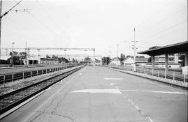
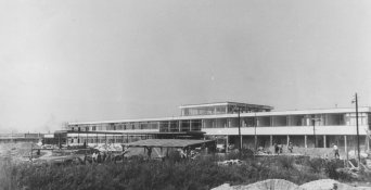
Look at these two photos and tell me what do you think when are they taken?
If you could guess year, maybe I can help you with the look. :wink:
 

Attachments

  • untitledscanned29ed0.jpg
    untitledscanned29ed0.jpg
    80 KB · Views: 188
  • vk6521.jpg
    vk6521.jpg
    89.4 KB · Views: 180

nworth

Member
Joined
Aug 27, 2005
Messages
2,228
Location
Los Alamos,
Format
Multi Format
After following the thread for some time, I realized that "the look" people were after was not the fine print look of the 50s and 60s but, rather, the photojournalistic look of the period. This was an era of fairly grainy films, available light, and push processing. It was the practical start of using 35mm for this kind of work. The films available now have lower contrast and finer grain than they did then. Using TMZ sort of gives the look of the (very) old Tri-X. Some of the developers used to push films were pretty rough - e.g. DK-50, DK-60a, D-76 with 20 grams of borax and extended times. You might try EFKE PL-100 (KB-21) pushed in DK-60a for that grainy, chalk and soot look. FX-1 is also from the period and was generally used for the "thin emulsion" films of the period, like PX and KB-17.
 

Antonov

Member
Joined
Jun 11, 2007
Messages
75
Location
Vinkovci, Cr
Format
Multi Format
After following the thread for some time, I realized that "the look" people were after was not the fine print look of the 50s and 60s but, rather, the photojournalistic look of the period. This was an era of fairly grainy films, available light, and push processing. It was the practical start of using 35mm for this kind of work. The films available now have lower contrast and finer grain than they did then. Using TMZ sort of gives the look of the (very) old Tri-X. Some of the developers used to push films were pretty rough - e.g. DK-50, DK-60a, D-76 with 20 grams of borax and extended times. You might try EFKE PL-100 (KB-21) pushed in DK-60a for that grainy, chalk and soot look. FX-1 is also from the period and was generally used for the "thin emulsion" films of the period, like PX and KB-17.

What do you think about these photos, when where they taken and with what, and what do you say about look?

http://zeljeznice.net/forum/viewtopic.php?t=5159

Regards, Anton
 

Dave Krueger

Member
Joined
Jul 30, 2006
Messages
714
Location
Huntsville, Alabama
Format
Multi Format
So, if "The Look" is to return film photography to a past time, discarding all of the advances in the science and art that has occurred since the 1950's and '60's, does this mean we are now consigning it to the ash heap of history? :confused:

This is an interesting question. I don't think we're relegating film to the past and I wouldn't describe history as a trash heap in any case (hah!), but I do think that film is seeing a resurgence of interest in the very characteristics that differentiate it from typical digital. I've been experimenting with films and developers specifically to tailor my use of materials to the kind of look I want the pictures to have. I used to catagorize film only by the speed (higher is better) and size of the grain (smaller is better). Now, I'm much more interested in the character of the grain in terms of how crisp it is, how smooth the tonal gradation is, and whether there are any apparent edge effects.

Yep, you people can take credit for turning me into the monster I've become... :D
 

Roger Hicks

Member
Joined
May 17, 2006
Messages
4,895
Location
Northern Aqu
Format
35mm RF
After following the thread for some time, I realized that "the look" people were after was not the fine print look of the 50s and 60s but, rather, the photojournalistic look of the period.
It's also the look after publication -- mostly printed on lousy paper after being coarsely screened, with a poor Dmax. Under these constraints, photographers often went after strong (if sometimes intricate) contrasts of light and shadow.

Actually, the few 'fine prints' I've seen from the 60s and before are a lot less 'fine' than modern ones, until you go back to the era of contact prints, when you didn't have 'fine prints' and 'prints' but just photographs (all right, with a few exceptions, but still..)

Cheers,

Roger
 

Dave Krueger

Member
Joined
Jul 30, 2006
Messages
714
Location
Huntsville, Alabama
Format
Multi Format
It's also the look after publication

Ah-ha! That raises a question in my mind. I know you're aren't specifically referring to this, but I was wondering when I was going through Ralph Gibson's book "Deus ex Machina", how much of the grain effect was produced by "enhancements" prior to printing. The book is fairly small format and I was thinking that halftone reproduction of even the grainiest images in a small format might loose some of that effect. So... It occurred to me that they may have inflated the grain to restore what is lost by the reproduction process. I have no idea if that's the case, of course.

Anyway, I'm thinking "the look" can be different when looking at a reproduction of the photograph instead of the actual photograph. I've never seen a real Ralph Gibson print, so I have not the slightest clue how accurately the book reproduced his work. So, in trying to acheive a similar character in my work, it's actually the reproduced look I'm using as a reference rather than the actual look.

I know this thread isn't about Ralph Gibson, but this seems related to the present discussion.
 

Antonov

Member
Joined
Jun 11, 2007
Messages
75
Location
Vinkovci, Cr
Format
Multi Format
I think that the majority of look people are searching for is from documentary photography.Just my opinion, because as I look at myself, I most of the look seek through that photography.
 
Photrio.com contains affiliate links to products. We may receive a commission for purchases made through these links.
To read our full affiliate disclosure statement please click Here.

PHOTRIO PARTNERS EQUALLY FUNDING OUR COMMUNITY:


Ilford ADOX Freestyle Photographic Stearman Press Weldon Color Lab Blue Moon Camera & Machine
Top Bottom