You're starting with a B&W negative or digital image. In the case that you don't want the final result to be neutral gray, what's your criteria for determining what the tone should be? The hue and the saturation. What has worked well for you and in what contexts? It can be a digital or chemical process, I'm mostly interested in how you choose the color and intensity.
-
Welcome to Photrio!Registration is fast and free. Join today to unlock search, see fewer ads, and access all forum features.Click here to sign up
You are using an out of date browser. It may not display this or other websites correctly.
You should upgrade or use an alternative browser.
You should upgrade or use an alternative browser.
How do you determine the character of toning you give to a B&W image?
-
- Thread starter loccdor
- Start date
Recent Classifieds
-
For Sale Kodak Ektachrome Infrared EIR aka Aerochrome
- Started by YoIaMoNwater
-
Want to Buy Old Kodak 101 roll film
- Started by blee1996
-
For Sale Schneider Kreuznach Super Angulon MC 120mm f8
- Started by RoboRepublic
-
Sold JOBO MultiTank 2 2521 4 X 5
- Started by Inayat Noor
-
For Sale Ilford 5X7 Paper Lot
- Started by davela
Forum statistics
A cursory review of most of my prints over the last few years will likely result in a response akin to "Matt sure likes toning".
So it is probably important to keep that context in mind when you read this post.
I print a lot of pictures of fairly old things - trees and older human artifacts being common subjects. Many of them are wood.
In my minds eye, I tend to see older styles of printing when I take and print them, and that means at least warm tone paper, but more likely neutral or cold tone paper toned either warmer (mostly) or colder than neutral.
I expect if I did more architectural work, I'd see more cold tones.
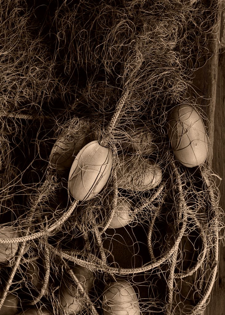
Two examples where the toning suggested itself to me at the time of taking:
Very warm:
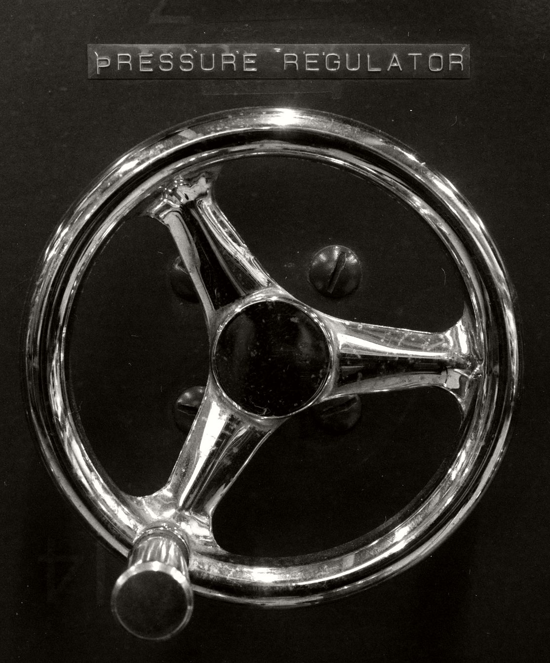
Veering toward the cold:
So it is probably important to keep that context in mind when you read this post.
I print a lot of pictures of fairly old things - trees and older human artifacts being common subjects. Many of them are wood.
In my minds eye, I tend to see older styles of printing when I take and print them, and that means at least warm tone paper, but more likely neutral or cold tone paper toned either warmer (mostly) or colder than neutral.
I expect if I did more architectural work, I'd see more cold tones.
Two examples where the toning suggested itself to me at the time of taking:
Very warm:
Net Loft Floats #10
- MattKing
- 2
A detail from some of the nets and floats on display at the Net Loft building at the Brittania...
Last edited:
I have always been partial to a slight sepia tone followed by selenium ( not over powering) Matts example of the netting is my choice.
I tone most all of my prints. Experiment and save swatches. Sometimes it's best to leave alone. I loved the last iteration of Kodak variable contrast cream base neutral tone papers in a little bit of selenium. Nothing more pleasing to my eye.
Wow I need to get downstairs and print. Got up to 2°C here today. I went out on my ebike, to heck with standing in the dark 

| Photrio.com contains affiliate links to products. We may receive a commission for purchases made through these links. To read our full affiliate disclosure statement please click Here. |
PHOTRIO PARTNERS EQUALLY FUNDING OUR COMMUNITY:  |


