Help with this photo

Forum statistics

Threads
198,991
Messages
2,784,235
Members
99,763
Latest member
dafatduck
Recent bookmarks
0

pierods

Member
Joined
Dec 18, 2007
Messages
365
Format
35mm
Hello everybody,

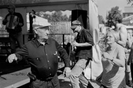
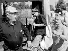
can you help with this photo?

CHS 100, Rodinal 1+50, 10 minutes, 20 C, Ilford agitation.

As far as I can see, exposure was right (speed is right, I see plenty of detail in shadows) but my dev time must have been short, mid tones are grayish and lifeless.

Or..?
 

Attachments

  • foto.jpg
    foto.jpg
    44.9 KB · Views: 262

thegman

Member
Joined
Feb 8, 2010
Messages
621
Format
Medium Format
I'm no expert on developing, but it looks pretty good to me,
 

Sirius Glass

Subscriber
Joined
Jan 18, 2007
Messages
50,389
Location
Southern California
Format
Multi Format
I'm no expert on developing, but it looks pretty good to me,

It looks good to me. Try dodging and burning to get the print that you want.
 

pentaxuser

Member
Joined
May 9, 2005
Messages
19,979
Location
Daventry, No
Format
35mm
Looks OK to me as well. Can you be more specific about what you see as "grey and lifeless" midtones.

Tell us specifically what isn't there that you'd like to be there.

As another APUGer has asked, is this a print scan or a neg scan? If it is the latter then how do you know what a print will look like?

We are getting more and more " problems" on APUG which I suspect are to do with scanning rather than negs and subsequent prints

pentaxuser
 

summicron1

Subscriber
Joined
Jul 28, 2010
Messages
2,920
Location
Ogden, Utah
Format
Multi Format
try a slightly longer exposure, maybe 50 percent, then burning in the brighter areas while dodging the shadow areas a titch, and knock your contrast up a notch.
 
Last edited by a moderator:

tkamiya

Member
Joined
Oct 3, 2009
Messages
4,284
Location
Central Flor
Format
Multi Format
I'm not sure how far I can go without being too digitally involved.

If this is a straight scan, it explains it. They always come out too flat. If you print it in darkroom, you are likely to find it's ok.
What I think you need is more contrast. I loaded it into NX2 and slid the black point to the top edge of the histogram. The image improved significantly. So in darkroom term, bump up the contrast one to 1 1/2 grade and expose so you get a full range of tones.

To me, your biggest problems are faces. They are gray. They need to be much lighter and brighter.

Here's how I would print it.
 

Attachments

  • foto2.jpg
    foto2.jpg
    100 KB · Views: 148

cepwin

Member
Joined
May 26, 2012
Messages
336
Format
35mm
Scanners can be tricky. The better ones have sophisticated SW that have essentially built in mini-photoshop so you can work with the "raw" negative before it produces the jpeg.
 
Joined
Jan 7, 2005
Messages
2,615
Location
Los Angeles
Format
4x5 Format
The whites just need to pop some. Take the highlight slider in levels and move it in some. I would also lighten up some of that shadow area on the left.
 
Last edited by a moderator:

Sirius Glass

Subscriber
Joined
Jan 18, 2007
Messages
50,389
Location
Southern California
Format
Multi Format
The whites just need to pop some. Take the highlight slider in levels and move it in some. I would also lighten up some of that shadow area on the left.

Use bleach [potassium ferracyanide] to get some pop.
 

naeroscatu

Subscriber
Joined
Oct 15, 2004
Messages
1,031
Location
Newmarket On
Format
Multi Format
The midtones look fine - it's your highlights that are gray and mushy. I'd try adding contrast - maybe just a half a grade to one grade.
I'm with Flyingcamera on this one. You don't really have whites in your highlights.
 
Photrio.com contains affiliate links to products. We may receive a commission for purchases made through these links.
To read our full affiliate disclosure statement please click Here.

PHOTRIO PARTNERS EQUALLY FUNDING OUR COMMUNITY:


Ilford ADOX Freestyle Photographic Stearman Press Weldon Color Lab Blue Moon Camera & Machine
Top Bottom