• Welcome to Photrio!
    Registration is fast and free. Join today to unlock search, see fewer ads, and access all forum features.
    Click here to sign up

Grainier looking lith

Watering time

A
Watering time

  • 0
  • 0
  • 19
Cigar again

H
Cigar again

  • 1
  • 0
  • 40

Recent Classifieds

Forum statistics

Threads
203,174
Messages
2,850,866
Members
101,710
Latest member
tparuy
Recent bookmarks
0

d.reed

Member
Allowing Ads
Joined
Sep 9, 2008
Messages
20
Location
Vancouver, B
Format
Medium Format
Hello,

I've been doing lith printing for a short while. I've both of Tim Rudman's books and I've been looking through what information I can find online as well.

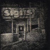
I'm using Fomatone VC RC and Easylith and have found them a lovely combination, lots of colour but not so much the graininess effect. Is there a factor I can focus on such as chemical ratios that will produce a grainier look with this paper and developer combination? I quite like the amount of colour I get with this and would like to keep that. Or would I be better to look at other papers? I've been using them quite dilute, 20ml A/20 B/1000 H2O at 68F.

Thanks,
Dana
 
Try other papers. The chemicals do have an effect, but secondary to the paper in my experience. There are 2 available that I've used with serious grain. Slavich Unibrom is grainy and controllable....but with occasional quality problems Fomabrom VC is seriously grainy and has a very particular look and is hard to control. Do a flickr search for lith and the paper names and you'll see examples. They are not very colorful, though. Another that I use (from my freezer stock!) is Kentmere Warmtone VC. It is more colorful and still grainy....and sadly discontinued. Some may still be available, though.
 
Easylith in general gives a pretty fine grain, it seems. The most pronounced grain I have gotten with any combination of paper and developer is Fomabrom 112 and Arista Powder Lith (from Freestyle in California).
Ilford MGWT and Slavich G4 gives a fairly grainy appearance also.
If you use negatives of moderate to high density and you have to expose for a long time, you can get some interesting grain that way.

Attached picture is Fomabrom and Aristalith, subsequently toned in sepia and selenium.
 

Attachments

  • Signs.jpg
    Signs.jpg
    304.7 KB · Views: 144
General observation: less sodium sulfite, more grain. To the point of pepper fogging. I am not familiar with your developer, so I do not know what is in there to begin with.
 
Thanks, I'll look at some of those papers. I'll just have to experiment a bit more with the chemistry too. I've only just started to vary the developer ratios. 2 to 1 A to B seems to have a small effect, little more grain, little less colour.
 
the others are correct .... grain is by far more the paper than the chemistry.
 
Photrio.com contains affiliate links to products. We may receive a commission for purchases made through these links.
To read our full affiliate disclosure statement please click Here.

PHOTRIO PARTNERS EQUALLY FUNDING OUR COMMUNITY:


Ilford ADOX Freestyle Photographic Stearman Press Weldon Color Lab Blue Moon Camera & Machine
Top Bottom