I've made a few good prints over the decades and nobody has ever said "nice print John, but it would have been so much better if you had used Delta/TMax/FP4/etc..)
Depends on who you listen to. Say it's Kodak. Put it somewhere on the Ilford-related part of the Internet, pretend to be a fanboy of Kodak, claim superiority over Ilford products and wait for yet another holy war

@OP:
lhalcong, sorry to be a complete jerk, but here it goes...
First,
have you pre-rinsed your negatives? Ilford materials state clearly to avoid pre-rinse, as it results in uneven processing.
I've found your middle tones unpleasant with FP4, better with Delta, and it's not only the fact that the overall contrast is higher. Maybe there was something off with paper exposure? Delta landscape looks simply brighter.
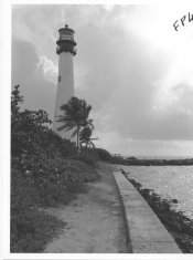
One of the other photos is unsharp.
Also both photos made with Delta somehow got more light: shrubs and face have more reflexes. If that's a reason or a result of higher contrast/shorter than optimal paper exposure, I dunno, it's not me to know this, only you. I know with strong wind and partial overcast light can go up and down by two stops in a second, but I doubt it was the case. At the same time, I can't deny the fact, that weather and light changes constantly when it's cloudy and windy.
List of possible variables is huge and differences I see can be narrowed down to FP4 looking more grainy (in a very nice way though). I believe one can work with tonal values to make both negatives look more similar. No clues about shadow detail, nothing really to say about highlights too - both are really important, and there's very little of it shown. I can see FP4 handles bright areas well, lacks contrast overall, but Delta doesn't look like simply blown due to high contrast, cause it might have been also overexposed/overdeveloped, at least this is how I'm interpreting the lack of separation in middle tones of FP4. And Delta, unlike FP4, looks pretty robust in highlights. Just mishandled.
Dunno why or what you've really (objectively) tested, and 'to go by heart' is the only valid, wise answer I can think of.
These are two different emulsions that may perform best in various soups, two different sensitivities - not by much, but still, finally non-scientific subjects and uncontrollable conditions might have fooled our eyes and bias our thinking.
Using same dev for various emulsions is actually a variable, as various films may have various responses to a developer (D76 may be the most standard thing to think of, but still it's not made by Ilford, so they might have cared less for some minute differences in curve shapes). Also times stated by Ilford are rounded, and not tailored to any specific conditions, while it may be beneficial to change things a bit depending on what you want to do with a negative - like if you plan to use it on a condenser or diffuser enlarger or if the subject had more or less contrast.
I believe in practice we'll be both squeezing as much as possible out of what we have, optimizing every step. Proper materials, careful exposure, trusty soups, time and temperature control, agitation pattern, and a lot of fine-tuning. And only afterwards, after nailing down whole process, down to mounting and exhibiting or reproducing, which may take years, I can think of "subjectively testing" similar (yet different) processes (not negative material alone) one against another. But in this case I'd rather stare at other person's work, or work upon someone else's recipes, cause life is too short.
If you want to be more scientific, yet still feed your intuitive hemisphere with something substantial, you can use still subject, like a bunch of flowers in a vase. Different materials, different textures, big tonal scale, small details, delicate texture in shadows and highlights, huge dark and bright flat spaces - test subject can simply have it all. Use artificial lights, swap cameras on a sturdy tripod, so that it's perfectly the same point of view, develop it as well as humanly possible, measure and document every possible parameter, finally print it huge on a graded paper (with multigrade paper I'd have doubts personally if eg. the base color is not changing the grades).
This thread reminds me of a different one, several pages long, where a guy cut his film in four to test granularity of different Rodinal soups, noticing significant density variations, but neglecting the fact the light has changed from sunny to overcast, finally drawing (valid) conclusion, that the film that got least light had also smallest and most regular grain in brighter tones (pale license plate), and he, still confused, related this to soup he had used. I think it was entertaining:
(there was a url link here which no longer exists)
Anyways, your work is a good reminder for me, so thanks a bunch. Personally, I've not yet found my favorite 100-ish film, this thread helps me a bit to know what can I look for.
Cheers!