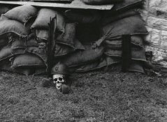
Congratulations on your first print. I remember mine...still have it, actually.
I am kind of puzzled how you even got it, though, given some of the questions you asked in response to the idea that it is very flat. If you don't know what midtones or contrast are yet, or how to change them, I'd at least read a basic photo textbook before you go on. You can get one at the library and be done with it in a few days. If you start printing without knowing what contrast is or how to change it, you are going to spend a lot of money and time unnecessarily. You can take shots in the dark and figure it out yourself using tons of time and paper, and still be none the better for it than if you had just grabbed a basic overview before jumping in; there is nothing to be gained by ignoring the basics in print form, in other words. You cannot effectively print without knowing something as fundamental as how to change contrast or lightness.


