Exposing & Printing Bright Sunlit Photographs

Flow of thoughts

D
Flow of thoughts

  • 2
  • 0
  • 41
Rouse st

A
Rouse st

  • 5
  • 3
  • 67
Plague

D
Plague

  • 0
  • 0
  • 51
Vinsey

A
Vinsey

  • 3
  • 1
  • 87

Recent Classifieds

Forum statistics

Threads
199,162
Messages
2,787,265
Members
99,828
Latest member
Photodegree
Recent bookmarks
1

brian steinberger

Subscriber
Joined
Jan 5, 2007
Messages
3,009
Location
Pennsylvania
Format
Med. Format RF
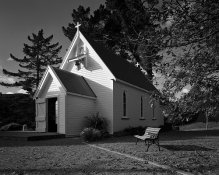
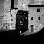
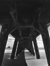
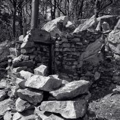
I'm trying to figure out what makes a great photograph which was made in bright sunlight; a print that makes you squint when you look at it. It seem to me that a lot of black & white photography is made in overcast or diffuse lighting. And while I've seen many photographs that have been taken is bright sunlight, only a few truly posses that feeling of bright sunlight. I have attached a few great examples.

Exposure:

Exposure in bright sunlight can be very difficult if allowing in-camera metering. Spot metering is a little easier. Is the key to a great sunny photograph the black detail-less shadows? Or the bright detail-less highlights? Or both?! Seems many photographers (Ansel Adams certainly) try to get as much detail in the shadows and highlights, compressed the tonal scale much, whether it be use of compensating developers, water bath, stand-development, etc. I find a great sunlit photograph to have black areas of detail-less shadows, though this is just my personal preference. Highlights can also fall quite high on the exposure scale, though through controls already mentioned can be controlled.

How are you guys exposing your sunlit photographs? Are you placing shadows on zone II? Maybe placing highlights on zone VIII? Reduced agitation in development most of the time?

Printing:

Then when it's time to print, I usually start with my lightest tone, usually a zone VIII in a sunlit photograph and find my exposure which makes it just visible on the paper, then use contrast to set the blacks. Many times though with my sunlit photos the whites are either too bright or not quite bright enough. It seems that it's a fine line between success and failure.

How are you guys printing your bright sunlit photographs? Are you letting some of your highlights go pure paper base white? Are you letting some shadows go to detail-less blacks?

I understand everyone's process is different. I'd just like to get an idea of other thoughts on bright sun photographs when it comes to exposure and printing.
 

Attachments

  • 3503124746_44079d00f7.jpg
    3503124746_44079d00f7.jpg
    118.9 KB · Views: 293
  • 4525626085_ff1aac26ed.jpg
    4525626085_ff1aac26ed.jpg
    140.5 KB · Views: 274
Joined
Jun 23, 2007
Messages
1,177
Location
Hamilton, Ca
Format
Multi Format
This naturalistic approach is what I've used on many 'clear sky' occasions: Don't meter, lord don't spot meter. Just sunny 16 rule and let everything fall where it is. Everything should render as your eye sees it: sun reflected on windows will blow out, deep shadows will be black, and everything else should render faithfully. My rationale is that if I was drawn to photograph it, it should look like what I saw. The contrast is handled to my liking with development time, attempting to standardize contact prints. To get close to the images you've cited, forget about exposing for the shadows, forget about developing for the highlights. Set for sunny 16 and let the film do what it does.

For printing, my preference is the highlights on the church wood above should be perceptibly darker than the paper base (so you can see the border as brighter), but I think it's fine for the sun reflected in the window to be as white as the paper. Sorry if that sounds superficial.
 
Last edited by a moderator:

DWThomas

Subscriber
Joined
Jun 13, 2006
Messages
4,606
Location
SE Pennsylvania
Format
Multi Format
I'm surely no expert, but I would tend to take the whitest white up to just about blown out, but use a contrast that still goes pretty deeply into black. To some extent, contrast is a relative effect, painters create strong centers of interest by placing darks and lights directly adjacent. The same values separated by intermediate values don't appear as strong.

Not sure if this is an optimum example, a zapped bit shot of a "real print!"

109659479.jpg


As a photo of a photo, it's a bit wonky, and only the clouds approach a blown out white, but I think the fact that the direct sunlit concrete falls next to the deep shadow under the arches illustrates what I'm trying to say.

Hmm, exposure wise, I discovered after the fact that day I had set my meter wrong, partly compensated by a generous allowance for a yellow filter, so the negs were on the thin side, but close to my norm contrast-wise.
 
OP
OP
brian steinberger

brian steinberger

Subscriber
Joined
Jan 5, 2007
Messages
3,009
Location
Pennsylvania
Format
Med. Format RF
Excellent example Dave! This is the type of bright sunlight shot I am trying to master. Interesting concept about adjacent areas of bright and dark tone, it certainly is effective. I'm sure there was plenty of tone underneath those arches to the naked eye, but the way you've printed this has rendered it screaming of sunlight! It would be interesting to see another example of this print with lots of detail in the shadows. I would fear it would turn out to be a muddy print. Sometimes I suppose the limitations of film help to portray a scene as such in your example, or maybe we're so used to seeing bright scenes portrayed with empty shadows that this is what we've come to expect. Thanks for sharing!
 

Vaughn

Subscriber
Joined
Dec 13, 2006
Messages
10,121
Location
Humboldt Co.
Format
Large Format
it is interesting how we perceive light. I find the second example you gave to be very unreal lighting -- the shadows are far too black -- not what we would experience if we were there. But at the same time it is a wonderful image, with the girl running (escaping?) out of the shadows (which are rather ominous-looking in their darkness.)

We tend to take in a scene as a gestalt -- looking into the shadows, then at the sunlit areas -- creating an image in our brains that contains information in both areas that we actually do not see at any one time. We do the same with focus. So the camera/film captures an image that we really do not see.

I prefer a negative that has printable information in all areas -- this gives me the option to print the neg anyway I want to.

Here is an image that best illustrates what I am after. While standing there, I could see all the detail under the wharf, then turn my attention to the sunlit areas and see all the detail there -- but not both at the same time. The neg has full detail in all areas, but I actually print it with some complete detailless blacks under the wharf...perhaps a little darker than what appears on the screen. I used a red filter to help bring the values under the wharf and the rest of the scene closer together.
 

Attachments

  • Tolaga bay Wharf.jpg
    Tolaga bay Wharf.jpg
    114.2 KB · Views: 226

Larry Bullis

Subscriber
Joined
May 23, 2008
Messages
1,257
Location
Anacortes, WA, USA
Format
Multi Format
We all have our preferences. That seems to me to be what's being discussed here. A lot of that specific technical stuff comes into line as one develops a clear idea of what a print should look like. Not everyone can agree on that.

For example, I recently had the opportunity to look at some Edw. Weston and A.A. prints side by side. Those two printed very differently. Adams skated on the edge at both ends, while Weston tended to live more in the middle values without sacrificing the overall scale. My own preference agrees more with his way of doing it, but I still enjoy seeing the more extreme approach when done well.

The balance between overall contrast and local contrast is sometimes hard to find. It is possible to contain vast illumination ranges by altering development or building special developers. The challenge there is to keep lively separation in adjacent tones, avoiding a result that, while it has both ends, lacks life in the middle.

All that considered, probably the most important thing is really the design of the image. Vaughn mentions "gestalt" above and cites the example of the girl running. For me, that image works much better than the other, which is "a picture of a church". The deep shadows make (in the running image) a very exciting shape. The construction of the image provides an overall graphic context that could stand as an image on its own, but the inclusion of the subject (girl) sends it into orbit by bringing life into an already solid structure. (Here I reveal my modernist roots!)

I can comment on the graphic elements, but the examples as shown don't give me much to go on regarding the technical means (loss or retention of detail, etc.) which allow or obscure substance in specific value regions. This is inevitable in translation from the real print to virtual. We just can't really know what is there.
 

jmcd

Member
Joined
Sep 10, 2002
Messages
710
My old Forte film compressed beautifully, but with newer films I have been leaning toward less compression, instead making use of the dark shadows, and enjoying the brilliance.
 
OP
OP
brian steinberger

brian steinberger

Subscriber
Joined
Jan 5, 2007
Messages
3,009
Location
Pennsylvania
Format
Med. Format RF
Thanks for keeping the comments coming, and wonderful example Vaughn!

Its an interesting comment Bowzart had about how Ansel and Edward printed. I tend to print at the extremes as Adams. Highlights to my work are the most important thing. Shadows to me, depending on how important they are of course many times can come or go, but an important highlight needs to be just that perfect tone to make a print sing.

My old Forte film compressed beautifully, but with newer films I have been leaning toward less compression, instead making use of the dark shadows, and enjoying the brilliance.

This is basically what I've been disconvering over the past few months while playing with new films in the absense of Neopan 400. Films like Neopan 400 or HP5 have a shoulder which many would find very useful in bright sunlight to tame highlights. But I find sometimes, particularily HP5 to look very "muddy" in sunlight. I believe it compresses too much. I've even tried super amounts of development and still cannot get HP5 to sing.

But lately, I've been discovering how wonderful FP4 is. It's more of a straight line curve which won't compress highlight detail. By under-exposing slightly and developing highlights to desired density I'm finding images closer to the examples above, much like jmcd describes.

Here's a shot I took yesterday in blaring sunlight, around 2pm of an old stone cabin. It was shot on FP4 in Rodinal 1:50. Highlights on the rocks were placed on zone VII and the shadows on the inside were between zone II and III. I think the neg may be over-developed just a tad. This is only a neg scan, but I am excited to print and share as well.
 

Attachments

  • Old Cabin, Buzzard Rocks.jpg
    Old Cabin, Buzzard Rocks.jpg
    396.6 KB · Views: 218

Ian Grant

Subscriber
Joined
Aug 2, 2004
Messages
23,273
Location
West Midland
Format
Multi Format
You need to do a personal film speed and development test as their should be more shadow detail than in those images.

It's important to get the detail into the negatives, that way you can print them anyway you like and will have far more control at the printing stage.

porth_merion.jpg


chios.jpg


Two examples of extreme contrast.

Ian
 

jmcd

Member
Joined
Sep 10, 2002
Messages
710
Brian,

I think your images look great, and most importantly you are getting what you want to see on paper. Also, a great topic for discussion with much to think about from many perspectives.

If you are experimenting with FP4+ and so on, try developing it in Xtol stock or D-76 stock—not for fine grain but for the brilliance.
 
OP
OP
brian steinberger

brian steinberger

Subscriber
Joined
Jan 5, 2007
Messages
3,009
Location
Pennsylvania
Format
Med. Format RF
Brian,

I think your images look great, and most importantly you are getting what you want to see on paper. Also, a great topic for discussion with much to think about from many perspectives.

If you are experimenting with FP4+ and so on, try developing it in Xtol stock or D-76 stock—not for fine grain but for the brilliance.

jmcd, funny you should mention Xtol because today I'm actually going out to shoot (blaring sun of course) and plan to try out Xtol 1:3. I've heard nothing but good things. Rodinal 1:50 gives me incredible sharpness with FP4, some of the best I've ever seen in photography. I know Xtol won't be able to even come close, but I'm hoping at 1:3 I can get improved sharpness.
 

jmcd

Member
Joined
Sep 10, 2002
Messages
710
Sounds good, Brian. Just to be clear, I recommend you also try the FP4+ in full strength solution for comparison.
 
OP
OP
brian steinberger

brian steinberger

Subscriber
Joined
Jan 5, 2007
Messages
3,009
Location
Pennsylvania
Format
Med. Format RF
jmcd, I've never developed anything in stock Xtol. I have plenty of experience with 1:1, I used it for years with Neopan 400 and loved it. I used it once with FP4 and found it to be lacking sharpness. Maybe Xtol undiluted for something that doesn't need sharpness, like clouds. I will definitely try!
 
Joined
Jan 17, 2005
Messages
1,355
Location
Downers Grov
Print for the white to have detail if there is detail, and use contrast to set the blacks.

If you have set up your development correctly, a full sun pic should print out with perfect whites & blacks on #2 or the paper of your choice.

If the blacks are grey, develope less. If they go too black, then develope longer. When you do this, the printing time will shorten and lengthen respectively to get proper whites.
What you are infact doing is decreasing or increasing negative highlight density. Exposre controls the shadaw density.
 

Larry Bullis

Subscriber
Joined
May 23, 2008
Messages
1,257
Location
Anacortes, WA, USA
Format
Multi Format
...Highlights to my work are the most important thing. Shadows to me, depending on how important they are of course many times can come or go, but an important highlight needs to be just that perfect tone to make a print sing.

For me both highlights and shadows are important. They are a means to an end - which is a convincing sense of substance throughout. This is true for me even if the image is quite a departure from what the eye would have seen.

Highlights, if too white, tend to look like holes in the picture.

Printing for the highlights and letting the shadows merge into featureless black always seems to me a cheap trick. We have a very highly regarded photographer around here who does that almost all the time, and the images are always very dramatic. The public loves them. The reason that they work so well is that she has a terrific ability to see the potential for coherent design when working with the camera. She also has had a long lifetime of experience.

Uncharacteristically, when printing for a recent show, I actually allowed an area which had plenty of detail in the negative go totally black. I thought of the person mentioned above as I was doing it. I don't think I've ever really done that before, at least since about 1965, and probably won't do it again anytime soon, either, but for that particular image it was perfect. It can be effective. However, even if you want to do something like that, you make it a lot easier for yourself if the negatives have a good foundation in the shadows.

The challenge with sunlight (expanded from a point source) is that without keeping the image fairly simple, it is easy to fragment the image. It may be counter-intuitive, but sunlight doesn't reveal; it tends to obscure.
 

Larry Bullis

Subscriber
Joined
May 23, 2008
Messages
1,257
Location
Anacortes, WA, USA
Format
Multi Format
To take it to an extreme, consider lith film which produces an image with no middle tones, just black and white. Most photographs just plain can't work with it, unless they are kept very simple. Think of a sidelit face with the triangular nose shadow and dark eye sockets, maybe with part of the eyelid completely white. Both eyelids? White shapes that aren't descriptive emerging from black void. Not only that, which is pretty obvious, but the turning of the surface away from the light would cause a break; one side being white, the other black. The shape of the edge would be produced by the shape that the light is falling upon, but would do something quite different from a legible description. The point is that the shape the light makes against the dark must read to the eye; the light makes it's own shapes as it falls upon a surface.

You don't need lith film to see effects like this. A disorganized pattern (or lack thereof) of light on even a fairly clearly defined form will produce an image of its own doing, having very little to do with how we see the image. You can destroy form quite easily.

Minor White used to call light from an overcast sky "revealing light". That's because the light from all parts of the sky lights underneath forms extended out into space. Sunlight, with the same form, would produce shadows which might not show the form clearly at all.

Sunlight can be very challenging. Overcast isn't anywhere nearly as difficult. Here's an assignment. Have someone blindfold you and lead you around so you don't kill yourself, on a sunny day. Make exposures. Print them ALL, so you aren't selecting for "good" ones. You are bound to produce a great example of this. You won't see it as clearly in your normal work because you are looking for organization whether you know it or not. Being aware of what the light is lighting, the shapes it produces in its interaction with the surface, makes a big difference. "Critical Seeing".
 

m_ring

Member
Joined
May 11, 2010
Messages
8
Location
Greenland
Format
35mm
I think the technical quality of your photographs look great. Here in Greenland I always struggle with the exposure when outside in bright sun light. Especially when I'm one the ice. I use 35mm only. I tend to guess the exposure and leave the meter alone. So far it works. I use Neopan 100 Acros and ADOX CHS 50@100 in Rodinal a lot. Always with a UV filter. When I have to use a fast film in bright sun I use Tri-X or Neopan 400 always in Tetenal Emofin (2-bath developer). When printing I try to get as much detail in the important areas of the photograph as possible so that means sometime I have to sacrifice other zones if the negative is really extreme. Though, I never let some of my highlights go pure paper base white. I use Ilford MGFB Warmtone Glossy for most of my work.

Greetings from the high north
 

R gould

Member
Joined
Apr 22, 2010
Messages
427
Location
Jersey Chann
Format
Medium Format
When it comes to exposure in bright sunlight I use a handheld meter,Weston master V, and either take a reading from my hand and open up a stop, or take a incident reading, as for the printing, it depends onwhat I see on the neg, and what I want,sometimes I go for detail, sometime I would emphasive the shadows,depends what I "Feel" the negative says to me.Richard
 

doughowk

Member
Joined
Feb 11, 2003
Messages
1,809
Location
Kalamazoo, MI
Format
Large Format
A question: does negative compression thru BTZS (or similar) methodology result in loss of information? In the digital world, compressed image files, such as with jpeg, is information lost as compared to saving as a "tif". I wonder if the analogy is appropriate? I normally try to capture as much information as possible in the negative, then deal with it in the darkroom. Of course its easier to do when contact printing on long-scale processes/media.
 

Ian Grant

Subscriber
Joined
Aug 2, 2004
Messages
23,273
Location
West Midland
Format
Multi Format
Using the Zone system or BTZ leads to greater rendition of information in the negative and is intended to prevent loss of detail in the shadow and burnt-out highlights. So just the opposite to your question.

Ian
 

doughowk

Member
Joined
Feb 11, 2003
Messages
1,809
Location
Kalamazoo, MI
Format
Large Format
Ian, if film can capture up to 15 zones of information ( as Bruce Barnbaum states), then BTZS reduces that range so that the negative more closely matches the ES of the paper. Negative range reduction I would think would also have a corresponding loss of information. Am I missing something? Thanks for your help on this issue that has always puzzled me.
 

Ian Grant

Subscriber
Joined
Aug 2, 2004
Messages
23,273
Location
West Midland
Format
Multi Format
The Zone System or BTZ are both used to increase the range of tones that a film can hold under contrasty situations, the decrease is in the overall negative contrast and usually film speed with increased exposure to ensure retention of shadow detail.

The converse is in very flat lighting were you might want to expand the range of tones by increasing the contrast and thats when you expand the range of tones in a negative & subsequent prints.

The degree of expansion/contraction that you use needs to be tempered by experience, as you may not want to lose mood in a lighting situation. An example of this is shooting in fog, I never increase contrast at neg stage or printing as that loses the atmosphere.

bluehills02sm.jpg


Ian
 
Last edited by a moderator:

doughowk

Member
Joined
Feb 11, 2003
Messages
1,809
Location
Kalamazoo, MI
Format
Large Format
Ian, I can understand negative expansion when in low contrast situations; but still don't understand the need for neg contraction. With older films one might be approaching the shoulder and need to avoid blown out highlights. Contraction would spread out the zones and avoid losing highlight information. But with newer films such as FP-4 and especially new T-max 400 they are relatively striaght-line for a very long exposure range - maybe up to 10-12 zones. If you have a scene with let's say 7 zone range and am using the newer film, why (other than ease of printing) would you contract the DR of the negative? Instead, I normally expose based on the shadow reading and the highlights fall where they may (within reason). Obviously, I'm still trying to understand the need for the BTZS system, which may be my shortcoming.
 

doughowk

Member
Joined
Feb 11, 2003
Messages
1,809
Location
Kalamazoo, MI
Format
Large Format
It comes down to how much effort are you willing to expend to get the print that the negative has to convey. A negative that matches the exposure scale of the paper/process you choose will make life in the darkroom alot easier. But even Ansel Adams was willing to go to herculean efforts to get the print he wanted. Negatives are a challenge. I may have to set aside many since they require skills I currently do not have or a process that I haven't mastered. But that's part of what many enjoy about traditional darkroom work - the challenge.
Its also a matter of how many of a negative/prints do you need. Brett Weston, for his portfolio series, may have chosen easier over better. His best may have been "a bitch" to print; and therefore were of limited quantity. And he, for one, certainly didn't follow the zone system. He was willing to have deep blacks and blown out highlights if it matched his vision.
 
Photrio.com contains affiliate links to products. We may receive a commission for purchases made through these links.
To read our full affiliate disclosure statement please click Here.

PHOTRIO PARTNERS EQUALLY FUNDING OUR COMMUNITY:


Ilford ADOX Freestyle Photographic Stearman Press Weldon Color Lab Blue Moon Camera & Machine
Top Bottom